A simulation study of sampling in difficult settings: Statistical superiority of a little-used method
Abstract
Taking a representative sample to determine prevalence of variables such as disease or vaccination in a population presents challenges, especially when little is known about the population. Several methods have been proposed for second stage cluster sampling. They include random sampling in small areas (the approach used in several international surveys), random walks within a specified geographic area, and using a grid superimposed on a map. We constructed 50 virtual populations with varying characteristics, such as overall prevalence of disease and variability of population density across towns. Each population comprised about a million people spread over 300 towns. We applied ten sampling methods to each. In 1,000 simulations, with different sample sizes per cluster, we estimated the prevalence of disease and the relative risk of disease given an exposure and calculated the Root Mean Squared Error (RMSE) of these estimates. We compared the sampling methods using the RMSEs. In our simulations a grid method was the best statistically in the great majority of circumstances. It showed less susceptibility to clustering effects, likely because it sampled over a much wider area than the other methods. We discuss the findings in relation to practical sampling issues.
1.Introduction
Health surveys in various parts of the world are conducted to estimate (for example) prevalence of disease or immunization, or relative risk (RR) of disease given exposure to a putative hazard. Conducting these surveys can be challenging when relevant information on the population of interest is limited. Surveys typically use multi-stage sampling. Our paper explores the impact of differences at the stage of sampling households.
Various survey methods have been proposed for low-information scenarios; some have been applied in the field. The World Health Organization (WHO) developed a random walk methodology to estimate immunization rates in young children as part of the Extended Program on Immunization (EPI) [1]. This approach selects 30 towns as Primary Sampling Units (PSUs) using probability proportional to size (PPS). To overcome the lack of a complete list of households, surveyors identify a central landmark in each town, choose a random direction, identify all households along that direction to the edge of the town, and randomly choose one as the starting household. Additional households are selected using a ‘nearest neighbor’ process until the required sample size is reached. We label this approach ‘EPI’ (The figures in the Appendix show graphically how it and other sampling methods are applied).
EPI has limitations – in particular, the sampling probabilities are undetermined, making it difficult to construct adjusted, unbiased estimates from the survey results. Several authors have proposed modifications. For example, Bennett et al. [2] suggested several approaches to ensure a wider geographic dispersion of the sample. One method divided the town into four quadrants and applied the EPI approach to select a quarter of the sample from each quadrant (‘Quad’). They proposed additional options: taking half the sample from the centre of the town and half from the edge; taking every third nearest house; and taking every fifth nearest house. Grais et al. [3] recognized that EPI biases the starting house to be close to the center of the town and proposed an alternative method to identify the starting household. However, none of these changes allows the estimation of sampling probabilities.
Kolbe et al. [4] made use of satellite images and Global Positioning Systems (GPS). They randomly chose GPS points within the survey area, drew circles around them on the images, numbered the buildings in the circle, and randomly chose one building from each circle. Shannon et al. [5] suggested a variant to avoid the overlap that can occur with circles: superimposing a grid of squares over the images of towns, randomly sampling several squares from each town, and randomly sampling a building from each square (‘Square’). Ambiguities about buildings that overlap the edges of squares can be resolved by assigning buildings to a square based on the side on which the building falls, e.g. north/west vs. south/east (Appendix Fig. A3 shows a schematic figure for the Square method). The Square and Circle methods produced very similar results. Since the Square approach avoids overlap, we include it and not the Circle method in this paper.
Several surveys (e.g., MICS [6]; Demographic and Health Surveys [7]) sample small areas (typically census Enumeration Areas), identify all households in those areas, and take random samples of the households in each area. The WHO has revised its EPI evaluation and uses this procedure of sampling small areas (‘SA’) [8]. The Afrobarometer surveys [9] use this approach when possible; when it is not, sampling adapts EPI by taking every 10th household in a randomly chosen direction from a randomly chosen point.
Some simulations have assessed whether the EPI method was ‘good enough,’ i.e., whether the biases and variances of the estimates were sufficiently small for the survey’s purposes [10, 11]. Bennett and colleagues [2] concluded that the variants they suggested performed better than the EPI approach. Himelein et al. [12] found that a random walk method performed poorly in estimating a continuous variable, household consumption.
We have conducted a simulation study to compare the performance of a selected set of different sample designs in estimating prevalence of a variable and RR of a disease given an exposure. We also examined how the performance of the methods depended on characteristics of the populations. We looked at sampling methods under ideal conditions and did not consider practical issues in surveys, which are discussed by Cutts et al. [13].
We investigated ten methods, including the variants of the EPI technique described by Bennett et al. [2]. For clarity, we report only on simple random sampling and four other selected methods in this paper: EPI, Quad, Square, and SA. We exclude most variants of the original EPI evaluation. The variant we do include (Quad) is the one that performed best in our simulations. Descriptions of all the methods and full results can be found at https://zenodo.org/record/7734149#.ZBtgDPbMLIx.
2.Methods
Our broad approach was as follows:
• Create 50 virtual populations with known characteristics (parameters), including allocation of disease or vaccination status and an exposure and disease status for different relative risks (RRs) from that exposure.
• Simulate different sampling methods to take 1,000 samples from the populations for each method.
• Estimate the prevalence of disease and the RRs from an exposure for each sample.
• For each method, compute the Root Mean Square Error (RMSE) of the 1,000 estimates.
• Compare the RMSEs for the different sampling methods both overall and in relation to the population characteristics.
Henceforth, we label the binary outcome ‘disease.’
2.1Creating the virtual populations
The simulation program was written to be extremely flexible. A variety of parameters was chosen, as we attempted to mimic how those parameters might vary in real life. We varied parameters for the overall populations and for characteristics of towns, households, and individuals within populations. To consider a broad range of many different parameters we used a ‘Latin hypercube’ approach [14], treating the parameters as measures that varied in small increments within a pre-specified range and ensuring unique combinations of the parameters. The technique is in effect a stochastic form of fractional factorial design that works well with large numbers of parameters. The procedure is complex and in this main text we provide an overview of what we did. Further technical detail and a list of parameters is included in the Appendix.
2.1.1Overall population
To create each simulated population, we randomly sampled one of the possible values for each parameter without replacement. For example, for the mean sizes of households the range was from 2 to 5, varying by units of 0.06. Since we created 50 populations with characteristics varying between and within the towns, we allowed 50 values for the parameters, and the Latin Hypercube approach ensured we used each of those values in exactly one simulated population. Other population parameters included the target disease prevalence (range 0.1 to 0.5), number of disease pockets per town (0 to 10, integer values only; also see below), and prevalence of exposure.
2.1.2Distributing the population among towns
Each population created was distributed among cities, towns and villages (henceforth, simply ‘towns’) using a Pareto distribution. We created 300 towns, with population sizes between 400 and 250,000. Each town was geographically represented as a square,
2.1.3Distribution of households within towns
Given a parameter value for a population, the actual value for a particular town was randomly chosen from a normal distribution centred at the population value with a small variance to reflect variation within populations. Within each town, we divided the area into 100 smaller squares (a 10
The households were placed randomly within each square. To enable precise placement, we used floating point variables for each of the
We incorporated ‘pocketing’, the presence of small areas with particularly high prevalence, representing a local spread of infection. This was done by randomly identifying points that were the centres of pockets. The number of pockets per town was randomly chosen for each population. Each pocket added to the risk of disease for everyone in the town. The risk declined rapidly with distance from the centre of the pocket, using one of three kernel types: exponential, inverse square, or Gaussian. For most people the additional risk was minimal.
2.1.4Determining disease status of individuals
Each individual’s disease status was based on their computed risk, which was in turn based on several factors. Once the background disease risk for a sub-area was determined, we further adjusted the probability based on household income and age. Each person’s actual disease status was determined randomly based on the adjusted probability (See Appendix for more detail). The random determination of disease status meant that the prevalence in a population differed from the target value that had been chosen.
2.1.5Relationships between disease and exposure
We also incorporated bivariate relationships between variables representing an exposure and a disease. The likelihood of exposure varied across the population depending on the location of the household. We considered relative risks (RRs) of 1.0, 1.5, 2.0, and 3.0. To program these, we assigned a different disease for each RR; for Disease 1 (the disease status described above) we had RR
Each disease status for individuals was based on the exposure level (present/absent), the background disease risk, and the relative risk. For example, if the background disease risk was 0.1, the relative risk of Disease 3 was 2.0, so the risk was the product, 0.2 and individuals were assigned Disease 3 status randomly, with binomial probability of 0.2. When the background prevalence and the RR were high, the product could be a probability greater than 1, so we ‘capped’ probabilities at 0.9. As with prevalence, the actual RRs differed from the target values.
2.1.6‘Control’ populations
Three additional populations were created with different prevalences but no variation in the parameters across or within the towns. These provided a ‘control’ for our procedures.
2.2Choice of sampling methods
We included the original EPI as it was the standard for many years and we wanted to confirm that its known flaws would affect its statistical properties. We added variants of EPI to see if increasing the geographic spread of the sample led to a reduction in any bias. As noted, we only show the results for Quad, which was the best performing variant. Small Area (SA) sampling was included as it is used in a number of surveys, including the updated version of EPI. Finally, Square has been used, albeit infrequently, but has never been evaluated.
2.3Applying the sampling methods
The methods all used a cluster sampling design. Apart from SA, the PSUs were towns. Thirty PSUs were selected using Probability Proportional to Size (PPS). We followed the approach used by, inter alia, EPI [8: Appendix D]. In practice, this is Probability Proportional to Estimated Size (PPES) since the PSU sizes are not known exactly. We used two ways to identify PSUs for the simulations. The first (‘same PSUs’) identified 30 PSUs which were used to obtain all 1,000 sets of simulated samples. The second approach (‘resampling’) took a fresh sample of PSUs each time a new set of samples was taken. A set consisted of the three samples sizes (210, 450, and 900) x five sampling methods, i.e., 15 samples. One thousand sets of samples were taken.
Households were selected in each PSU until the specified sample size of individuals was reached. Sometimes the PPS selection method chose a town more than once. If the town was chosen
The sampling methods within the PSUs were.
2.3.1Simple random sampling – ‘Random’
Simple random sampling (SRS) selected households with equal probability within PSUs. While logistically impractical in real-life populations, SRS was our standard for comparisons of the methods (See Appendix Fig. A1).
2.3.2The original EPI method – ‘EPI’
We followed the original Extended Program on Immunization (EPI) random-walk approach [World Health Organization, 2005] described above. We used the centre of the town in place of a landmark. In practice buildings occupy an area in two dimensions, whereas we placed each building at a point. So instead of drawing a line from the centre of the town to the edge, we drew a narrow strip, symmetrical about the random direction, and identified buildings in that strip. We randomly chose one as the starting household and identified nearest neighbors (in Euclidean distance) until the required sample size was achieved (See Appendix Fig. A2).
2.3.3Selecting parts of the sample from each quadrant – ‘Quad’
We divided each selected town into four quadrants and applied the original EPI method (Appendix Fig. A2) to each of them, replacing the central landmarks with the centres of the quadrant. Bennett et al. [1994] took a quarter of the sample from each quadrant. Our sample sizes per town were not divisible by four, so we ensured the sample size per quadrant was as even as possible, randomly determining which areas would have an extra ‘participant’.
2.3.4Square grid – ‘Square’
We constructed a 64
2.3.5Small areas as PSUs – ‘SA’
We constructed SAs by dividing towns into rectangular areas with between 50 and 100 households. SAs were chosen randomly from the whole population using probability proportional to size and households were randomly selected from each of the selected EAs until the target sample size was attained.
2.3.6Sample size per PSU
Within each town (or SA), for each sampling method we used three sample sizes: 7, 15, and 30 children per PSU chosen. The samples were chosen independently, and yielded overall sample sizes of 210, 450, and 900. For each sample size, we conducted 1,000 simulations of the sampling.
2.4Analysis
2.4.1Calculating probabilities of selection
The original EPI methodology treats samples within towns as simple random. Under this assumption, since towns are selected with probability proportional to size, these samples are self-weighting, i.e., the probability of selecting any individual in the population is constant. We assumed this property also applied for Quad and SA. For the Square method, we estimated the overall probability of selecting an individual in the sample by multiplying together the probabilities of selecting the town, selecting the squares within the town (accounting for empty squares), and the household within the square (accounting for households with no children). The sampling weight was the inverse of this overall probability.
2.4.2Calculating Prevalences and Relative Risks
For each sample size (210, 450, or 900) we computed the four prevalences of disease and the RRs, applying sampling weights when appropriate, for each of the 1,000 simulations. Since the true prevalences and RRs were known, we computed the error of each sample (sample estimate minus true value) and took the mean of those 1,000 values to estimate the bias.
We computed the variance of the estimates across the 1,000 simulations. We used the bias and variance to compute the Mean Squared Error (MSE), where
The Root Mean Squared Error (RMSE), the square root of the MSE, was our measure for comparing the sampling methods.
Actual surveys, of course, are only conducted once and variance estimates of the proportions must be calculated directly from a single sample. For EPI and Quad, one can use equation 2 in Brogan et al. [16]. For SA and Square, one can apply the approach described in WHO’s Reference Manual [8:70 and Annex K]. Stata programs for the computations are available at Vaccination Coverage Quality Indicators [17].
2.4.3Overall comparisons of the sampling methods
We compared the sampling methods in two ways: firstly, for each population (and sample size) we ranked the RMSEs for the four methods. Lower RMSEs had lower ranks. We calculated the mean rank for each sampling method across the 50 populations.
Secondly, for each population (and sample size) we took the ratio of the RMSE for the sampling method to the RMSE for simple random sampling, our gold standard. We calculated the mean of these ratios for the 50 populations and compared the means between the sampling methods.
Table 1
Mean ranks of RMSEs for relative risk
| Sampling method | Mean ranks when estimating | |||||
|---|---|---|---|---|---|---|
| Prevalence | Relative risk | |||||
|
|
|
|
|
|
| |
| SA | 2.74 | 2.74 | 2.74 | 3.06 | 3.40 | 3.26 |
| Quad | 2.30 | 2.38 | 2.44 | 1.72 | 1.68 | 1.92 |
| Square | 1.22 | 1.08 | 1.12 | 2.10 | 1.56 | 1.38 |
| EPI | 3.74 | 3.80 | 3.70 | 3.12 | 3.36 | 3.44 |
Note: RMSE
Table 2
Mean ranks of RMSEs for relative risk
| Sampling method | Mean ranks when estimating | |||||
|---|---|---|---|---|---|---|
| Prevalence | Relative risk | |||||
|
|
|
|
|
|
| |
| SA | 2.70 | 2.76 | 2.62 | 3.12 | 3.40 | 3.16 |
| Quad | 2.38 | 2.38 | 2.42 | 1.78 | 1.68 | 2.02 |
| Square | 1.26 | 1.14 | 1.22 | 2.02 | 1.64 | 1.34 |
| EPI | 3.66 | 3.72 | 3.74 | 3.08 | 3.28 | 3.48 |
See footnote to Table 1.
2.4.4Impact of the population parameters
We also wanted to learn how the RMSE varied with different values of the parameters used to construct the populations. We created graphs showing the RMSEs for the different methods in relation to the parameter values. We smoothed the plots using generalized additive models.
2.5Computing
The creation of the populations and simulations of sampling were conducted on a modern high-performance cluster: we used SHARCNET, a computational resource supported by a consortium of Ontario universities [15]. The two runs used for our final data took approximately 380 processor hours. The computer code and other details of the methods are available in our Supplementary material at https://zenodo.org/ record/7734149#.ZBtgDPbMLIx.
3.Results
3.1Overall analyses of RMSE Ratios and their ranks
3.1.1Mean ranks
Tables 1 and 2 show the mean ranks for when the Relative Risk was 10 and 3.0, respectively, and the same towns were ‘reused’ for each of the 1000 simulations (The results for other situations are similar and shown in the Supplementary material).
For estimates of prevalence, the Square method was the best, with mean rankings lower than (i.e., better than) those of other methods. Indeed, it ranked the best for at least 40 of the 50 populations regardless of the sample size or the sampling of towns. SA and Quad were similar. The EPI method was generally worse. Overall, the mean rankings did not change much with sample size.
For estimates of Relative Risk, the picture is a little different. For the sample sizes of 7 per PSU, the Quad method had the lowest mean ranks. For 15 per PSU, the mean ranks for Quad and Square methods were very similar. For the largest sample size (30 per PSU) the Square technique was the best.
Table 3
Mean ratios of RMSEs for relative risk
| Sampling method | Mean ratioss when estimating | |||||
|---|---|---|---|---|---|---|
| Prevalence | Relative risk | |||||
|
|
|
|
|
|
| |
| SA | 1.18 | 1.41 | 1.62 | 1.08 | 1.31 | 1.44 |
| Quad | 1.23 | 1.43 | 1.75 | 1.33 | 1.05 | 1.16 |
| Square | 1.01 | 1.04 | 1.07 | 1.22 | 1.00 | 0.99 |
| EPI | 1.39 | 1.73 | 2.15 | 1.49 | 1.34 | 1.55 |
Note: RMSE
Table 4
Mean ratios of RMSEs for relative risk
| Sampling method | Mean ratioss when estimating | |||||
|---|---|---|---|---|---|---|
| Prevalence | Relative risk | |||||
|
|
|
|
|
|
| |
| SA | 1.26 | 1.55 | 1.83 | 1.15 | 1.32 | 1.41 |
| Quad | 1.35 | 1.63 | 2.01 | 1.00 | 1.03 | 1.20 |
| Square | 1.03 | 1.06 | 1.11 | 1.00 | 0.98 | 0.99 |
| EPI | 1.52 | 1.94 | 2.43 | 1.16 | 1.32 | 1.58 |
See footnote to Table 3.
3.1.2Means of ratios of RMSEs
Figure 1.
Mean of ratios of RMSE for sampling method to RMSE for simple random sampling. Figure shows the mean ratios when estimating (a) Prevalence and (b) Relative Risk (RR), using the same sample of towns (clusters for the SA method) for each population, and RR
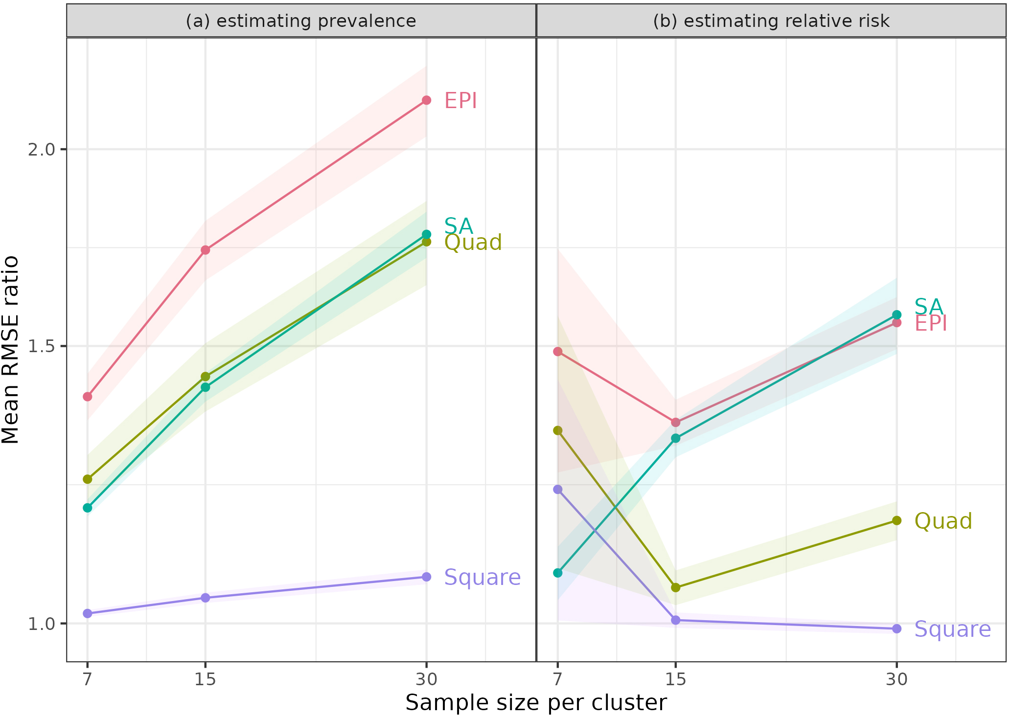
The means of the ratios of RMSEs (to the RMSEs for simple random sampling) are shown in Tables 3 and 4 for Relative Risks of 10 and 30 when the same towns were used for each of the 1,000 simulations. Once again, results for other cases are similar and are included in the Supplementary information. We also examined the results graphically (Fig. 1). Part (a) shows RMSE ratios when estimating prevalence for RR
For estimating prevalence, the Square method was always best – it had the lowest mean ratios, which were close to 1 for all sample sizes, indicating that the RMSEs were similar to those from simple random sampling (SRS). Notably, the other methods had mean ratios that increased with sample size per PSU. With SRS, statistical theory predicts that an increase in sample size from 7 to 30 per PSU will reduce the variance of estimates by a factor of just under a quarter (7/30). The increase in the ratios indicated that these methods benefited less from larger sample sizes. This disadvantage likely reflects some intracluster correlation due to the homogeneity of people in neighbourhoods. This result was not surprising, since these methods sample close neighbours within clusters.
One might have expected the Quad approach to be relatively free of this property, since it samples from different areas of the PSUs, but it also showed an increase in the mean ratio with larger sample size. Since SA takes random samples, it might have avoided the problem, but it did not.
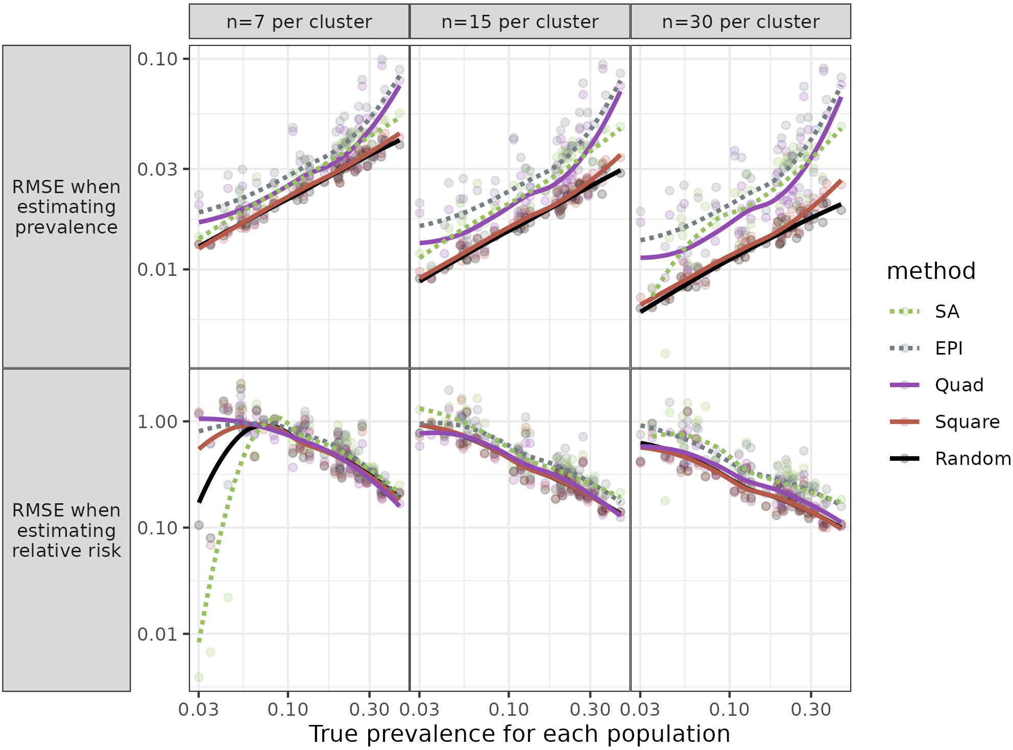
Figure 2.
Root Mean Square Error (RMSE) for each population against prevalence. Figure shows RMSE for three sample sizes, when the same towns were sampled for each simulation and relative risk (RR)
For estimates of Relative Risk, the Square method performed very well; the mean RMSE ratios were mostly close to 10, for all three sample sizes. The Quad procedure was sometimes – but not always – comparable in having low mean ratios.
3.1.3Impact of parameter values
Given the results above, we did not expect that examining the relationship between the RMSEs and parameter values (which characterized the populations) would identify circumstances when a method other than Square would be preferable. Still, for completeness, we looked at the relationships. We examined graphs of the mean RMSE ratios as a function of parameter values (Fig. 2).
Individual parameters had little or no impact on the relative performance of different methods when estimating prevalence. This was mostly the case for estimates of RR. Especially for the larger sample sizes (
Further details of the Results are in the Supplementary information.
3.2Non-varying populations
For the three populations for which all individuals had the same probability of disease, all methods were similar in their RMSEs (data in Supplementary information).
4.Discussion
4.1Summary of main results
Our simulations found that the Square method was nearly always the best, as measured by lower RMSEs. Under some circumstances, the Quad approach, which samples from four areas of each town, performed well, better than the EPI method, but not as well as the Square technique. SA was mostly an improvement over EPI, especially when estimating prevalence. The other criterion for comparison, the ranks of RMSE ratios, suggested that the Square method was almost universally better.
The examination of RMSEs in relation to population parameters revealed that there were no particular parameters (i.e., no population types) for which the relative ranking of the methods varied, at least for the larger sample sizes. For the three non-varying populations, as expected, there were minimal differences between methods.
4.2Commentary
Several procedures have been proposed to overcome the known limitations of the original EPI. These new procedures did improve on EPI but had their own limitations. Thus, some authors (e.g., [16]) have proposed segmenting towns into smaller units, whose populations can be enumerated to allow simple random sampling. Our results for the SA approach, though, suggest that the homogeneity within small segments produces sufficiently large design effects that increasing sample size within the segments does not improve precision as much as expected. Moreover, it requires some prior identification of the SAs, beyond data on town population sizes alone.
Designers of those surveys are well aware of the impact of clustering. The Reference Manual for the revised WHO EPI method (which we labelled SA) includes a table of the design effects (DEFF) with different values of the Intracluster Correlation Coefficient (ICC) [8:127]. It states that a conservative estimate of the ICC for routine immunization surveys is 1/3, or 0.333. With seven respondents per PSU (cluster) the DEFF is 3.0, so that three times as many SAs must be sampled to achieve the same precision as a random sample. This adds considerably to the time and cost of the study.
The Square approach, which does not have this limitation, could be adapted in the absence of information on the target population, for example, when an informal refugee camp is formed. Drones or other technology could ensure the aerial images used are up-to-date. This approach would be even more feasible if newer software can recognize buildings or tents on the ground, so the step of identifying structures could be automated.
One possible disadvantage of the Square method is that, in some places, significant travel (hence increased time and cost) may be required to reach all the sampled households within a PSU, while the other methods restrict samples to a small geographic area. Still, this feature may be an advantage if there are concerns about the security of interviewers: with the Square method, interviewers can enter and leave areas quickly, rather than spending time finding and interviewing several households in a small neighbourhood.
4.3Strengths and limitations of our work
Our study has several strengths. We attempted to create realistic populations, whose characteristics varied between and within towns. We included multiple populations, which simulations using real data cannot. Our full analysis included many sampling methods, including some variations on EPI that have been proposed but to our knowledge have not been used in practice. For the SA and Square techniques, sampling probabilities can be properly estimated, unlike the original EPI method (and its variants).
Of course, our study also has limitations. The populations are simulated, not real. Small neighbourhoods in our simulations may be more homogeneous than in real life; still, similarity of nearby households is broadly realistic. Our simulated samples were ideal and ignored the logistical difficulties experienced by real surveys. For example, population numbers are inexact so PPS sampling is subject to error; interviewer teams make decisions that may not strictly follow protocols; and people in households may be out when interviewers call or may refuse to participate (As noted earlier, Cutts and colleagues [12] provided a fuller discussion). Still, we expect these problems would apply similarly – and lead to similar degrees of inaccuracy – for different sampling methods. In practice, the Square approach relies on some technical ability to deal with images and to identify GPS locations of buildings. It also requires identifying buildings from aerial images, which can lead to errors due to, e.g., tree coverage.
We did not assess ‘balanced sampling’ described, e.g., by Tillé [18: 119-142] that can improve the efficiency of a sampling design. The approach uses information on the population that is correlated with the variables of interest. For an infectious disease spatial autocorrelation suggests spatial sampling to create the balance. Alleva and colleagues [19] considered the approach in estimating parameters relevant to the SARS-CoV-2 pandemic. They conducted a simulation confirming the value of spatially balanced sampling at the first stage of sampling. Our study was concerned with situations where information on the population is very limited so balanced sampling is not feasible.
The time required to complete the survey may influence the choice of sampling method. EPI and its variants can be completed quickly, while the WHO manual for the updated EPI methodology (i.e., SA) projects an overall 12-month timetable [8:23]. The Square method requires obtaining the relevant images and identifying buildings from them, which should be possible to do quite quickly: a sample of the grid squares can be chosen and surveyors need only identify buildings in those squares.
4.4Contribution of our study
Our work adds to the literature in several ways. To our knowledge, it is the first simulation study to explore the properties of small area (SA) sampling and ‘Square’ sampling. While studies based on real-life data can only consider a single population, we created 50 large populations across hundreds of towns. We varied parameters across these towns to create more realistic populations and examined the impact of these parameters. We compared multiple sampling methods. We know of no other study that compares how different sampling methods affect estimates of relative risk. Finally, we included the previously-untested Square method, which has proved to be statistically superior to other sampling approaches that are used in several major official surveys.
5.Conclusion
In our simulations the Square method is almost always the best from a statistical perspective, especially when estimating prevalence or for larger sample sizes. Quad and SA improve on the original EPI (EPI), but not enough to be statistically preferable to the Square method, which is relatively easy to apply.
Acknowledgments
The study was funded by the Canadian Institutes of Health Research, Funding Reference Number: 123432.
References
[1] | World Health Organization. Immunization coverage cluster survey – Reference manual. Geneva: World Health Organization, (2005) . |
[2] | Bennett S, Radalowicz A, Vela V, Tomkins A. A computer simulation of household sampling schemes for health surveys in developing countries. Int J Epidemiol. (1994) ; 23: : 1282-91. |
[3] | Grais RF, Rose AMC, Guthmann J-P. Don’t spin the pen: two alternative methods for second-stage sampling in urban cluster surveys. Emerg Themes Epidemiol. (2007) ; 4: : 8. doi: 10.1186/1742-7622-4-8. |
[4] | Kolbe AR, Hutson RA, Shannon H, Trzcinski E, Miles B, Levitz N, et al. Mortality, crime and access to basic needs before and after the Haiti earthquake: A random survey of Port-au-Prince households. Med Confl Surviv. (2010) ; 26: : 281-297. |
[5] | Shannon HS, Hutson R, Kolbe A, Haines T, Stringer B. Choosing a survey sample when data on the population are limited: a method using Global Positioning Systems and satellite photographs. Emerg Themes Epidemiol. (2012) ; 9: : 5. |
[6] | MICS Manual for Mapping and household listing. (2019) . Available at https://mics.unicef.org/tools (accessed 17 October 2023). |
[7] | Demographic and Health Surveys. The DHS Program. https://dhsprogram.com/Methodology/Survey-Types/DHS-Methodology.cfm#CP_JUMP_16156 (accessed 17 October (2023) ). |
[8] | World Health Organization. Vaccination coverage cluster surveys: Reference manual. Geneva: World Health Organization, (2018) . |
[9] | Afrobarometer. Round 9 Survey Manual, (2022) . https://www.afrobarometer.org/wp-content/uploads/2022/07/AB_R9.-Survey-Manual_eng_FINAL_20jul22.pdf (accessed 17 October 2023). |
[10] | Henderson RH, Sundaresan T. Cluster sampling to assess immunization coverage: a review of experience with a simplified sampling method. Bull World Health Organ. (1982) ; 60: : 253-60. |
[11] | Lemeshow S, Tserkovnyi AG, Tulloch JL, Dowd JE, Lwanga SK, Keja J. A computer simulation of the EPI survey strategy. Int J Epidemiol. (1985) ; 14: : 473-81. |
[12] | Himelein K, Eckman S, Murray S, Bauer J. Alternatives to full listing for second stage sampling: Methods and implications. Stat J of the IAOS. (2017) ; 33: : 701-18. |
[13] | Cutts FT, Izurieta HS, Rhoda DA. Measuring coverage in MNCH: design, implementation, and interpretation challenges associated with tracking vaccination coverage using household surveys. PLoS Med. (2013) ; 10: : e1001404. |
[14] | Blower SM, Dowlatabadi H. Sensitivity and uncertainty analysis of complex models of disease transmission: An HIV model, as an example. Int Stat Rev. (1994) ; 62: : 229-243. surveys. PLoS Med. 2013; 10: e1001404. |
[15] | Anon. About SHARCNET. https://www.sharcnet.ca/my/about (accessed 17 October (2023) . |
[16] | Brogan D, Flagg EW, Deming M, Waldman R. Increasing the accuracy of the Expanded Programme on Immunisation’s cluster survey design. Ann Epidemiol. (1994) ; 4: : 302-11. |
[17] | Vaccination Coverage Quality Indicators. https://www.biostatglobal.com/VCQI_resources.html (accessed 17 October (2023) ). |
[18] | Tillé Y. Sampling and estimation from finite populations. Wiley: Amsterdam, (2020) . |
[19] | Alleva G, Arbia G, Falorsi D, Nardelli V, Zuliani A. Optimal two-stage spatial sampling design for estimating critical parameters of SARS-CoV-2 epidemic: Efficiency versus feasibility. Statistical Methods and Applications. (2023) ; 32: : 983-999. |
Appendices
Appendix
The Appendix provides further detail on the creation of the populations, lists the parameters used, and shows figures to illustrate diagrammatically the sampling methods.
The program we used was highly flexible, so some aspects such as the number of populations could be set before the computer runs. We set the value at 50. Other parameters listed in the Table below were selected by the Latin Hypercube approach. Population density, household income, area disease risk, and exposure were all determined by location, via a linear combination of the x and y coordinates. We have not provided specific parameter values, as they cannot be directly interpreted. Rather we note that the values of these variables changed across the towns with the extremes at the lower right and upper left, i.e., at the minimum and maximum values of
An individual’s disease status depended on several variables: income, household disease risk (itself dependent on local disease risk), and pocketing. Thus
where the
Table A1
Parameters used in creation of populations and disease determination
| Variable | Values used in this study |
|---|---|
| Target disease prevalence | (0.1,0.5] |
| Number of populations generated | 50 |
| Number of towns generated | 300 |
| Minimum population of a town | 400 |
| Maximum population of a town | 300,000 |
| Shape parameter used by town size Pareto distribution | 0.785 |
| Number of squares in the horizontal direction | 10 |
| Number of squares in the vertical direction | 10 |
| Population density trend’s X coefficient | * |
| Population density trend’s Y coefficient | * |
| Mean number of individuals per household | (2,5] |
| Number of disease pockets per town | [0,10], Integer values only |
| Type of kernel to use for disease pockets | Exponential; Inverse square; Gaussian |
| Scaling factor used for disease pocket | (0.5,2] |
| Mean income trend’s base value | * |
| Mean income trend’s X coefficient base value | * |
| Mean income trend’s Y coefficient base value | * |
| SD of values of income | * |
| Mean disease risk trend’s base value | * |
| Mean disease risk trend’s X coefficient base value | * |
| Mean disease risk trend’s Y coefficient base value | * |
| Mean exposure trend’s base value | * |
| Mean exposure trend’s X coefficient base value | * |
| Mean exposure trend’s Y coefficient base value | * |
| Disease weight for household income | (0,1] |
| Disease weight for household risk | (0,1] |
| Disease weight for pocketing | 1 |
Notes: Coefficients for Income, Disease, and Exposure were for use in linear function based on x and y coordinates of households within a town. Disease weights were applied when determining actual disease status to allow for different impacts of the predictors. For values shown as a range, the Latin Hypercube selected the 50 values at equal intervals between the lowest and highest values of the range. *See Appendix text for explanation.
Appendix figures showing sampling methods.
Each diagram shows a town. To keep the diagrams simpler to interpret, just three households are chosen per town (or per Small Area).
Appendix Fig. A1.
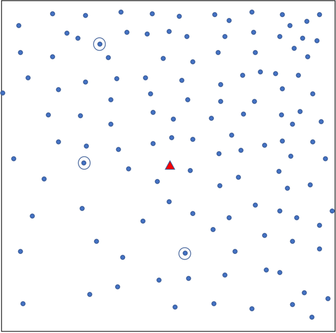
Simple random sampling. Each dot shows a household. The triangle represents a central landmark. Three households (circled) are randomly chosen.
Appendix Fig. A2.
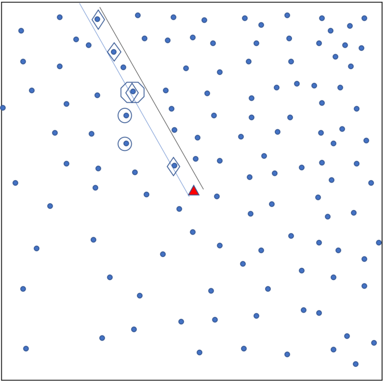
Sampling using original EPI method. Each dot shows a household. A central landmark is identified (triangle). A random direction is chosen (parallel lines) from the landmark and households in that direction are identified (diamonds). From these, the ‘starting’ household’ is randomly chosen (octagon) and nearest neighbours (in Euclidean distance) are also selected for the sample (circles). The ‘Quad’ sampling method divides a town into four quadrants and applies this sampling approach in each quadrant.
Appendix Fig. A3.
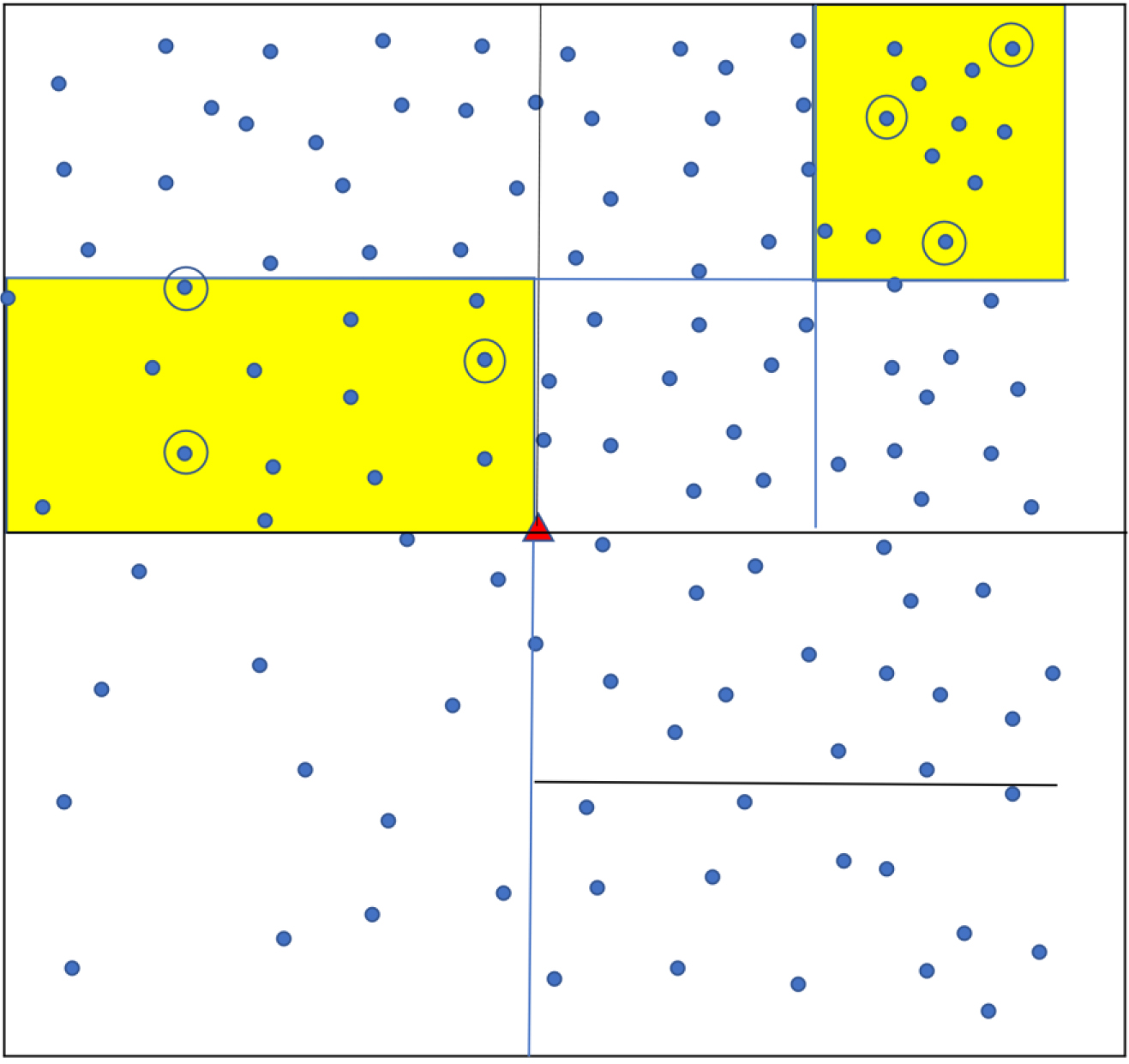
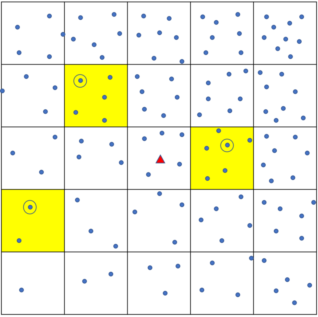
Sampling using ‘Square’ method. Each dot shows a household. The town is divided into a grid of smaller squares. Yellow shading shows the three that are randomly chosen, and one household (circled) is randomly chosen from each.
Appendix Fig. A4.
Small area (SA) sampling. The town or population is divided into successively smaller areas until each contains a number of households in the pre-specified range. Several small areas (yellow shading) are randomly chosen. Three households are randomly sampled from each selected small area.