Development of an online digital resource accessible for students with visual impairment or blindness: Challenges and strategies
Abstract
BACKGROUND:
People with visual impairment or blindness face a wide range of daily barriers, both at school and at work.
OBJECTIVE:
This article describes the development process of an online resource, addressing Occupational Safety and Health (OSH), accessible for students with visual impairment or blindness.
METHODS:
This study was framed in a Design-Based Research methodology involving the analysis, design, development and implementation of a digital resource. In the analysis stage, a first list of accessibility challenges was created allowing the design of strategies and specific technical solutions to approach them.
RESULTS:
The development process has shown that online digital resources can be accessible for users with visual impairment or blindness and even the most visual contents and activities (based on images and videos) can be easily adjusted.
CONCLUSIONS:
Online accessible resources should be based on the World Wide Web Consortium (W3C) guidelines, allowing the proper description of all contents by screen readers, using audio description, accessible features and providing keyboard navigation. Further research must be conducted to deepen knowledge on the role of educational digital resources for students with visual impairment or blindness, namely regarding OSH barriers that workers with visual impairment or blindness face at the workplace (as visual safety signs and pictogram labels).
1Introduction
Today there are over 1.5 billion of websites [1]. Since the emergence of the Internet, people have access to multiple types of information and use it for social, educational or entertainment purposes [2]. In fact, there has been an interesting increase of resources available online, but a large proportion of these are not accessible to users with visual impairment or blindness, due to different digital barriers that these users face. When considering educational materials, they are often reliant on visual formats [3], such as images, graphs or multimedia contents. These constraints can have a significant impact on the successful inclusion of students with visual impairment [4], especially into secondary education courses in chemistry, physics or microbiology where full visually complex concepts [5] are presented. If these contents are not available in accessible formats, the understanding of the materials will be limited to students with visual impairment or blindness [6]. Previous studies had already shown that high school students with visual impairment claim “doing nothing” as one of the most frequent activities at school, when the contents or methods are inaccessible [7]. It is, therefore, mandatory to create accessible resources specifically designed to those people who are unable to access the visual side of the web.
“OSH! What a bright idea” is an interactive booklet aimed at students from 14 to 18 years old addressing Occupational Safety and Health (OSH) topics. Bearing in mind that this particular target is a risk group for occupational fatigue and work accidents, the main objective determined for the educational resource was to increase students’ awareness, including the ones with visual impairment or blindness, of OSH in their daily and professional lives; and, in the long term, to raise levels of safety at work and to decrease the number of occupational accidents and diseases among young workers [8–10].
When considering OSH topics, much of the information is represented in a visual way, such as safety signs or safety pictograms in the chemical labels. Thus, the development of an inclusive digital-based resource can have a positive impact to support education and inclusion of people with disabilities improving their quality of life [12–14].
Considering the graphical nature of the web, the access, navigation and interpretation is highly difficult for people with visual impairment or blindness [15]. Commonly, they use screen readers to access web pages, which outputs the content to a braille display or to voice output [6]. Also, users with visual impairment or blindness typically use their keyboard to navigate, tabling through content and pages and use features like magnifier or high contrast if available. McLaughlin & Kamei-Hannan (2018) recent results shown that the use of digital devices increases reading speed of users with low vision when compared to large print paper, allowing users to adjust the font size, style and color preferences [16]. The Beal & Rosenblum (2018) study also revealed a positive impact on the performance of students with visual impairment to solve mathematical problems using an assistive technology with an iPad instead of working with print or braille materials, depending less of teacher and feeling more motivated to [17]. However, to ensure that this navigation occurs properly, it is necessary to consider some guidelines when developing to the web. The World Wide Web Consortium defines guidelines and standards in order to make the World Wide Web an open Web platform for both developers and regular users, contributing for the creation of richer browsing experiences.
“OSH! What a bright idea” digital resource was developed under the scope of the Erasmus+“Mind Safety - Safety Matters!” project, taking into consideration the adequate navigation both sighted users and of users with visual impairment or blindness. This paper describes its development process focusing on the challenges and strategies used to ensure its accessibility particularly considering users with visual impairment or blindness. All contents of the booklet (available in http://osh.act.gov.pt/) are available in seven languages: English, Portuguese, Romanian, Spanish, Catalan, Dutch and Czech. This multilingual approach contributes to enhancing the inclusive dimension of the online resource.
2Methods
The accessible online digital resource described in this paper was developed using a Design-Based research methodology [18–21], following the five phases of the ADDIE model (Analysis, Design, Development, Implementation and Evaluation), a systematic instructional design model. This paper focuses specifically on the first four stages of this process.
In the Analysis stage, a list of accessibility challenges was created; in the Design stage these accessibility challenges were addressed using a set of design strategies and specific technical solutions, according to the W3C Web Content Accessibility Guidelines and using accessible plugins.
During the Development and Implementation stages a web-based approach was used, exploiting web technologies such as HTML5, CSS3, JavaScript, PHP and a Blank Wordpress theme to create a digital resource to be explored in different educational scenarios, typically in a classroom context. The Blank Wordpress theme was a strategic solution to enable and facilitate some required features, mainly in what accessibility is concerned - allowing the simple implementation of features to manipulate the pages like zoom in and out or high contrast; and also regarding to multilingualism - simplifying the web pages’ conversion to each one of the seven available languages.
The development process of a digital resource usually starts with wireframes drawing, defining the structure, elements disposition and navigation [22]. This phase aims to evolve towards the design of the interface, usually without technical concerns to web accessibility. These concerns, when they happen, tend to take place only when coding starts, following the accessibility guidelines of providing alternative texts to images, zoom-in and zoom-out features, among others. In the study that frames this paper, those concerns started in the Analysis stage aiming to demonstrate the importance of web accessibility since the first stages of the development process. This methodological approach influenced not only the technical implementation of the digital resource, but also its conceptualization and the interface design, leveraging innovative solutions to ensure the integration of proper features both to sighted users and to users with visual impairment or blindness.
The development of “OSH! What a bright idea” started with the definition of OSH themes to explore, considering the Occupational Safety and Health Administration (OSHA) references [23], resulting in the following eight themes: General OSH topics; Chemical Hazards; Biological Hazards; Physical Hazards; Work processes Hazards; Ergonomic Hazards; Work organization Hazards; New Hazards and Risks.
Based on these themes, a navigation map was proposed and it was decided that all themes would have a common structure of navigation (with the exception of “General OSH topics” due to the nature of its contents) divided into six sections: Video; What you need to know; Causes, Effects, Injuries; Safety rules; Know more about; Hands on. This thematic structure encompassed the design of a set of specific contents and navigation features leading to the identification of specific primary challenges considering blindness and low vision.
Video contents and mini-games included in the “Hands on” section were identified as the main challenges, as they had to be perceived and playable by sighted students and by students with visual impairment or blindness. As mentioned previously, the implemented methodological approach was not based on the use of alternative versions for each one of these groups of students, but to develop solutions that both could access. Considering these challenges, a set of strategies to approach each one was studied following the Web Content Accessibility Guidelines (WCAG) of the World Wide Web Consortium [24] and the required accessibility dimensions to consider were schematized (Fig. 2). The used strategies were, therefore, based on W3C accessibility recommendations aiming to ensure that the contents and navigation features of the online digital resource were perceivable, operable, understandable and robust, being more accessible to people with disabilities but also improving usability to users in general [24].
As illustrated in Fig. 1, the methodological path that framed this study showed that texts, images and videos can be made accessible using Audio and Audio-description features alongside with Alternative Textual Descriptions for each language of the resource. Zoom in and zoom out, Increase and decrease font size and High contrast are also important accessible features to consider.
Fig. 1
How to make web-based contents accessible to blind and low vision?
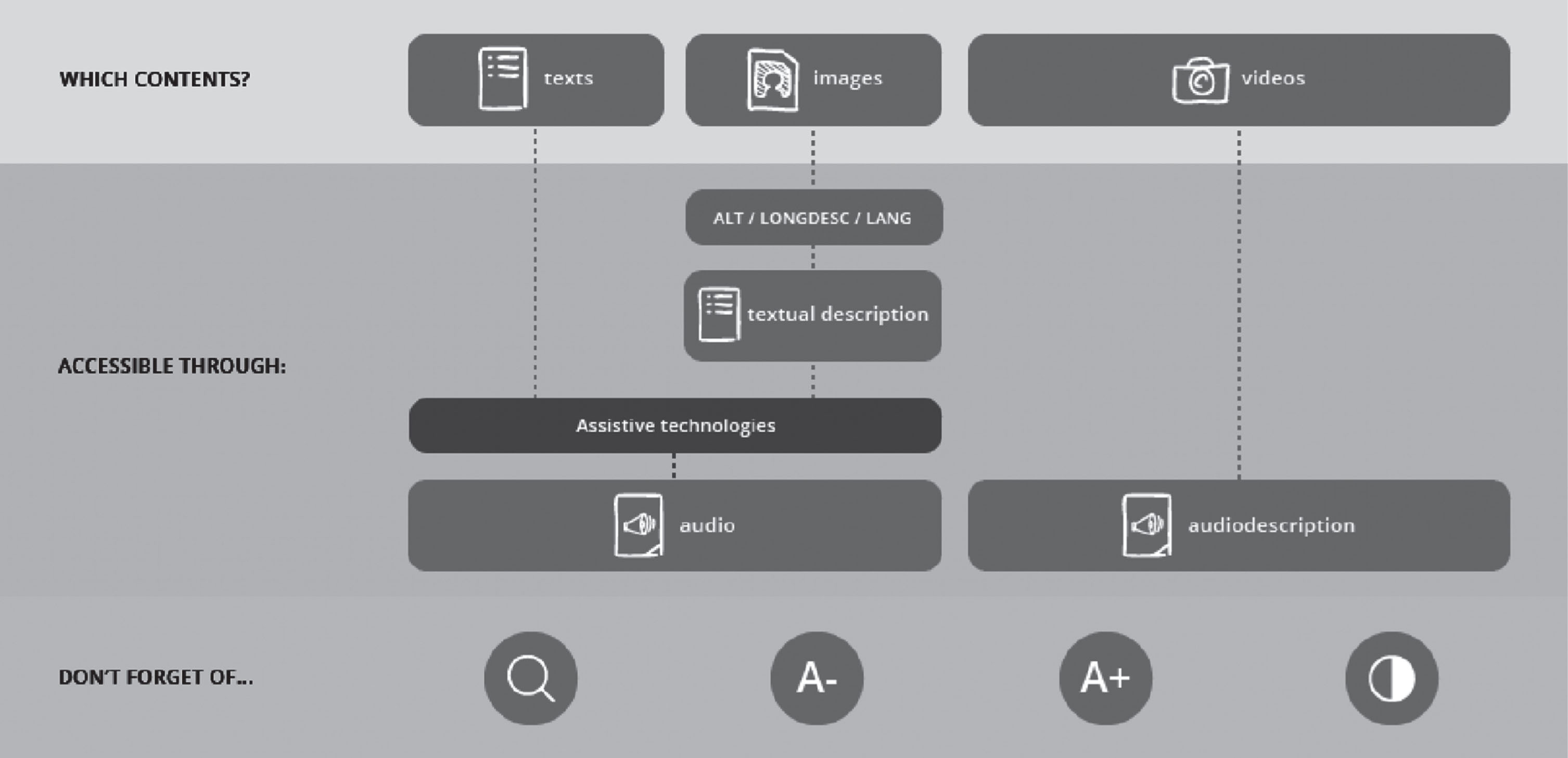
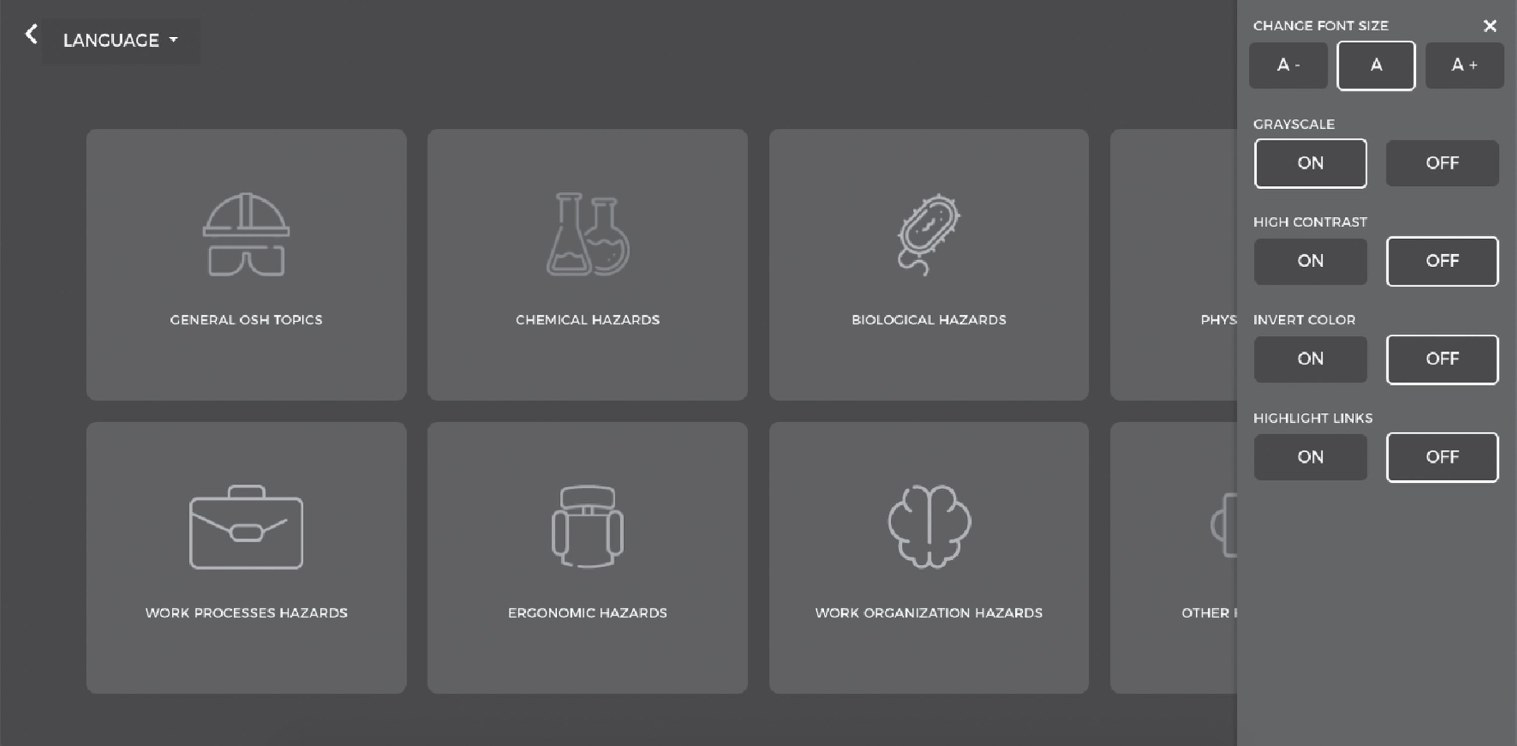
Fig. 2
Accessible sidebar of “OSH! What a bright idea”.
3Results
After discussing the accessible challenges described previously, it was possible to identify the accessible adopted solutions to face each challenge. The next section presents a detailed presentation of the implemented strategies used in the online resource: accessible sidebar; videos and images; navigation and interaction. The resource can be accessed using computers as well as tablets and smartphones.
3.1Accessible sidebar
One of the dimensions of Web Content Accessibility Guidelines (WCAG), the Distinguishable, refers to the relevance of providing features to separate foreground information from background information [24]. This includes special attention to the use of color, contrast, resizes of text, among others. Following these criteria, “OSH! What a bright idea!” included an accessible sidebar using the Wordpress (WP) Accessibility Spring Plugin. Behind the decision of using the Accessibility Spring Plugin, two other Plugins were analyzed (Accessible Poetry and WP Accessibility):
• WP Accessibility Plugin: features of high contrast, grayscale, increase and decrease font size;
• Accessible Poetry Plugin: features of zoom in and zoom out, increase and decrease font size, bright and dark contrast, mark and underline links and also an option to disable flashes;
• Accessibility Spring Plugin: features of increase and decrease font size, grayscale, high contrast, sepia, invert colors, contrast cursor and highlight links.
After the overall analysis of these options, it was clear that the features provided by the WP Accessibility Plugin represent an important part of the accessibility aspects. However, the increase font size feature was limited to one time use only and that was considered as a disadvantage when compared to the other Plugins. The Accessible Poetry Plugin was also considered as a viable option, although when compared to the Accessibility Spring Plugin its contrast options were less efficient. Considering this, the Accessibility Spring Plugin represented the most feasible option, providing features to increase and decrease font size, grayscale, high contrast, sepia, inverted colors, contrast cursor and highlight links. Five of these options were enabled in the “OSH! What a bright idea” digital resource in order to ensure proper navigation to students with low vision, allowing them to control font size, apply grayscale, high contrast, invert color and highlight links (Fig. 2).
3.2Videos and images
Videos and images, as audiovisual or only visual contents, represent another challenge considering users with visual impairment or blindness. From a technical perspective, it is necessary to fill alt or aria-described attributes for images and ensure an audio described version to all the video contents. Therefore, the main challenges were not related to the technical aspects, but to ensure that the visual information is properly communicated to the users, allowing them to make their own interpretation of the described contents, as sighted users can do.
To “OSH! What a bright idea”, eight original videos were recorded to act as triggers for each theme, with short stories performed by a teenager illustrating situations of his daily and occupational life. As WCAG Guideline 1.2 specifies, it is necessary to provide alternatives for time-based media, suggesting audio description for all pre-recorded videos. In the highest level of accessibility (AAA) audio description should make it possible to understand the video, describing also the pauses in foreground. Considering this, it was known that it would be necessary to ensure an audio described version to each one of the eight videos, resulting into sixteen videos in total.
This process of video production is a clear example of how important it can be taking into consideration the accessibility since the first stages of the development process. Even knowing that it would be necessary to have two versions of each video, the video scripts were written considering these two types of outputs: regular videos and audio described videos. In this way, it was decided that it would be interesting to tell all the stories without dialogues between characters, using only a voice over which tells the story through the main character perspective, acting as his conscience voice. That voice-over strategy enables the creation of a speech that sounds natural in both versions, avoiding the constant exchange between character and audio described voice, using exactly the same voice and expression but in a more detailed way about scenarios and visual references in what concerns the audio described versions. For example, the regular version of the Biological Hazards video starts with “It’s a hot, hot day and Rick is waiting for his friends”, and in the audio described version the voice says “Today is a really hot and sunny day and Rick is in the bus station waiting for his friends”, keeping the tone but adding visual information to the narration.
Regarding the images, the information contained within them should be also perceived by students with visual impairment or blindness, unless if they were purely decorative. From a technical perspective, all the images available at “OSH! What a bright idea” have an alternative text, which describes the pictogram or photographic content. Considering the need to provide equally navigable content to students with visual impairment or blindness, it was necessary to ensure the availability of descriptions and not only labels to the visual content, such as safety signs and pictograms example at General OSH theme (Fig. 3). In that case, all the 64 safety signs and pictograms were visually described taking into consideration their shapes, elements and colors, as shown in the examples of Fig. 4.
Fig. 3
Safety signs’ section at “General OSH Topics”.
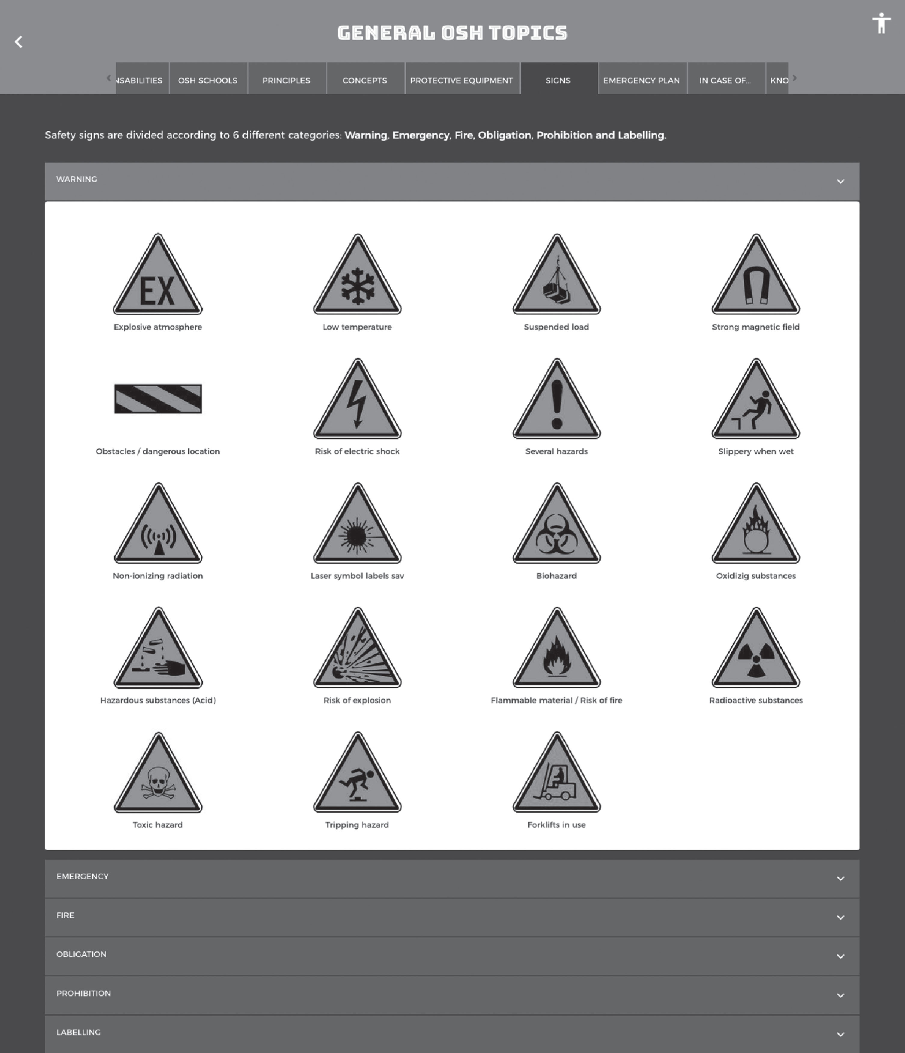
Fig. 4
Example of labels and alternative texts of safety signs at “OSH! What a bright idea”.

3.3Navigation and interaction
Navigable guideline specifies the relevance of telling users where they are and enable them to go where they want to [24]. In order to do so, it was necessary to apply success criteria to ensure keyboard navigation on pages as well as content. Apart from that navigation, the major challenges were faced with all the mini-games that should be equally playable by sighted and by students with visual impairment or blindness, avoiding the use of alternative versions.
The following topics describe examples of practical activities of the “Hands on” section in which the accessibility challenges and the strategies used to overcome them have led to reformulate content.
3.3.1Hazard or Risk?
“Hazard or Risk” is a mini-game in which students should be able to distinguish hazard concept from risk concept. The first plan was to create two boxes, one for the hazards and another to the risks, in which examples of each one should be dragged into the correct box (Fig. 5).
Fig. 5
First plan to “Hazards or Risk” mini-game.
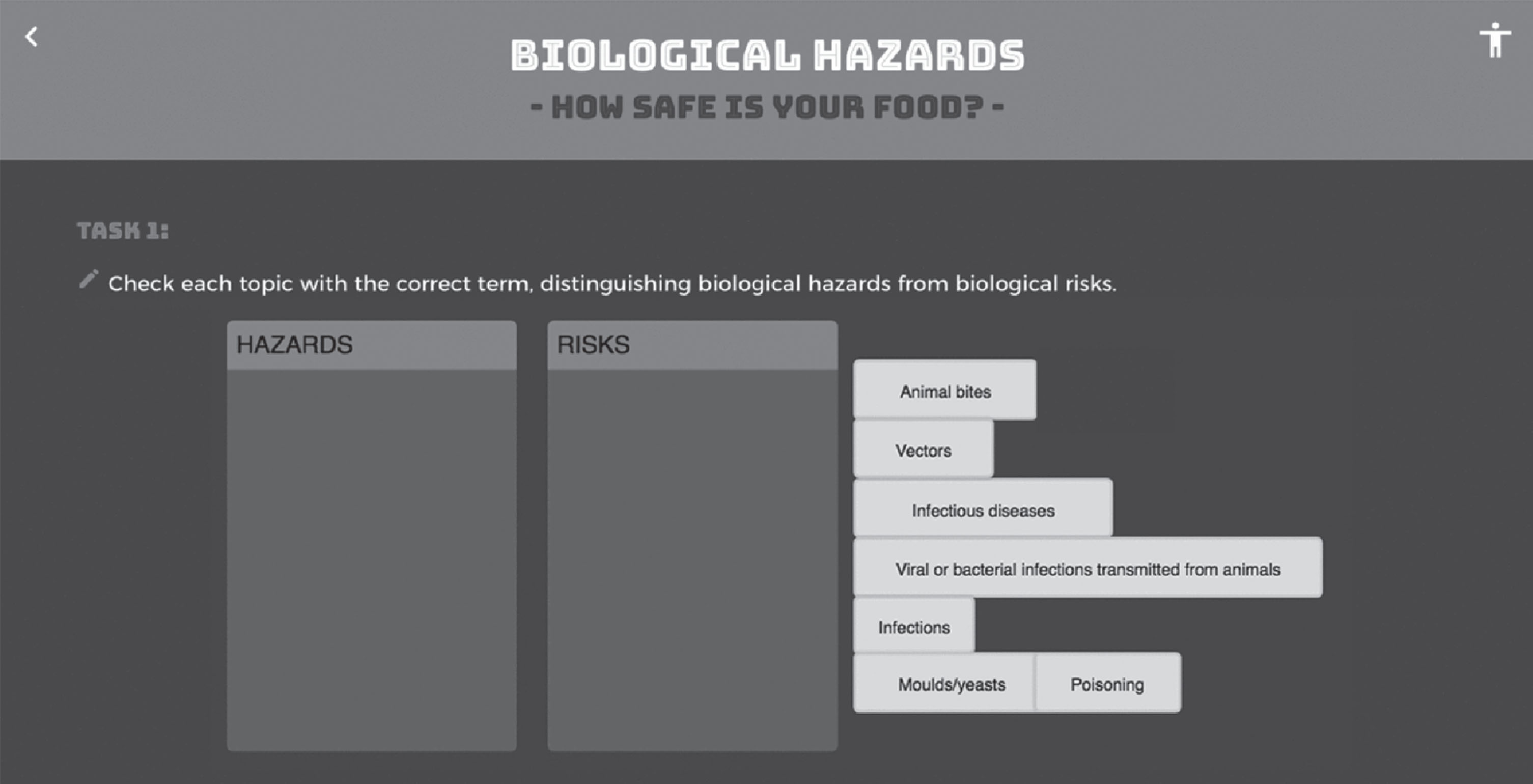
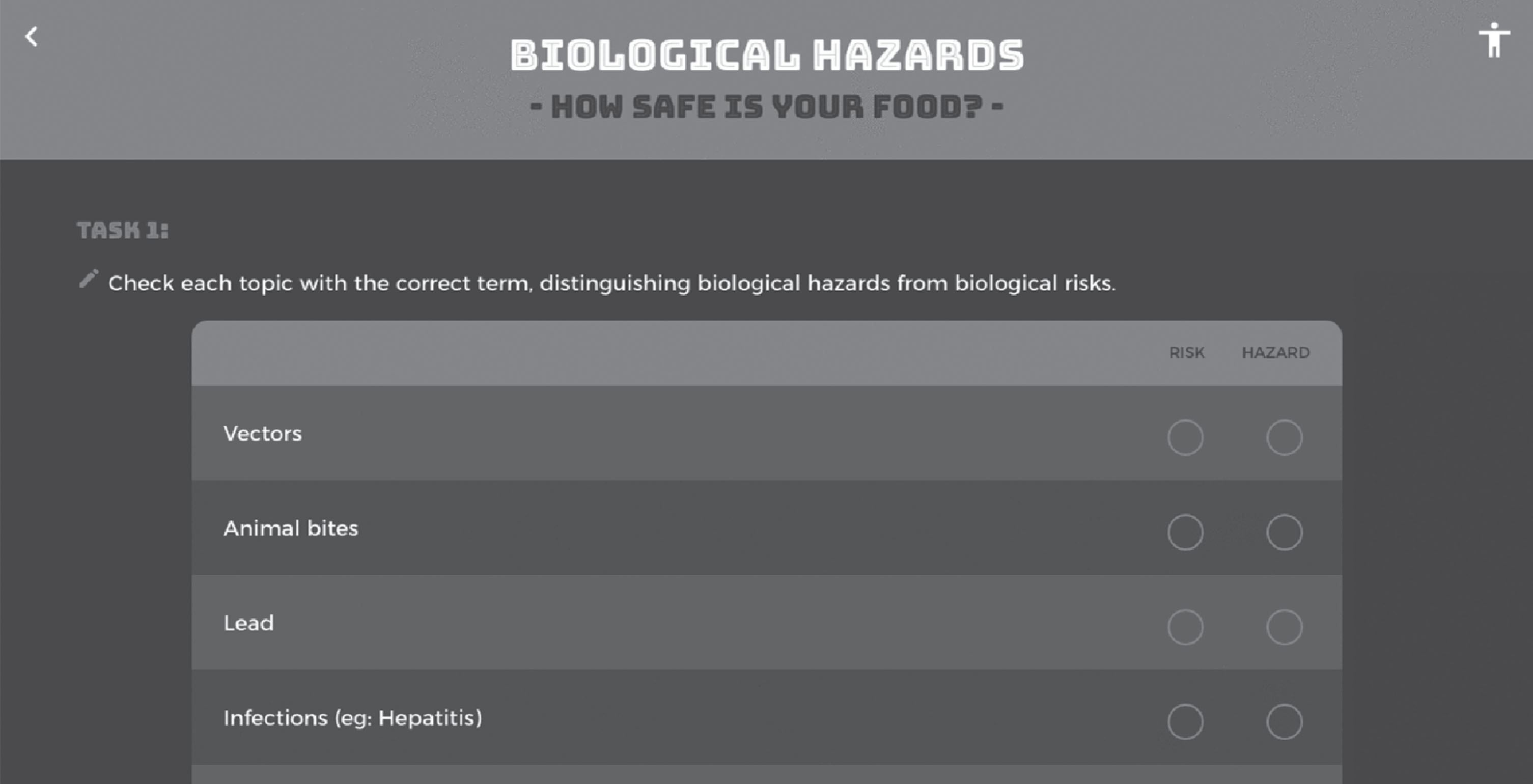
However, this would be complex for people with visual impairments and even impossible for the ones with blindness. For that reason, it was necessary to rethink the strategy to create an “Hazard or Risk” mini-game navigable by both types of users. The solution was to incorporate the content into an HTML table with two radio buttons: one for the hazards and another for the risks, which allows the user to read the content row by row and select the correct option to each one, as shown in Fig. 6.
Fig. 6
HTML table as the solution to “Hazards or Risk” mini-game.
3.3.2Time and bacteria
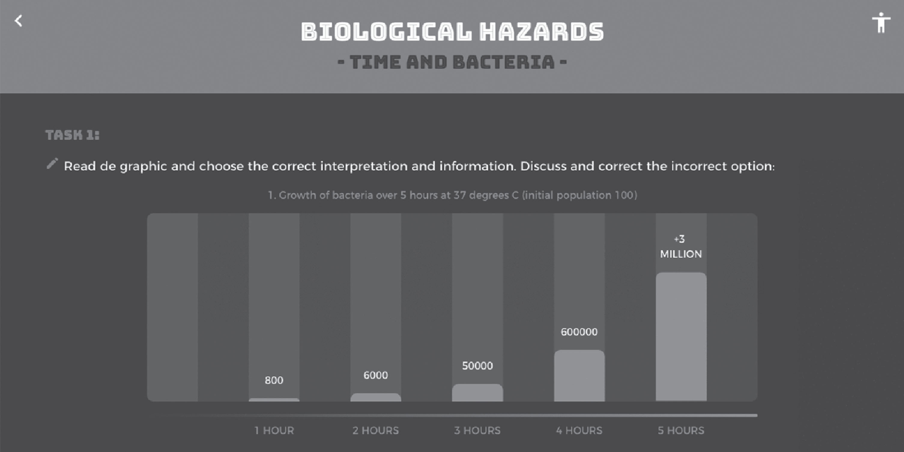
In the “Time and Bacteria” mini-game students should be able to interpret a chart about the growth of a specific bacteria over the period of five hours. If the chart image had an alternative text it would be accessible students with blindness, but they would have to hear a long description all at once. The aim was to ensure that students with visual impairment or blindness could interpret and navigate into the contents individually (Fig. 7), doing their own interpretation at their own rhythm, as sighted users can do. To achieve this, the solution was to design the chart with code, customizing the contents instead of using a single image.
Fig. 7
Individual navigation into chart contents of “Time and Bacteria” mini-game.
3.3.3Where is the danger?
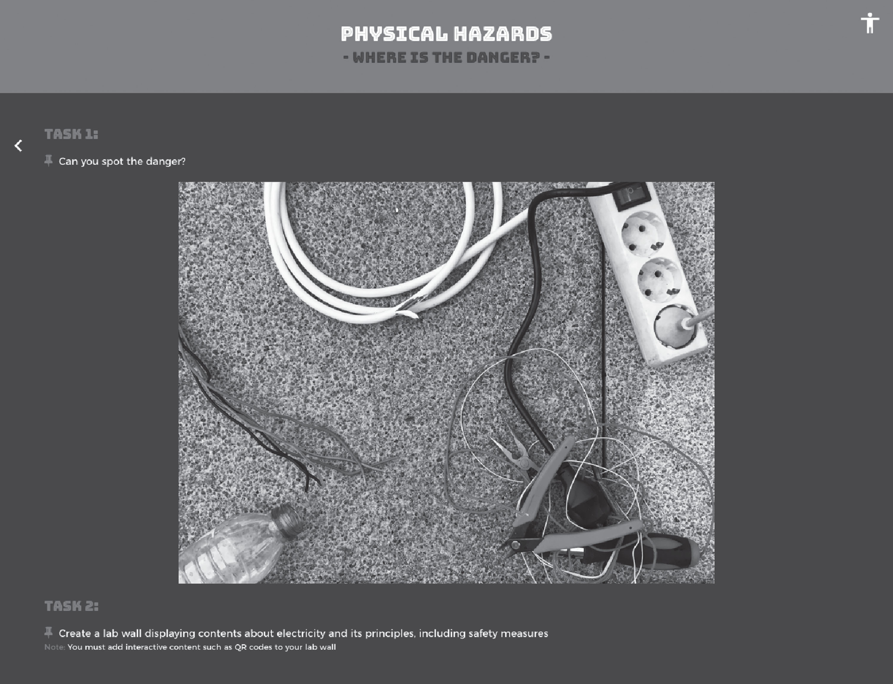
With the “Where is the danger” activity, students should be able to identify the potential dangers related to electrical hazards of a scenario presented in a photography (Fig. 8), such as damaged cables, cables in contact with water and disorganized use of cables and tools. Once again, the challenge was to ensure that students with visual impairment or blindness could interpret the contents individually, avoiding a long description of the picture. In order to do so, the picture was mapped, using a HTML < map>tag to mark the different areas presented into the photography. This included not only the danger spots but also the other elements, to allow students with visual impairment or blindness to identify what is the danger and what is not, as sighted users can do when they see the photography. In sum, students with visual impairment or blindness could navigate into the picture using their keyboard, hearing the description of each spot and selecting those that they consider dangerous.
Fig. 8
“Where is the danger” mini-game.
4Conclusion
This paper described the development process of an online digital resource accessible for students with visual impairment or blindness. A Design-Based research methodology was used focusing on the Analysis, Design, Development and Implementation stages. Accessibility challenges were identified; strategies and technical solutions to approach them were discussed and implemented, to ensure adequate access and navigation.
These strategies and technical solutions have proved to be robust and effective in solving the accessible challenges, allowing the study to evolve into the Evaluation phase: the fifth stage of the ADDIE model (Analysis, Design, Development, Implementation, Evaluation) is currently being prepared and will be performed in further studies with end-users (students with visual impairment or blindness) that will test and validate the online resource. Conducting this final stage is of major importance to better understand the accessible, inclusive and universal dimension of the online resource.
Developing educational resources able to address the diversity of uses and users while meeting the requirements of an innovative educational resource has a major influence not only in the design process of the resource but also in the nature of the learning strategies and activities. The booklet represents thus an opportunity to present an approach to OSH education that is mainly concerned with the design and development of inclusive solutions for students with visual impairment or blindness and with the development of multimedia and interdisciplinary contents throughout the different themes. However, to ensure proper navigation several challenges have been overcome, at both the strategies and activities conceptualization and implementation, trying to keep the same contents in a Design for all perspective without separated versions of contents.
Being an educational solution that is concerned with the inclusion of this particular public, it also gives them the opportunity to look deeper into a field study in which materials, by their nature and features, typically are directed to students that show no impairments. By doing so, it may contribute to increasing their competences in this field and to equip them to have better and safer behaviors.
As in the project that supported the development of this interactive booklet five partners were involved (Portugal, Spain, Czech Republic, Romania and The Netherlands), the project’s impact on the participant organizations can be analyzed so far in two dimensions: on the one hand, the international consortium dynamics and the process, and on the other hand the challenges and opportunities that mainstreaming OSH into inclusive education means today. The dynamics of the partners has further contributed to boost the discussion about the genuine need and benefits of joining different perspectives and national realities to improve OSH in the educational sector developing an accessible interactive booklet for both sighted and for students with visual impairment or blindness, avoiding the use of alternative versions. The technical accessibility solutions were very well received and understood by all the partners and broader at European level.
Further research must be conducted to deepen knowledge on the role of educational digital resources for students with visual impairment or blindness. These resources can have an important effect in promoting Occupational Safety and Health. This is a critical aspect when observing the OSH barriers that workers with visual impairment or blindness face at the workplace (as visual safety signs and pictogram labels) and can contribute to improve their employment and to build successful interventions or policies to overcome those barriers.
Conflict of interest
None to report.
Acknowledgments
The University of Aveiro team would like to particularly thank the ERASMUS+Education and Training Programme, ACT – Autoridade para as Condições de Trabalho and “Mind Safety – Safety Matters!” project and international partners.
References
[1] | Worldometers.info. worldometers. Dover, Delaware, U.S.A; 2018. |
[2] | Dogruer N , Eyyam R , Menevis I . The use of the internet for educational purposes. Procedia – Soc Behav Sci [Internet]. (2011) ;28: :606–11. Available from: http://dx.doi.org/10.1016/j.sbspro.2011.11.115 |
[3] | Jones MG , Childers G , Emig B , Chevrier J , Tan H , Stevens V , et al. The Efficacy of Haptic Simulations to Teach Students with Visual Impairments About Temperature and Pressure. J Vis Impair Blind. 2014;108. |
[4] | Vojtech R . Digital Barriers in Educating Students with Visual Impairment. Procedia – Soc Behav Sci [Internet]. (2016) ;217: :935–40. Available from: http://linkinghub.elsevier.com/retrieve/pii/S1877042816000835 |
[5] | Jones MG , Minogue J , Oppewal T , Cook MP , Broadwell B . Visualizing without vision at the microscale: Students with visual impairments explore cells with touch. J Sci Educ Technol. (2006) ;15: (5-6):345–51. |
[6] | Rotard M , Taras C , Ertl T . Tactile web browsing for blind people. Multimed Tools Appl. (2008) ;37: (1):53–69. |
[7] | Jessup G , Bundy AC , Broom A , Hancock N . Fitting In or Feeling Excluded: The Experience of High School Students with Visual Impairments. J Vis Impair Blind [Internet]. (2017) ;111: (1):5–19. Available from: http://ezproxy.lib.uconn.edu/login?url=https://search.ebscohost.com/login.aspx?direct=true&db=eric&AN=EJ1127227&site=ehost-live |
[8] | Rodrigues F , Almeida AM , Antunes F , Beja J , Pedro L , Clemente M , et al. Occupational Safety and Health – developing inclusive, interdisciplinary and digital-based resources for students. In: Ed. CRC Press/Balkema 2018, editor. International Symposium on Occupational Safety and Hygiene. London: Taylor & Francis Group; 2018. |
[9] | Clarkson L , Blewettb V , Rainbirdb S , Patersonb JL , Ethertonb H . Young, vulnerable and uncertain: Young workers’ perceptions of work health and safety. Work. (2018) ;61: :113–23. |
[10] | Zierold KM . Safety training for working youth: Methods used versus methods wanted. Work. (2016) ;54: (1):149–57. |
[11] | Lauría A . “The Florence Experience”: A multimedia and multisensory guidebook for cultural towns inspired by Universal Design approach. Work. (2016) ;53: (4):709–27. |
[12] | UNESCO. Global Report Opening New Avenues for Empowerment ICTs to Access Information and Knowledge for Persons with Disabilities. Paris; 2013. |
[13] | Fok D , Polgar JM , Shaw L , Jutai JW . Low vision assistive technology device usage and importance in daily occupations. Work. (2011) ;39: (1):37–48. |
[14] | Ferronato L , Ukovic A . Enabling positive work outcomes for people with low vision: Two case studies. Work. (2014) ;47: (3):381–6. |
[15] | Paciello MG . Web Accessibility for People with Disabilities. Second. Taylor & Francis Group, editor. Lawrence, Kansas; 2000. |
[16] | McLaughlin R , Kamei-Hannan C . Paper or Digital Text: Which Reading Medium Is Best for Students with Visual Impairments? J Vis Impair Blind [Internet]. (2018) ;112: (4):337–50. Available from: http://search.ebscohost.com/login.aspx?direct=true&db=cin20&AN=130982438&site=ehost-live |
[17] | Beal CR , Rosenblum LP . Evaluation of the Effectiveness of a Tablet Computer Application (App) in Helping Students with Visual Impairments Solve Mathematics Problems. J Vis Impair Blind [Internet]. (2018) ;112: (1):5–19. Available from: http://ezproxy.lib.uconn.edu/login?url=https://search.ebscohost.com/login.aspx?direct=true&db=eric&AN=EJ1172160&site=ehost-live |
[18] | Richey R , Klein J . Developmental Research Methods: Creating Knowledge from Instructional Design and Development Practice. J Comput High Educ Spring. 2005; |
[19] | Shavelson R , Phillips D , Towne L , Feuer M . On the science of education design studies. Educ Res. 2003; |
[20] | The Design-Based Research Collective. Design-Based Research: An Emerging Paradigm for Educational Inquiry. Educ Res. (2003) ;32: (1):5–8. |
[21] | Van den Akker J , Bannan B , Kelly AE , Nieveen N , Plomp T . An Introduction to Educational Design Research. In: Educational Design Research. 1st ed. Oxon: Routledge; 2006. |
[22] | Robbins J . Learning Web Design: A begginer’s guide to HTML, CSS, JavaScript andWeb graphics. 5th ed. O’Reilly Media, editor. 2018. |
[23] | European Commission. Guidance on Risk Assessment at Work [Internet]. Luxembourg; 1996. Available from: http://osha.europa.eu/en/topics/riskassess%0Dment/guidance.pdf |
[24] | World Wide Web Consortium. Web Content Accessibility Guidelines 2.0. 2008. |

