
Statistical and Data Literacy, a practitioner’s view for policy-making: How to provide independent, objective and authoritative data and information for policy-making
Abstract
Data literacy is the ability to search, read, understand, create and communicate with data; to ask the right questions about the data; to know what can or cannot be said; to explain a story, or better, provide insights with data, in the form of infographics or other visually appealing elements. The respective knowledge profile can be referred to as that of a data scientist.
Within policy-making a key question is what role the data scientist, working with or for policy-makers, should play. Moreover, the skills and capabilities they should master are crucial to understanding, for instance, what type of information policy-makers need, or what is the right format to communicate data and statistics to them. Likewise, for policy-makers it is important to recognise the skills needed to understand the messages deriving from data, and how data scientists can help them to understand such data.
This article gives a practitioner’s view on data literacy for policy-making. It highlights the steps that a data scientist follows to communicate insights from data and statistics in the form of data visualisation and infographics. It looks at the tasks performed by a data scientist when preparing such papers. The ability to undertake such tasks can be regarded as essential skills or know-how to help those who cannot work effectively with data.
Data literacy seems to have various definitions, such as the ability to search, filter, evaluate and manage data.22 This can go further, considering it as a combination of skills and mindset to find insight and meaning within data.33 A further step in the definition stresses that being data literate also means being a critical consumer of data. Not only understanding the meaning of the data, reading graphs appropriately and drawing correct conclusions, but also recognising when data are being used in misleading or inappropriate ways.44 Communicating with data55is also a key ability in data literacy; in practices, being able to explain a story, or better still, give insights from data, in the form of infographics or other visually appealing elements.
The professional profile encompassing these abilities can best be termed ‘data scientist’. What should be the role, and the abilities, of a data scientist working with or for policy-makers? At the heart is understanding what types of information policy-makers need, and what are the right formats to communicate different types of data to them. Policy-makers, too, need certain skills to understand the messages of data. So, how can the data scientist help policy-makers to better understand data?
Historically, statistics started with surveys, which then expanded to public administrative sources, and ultimately led to the explosion of data we face in today’s world. The data ecosystem is much broader now – not only with official and non-official statistics, but also, for instance, with big data, digital data and geospatial data. Such an abundance of data definitely requires higher levels of data literacy within the wider population. According to Eurostat data,66 some 214 thousand students are enrolled in ‘statistics and mathematics’ in tertiary education, representing 1.3 % of all students in tertiary education (2019).
It is true that more data means more information; but it also means more potential for disinformation. It raises questions such as over respect for privacy, and, finally, it means divergence in data quality. The notion of quality can refer to objectivity, accuracy, relevance, transparency and timeliness. Good quality statistics are based on solid scientific production processes. But ultimately, a good statistical indicator is one that is responsibly and effectively used.
In a world with plenty of data, what role is there for a data scientist to play within policy-making? How can the profession help policy-makers, or readers in general, to understand data? In general, there is, in fact, a growing gap between those who can work effectively with data and those who cannot. Looking at the work of the data scientist, what steps can they take to close the gaps in understanding for those that are not data literate? As the use of statistics has become a political power resource, and access to and understanding of statistics is becoming more and more important, how can a data scientist make data talk to a broad group of people, and ensure they are properly understood.
This article gives a practitioner’s view on data literacy for policy-making. It highlights the steps the data scientist needs to follow to communicate insights from data and statistics in the form of data visualisation and infographics. It looks at the tasks performed by data scientists while preparing such documents; these tasks can be regarded as essential skills or know-how to support those who cannot work effectively with data themselves.
1.A practitioner’s view of data literacy for policy-making.
What types of information in particular do policy-makers need, and what are the channels to communicate it to them? Presenting statistics in an appealing visual way such as in infographics is clearly a good example. Short visual papers of two pages seem to generate a lot more interest compared to longer text-heavy papers. It is a handy evidence-based document to have to hand while discussing the topic during a meeting, for example. Interactive infographics on the internet are also an interesting communication tool. Readers can discover the topic by themselves with a few clicks, surfing around the different sections. They can decide what interests them and can build their own story based on the statistics provided.
Data scientists can contribute to fulfilling such needs among policy-makers through preparing such documents, but also in sharing their know-how of the tasks performed, to help further develop data literacy among their audience.
1.1Data quality and collaboration patterns
As said, data literacy is the ability to use data – meaning ‘use’ in the broad sense of the term. The first step for a data scientist is to search for the statistical indicators that best fit the topic under analysis. But where should one look to get statistics, i.e. good quality statistics? Ultimately, the question is, what do we need to know to be able to find good quality statistics?
Good quality statistics are based on solid scientific production processes that follow statistical standards. The UN fundamental principles of statistics and the European statistics code of practice set the standards for developing, producing and disseminating statistics.77 These are the global standards on which statisticians base their professional exchanges of data, i.e. to be able to understand and talk each other, and to learn from each other. When looking for data it is vital to keep this in mind.
In an organisation dedicated to supporting policy-makers, such as the European Parliamentary Research Service, staff members are each experts in one of a broad range of fields: circular economy, trade, internal market, EU budget, and gender balance, to mention just a few. This is also the pattern in many other institutes working with or for policy-makers, including Eurostat, the European Commission as a whole, and universities. Working with such experts is an opportunity that the data scientist needs to embrace. A data scientist is an expert in data, whereas the subject expert has the knowledge of the topic concerned. Collaboration between these two professionals is essential throughout the process of data analysis and producing infographics. It is a real win-win situation. The expert knows the topic; therefore knows what to look for and where to find relevant studies, data and information. The data scientist should work with the specialist to understand the topic fully; to ask questions related to the data; to find possible explanations for outliers; and eventually, to test the visualisation. On the other side, the subject specialist should find it interesting and enriching to ensure the infographic offers a real insight into their topic; ultimately it should present a new evidence-based view of an issue.
1.2Official European statistics for EU policies
When approaching a new topic, clearly the first step is to gain general knowledge of it. Let us imagine the development of a new infographic to show the situation of the circular economy in the EU. First, we need to understand what ‘circular economy’ means, in order to understand which indicators could be useful. The circular economy is a production and consumption model that involves reusing, repairing, refurbishing and recycling existing materials and products to keep materials within the economy and to minimise waste. The indicators chosen for the infographic will therefore be related to recycling and waste.
Looking at the official EU statistics on this topic, Eurostat in particular, existing articles, statistical explanations and visualisations are all useful to help become familiar with the subject and data availability. But also, very importantly, to gain an insight into what has already been published, in order not to repeat but rather to bring forward new products. While Eurostat presents data on the EU, it can also be interesting to see what is available for the rest of the world. Often, comparison with a selection of countries across the world adds context and thus can put things into perspective. However, if we want to use data coming from different sources, we need to be sure that their definition and collection follow the same standards.
The choice of source is fundamental for the success of the data analysis and subsequent infographic. If writing about EU policies, Eurostat is the first source. What appears interesting with Eurostat is their approach of communicating, not just disseminating, data. On the Eurostat website one can find not only the database, but also animated infographics, publications, dashboards, and ‘statistics explained’. The latter is a very interesting tool for supporting statistical and data literacy. It is a sort of ’wiki’ with graphs as well as definitions and explanations of indicators. The database has a modern data browser with different export tools, for instance allowing the creation of maps and graphs.
It is interesting to note that many directorates-general of the European Commission have their own ’facts and figures’, scoreboards, statistics, and visualisation webpages. OECD.Stat is also an important source. Their database covers various topics, including demography, education, health and climate; generally, encompassing data for the 34 OECD member countries and also the 6 EU countries not currently belonging to the OECD. Various European agencies also make available their own data. Frontex, for instance, the European border and coast guard agency, publishes data on detection of illegal border crossings. The European Environment Agency (EEA) offers a climate change data centre. GlobalStat, an interesting project at the European University Institute, provides a comprehensive collection of data. Its aim is to facilitate the search for and use of data collected from various bodies. It provides data on the 193 sovereign nation states that are recognised members of the United Nations. At world level, UNStat compiles and disseminates global statistical information, and the International Monetary Fund (IMF) publishes a macroeconomic and financial information database.
The ability to search for statistics enhances data literacy. It means knowing not only what to search for but also where. It means being able to see the difference between poor and good quality statistics. It means being aware that statistics from different sources should only be combined if both sources follow the same standards for collecting and compiling statistics.
1.3Do we have a story?
Having identified the type of data and indicators needed, we start the search and analysis phase. We download and analyse statistics closely. We ask questions about it; we look at outliers and search for explanations; we explain statistics with other statistics. In this process, methodology and metadata play a very important role. It is vital to understand what the numbers mean; is it in thousands, percentages, million euros, share of population, what group of population. We need to be sure that we understand the statistics, that we have a clear knowledge of what they mean. If we do not understand correctly, our message in the visualisation will certainly be flawed or even wrong. Looking at the metadata may bring other ideas for indicators to introduce into the analysis. In the circular economy example, we look at the recycling rate – the share of recycled waste in total waste generation. While reading the metadata we realise that trade in recyclable raw materials is used to calculate this rate. So, it might also be interesting to present statistics on this.
Analysing the statistics, we build a story to tell. Statistics will drive the story and not vice versa. It is important to say something with the visual, we should inform, and we should be impartial, objective, accurate and balanced. But note that the selection of indicators is already based on a value judgement of what we believe is important. We do not make graphs for the sake of having graphs, but to support insight into the data analysed. Building a story is a task that swings between searching, analysing and creating charts, until the storyline is established. While we do this, we continually ask ourselves questions about the indicators, search for other explanations, do additional research if required, and cross-check statistics with other statistics. In fact, good statistics might be defined as those that have been well questioned.
Building a story out of statistics means being able to analyse and to ask the right questions about the statistics. It will allow you to see a story in a visual; to judge if a visual delivers that story or if it is lacking something. Most likely, a data-literate reader would question the story rather than interpret it incorrectly.
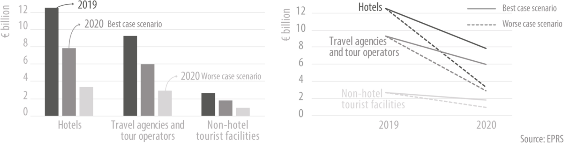
Figure 1.
Estimated impact of COVID-19on revenues of the tourism industry in Italy (2020, in billion euros) Same data, different visual, different perception, different message.
1.4A clear message and a suitable visual
A clear message and a clear visual is the aim; but there are many ways to visualise data. Change over time, deviation, correlation, distribution, part to whole, spatial; they all have corresponding visuals. A line chart emphasises changes in trends; a scatterplot or bubble chart shows the relationship between two variables; a histogram shows the frequency of values in a dataset; a doughnut or treemap shows a single entity broken down into elements; a map shows precise locations or geographical patterns. A visual vocabulary88 is always a nice poster to hang on the wall. Choosing the right element to narrate the story is crucial. The same data presented with two different visuals can give two different messages. Figure 1 is an example of the same data presented with two different visuals. It represents the impact of COVID-19 on the tourism sector in Italy, highlighting three types of tourist facilities. It shows the year 2019 and the best- and worst-case scenarios for 2020. The bar chart is rather misleading, as it seems that three years are represented, while it actually talks about two scenarios for the second year (2020). The line chart is clearer as it shows the evolution in time – from 2019 to 2020 – and the dots line highlight the best- and worst-case scenarios.
Preparing infographics is fun; in a way it brings the data scientist back to their roots. Leaving aside the computer for a while, and sketching with colour pencils what will be presented in the final infographic. Sketching out the visualisation is the test phase, and when each element is chosen. This method has a lot of advantages; the story takes form as we look at the visualisation as a whole. It allows us to decide on the visuals, colours, hierarchy, size and ratio. In an infographic, size matters; the biggest visual on the page will most probably get the highest attention from readers. The number of sketches needed depends on the satisfaction we get from the exercise. Is the message well explained for readers? Showing the sketch to people who do not know the subject is a good way to test. If it does not work, we need to adapt. The time spent sketching in pencil will always be shorter than doing it straight on the computer. We need to choose wisely, as our choice guides the reader throughout the story.
In this context, colours play an important role. Generally speaking, an institution that deals with visualisation probably already has its own colour palette. That is part of establishing its visual identity. The choice of colour drives and influences the message. Colours can be divided into three different categories: warm, cool and neutral.99 Warm colours such as red, orange and yellow; cool – green, blue and purple; and neutral – black, grey, white and brown.
The hottest and most dynamic colour is red. It should be use minimally and in a form of accent or to draw attention. Orange is a balanced colour, energetic but at the same time friendly and inviting without being overpowering. Yellow is warm and stimulating, and can be used to give an impression of happiness.
Green is a calming and balancing colour, representing stability and inspiring possibility. It may be used to represent harmony in a design. Blue represents trustworthiness and security. Light blues, for instance can be used for social websites to represent calm and friendliness. Purple represents nobility and luxury, but also creativity and imagination.
The neutral colours are used as a backdrop, with brighter accent colours or with text. Black represents power, grey neutrality and calm, white clarity and cleanliness. Grey is probably the most important colour in data visualisation; it is used in graphs to represent the axis or text, leaving the brightest colours to give the message. Importantly, it reduces the visual ‘noise’ in visualisation.
1.5Plotting data
How can we be clear when plotting data on the visuals? That comes with the choice of the storyline. Ordering data, calculating percentages and cumulative figures; using averages such as means, medians or modes. Using maps with relativised data such as density, per inhabitant, percentages. A darker colour means a larger statistical value. But there can be exceptions. Let us imagine two maps side by side, showing the employment and unemployment rates. A high employment rate is represented with the darkest colour. High employment is good. But what about unemployment? If it is represented with a dark colour, visually it would give the wrong message in relation to employment. High unemployment is good? Most probably this is not the desired message. Therefore, in this example, the unemployment map should have a darker colour representing low unemployment. The message will then be consistent: high employment and low unemployment are good.
Simplicity is important. An overloaded graph will be difficult to understand. Even worse, it may not deliver the message at all. It is therefore desirable to prepare each graph to be as simple as possible. Not using too many variables; avoiding 3D effects, as they may give a distorted perception of the scale and make it harder to read the data points. If using a pie chart, include no more than 6 or 7 variables and follow the 12 o’clock rule. If using a double scale, indicate this clearly in the legend, or even better use two small graphics side by side.
Knowing how to correctly plot the statistics means choosing the right indicators and aggregates that describe the statistics; the appropriate graph and the number of variables to include; the right colour to highlight or not certain values. This is part of data literacy, and the benefit, whether preparing or reading infographics, is that it allows to distinguish between good and poor visualisation.
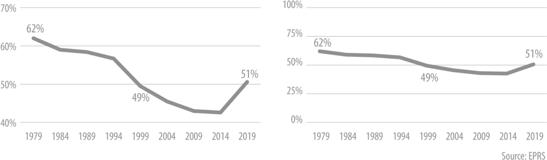
Figure 2.
Turnout at EP elections since 1979 Same data, different axes, different message.
1.6Ethics
What about ethics in using and analysing data for policy-making? Certainly, that plays an important role. It put limits on data use: what cannot be said with data, and which questions need to be raised to understand them. There are ethics in statistics that need to be followed by a data user, so that only the factual content is reported and there is as little room as possible for misrepresentation or misunderstanding of the data. Figure 2 helps to explain. The data refer to the turnout in European elections. One chart with a scale starting from forty per cent and a second with a scale from zero to one hundred per cent. The difference in the message of the two graphs is very clear. In the left-hand one, it seems that the values drop close to zero and the curve seems very deep, which is not the case. So, what about ethics in data analysis and visualisation? Cutting the axis distorts the message, it makes the picture less clear, and does not inspire trust. We should not manipulate the representation of data to give the message that we want or that somebody else wants.
Like any other field, there are ethics for data scientists that need to be followed. Being aware of these provides added value for data-literate persons as it allowed them to more easily spot unethical behaviour at any step of the process. In data collection for instance, there can be bias through posing the wrong question; in the visualisation, not including outliers or presenting only figures that shows positive output; in a survey, when the differences in values are not statistically significant. Ethics in statistics and therefore in data literacy, are important to give the right direction to be objective and reflect the truth.
1.7Text, annotations and sources
Once the sketch is done, it is time to move to the computer. This step can be done by the data scientist, or it can be done by a graphic designer. It needs a certain know-how of the software used for doing infographics. Depending on the details and the complexity of the infographic, there are various software tools that can be used.1010
Once the layout of the infographic is ready with all the visuals, it is necessary to add text or annotation that will allow the reader to better understand the message but also to give it more analytical depth; and furthermore, to explain the methodology. This is important because using both visuals and text will ensure more people understand the message. Explaining clearly the methodology will ensure no misunderstanding or misinterpretation of the meaning of the data.
Last, but definitely not least, an important element to add is the data source with a weblink (when possible). Adding the source allows the reader to verify themselves, but more importantly, it inspires trust. Seeing the source of the data generally makes the reader more comfortable in accepting the data.
2.Conclusions
Creation of infographics is a very specific task for a very specific profile; the result of which benefits policy-makers. As said, highlighting the steps to follow when preparing an infographic illustrates the variety of skills required. But in this journey of creating an infographic, above all trust is required. It is a two-way exchange of trust. The data scientist, as first user, towards data producers; readers towards the data scientist and producers. But how do we gain trust as data users? Reliable data, clear messages and ethics are certainly important.
Using data that come from institutes with the highest international and European principles and standards. In the EU, for instance, official statistics are based on principles and on a legal framework.
Trust also comes through a series of small, but highly professional steps in preparing an infographic. Asking questions and finding answers about data gives you knowledge of the data itself. It is actually ethical to do that, because to be objective and to respect the truth you need to fully understand the data from as many angles as possible. Ultimately that will help you gain trust.
Data properly ordered; clear labels; consistency in colours; texts to help understand graphs and to explain the data. It is also important to tell the story of where the data come from. A good product needs a good marketing campaign, and so do statistics. Presenting statistics in an understandable, visual and appealing way is a way of building trust.
A clear message is another key point for gaining trust; we say something with the visuals, we inform while being balanced and objective, we make insights into the data we have analysed. A clear message is also achieved by adding annotations, explaining the methodology, and hyperlinking sources. The annotations explain in a few words how to read a graph and what is the message on it. Explaining the methodology is also useful for readers, as it can also better clarify the data.
Generally, there are ethics in statistics that need to be followed by a data user, so that only the truth is reported and there is no misrepresentation or misunderstanding of the data. The previous example of turnout data in European elections plotted on a line chart explains well the issue; applying ethics in presenting statistics and data in an understandable and exciting way will allow policy-makers to understand infographics but also to ensure trust. Data and statistics are nothing if we cannot trust them.
Presenting data in an appealing and visual way, such as two-page infographics papers, is a good example of communication for policy-makers. Taking the example of the circular economy,1111 a paper of two pages could include: overall information on the jobs and added value related to circular economy sectors, trade in recyclable raw materials, circular material use rate; and also, data on waste by economy and waste streams. It is a handy evidence-based document. This article has sought to
give a practitioner’s view on data literacy for policy-making. Being aware of the steps in preparing an infographic provides added value for policy-makers as the use of statistics has become a political power resource, and access to and understanding of data is becoming more and more important. Whether just for reading or for creating one’s own infographic, being aware of the actions involved can be helpful; using reliable data sources; questioning and analysis of statistics; clear message and storyline; clear and simple representation of indicators. All these steps set out how a data scientist can help policy-makers to understand statistics better.
Notes
2 The Joint Research Centre (JRC), The Digital Competence Framework 2.0.
3 Data literacy project.
4 Carlson et al. (2011), Determining Data Information Literacy Needs: A Study of Students and Research Faculty.
5 Tableau and Qlik.
6 Eurostat data (EDUC_UOE_ENRT03).
7 Fundamental Principles of National Official Statistics, United Nations Statistical Division, 2014; European Statistics Code of Practice, Eurostat, 2017.
8 https://github.com/Financial-Times/chart-doctor/raw/main/ visual-vocabulary/Visual-vocabulary.pdf.
9 Source: TechKing, The Psychology of Colour.
10 For example, Adobe Illustrator and InDesign, Excel, Tableau, R, QGIS, or webpages that provide templates for preparing graphs, such as Flourish, RAWGraphs or Datawrapper. (This list is not exhaustive).
11 Living in the EU: Circular economy.
References
[1] | The Digital Competence Framework 2.0, The Joint Research Centre (JRC). |
[2] | Data literacy project, How do you define Data Literacy? (2021) . |
[3] | et al.Determining Data Information Literacy Needs: A Study of Students and Research Faculty, 2011. |
[4] | What is Data Literacy? Tableau. |
[5] | What is data literacy, and why does it matter for your organization? Qlik. |
[6] | European Statistics Code of Practice, Eurostat, (2017) . |
[7] | Students enrolled in tertiary education, Eurostat data (EDUC_UOE_ENRT03, (2022) ). |
[8] | Fundamental Principles of National Official Statistics, United Nations Statistical Division, (2014) . |
[9] | Visual vocabulary, Financial times ((2016) –2019). |
[10] | Interactive Visual Vocabulary, Financial times ((2016) –2019). |
[11] | The Psychology of Colour, TechKing, (2011) . |
[12] | et al.Living in the EU: Circular economy, 2021. |