
From face-to-face teaching of official statistics to e-learning for the Sustainable Development Goals
Abstract
How should we teach the users of official statistics? Many government advisors lack adequate mathematical and statistical skills. The authors were part of different teams that developed a National Certificate of Official Statistics comprising four modules taught face-to-face with competency-based assessment that included a workplace project, and three free downloadable web apps in official statistics hosted on the International Statistical Literacy Project website. They also supplied draft content for a United Nations Institute of Training and Research (UNITAR) e-learning course Understanding data and statistics better – for more effective SDG decision making comprised of five self-teaching modules. Key common elements in this progression from a country specific paper-based course to an international e-learning course targeted at the United Nations’ Sustainable Development Goals, included:
• establishing cooperative teams, including information technology and course design experts
• de-mathematising statistical content, in favour of conceptual understanding
• using visual tools, such as dynamic and interactive graphics, to interpret data
• recreating as little material as possible with use of freely available internet tools.
There were challenges to be overcome: how to make the content internationally applicable to an international audience; how to keep material up-to-date and relevant and how to provide appropriate formative and/or summative assessment.
1.Introduction
Both authors are statistics educators with many years experience (see Appendix) and have been involved in the development and at least some of the teaching in each of the learning programmes described in this paper.
The focus of this paper is the investigation of commonalities and challenges in three different forms of learning programmes, each developed to assist local and national government advisors to understand, interpret and present statistical information. These users need to both present data well in their advice to Government and interpret research information and nationally important social and economic measures (official statistics). In some cases, this will require understanding ‘traditional’ statistical concepts and methods, such as confidence intervals, p-values and linear regression. In other cases, it requires an understanding of new concepts such as those underlying population dynamics (demography) and macroeconomic indicators (e.g. price indices, gross domestic product). The emphasis in the three programmes described is on understanding the concepts not the underlying mathematics and being able to effectively interpret and use this data. Data visualisation tools such as dynamic and interactive graphics [1, 2] and videos are widely used to aid conceptual understanding.
At both the national and international level, government advisors need to be able to effectively use published official statistics and other statistical material but they often have limited background mathematical skills, making it difficult to teach even relatively basic statistical analyses. For example, in 2011, the New Zealand Prime Minister’s Science Advisor, Dr Peter Gluckman, pointed to the lack of capability in the state sector for the monitoring and evaluation of key policies and programmes stating that, ‘the costs and implications of inferior science or wrong data leading to policy decisions are immense’ [3]. Forbes [4] also identified highly variable or insufficient statistical understanding in some New Zealand state sector agencies. To address this lack, in 2007 Statistics New Zealand in negotiation with the School of Government, Victoria University of Wellington, created the joint position described in the Appendix. It was quickly realised that statistical capability needed to be raised in two distinct state sector groups:
1. Statistical specialists who generated official statistics;
2. Policy advisors who informed government and were often highly literate but with limited mathematical skills.
Some targeting of the first group was undertaken with seminars and short-courses in specific areas and also the development of an across-university postgraduate (Honours) course in official statistics (that is still running and has been taught for ten years with 30 to 50 students each year from six of the eight New Zealand Universities). These are normal university students enrolled at honours level in statistics, social and public policy or the social sciences (including geography, environmental studies, sociology, criminology, psychology, political science and demography). The prerequisites are a basic course in applied statistics at first year level and a higher-level course in applied statistics or completion of a programme in quantitative analysis in one of the above disciplines. The course involves staff from different New Zealand universities and Statistics New Zealand with specialist expertise teaching in their particular area. Topics covered include data sources (surveys and administrative data), the legal and ethical framework of official statistics, demography, the collection and analysis of health, social and economic data, data visualization including spatial and geo-visualisation, data matching and data integration, and macroeconomic statistics with an overview of the System of National Accounts. There is a single two-hour lecture every week for ten weeks delivered by video conferencing. Assessment is by five written assignments and there is no final exam. While there are no formal tutorials, students can interact with each other and also with the lecturers through the dedicated course website [5].
Although it is the second group (policy and other advisers) that is the focus of this paper material from the Honours course has been included (with acknowledgements to the authors) in both the latter two learning programmes described below. The three types of learning programmes aimed at policy and other government advisors that are examined in this paper are: a competency-based (learners either pass or did not complete) Certificate of Official Statistics created by Statistics New Zealand and taught to learners in both New Zealand and a number of Pacific Islands between 2007 and 2017; a set of three free self-teaching web apps (Measuring Price Change, Comparing populations and Graph It in Excel); and an e-learning course developed by the United Nations Institute of Training and Research (UNITAR), Understanding data and statistics better – for more effective SDG decision making. Participants in these programmes are called learners, to distinguish them from students formally enrolled in an educational institution. In the Certificate of Official Statistics, the learners are usually in full-time employment and need their work-place manager’s permission to enrol. In the two online programmes, learners can self-select to participate and can move in and out accessing either all of the programme or only the learning they require. Each of these programmes has some shared content with the two other programmes or the Honours Course described above.
2.The learning programmes
2.1Certificate of official statistics
New Zealand’s national Certificate of Official Statistics was developed by a 3-way partnership between the national statistics office (Statistics New Zealand), the agency responsible for cross-departmental state sector issues (State Services Commission) and the Industry Training Organisation responsible for state sector training (Learning State). It targeted state sector users (rather than producers) of official statistics. In 2007, a group of academics (at least one from each of the seven main New Zealand university statistics departments) with either a general interest in statistics education or specialist skills in a particular area of official statistics (e.g. demography, data matching, survey design, social statistics, data visualisation, macroeconomic statistics) were brought together to advise on the number of modules that the Certificate would contain and the content of each module. They also agreed to work collectively with Statistics New Zealand to deliver and assess these units. The resulting Certificate was based on statistical thinking/literacy theory focussing on conceptual rather than mathematical understanding [6, 7]. For example, the concept of a mean is that it is the balancing point of an ordered set of data whereas the mathematics of the mean is that it is the sum of the data values divided by the number of values. Similarly, conceptual understanding of confidence intervals and p-values focusses on their meaning and interpretation rather than their numeric values. The statistical content is at a relatively simple level (e.g. univariate and bivariate measures of association, confidence intervals and interpretation of significance tests, the basics of demography, age standardisation and price indices). That is, the learning programme (course) contained both general statistics and an overview of official statistics [8, 9] with as much use as possible made of resources freely available on the internet, such as statistics calculators, interactive tables, graphics and video material. The following four taught modules comprised 60% of the Certificate:
1. Resolve ethical and legal issues in the collection and use of data in a public-sector context
Included both national legislation and internationally agreed principles (e.g. United Nations Fundamental Principles of Official Statistics) and ethics.
2. Interpret statistical information to form conclusions for projects in a public-sector context
Included univariate and bivariate combinations of categorical and numeric variables, simple time series, index numbers, basic health and demographic techniques.
3. Assess a sample survey and evaluate inferences in a public-sector context
Included administrative and survey data collections, simple estimation (confidence intervals) and interpretation of simple inferential statistics (e.g. t-tests and Chi-squared tests) using web-based p-value calculators.
4. Evaluate and use statistical information to make policy recommendations in a public-sector context
Using the learning from previous units this included evaluating the appropriateness of different data collections to help answer a given policy question and describe the properties of appropriate new data collections.
The assessment was competency based (that is, learners were required to demonstrate that they had a certain level of understanding and skill and, within a given timeframe, could re-sit units) with no grades being awarded. It was designed to be approximately equivalent to the interface between the final year of schooling and first year of university. Both the learning and assessment used real statistical research, policy and media publications. Learners had email access to the course teachers and special tutorial sessions were also made available. Each module was formally assessed but learners were free to submit assessments in their own time frame (it was expected that this would be within the year the course ran). In the first two years learners could do the remaining 40% of the course by selecting other units registered on the New Zealand Qualifications Framework [10], such as management and communication skills or knowledge of public sector processes. From 2009 onwards learners were required to do a work-place placed project as their final assessment, worth 40% of the course [11]. The project component was seen as an important part of the Certificate but as it was based in the learner’s own workplace, the level of statistics it contained was highly variable. At a minimum, the project should have contained graphs and at least one appropriate bivariate statistical analysis such as: relationships between pairs of numeric or categorical variables, confidence intervals for means or proportions, interpretation of hypothesis tests (p-values) or investigation of time series.
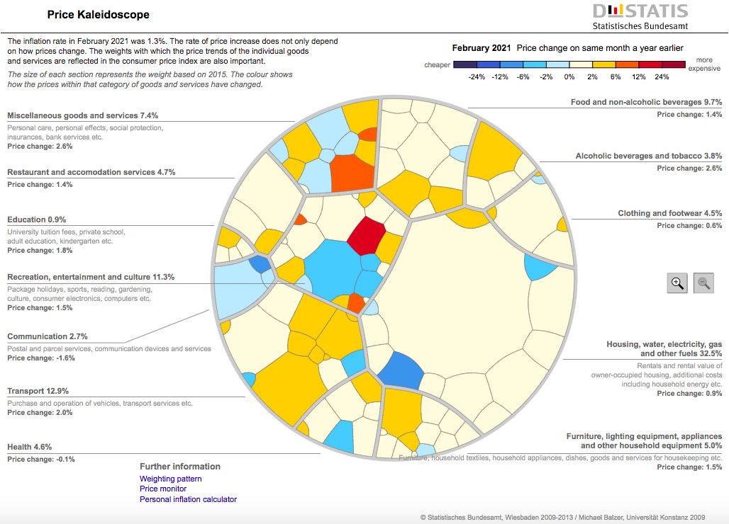
Dynamic and interactive data visualisations and YouTube videos were used to motivate learners, accompanying the face-to-face delivery of the units. For example, the interactive Price Kaleidoscope developed by the Federal Statistical Office of Germany (shown in Fig. 1) was used, not just to discuss the Consumers Price Index, but also to demonstrate the concepts of ‘a basket of goods’ and of ‘weighting’. This tool is interactive in the sense that users can click on and zoom into areas to get more information.
Figure 1.
Federal Statistical Office of Germany’s Price Kaleidoscope for the February 2021 quarter https://service.destatis.de/Voronoi/PriceKaleidoscope.svg.
Learners were also supplied with written workbooks that contained links (urls) to these visualisations, and to free simulation and teaching software such as Massey University’s CAST programme https://cast.idems.international/ developed by Doug Stirling [12] and to online calculators such as Vasserstats (http://vassarstats.net/newcs.html) that was used to calculate Cramer’s coefficient (V) and Chi-squared values for small cross-tabulations. Learners were expected to be able to interpret not calculate such statistics.
Two ‘case-study’ publications (official statistics or other government agency releases, research reports or media articles) were chosen for use across all four units for teaching purposes and two separate publications were chosen for assessment purposes. As reported by Harraway and Forbes in 2013 [5] when the Certificate was taught in New Zealand the case studies were either Statistics New Zealand’s official statistics releases or reports (such as labour force mobility) other government agency documents (e.g. Maori language usage) or academic research reports on current issues (such as on the impact of housing insulation). The intention was that case studies were targeted to the home country in the Pacific Islands and Vanuatu is a typical example. When the Certificate was taught there in 2017, Vanuatu legislation and codes of conduct around official statistics were explored, and some specific Vanuatu examples (e.g. the Vanuatu Household Economics Survey 2010 [13] and the 2015 study ‘Children, Women and Men with Disabilities in Vanuatu. What do the data say?’ [14]) were used in exercises and assessments but many of the other examples used were from either New Zealand or other Pacific countries.
In their analysis of a small sample of New Zealand learners, Forbes and Keegan [15] found that they had highly variable backgrounds in statistics, from having never studied statistics or mathematics through to advanced tertiary level (some doing the Certificate as professional development for their job). The most common reasons given for enrolling were because the learner either wanted to learn about official statistics or to become more confident using official statistics. At that time, only about 2/3 of learners completed the Certificate and the project component seemed to be a barrier for a number (10%) of learners. One of the advantages of the workplace based project was that managers could have small research projects done outside their agreed annual work plan. It was intended that the project would be negotiated between the learner and their workplace managers and would be done in the workplace under their manager’s supervision, thereby enabling the learner to have access to the required raw data. However one of the problems with having a workplace based but externally assessed project is that learners need to interact with their managers in the choice of the project and throughout its development and this may not be a priority for the manager. The reasons given for not starting or completing the project, included that the manager didn’t have enough time to design or supervise it. However, examples of successfully completed projects in New Zealand and Tonga are:
• Factors affecting participation in a government funded children’s internet survey
• Comparing religious affiliation for Tongans in the New Zealand and Tongan Censuses
• Analysis of travel by preschool children using New Zealand Household Travel Survey data
• Comparison of local and international prices in Tonga
• Survey of transport issues for residents in a new subdivision in Christchurch, New Zealand
• Differences between the CPI and Statistics New Zealand’s Household Consumption Expenditure Implicit Price Deflator [11].
Projects from the other Pacific Islands were reported as most commonly addressing the UNs Sustainable Development Goals (SDGs), in particular, Goal 1: No poverty, Goal 3: Good health and well-being, Goal 8: Decent work and economic growth and Goal 16: Peace, Justice and Strong institutions [16].
The Certificate took place over a reasonably long period of time (theoretically up to a year but some learners took substantially longer than this) and a number of learners changed positions, either within the same organization or to a new agency, in the time that they were enrolled. In order to gain maximum return from an organisation’s investment in the Certificate, some new initiatives were introduced in 2013 to help learners complete the project (e.g. workshops for both learners and their managers about the project and requiring the submission of a project research plan).
There was a fee to enter the Certificate, usually paid by the learner’s workplace. Small groups of 15–25 learners (all in current employment in either government or local authority agencies) were taught in one or two-day blocks in a traditional classroom setting, with units usually spaced six to eight weeks apart to give learners time to complete assessments. The certificate was taught in New Zealand between 2007 and 2012 and versions tailored for each of the Pacific Islands (Tonga, Samoa, Tokelau, the Cook Islands and Vanuatu) between 2012 and 2017. In some years there was more than one cohort of learners with fourteen cohorts of learners (nine in New Zealand and one in each of the Pacific Islands) overall taking part in the certificate [11, 16]. However, this was fewer than 300 learners overall participating in the seven years the certificate was offered. Up until 2013 (when it was delivered in New Zealand) roughly 40% of enrolments were from the national statistics office with the remainder coming from a wide range of government and local authorities as well as other non-government agencies. A total of 37 different organisations had participating learners.
While one of the strengths of the Certificate of Official Statistics was that it was adapted for each specific country and its statistical legislation, with country-specific case-studies being used in both the teaching and assessments, this required substantial work on the part of teachers. In addition, in a number of the Pacific Island nations there was only variable strength internet connectivity. The time-commitment required of teaching staff was a weakness and not sustainable in the longer term. As well as the face-to-face teaching, encouraging learners to complete assessments often required intensive work with completion of the Certificate being an ongoing issue. It was intended that learners complete the certificate within twelve to eighteen months. However, some were very late in completing assessments with a few taking several years to gain the full qualification. There were also a number of learners who completed all the four taught units but not the final project. In the early (2007–2010) cohorts, the mean completion rate for the certificate was low (65%) but the completion rate was larger for some of the Pacific Island cohorts, being as high as 80% in some countries [11, 16]. Some learners also reported that either they were not seeking formal qualifications or that they found it hard to balance learning with their work and family commitments [15]. Not only was delivery of the Certificate very labour intensive, but there were also considerable financial costs, in particular when delivered in the Pacific Islands (even though this was supported by a New Zealand Ministry of Foreign Affairs grant). There was also the lost opportunity cost (of investing in other activities) to the organisation, Statistics New Zealand, doing the administration and management of the Certificate. It was inevitable that it would only have a limited life span. The Certificate is no longer being offered [17].
2.2Web apps
Leading on from the Certificate of Official Statistics the authors began investigating the feasibility of producing e-learning tools to enhance and replace some of the written material in it. The target audience was again to be primarily government policy and other advisors who may have limited mathematical skills. In 2013 a joint project between the New Zealand academics and the United Kingdom Royal Statistical Society Centre for Statistical Education (SSCSE) was established. As well as the two authors, the project team included the director, Neville Davies, of the SSCSE located at Plymouth University (United Kingdom), a webmaster (Dominic Martignetti) and education specialist (Kate Richards) both from the SSCSE, and an IT specialist (Greg Trounson) from the University of Otago, Dunedin (New Zealand). The concept of producing e-learning tools such as apps or web apps in official statistics was discussed in a workshop at the International Conference on Teaching Statistics where it was decided that such tools should:
• be free and easily accessible for learners
• be self-contained on a variety of IT platforms such as desktop computers, laptops, tablets and Smart Phones
• have an international perspective encouraging use in developing countries
• be interactive, making them less like static e-books and more like a miniature learning environment including questions and quizzes
• be based on a structured learning approach [18].
The two primary focuses for the type of tool to be developed were the ability to work offline and to be as functional for mobile use as for the desktop. The webmaster’s advice was that a web based app would be preferable over a dedicated mobile APP as at that time, although both were capable of delivering content via the web to mobile devices a web app relies on a web browser and is in essence a ‘mini’ website (optimised for mobile viewing) while a mobile APP is tied to a mobile device. The choice of a web app had several distinct advantages, including:
• one version for all devices.
• reliant on web standards and not tied to proprietary programme languages.
• distribution and downloading can be done via a user’s browser as opposed to a dedicated APP store.
The resultant apps needed to be reusable, shareable and able to be updated – something that may not be as easy to achieve with a mobile APP. The webmaster decided to use HTML5 (then the latest version of HTML) for the web app development as most smartphone browsers were more than capable of delivering this content and also, if required the latest most up-to-date and free browser for any given device could be downloaded easily. In theory anything that could be viewed via the latest web browser on a desktop computer could also be viewed on a mobile device, including forms, hyperlinks, images, animation and video/audio.
The project team had only limited finances and time available so it was decided to initially develop three web apps. The first step was prioritisation of the learning needs of policy advisers with the top three areas deemed to be understanding:
• demographic change and comparison of different population groups (within a country or between countries);
• the measurement of price change and its use in policy settings and
• the ability to interpret graphical information and create simple graphs.
General statistical thinking material was sourced from the Certificate of Official Statistics, and specialist official statistics material from both the national statistics office and the Honours paper in official statistics mentioned above (with acknowledgements given to academics all of whom willingly shared material). However, it was the webmaster and IT specialist who were able to turn this into web apps containing both applications and structured learning exercises.
The resulting web apps are:
1. Measuring Price Change (Prices) – includes a focus on the Consumer Price Index (CPI), working with price indices, changing base year, time series in connection with the CPI, moving averages, trends, seasonality, and the policy uses of price indices. http://iase-web.org/islp/apps/gov_stats_priceindices
2. Comparing populations (Populations) – over time between countries and between groups within countries that includes demographic drivers such as fertility, mortality, migration, life tables, population pyramids, age standardisation and odds ratios. http://iase-web.org/islp/apps/gov_stats_populations
3. Graph It in Excel (Graphs) – includes a history of graphics, good (and bad) data presentation and also gives instructions for the creation of simple graphs including boxplots and population pyramids in Excel. http://iase-web.org/islp/apps/gov_stats_graphing
As with the Certificate of Official Statistics as much use as possible was made of teaching and calculator resources freely available on the internet. Learners being online meant that direct links to other websites could be provided as well as to videos and interactive and/or dynamic graphs (such as dynamic population pyramids that demonstrate the demographic concept of momentum; population growth and decline). Both the Population and Price indices web apps have an introductory video, the former to a Wingspan Production video-clip from Hans Rosling’s “From Sick and Poor to Wealthy and Rich” BBC4 YouTube video [19] and the latter to a 2009 New Zealand television news report on the Consumer and Food Price Index as shown in Fig. 2.
Figure 2.
a. Measuring Price Change web app viewed on a computer screen. b. Measuring Price Change web app viewed on a mobile phone screen.
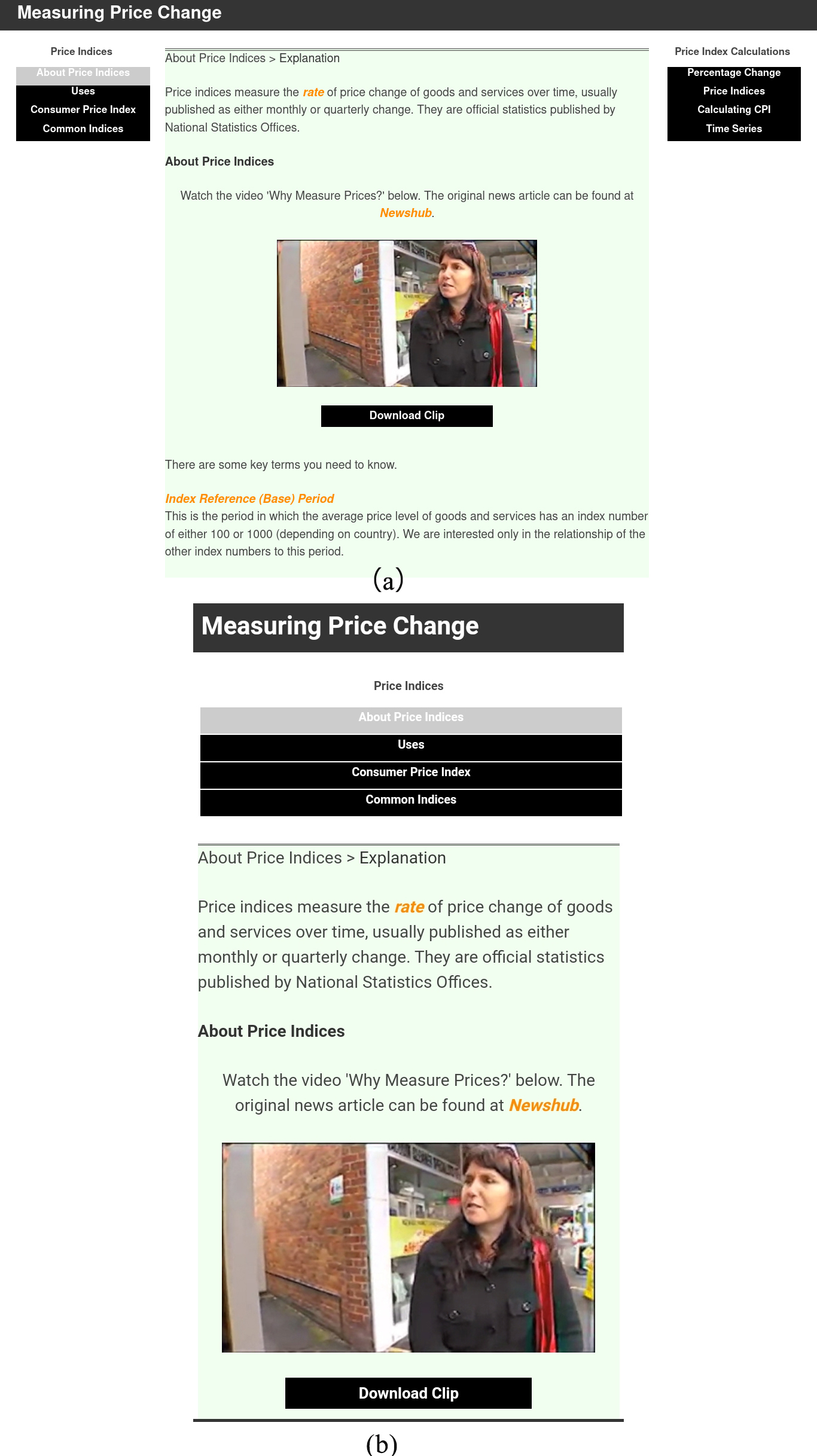
Figure 2 shows the structure of both the Prices and Populations web apps which have commentary such as history and uses in policy making on the left-hand side and ‘how to do’ instructions on the right-hand side. Figure 2a shows the web app viewed on a computer, iPad or android and Fig. 2b shows it viewed on a mobile phone.
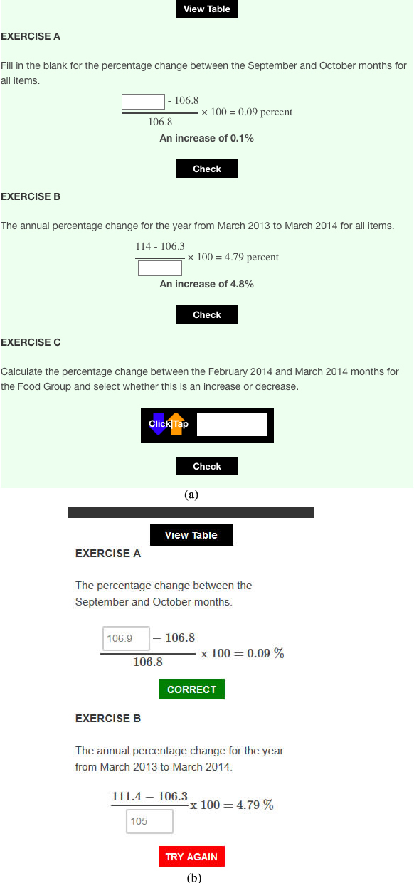
Figure 3a is a snap shot showing the structured learning approach, with exercises getting progressively more difficult, for calculating percentage change. Figure 3b shows the responses that learners get depending on whether their input is correct or not.
Figure 3.
a. Snap shot of exercises for calculating percentage change. b. Responses to learner input in teaching exercises.
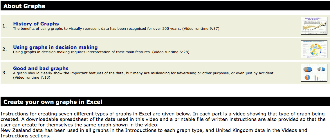
The Graphs web app used a different structure and teaching method as shown in Fig. 4. It contains video presentations about the history of graphs, how to use graphs (particularly newer dynamic and interactive graphs) to aid decision making and the features of good and bad graphs. These are followed by videos, datasets and instructions on how to create graphs in Excel (the most common spreadsheet available to the targeted learners).
Figure 4.
Screenshot showing the structure of the Graphs web app.
The web apps are hosted on the International Statistical Literacy Project (ISLP) resources page of the International Association for Statistical Education (IASE) website https://iase-web.org/islp/Resources.php?p=Apps. They were designed to be international (and of particular use in developing countries) but to achieve this needed further input and relevant examples. It was hoped that this could possibly be supplied by national statistics offices, but this has not been realised. While the primary target for the web apps was users and, to a lesser extent, generators of official statistics, they are free for anyone to use and easy to access. Between 1 November 2017 and 1 February 2020 the number of unique users (multiple visits from the same email address count as one user) to each web app was:
Measuring Price Change 14872 Comparing populations 10534 Graph it in Excel 15257
Of course, many of the unique visits may be just to access one specific area in a web app.
It was initially envisaged that these web apps would be used for self-teaching by individuals. However, they are also suitable for use in classroom environments with access to suitable technology. In New Zealand, the web apps have been used in several different types of university courses, including a short-course for local and national policy advisors, and to complete assignments within the Honours course in official statistics and other university demography courses. A small sample of learners and teachers reported that the web apps were easy to access with no technological problems (including on different devices such as laptops or tablets or for multiple simultaneous access) and that learners enjoyed working with them [20]. The web apps have been used as an electronic reference book, a source of exercises for students to attempt either individually or in the classroom or as a tool for students to use when completing assignments.
One additional feature of the web apps is that they are reasonably easy to translate into other languages. For example, in two separate presentations the use of Google Translate on the web apps was demonstrated. (First copy and paste the web app address into https://translate.google.co.uk, select the appropriate language then click the translate button). Of course, translations were not needed for mathematics, numbers or graphs and the translations of text into Portugese and Maori (indigenous language of New Zealand) were not perfect but deemed to be useable.
Linkage to each of the three web apps is also given at the appropriate point in the UNITAR e-learning programme.
2.3United Nations Institute of Training and Research (UNITAR) e-learning course
In addition to having the common purpose of all the learning programmes (to convey how data could be used to inform public policy in general), the UNITAR e-learning programme was designed specifically for users reporting on progress towards the 17 United Nations’ Sustainable Development Goals (SDGs) https://sdgs.un.org/goals:
Goal 1. No Poverty Goal 2. Zero Hunger Goal 3. Good Health and Well-being Goal 4. Quality Education Goal 5. Gender Equality Goal 6. Clean Water and Sanitation Goal 7. Affordable and Clean Energy Goal 8. Decent Work and Economic Growth Goal 9. Industry, Innovation and Infrastructure Goal 10. Reduced Inequalities Goal 11. Sustainable Cities and Communities Goal 12. Responsible Consumption and Production Goal 13. Climate Action Goal 14. Life Below Water Goal 15. Life on Land Goal 16. Peace, Justice and Strong Institutions Goal 17. Partnerships for the Goals.
The authors were initially contracted by UNITAR to develop the draft content for a five-module course focussing on the use of indicators for the SDGs that contained a basic statistics ‘refresher’ and demonstrated the importance of data literacy including how data can be used, how to communicate with data correctly and effectively, where to find appropriate data, how to analyse data and how to evaluate the quality of data. A combination of story-telling (use of case studies), videos, links to other internet sites as appropriate and hands-on exercises was included to help learners gain conceptual understanding and extract key measures from the data. Some material from the previous two programmes was included and also some from the Honours course mentioned above (including specialist material such as geo-visualisation techniques). Other material (for example, that on Big Data) was contributed by other New Zealand academics, with again all the contributors being acknowledged in the draft course.
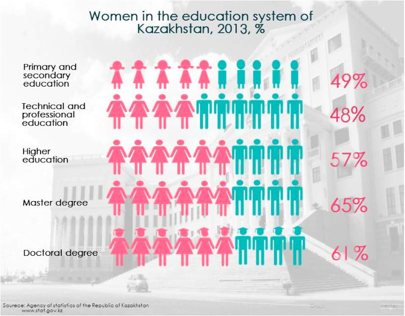
Figure 5.
Infographic from the Agency of Statistics, Kazakhstan.
An effort was made to include as many international real-world exercises and examples in the draft material as possible so that the course would have wide international coverage (and there was a specific request from UNITAR to use case studies relevant to Africa). Resources used included national statistics office surveys and reports, research papers (such as the work of the 2019 Nobel Prize Winners in Economics: Abhiji Banerjee, Esther Dufl and Michae Kremer, e.g. [21]) and topical issues (such as the 2019 Samoan Measles Epidemic, the 2019 South American Zika virus and the world wide 2019 pandemic, COVID-19). The impact of the authors’ location and accumulation of examples over a number of years meant that many in the initial draft were again based on examples from New Zealand or the South Pacific. However, this is not the case in the final course entitled, Understanding data and statistics better – for more effective SDG decision making, https://www.unitar.org/event/full-catalog/understanding-data-and-statistics-better-%E2%80%93-more-effective-sdg-decision-making as it is the result of a diverse team comprising persons from different countries and with different skill sets including statistics education, course design and country specific expertise. Contributions from team members other than the authors substantially extended the course’s international perspective. As acknowledged in the online course syllabus https://learnatunitar.org/pluginfile.php/200074/mod_resource/content/5/Course%20syllabus-Understanding%20data%20and%20statistics%20better_o.pdf, some of those that provided substantive contributions to the course were Helen MacGillivray (former president of the International Statistical Institute), and UNITAR staff including Aniket Bhushan, Vibeke Nielsen, Leandre Ngogang Wandji and Elena Proden.
There is no fee for this Web based course, originally of nine months duration (initially intended to run from April to December 2020). It is targeted at public officials in charge of SDG policies, data producers and those interested in learning more about the role of data in public policy design. It is a self-paced course with each of the following five modules being rolled out progressively with an estimated learning time per module ranging from 2 to 5 hours. Each of the following modules contains a number of study questions and hands-on exercises and is then followed by an objective final assessment consisting of 10 randomly selected questions.
Module 1. Statistical literacy Module 2. Interpreting and assessing the fitness for purpose of data Module 3. Communicating with data Module 4. Data sources for SDG indicators Module 5. Policy formulation, monitoring and evaluation
Real world examples, in the form of case studies or stories are used to introduce sections of the course and motivate learners. For example, three stories are used in Module 1: The Hans Rosling video Moving the world from “sick and poor” to “healthy and rich video that was used in the Populations web app [19], Estimating the Global Burden of Disease: Rotovirus and What’s wrong with smoking? – One country’s 180∘ turn in 50 years of smoking policies. In Modules 2 and 3 there are nine and ten examples respectively used as stories, case studies or as major sources for exercises. Several of these are very current (for example. “COVID: The Situation in Switzerland”https://www.swissinfo.ch/eng/covid-19_coronavirus–the-situation-in-switzerland/45592192 and the “WHO Coronavirus Disease (COVID-19) Dashboard” https://covid19.who.int/.
Many examples, in both the case studies or exercises, are derived from official statistics as these have particular qualities making them suitable for use in monitoring progress towards many of the SDGs. They are often internationally comparable (using agreed standards and classifications) enabling between country comparisons and are usually repeated at regular intervals giving the long time-series needed for monitoring over time. They are usually based on complex survey designs (often out of the cost range of other agencies) and are large scale with broad coverage (have many variables allowing for comparisons between groups). They are designed to be multi-purpose (for data to be collected once and used often). However, often only a simple analysis is provided by the collecting agency particularly when official statistics are extracted from administrative datasets designed for another purpose (such as health records) [22]. Official statistics data, graphics (such as the simple infographic shown in Fig. 5) or reports from the national statistics agencies of the following countries, among others, are included in the course: Canada, Croatia, Denmark, France, Germany, Ghana, Jamaica, Japan, Kazakhstan, Norway, the Philippines, New Zealand, South Africa, Sweden, Switzerland, the United Kingdom and Vietnam. International data from United Nations agencies and the World Health Organisation (WHO) is also used.
While official statistics are a major source of data for the SDGs, in particular those dealing with social and economic issues, monitoring progress towards the SDGs requires an enormous range of data types, from numeric through to satellite imagery. One of the challenges in developing a course covering all 17 SDGs is that the amount and quality of data available for each SDG is highly variable. Even in some social areas such as health there is often little or only very poor-quality data available. One example is Rotavirus data (used as a case study in Module 1). Rotavirus can cause death from diarrhoea in young children so it makes sense to target the Rotavirus vaccine that is effective against the disease to those countries which have the highest proportions of diarrhoea cases due to Rotavirus. However, according to one of the data videos available on the University of Otago website http://www.stats.otago.ac.nz/videos/statistics/Rotovirus/index.html), while data on the number of deaths from diarrhoea generally is available for 176 countries that for Rotavirus specifically is available only for 39 countries. Is this data sufficient for targeting an expensive vaccine?
In other areas, such as climate change, there are massive amounts of continuously updated data available sometimes in non-numeric formats (such as satellite imagery) and interpretation relies on new forms of dynamic and interactive visualisations [5]. In general, learners in the UNITAR course want to use data in either of two ways; to measure an indicator of progress or to design some intervention aimed at improving a situation. However, data comes from a variety of sources, from national statistics offices to citizen generated or web-scraped data. Learners need to know not only how to interpret data but also how to make judgements about the quality of data. In many situations where the cost of doing nothing is unacceptably high, decisions need to be based on the best data available.
Metadata (data about data such as definitions of variables, how missing values were treated, what item response rates were, etc.) is one of several areas emphasised more in this learning programme than the previous two. Metadata is first mentioned in the Rotavirus case study in Module 1 “it is at the bottom of the spreadsheet that important information about the data (metadata) is given.” then Module 2 begins with a detailed Case Study on Reporting on intimate partner violence (related to SDG5 that has several indicators for violence against women and children). The first task learners are asked to do is to link to UN metadata for one of these indicators then answer a number of multi-choice questions about the data. This is followed by discussion of, and an exercise related to, an extract from the Trinidad and Tobago National Women’s Health Surve [23].
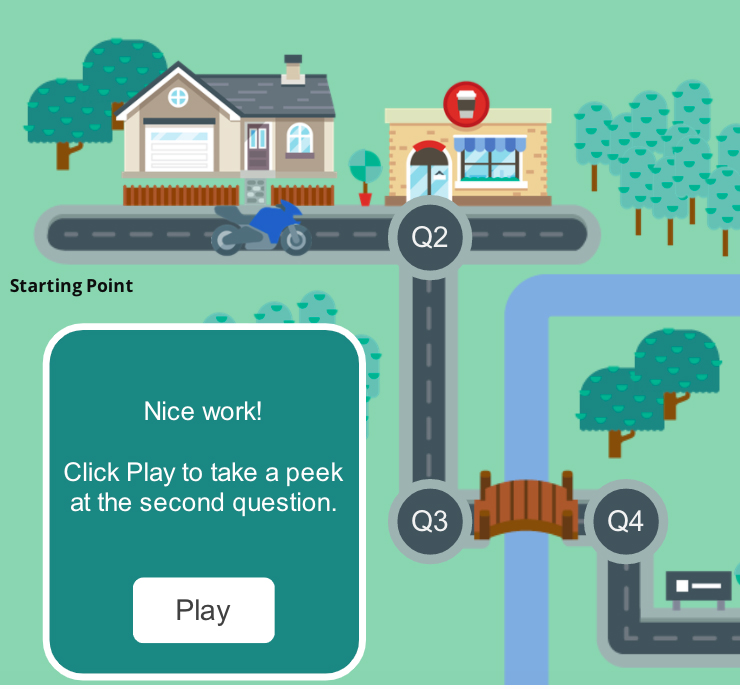
Overall the course not only gives both a broad background in statistical thinking and the analysis of data but also provides a stepping stone into areas where further expertise may be required. It is extremely broad with little coverage of more sophisticated statistical techniques, but it does require learners to be able to interpret statistical results. An example is the use of work by Bailey et al. [24] where men aged 18–24 years in Kenya were randomly assigned to be circumcised or not and then tested for HIV in the following 1, 3, 6, 12, 18, and 24 months. This is effectively a Randomised Control Cohort Trial (RCCT) but learners in this course don’t need to know the details of the technique, only being required to interpret what the statistically significant reduction in the risk of acquiring an HIV infection of between 22%–72% (95% confidence interval) for the circumcised group compared to the non-circumcised group meant. Interpretation of data in general is another area that has greater emphasis in this learning programme than the other two, with many exercises on interpreting data in written form, in tables and in graphics, such as in the infographic shown in Fig. 5. The e-learning environment also allows for direct linkage to other courses including those run by UN agencies (such as the United Nations Statistics Division’s Compiling national metadata for Sustainable Development Goalshttps://www.unsdglearn.org/courses/compiling-national-metadata-for-sustainable-development-goals/ and UNITAR’s Introduction to data governance for monitoring the SDGshttps://www.unitar.org/event/full-catalog/introduction-data-governance-monitoring-sdgs. It also enables innovative ways of teaching (for example, using virtual flip-charts and step-by-step instruction guides) and fun ways of structuring exercises (as shown in the motorcycle ‘game’ in Fig. 6).
Figure 6.
Motorcycle game leading learners through a series of questions about tables.
One success of this course is that it does help learners know what type of data is best for their particular problem, where data can be sourced, how to determine the quality of data and what can be learnt from the data (using statistical tools to understand and explore the impacts of chance and variation, and explore patterns and trends in the data). In addition, it challenges learners to look at the relationship between data outputs and long-term outcomes. For example, the output of the study on the relationship between circumcision and HIV infection in Kenyan discussed earlier is a reduction in Kenyan HIV infection, but the desired long-term outcome for the SDG would be a global reduction in HIV infection.
According to the course website, by mid-March 2021, almost 800 learners had enrolled in the course. They were from over 50 countries with larger numbers from Africa (in particular Nigeria and Ghana) and Asia (especially India). However, there was at least one learner from most European, Middle Eastern and South American countries as well as some from Canada, the US and the Pacific.
Although the course was originally intended to be completed before the end of 2010 one of the possible impacts of the COVID-19 pandemic has been that by mid-March 2021 only the first three modules had been posted online. However, the course remains open to learners.
3.Common threads
3.1Educational philosophy
One common classification of educational pedagogy gives five types: constructivist, collaborative, integrative, reflective or inquiry based [25, 26]. Of these, the most applicable to all three of these learning programmes is integrative (where some theory is given, practical skills are developed, and reflection and student inquiry involving individual exploration of the material is encouraged). All the programmes are mastery based and student-centred [27] attempting to set the learning in the real world of the learner by using up-to-date examples that are from their own experience.
There are also some distinct differences that arise naturally from the different teaching modes (face-to-face versus online). For example: the Prices and Populations web Apps use the technique of filling in missing values in structure learning exercises as shown in Fig. 2; included in the Graphs web Apps are instructions and data so that common simple graphs can be reconstructed using the most common spreadsheet programme available to learners (Excel); and in the UNITAR course there are a variety of exercise forms used including free response answers (without feedback), and several kinds of multi-choice (from traditional through to ‘drag and drop’ alternatives as shown in Fig. 9 below). Of necessity, much of the timeframe of learning was set by the teachers in the Certificate of Official Statistics but in both the web apps and the UNITAR programme not only is learning self-paced but learners can move around freely choosing for themselves the order in which they learn.
All three learning programmes contain sections on the policy uses of specific data as well as giving underlying concepts and simple calculations and specifically target learners that do not have a high level of mathematics. Each programme attempts to capture the following essence of statistics: sourcing and evaluating the quality of data, understanding and exploring chance and variation in data, and exploring patterns and trends in data, by emphasising underlying concepts. They could all be described as data focussed, searching for and telling the story that lies within the data, using the following process:
• What is the problem being investigated? (e.g. In the UNITAR course are we monitoring progress towards an SDG or designing an intervention aiming at improving some outcome?).
• What data is available, what quality is the data and how applicable is it to our problem?
• What can we learn from the data (using statistical tools to understand and explore chance and variation and examine patterns and trends in the data)?
• How can we present the story our data tells in the most appropriate way for our audience?
The underlying philosophy in each learning programme is to give learners just enough basic statistics so that they can interpret and re-present information relevant to their situation. The UNITAR course in particular emphasises data interpretation, data presentation and data communication.
3.2Resources and reuse of material
Official statistics, including data and reports from government agencies, lie at the heart of all three of these programmes, being the focus of the first two and a major source of data for indicators of progress towards the Sustainable Development Goals, in particular the social and economic ones. The second major resource is research publications from academic and other accredited research bodies.
Another common thread is that all three reuse teaching material from a wide variety of sources. The three programmes also build on one another, each using and expanding on earlier material, and there is deliberate re-use of good material from previous courses, other academics or textbooks. For example, in the UNITAR course a number of textbooks are referred to including Harraway, 1993 [28], Arygous, 2010 [29] and Moore and McCabe, 2006 [30]. Each programme also provides direct links to material and software available on the internet. As stated above the written workbooks given to learners in the Certificate of Official Statistics contained a number of links (url) to online statistical calculators, simulation and teaching packages. Of course, the online environment of the other two programmes enables much greater use of internet linkages, and both the Khan Academy https://www.khanacademy.org/math/ap-statistics/sampling-distribution-ap/sampling-distribution-mean/v/sampling-distribution-of-the-sample-mean and the free New Zealand statistics software, iNZSight for Data Analysis https://inzight.nz/install/ are used in the UNITAR course. Much of the material in Module 3 – Communicating with data, Section c. Telling a story with graphs and Section d. Telling a story with maps is sourced from either the Graphs web app, or the 2009 PARIS21 and Statistics Norway User-friendly presentation of statistics [31].
Other examples of reuse include material from the aforementioned Honours course in official statistics and material on demography and price indices is included in all three programmes, with acknowledgements to the original creators. The ‘What’s wrong with smoking? case study/story included in the UNITAR course was originally created by Forbes for post-graduate Public Policy courses in the School of Government at Victoria University of Wellington to demonstrate how different types of statistics (from preliminary research results through to a specific question in the national census) have informed different types of Government policy (education, regulation, intervention or legislation). Smoking statistics are now, together with administrative data on tobacco consumption, used for ongoing monitoring of levels of smoking and targeting of interventions. That work is expanded upon with the use of Richard Doll’s “The Man who stopped smoking” YouTube video in Module 3 as exercise material. Some of the visualisations mentioned below have been reused from Hidalgo, 2010 [32] and the diagram and discussion of policy uses in the UNITAR course of the application of Pennsylvania State University’s GeoVista tool [33] to 2008 Census data for Auckland City, New Zealand was previously used in the above Honours course and a Masters of Public Policy course at Victoria University of Wellington [34]. This tool allows data to be simultaneously displayed in a variety of both graphs and maps. Clicking on a point of interest (such as an outlier) results in it being highlighted on all the visualisations.
3.3Use of visual tools
Both data visualisations and videos are used in all the programmes but were limited to being demonstrated only within the classroom setting in the Certificate of Official Statistics. The e-learning environments of both the web aps and the UNITAR programme enabled them to be integrated into the teaching.
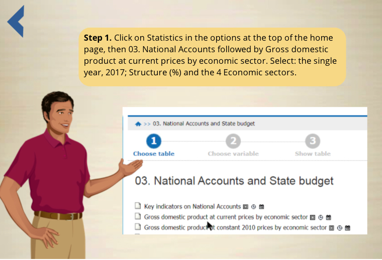
Many types of videos are used throughout the UNITAR course: as teaching guidelines (as in Fig. 7. That is an optional step-by-step guide that learners can use to show how to access GDP data from the General Statistics Office of Vietnam and use it to construct a pie graph); as motivational case studies/stories and as examples for exercises.
Figure 7.
Video Guide on accessing and using official statistics.
Many of the case studies/stories used in the UNITAR course are videos. Two of these: Estimating the global burden of disease based on World Health Data investigating World Rotavirus incidence (relevant to SDG3: Good Health and Well-being) and Maui’s Dolphin: Uncovering a new subspecies (relevant to SDG14: Life below water) came from a set of 20 videos developed by Harraway that are freely available on the University of Otago Department of Mathematics and Statistics web site https://www.stats.otago.ac.nz/videos/statistics/. Each of these video recordings is from an expert in the field explaining how the data was collected and used, placing an emphasis on the interpretation of graphs, tables and confidence intervals without a detailed explanation of any statistical analyses used. However, Excel datasets, are also included for learners to use to replicate analyses if they wish. A link to the spreadsheet associated with the Rotavirus video is included in the UNITAR course. Over the last decade over 100,000 unique visits have been made to these videos and several of the other videos are also relevant for SDG 3: Good Health and Well Being. Three are specifically about official statistics (Property Sales using Census data, Natural Resource Accounts and Economic Time Series Analysis).
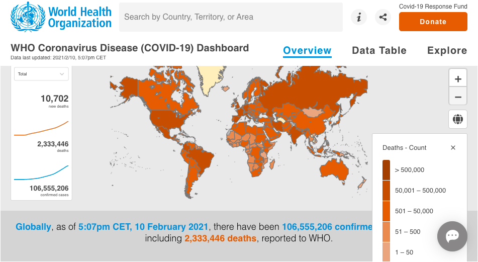
Data presentation in both words and tables is covered in the Certificate and the UNITAR course. In the latter, much of the material for the written presentation of data is based on the 2009 PARIS21 and Statistics Norway Guide, ‘User-friendly presentation of statistics’ [31] and most of the tables are extracted from national statistics offices. All three programmes cite William Playfair’s famous 1786 quote, ‘Information that is imperfectly acquired, is generally as imperfectly retained, and a person who has carefully investigated a printed table finds, when done, that he has only a very faint and partial idea of what has been read, and that, like a figure imprinted on sand, is soon totally erased and defaced’ p3 [35]. Learners are told how graphics can be used to summarise and make large sets of data understandable and to show visually insights and comparisons that may have stayed hidden otherwise. Although learners are expected to be able to create and interpret simple commonly used graphs (pie charts, bar graphs, histograms, line graphs, etc.) the emphasis in all the programmes is on the interpretation of graphs and knowing the difference between good and bad graphics. However, they are also exposed to new graphical forms. Even in the Certificate, teachers used dynamic or interactive graphics to display concepts whenever possible. Dynamic population pyramids were used in all the programmes to enable learners to explore for themselves the impact and policy implications of high or low fertility, mortality or migration on population structures over time. The Price Kaleidoscope discussed above and the OECD Better Life Index are examples of interactive graphs used. Many forms of maps are used in all the courses as well, including cartograms, shaded and dot maps and this is extended to more recent integrated maps and graphs with the WHO Coronavirus Disease (COVID-19) Dashboard, https://covid19.who.int/, shown in Fig. 8 given as an example. The map shown is followed by time series on the Global number of confirmed cases and deaths. Clicking on any country will display that country’s most recent data together with its related time series.
Figure 8.
WHO Coronavirus Disease (COVID-19) Dashboard.
Many national statistics offices are at the forefront of the creation of new dynamic and interactive graphs and maps that make it easier for readers to interpret the story underlying their data, and the use of infographics (as in Fig. 5) in official releases is becoming commonplace.
More use could be made of visual tools to demonstrate statistical concepts. Three-dimensional scatterplots have already been used to teach the concept of interaction in simple regression [36] but perhaps the next challenge for statistics educators is to develop some visual tools for teaching basic statistical concepts such as the mean as the centre of gravity of a set of data or to show percentage change visually as a proportion of the original value.
3.4Collaborative teams
The development of each of these programmes was the result of the establishment of a team of collaborative experts. For the Certificate of Official Statistics, the members were primarily statistics educators but for the web apps a webmaster and an IT specialist were also included and for the UNITAR course there was a specialist course designer as well as an international spread of team members. Given the specialist technology skills needed it is unlikely that any e-learning courses could be developed without such a team approach and the COVID-19 pandemic has shown us all that while e-learning may never replace the in-person teacher it is an extremely powerful teaching tool with the ability to cross national boundaries and facilitate large numbers of learners.
4.Challenges and concluding comments
There are three major challenges that are common to each of the learning programmes: internationalisation; keeping material up-to-date and providing appropriate assessment.
4.1Internationalisation
The Certificate of Official Statistics was only intended to be taught within New Zealand and the Pacific Islands. Internationalisation was done by including country specific examples both within the teaching and for assessment, as described above. It was hoped that the web apps would have a wider international appeal but again many of the examples used come from Pacific countries. The UNITAR programme is by far the most successful in delivering an international perspective with the authors extending the number of countries data was sourced from in the draft material and UNITAR staff inserting further examples from a wide range of countries. This is the result of having a diverse development team comprising persons from a number of different countries and continents. Even so, further content from Asian and South American countries could be added.
Figure 9.
Bar Graph Exercise from the UNITAR course.
4.2Keeping material up to date
Teaching material, whether in paper or electronic form, needs to be continually updated to ensure its relevancy to learners but this is always a challenge when learning programmes are funded for only a limited period. Some textbook exercises for teaching basic statistics have stood the test of time as discussed above but it seems that the more current a motivational case study is the less likely it is to remain up-to-date. Will data on the 2019 Samoan Measles Epidemic or even COVID-19 have more than historical interest in another decade! Academic research reports tend to be relatively easy to access online and have a long electronic lifetime but the same cannot be said of other information. For example, video news reports can have a very short lifespan meaning that permission must be obtained to create copies for e-learning courses that do not infringe copyright. This was the case with the New Zealand television news article “Why Measure Prices” that was used in the Prices web app. The video still plays as it is hosted within the web app but the url leading to the original clip no longer functions. In the longer term, educators may be restricted to only using videos available on platforms such as YouTube. Many national statistics offices also regularly update their websites and can delete or change access to data features. It was hoped that by directing learners to the main webpage of a national statistics office that they would be able to explore and find the feature mentioned but at least one office, Statistics New Zealand, that still has electronic access to a dynamic population pyramid https://www.stats.govt.nz/tools/interactive-population-pyramid-for-new-zealand then states that it is no longer available. Cost considerations always override the needs of users, including teachers and learners.
4.3Assessment
Regardless of the mode being used, assessment design is a specialist area with the prime underlying principles being validity (accurately measure the learning that it is intended to measure), reliability (provide consistent results from repeated or equivalent assessments) and authenticity (the learner’s own work) [36]. These qualities are extremely important for ‘high-stakes’ learning (for example, secondary and tertiary qualifications) but it is the authors’ view that also, for both formative and summative assessments, the assessment format should match the teaching format (e.g. paper based or online), assumptions should not be made about ‘common knowledge’ particularly for second language learners, the assessment should be open to alternative solutions or ways of answering and it should give learners the chance to demonstrate what they know and not test what they don’t know. It is hard to design real world assessments that are completely without cultural basis (we all have to learn not to teach as we were taught). Particularly in an electronic environment, it is difficult to ensure that the right skill is being assessed. Figure 9 is an exercise from the third module in the UNITAR course.
The skill being tested is knowing which type of bar graph to use in a given situation but, given the formal English language used, it is likely that English language skills are also being tested, especially for English as Second Language learners. We are all still learning how to assess well and fairly. In particular, when using electronic assessments, we have to be precise about what it is that learners are expected to do and also aware that synonyms may not always be recognised as correct answers. For example, in mathematics the terms larger and smaller, higher and lower, bigger and tinier may all simultaneously be correct when comparing two numbers but may not all be recognised by a computer programme.
The learning programmes all have different strengths. The Certificate of Official Statistics was ideal for teaching official statistics in small pacific island nations where person to person contact is important and technology is sometimes limited. However, it also had the highest cost per learner involving at least eight different teacher and intensive resource development for the less than 300 participants over the seven years it was offered. The web apps provide learners with an opportunity to explore both the policy uses and the techniques associated with an aspect of official statistics in greater depth than the other programmes. As all the set-up costs for their development were donated this is possibly the most cost effective programme, each web app reaching between 10–15,000 learners over a three-and-a-half-year period. However, what is not known is how the web apps were used and what learning was achieved. The successes of the UNITAR course are that it has been targeted specifically at users of the United Nations Sustainable Development Goals and that it has been able to reach a truly international audience, with almost 800 learners accessing it in the first year. Both the web apps and the UNITAR course can cater for large numbers of learners, including reasonable numbers simultaneously, and their major cost was in the initial development of teaching material and design of the e-learning programme. However, if they are to be kept up-to-date and relevant there will be further ongoing costs.
The three learning programmes demonstrate a progression from a fee paying intensive and country specific paper-based course in official statistics, through to freely accessible web apps giving a more in-depth extension in specific areas of official statistics, then to a free broad-based e-learning course targeted at users of the United Nations’ Sustainable Development Goals. The programmes have key elements in common: each used diverse cooperative teams in their development, centred the taught curriculum on the needs of the learners, were based on statistical thinking theory (focusing on conceptual understanding) and reused as much material (whether from other learning programmes or from the internet) as possible. The willingness of academics and other educators to make their material freely available, whether by direct transfer or making it publicly available on the internet, has enabled this.
The authors have a shared vision of a future where statistical education is freely available to learners, at any time and in any place, and both the web apps and the UNITAR programme make real steps in this direction. However, there is still further work to be done, for example on developing visual tools that help learners gain a conceptual understanding of simple statistical measures. There are also always some questions that arise, and areas for improvement that could be addressed in each learning situation.
Two common issues that arose here were the role of assessment and the longevity and currency of each of the programmes. While it seems appropriate to have formative assessment (exercises designed to enhance teaching and learning) taking place during a course what is the role of summative assessment and/or accreditation in the longer term? It also seems that without an ongoing investment in course maintenance and up-dating of material all teaching programmes, whether paper based or e-learning, will have a limited life span.
References
[1] | Forbes, S. ((2010) ). Data Visualisation: A new statistical literacy tool for statistical offices. ASC 2010 Statistics in the West: Understanding our World? Proceedings of the Seventh Australian Conference on Teaching Statistics (OZCOTS 2010), Eds MacGillivray, H., Phillips, B. Fremantle, Australia. pp. 1-6. http://www.ozsnets.com/ozcots2010. |
[2] | Forbes, S., Ralphs, M., Goodyear, R., Pihama N. ((2011) ). Recent ways of visualising official statistics. The Information and Decision Support Centre Working Paper Series. The Egyptian Cabinet – IDSC, 2011, Cairo, 35pp. http://www.idsc.gov.eg/Publications/PublicationDetails.aspx?typeid=10&id=273. |
[3] | Gluckman, P. ((2011) ). Towards better use of evidence in policy formation: a discussion paper. Office of the prime minister’s science advisory committee. New Zealand Government. p15. |
[4] | Forbes, S. ((2011) ). Collaboration and cooperation: the key to reaching out? Proceedings of the 2011 IASE Satellite Conference – Statistics Education and Outreach. |
[5] | Harraway, J.A., Forbes, S.D. ((2013) ). Partnership between national statistics offices and academics to increase official statistical literary. Statistical Journal of the IAOS. 29: , 31-40. IOS press. |
[6] | Ben-Zvi, D., Garfield, J. (Eds.) ((2004) ). The challenge of developing statistical literacy, reasoning, and thinking, Kluwer Academic Publishers, The Netherlands. |
[7] | Forbes, S., Pfannkuch, M. ((2009) ). Developing Statistical Thinking: Teaching and Learning, in Averill, R., Harvey, R. (Eds.) Teaching Secondary School Mathematics and Statistics: Evidence-based practice, Wellington, NZCER Press, 2, pp. 93-127. |
[8] | Forbes, S. ((2009) ). Creation and evaluation of a workplace based Certificate in Official Statistics for government policy makers. In Proceedings of the International Association of Statistics Education (IASE) satellite Conference, Next steps in statistics education, 2009. Durban, South Africa. Available at http://iase-web.org/documents/papers/sat2009/9_2.pdf. |
[9] | Forbes, S., Bucknall, P., Pihama, N. ((2010) ). Helping make government policy analysts statistically literate, Refereed invited paper presented at the 8th International Conference On Teaching Statistics (ICOTS8) July 2010 and published in the proceedings Data and Context in Statistics Education: Towards an evidence based society, edited by Chris Reading (Ljubljana, Slovenia, Statistical Society of Slovenia, 2009. http://www.stat.auckland.ac.nz/∼iase/publications.php?show=icots8. |
[10] | National Qualifications Framework Project Team. ((2005) ). The New Zealand National Qualifications Framework, Revised paper. Wellington, New Zealand: New Zealand Qualifications Authority. |
[11] | Forbes, S., Keegan, A. ((2016) ). Helping raise the official statistics capability of government employees. Journal of Official Statistics. 32: (Issue 4), 811-826, ISSN (Online) 2001-7367. doi: 10.1515/jos-2016-0042, November 2016. |
[12] | Stirling, D. ((2010) ). Improving lectures with CAST Applets. Proceedings of the 8th International Conference on Teaching Statistics, ICOTS 8, online (6 pages) https://iase-web.org/documents/papers/icots8/ICOTS8_9G3_STIRLING.pdf?1402524972 Accessed 12/10/2012. |
[13] | Vanuatu National Statistics Office ((2011) ). Vanuatu Household Economics Survey 2010 https://mjcs.gov.vu/images/research_database/2010_HIES_REPORT.pdf. |
[14] | UNICEF Pacific and Vanuatu National Statistics Office ((2014) ). Children, Women and Men with Disabilities in Vanuatu: What do the data say?, UNICEF, Suva, 2014. |
[15] | Forbes, S., Keegan, A. ((2014) ). Bringing the workplace into a national certificate in Official Statistics. Proceedings of the 9th International Conference on teaching Statistics (ICOTS9). Online (6 pages). http://icots.info/9/proceedings/pdfs/ICOTS9_5B3_FORBES.pdf. |
[16] | Statistics New Zealand ((2017) ). STATS NZ PACIFIC CERTIFICATE IN OFFICIAL STATISTICS (BUILDING OFFICIAL STATISTICS USER CAPABILITY IN THE PACIFIC). Paper presented to “Statistics for Development Division (SDD) 5th Regional Conference of Heads of Planning and Statistics (HOPS)” (Noumea, New Caledonia, 14–16 November 2017) https://spccfpstore1.blob.core.windows.net/digitallibrary-docs/files/9e/9e3d32a5a058877b796782f2e9cf8858.pdf?sv=2015-12-11&sr=b&sig=R6STZUtswVqJRIxNq%2BkIWzeKxMyl1QGJiTXIm0yM9GM%3D&se=2021-02-28T23%3A50%3A02Z&sp=r&rscc=public%2C%20max-age%3D864000%2C%20max-stale%3D86400&rsct=application%2Fpdf&rscd=inline%3B%20filename%3D%22Day_1_IP1.5B_2017_HOPS5_Stats_NZ_Pacific_certificate_in_official_statistics.pdf%22 Accessed 25/8/20. |
[17] | Statistics New Zealand ((2020) ). Certificate in Official Statistics – no longer offered. http://archive.stats.govt.nz/about_us/who-we-are/home-statisphere/seminars-training-forums/public-sector-decision-making.aspx#gsc.tab=0 Accessed 25/8/20. |
[18] | Forbes, S., Harraway, J., Davies, N., Martignetti, D. ((2014) ). Bringing e-learning into a National Certificate of Official Statistics. Paper presented to the International Association of Official Statistics, Da Nang, Vietnam. |
[19] | Rosling, H. ((2010) ). YouTube Video. “200 Countries, 200 Years, 4 minutes – The Joy of Stats 26/11/2010. BBC 4. https://www.youtube.com/watch?v=jbkSRLYSojo. |
[20] | Forbes, S., Harraway, J., Hohmann-Marriott, B. ((2018) ). USING WEB APPS IN THE CLASSROOM Paper presented to the 10th International Conference on Teaching Statistics (ICOTS 10) https://iase-web.org/icots/10/proceedings/pdfs/ICOTS10_1H3.pdf?1531364187[12]. |
[21] | Banerjee, A.V., Duflo, E. ((2011) ). Poor economics: A radical rethinking of the way to fight global poverty, Penguin. |
[22] | Forbes, S. ((2010) ). Getting better value from official statistics. The Information and Decision Support Centre Working Paper Series, No. 3. Information and Decision Support Centre. Cairo, Egypt, June 2010. 26pp. http://www.idsc.gov.eg/Publications/PublicationDetails.aspx?typeid=10&id=192. |
[23] | Pemberton, C., Joseph, J. ((2018) ). National Women’s Health Survey for Trinidad and Tobago. doi: 10.18235/0001006 Copyright © 2018 Inter-American Development Bank. Publication Code: IDB-MG-581. |
[24] | Bailey, R.C., et al. ((2007) ). Male circumcision for HIV prevention in young men in Kisumu, Kenya: a randomised controlled trial. The Lancet. 369: (Issue 9562), 2007, 24 February-2 March, Pages 643-656. doi: 10.1016/S0140-6736(07)60312-2, Online https://www.ncbi.nlm.n0ih.gov/pubmed/1732131 Accessed 12/11/20. |
[25] | Relleve, C.C.O. ((2010) ). (Powerpoint slides) VALUES EDUCATION PEDAGOGY FOR Z LEARNERS City Schools Division of Dasmarinas, Philippines. https://www.dlsud.edu.ph/coed/ncvre/docs/2019/DrChesterRelleve-PEDAGOGYGENZ.pdf Accessed 30-1-21. |
[26] | Kumari, V. ((2014) ). Constructivist Approach to Teacher Education: An Integrative Model for Reflective Teaching, Journal on Educational Psychology, v7 n4 p31-40 Feb-Apr 2014. |
[27] | Peterson, A. Combinations of pedagogies, innovative and established in Understanding innovative pedagogies: key themes to analyse new approaches to teaching and learning OECD Education Working Paper No. 172 pp(33-60) EDU/WKP(2018)8 OECD http://www.oecd.org/officialdocuments/publicdisplaydocumentpdf/?cote=EDU/WKP(2018)8&docLanguage=En Accessed 2-2-21. |
[28] | Harraway, J. ((1993) ). Introductory Statistical Methods and the Analysis of Variance. 2nd Edition. University of Otago Press. |
[29] | Arygous, G. (Ed.) ((2009) ). Evidence for policy and decision-making: a practical guide. University of New South Wales Press. |
[30] | Moore and McCabe ((2006) ). Introduction to the Practice of Statistics, Third edition, W.H. Freeman & Co Ltd 2000; ISBN 10 0716741350, ISBN 13 9780716741350. |
[31] | PARIS21 and Statistics Norway 2009 User-friendly presentation of Statistics Design and layout: Siri Boquist and Marit Vågdal, Statistics Norway ISBN 978-82-537-7675-0 (https://www.ssb.no/en/omssb/samarbeid/internasjonalt-utviklingssamarbeid/a-handbook-on-dissemination-of-statistics). |
[32] | Hidalgo, C.A. ((2010) ). ‘Graphical Statistical Methods for the Representation of the Human Development Index and its Components’ United Nations Development Programme, Human Development Reports, Research Paper 2010/39. United Nations, New York. |
[33] | GeoVISTA Center. ((2012) ). Department of Geography, The Pennsylvania State University, University Park, PA, http://www.geovista.psu.edu/grants/cdcesda. |
[34] | Forbes, S.D. ((2012) ). Data visualisation: a motivational and teaching tool in official statistics. International Journal of Technology in Statistics Education. 6: (1). http://escholarship.org/uc/uclastat_cts_tise. |
[35] | Playfair, W. ((1786) ). The Commercial and Political Atlas, representing, by means of stained copper-plate charts, the exports, imports, and general trade of England, at a single view. To which are added, Charts of the revenue and debts of Ireland, done in the same manner by James Corry. Debrett; Robinson; and Sewell, London. |
[36] | New Zealand Qualifications Authority (under review) Learning and Assessment: A guide to assessment for the National Qualifications Framework. https://www.nzqa.govt.nz/providers-partners/assessment-and-moderation-of-standards/assessment-of-standards/generic-resources/. |
Appendices
Appendix
One of the authors, John Harraway, is an Associate Professor with over 50-years experience teaching in the Department of Mathematics and Statistics at the University of Otago in New Zealand and the other, Sharleen Forbes, held a joint position as Adjunct Professor of Official Statistics in the School of Government at Victoria University of Wellington and General Manager, Statistics Education at Statistics New Zealand until retirement in 2014. Her doctoral speciality was assessment in statistics education and since 2015 she has been an advisor on assessment in senior school education for the New Zealand Qualifications Authority (NZQA) and occasional consultant to the Ministry of Education.