
Social network analysis and community detection on spread of COVID-19
Abstract
This paper explains the epidemic spread using social network analysis, based on data from the first three months of the 2020 COVID-19 outbreak across the world and in Canada. A network is defined and visualization is used to understand the spread of coronavirus among countries and the impact of other countries on the spread of coronavirus in Canada. The degree centrality is used to identify the main influencing countries. Exponential Random Graph Models (ERGM) are used to identify the processes that influence link creation between countries. The community detection is done using Infomap, Label propagation, Spinglass, and Louvain algorithms. Finally, we assess the community detection performance of the algorithms using adjusted rand index and normalized mutual information score.
1.Introduction
On March 11, 2020, the World Health Organization (WHO) declared the novel coronavirus (COVID-19) outbreak as a global pandemic, which started to spread from Hubei, China. Human coronaviruses cause infections of the nose, throat, and lungs. It is most commonly spread from an infected person through close contacts and symptoms may take up to 14 days to appear after exposure to COVID-19. It started to spread across the world as the patients who did not start to show any symptoms have traveled across countries. Finally, countries had to lock down to stop the spread. By the end of April, 2020, the virus has spread in more than 150 countries.
Historically, human behavior was responsible for the spread of many diseases. To stop the spread of bubonic plague, which is called as the black death, citizens of the Yorkshire village of Eyam in England had to voluntarily quarantine themselves (Scott et al., 2001). More recently, during the influenza pandemic, people stayed away from crowded places (Crosby, 1990). In the early twenty-first century, the usage of face masks became increased, and traveling behaviors were changed, due to severe acute respiratory syndrome broke out (Lau et al., 2005).
Social network analysis has been used to describe the disease transmission during epidemics. Many empirical studies in humans (Rohani et al., 2010; Stehlé et al., 2011) and animals (Craft, 2015; White et al., 2017) have found the importance of social network structure on epidemiology. During the 2009 H1N1v influenza epidemic Eames et al. (2012) found that changes in contact patterns explain changes in disease incidence.
Exponential random graph models (ERGMs) are edge-based models that model the probability or weight of each edge as a function of network structure and the characteristics of individuals (nodes) within the network in network analysis (Van der Pol, 2019). ERGMs can be a powerful tool in understanding disease epidemiology. In 2018 Nele and others (Goeyvaerts et al., 2018) used ERGM for infectious disease modeling within household members and found that fathers are less likely to be infected. From the research work of Chris, David and David R. (Groendyke et al., 2012) were able to show that the ERGM network model better fits the epidemic data than a Bernoulli network model previously used. Nowadays many researches are going on to understand the community structure using community detection (Chakraborty et al., 2016; Rao et al., 2016) as it is important to understand the nature of the spread, specially during an epidemic.
In this paper, we perform a social network analysis to analyze the data from the 2020 outbreak of the coronavirus in order to understand the spread and community structure of COVID-19 across the world and the impact of other countries on the spread of COVID-19 in Canada.
2.Materials and methods
2.1Data sets
At the beginning of this study the main challenge was finding data sets which contain information about travel history, as it was the main attribute to create links between countries. The data used in this research were obtained from two GitHub repositories. The data sets regarding the spread of COVID-19 across the world and in Canada were downloaded from the links given in Rajkumar (2020) and Berry and Soucy (2020). The first data set contains information about patients across the world starting from 22 Jan 2020 as multiple updated versions. This data set, which is a matrix of 13174 (rows) by 44 (columns), is extracted from the Johns Hopkins University’s dashboard using the methodology of Xu et al. (2020) and a sample of data set is given in Table 1. The second data set contains information about patients in Canada starting from 25 Jan 2020. The “COVID-19 Canada Open Data Working Group” Berry and Soucy (2020) are collecting these data and all the details about the sources are included in the technical report in Berry and Soucy (2020). For this study we have used January to March and January to April data points of first and second data sets respectively. Details about these countries were obtained from the worldometers.info website (Worldometer COVID-19 Data et al., 2020).
Table 1
Sample of world data set
| ID | Age | Sex | City |
| travel_history_dates | travel_history_location |
|
|---|---|---|---|---|---|---|---|
| 1 | 30 | Male | Chaohu City, Hefei City |
| 17.01.2020 | Wuhan |
|
| 2 | 47 | Male | Baohe District, Hefei City |
| 10.01.2020 | Wuhan |
|
| 3 | 49 | Male | High-Tech Zone, Hefei City |
| 10.01.2020 | Wuhan |
|
| 4 | 47 | Female | High-Tech Zone, Hefei City |
| 07.01.2020 | Wuhan |
|
2.2Data cleaning
Here some patients’ records did not have any travel information and some did not report the country they traveled. So they were considered as locally infected cases. Also according to travel history some people had visited more than one country. So multiple rows were added for the same patient by splitting the travel history variable. In some records, the values of “travel_history_location” were cities, and we had to replace them with the countries of those cities. Finally, two new data sets were created, where “Travel location” was considered as the “Source”, “Country” was considered as the “Target” and the number of patients who traveled between these locations were considered as “Weight” variable. In Canada data set, provinces were considered separately. Hence in that “Province” was considered as the “Target” variable. These new data sets were used to create social networks. Tables 2 and 3 show samples of those newly generated data sets.
Table 2
Sample of new data from data set 1 (across the world)
| Source | Target | Weight |
|---|---|---|
| Australia | Australia | 1 |
| Canada | Canada | 4 |
| China | Australia | 13 |
| China | Belgium | 1 |
| China | Cambodia | 1 |
| China | Canada | 5 |
Table 3
Sample of new data from data set 2 (Canada)
| Source | Target | Weight |
|---|---|---|
| Alberta | Alberta | 16 |
| Cruise | Alberta | 4 |
| Netherlands | Alberta | 1 |
| Turkey | Alberta | 1 |
| Ukraine | Alberta | 1 |
| United States | Alberta | 3 |
2.3Social network visualization
In these networks, nodes represent each country and province of Canada, and a connection (link) between nodes was created when a person traveled from one location to another. The node size is indicated by “in-degree” and “out-degree” centralities. In-degree means number of inbound links toward a node, while out-degree means number of outbound links from a node (Hunter et al., 2008). The degree centrality means the number of edges connected to the nodes without considering the arrowhead.
2.4ERGM model creation
Exponential Random Graph Models (ERGM) are used to identify the variables that influence link creation between countries. The basic principle underlying the method is the comparison of an observed network to Exponential Random Graphs.
(1)
Here
The ERGM models were fitted using network and node attributes. For each data sets, four models were considered. The first model is the baseline one with only the edges. The second and third models use network and node attributes, respectively. The final model uses both node and network attributes. Finally, these four models were compared using the Akaike Information Criterion (AIC) and Bayesian Information Criterion (BIC). The model with the smallest AIC and BIC values is considered as the best model. The models were also evaluated using “Goodness of fit”, and “MCMC diagnostics” (Hunter et al., 2008).
2.5Community detection
In social network analysis, community is defined as a subset of nodes within the graph that have a higher probability of being connected to each other than to the rest of the network. To understand the nature of the spread of COVID-19, communities were identified using community detection algorithms. Since the generated networks of this study are directed, the following community detection algorithms for directed graphs are used; Louvain algorithm, Infomap algorithm, Label propagation algorithm, and Spinglass algorithm.
2.5.1Modularity
Most of the algorithms are developed based on Modularity. Because of that, understanding the meaning of modularity is important. It measures the strength of the division of a network into groups. Modularity is defined as,
(2)
Here
(3)
The main difference between these two modularities is, when calculating directed modularity in-degrees and out-degrees were considered, but when calculating in undirected modularity, only the degree centrality is considered.
2.5.2Louvain algorithm
The Louvain method (Blondel et al., 2008) is an unsupervised algorithm for detecting communities in networks. This has 2 phases; Modularity Optimization and Community Aggregation. These two phases are executing until there are no more changes in the network, and the maximum modularity is achieved. At the Modularity Optimization phase, each node is assigned to its own community. Then node
(4)
Here
In the community aggregation step, nodes in the same community consider as nodes, and builds a new network where nodes are the communities from the previous phase. Once the new network is created, the second phase has ended, and the first phase can be re-applied to the new network. These phases are carried out until there is no more change in the community, and a maximum of modularity is achieved.
2.5.3Infomap algorithm
This algorithm repeats the two described phases in Louvain until an objective function is optimized (Hu & Liu, 2015). Instead of modularity, this algorithm optimizes the ’Map equation’. Louvain algorithm finds community structure by minimizing the description length of a random walker’s movements on a network. This random walker randomly moves between each node of the network. The random walker would like to move through the highly weighted edges. Hence, the weights of the connections within the community are greater than the weights of the connections between nodes of different communities.
The definition of the map equation is based on Shannon’s Source Coding Theorem, from the field of Information Theory (Rosvall et al., 2009). Here each module has a “module codebook” and these module codebooks have “codewords” for the nodes within each module, which are derived from the node visit/exit frequencies of the random walker. The “index codebook” has codewords for the modules, which are derived from the module switch rates of the random walker. The map equation shows that the average length of the code (a step of the random walker) is equal to the average length of codewords from the index codebook and the module codebooks weighted by their rates of use.
(5)
A network with
2.5.4Label propagation algorithm
The Label Propagation algorithm (LPA) is one of the fast semi-supervised algorithms for finding communities in a graph, and the algorithm is based on the assumption that nodes near each other are likely to have similar class labels. The algorithm works as follows; Every node is initialized with a unique community label (an identifier), and these labels propagate through the network. At the propagation step each node update the label based on the labels of their neighbor’s. When there are ties, labels are selected uniformly and randomly. This algorithm converges when each node has the majority label of its neighbors. And this stops if either convergence or the use defined maximum number of iterations is achieved.
In LPA, the influence of a node’s label other nodes is determined by their respective closeness (Raghavan et al., 2007) and the closeness between nodes is measured by Eq. (6). Here the euclidean distance between node i and j is showed by
(6)
(7)
2.5.5Spinglass algorithm
Spinglass method minimizes the Hamiltonian of the network (Reichardt & Bornholdt, 2006). Spinglass has the following four requirements, and they are considered to develop communities.
1. Reward internal edges between nodes of the same group (in the same spin state).
2. Penalize missing edges between nodes in the same group.
3. Penalize existing edges between different groups (nodes in different spin state).
4. Reward non-links between different groups.
Hamiltonian for spinglass is given by the following equation. Here
(8)
3.Results
3.1Analysis of the world data set
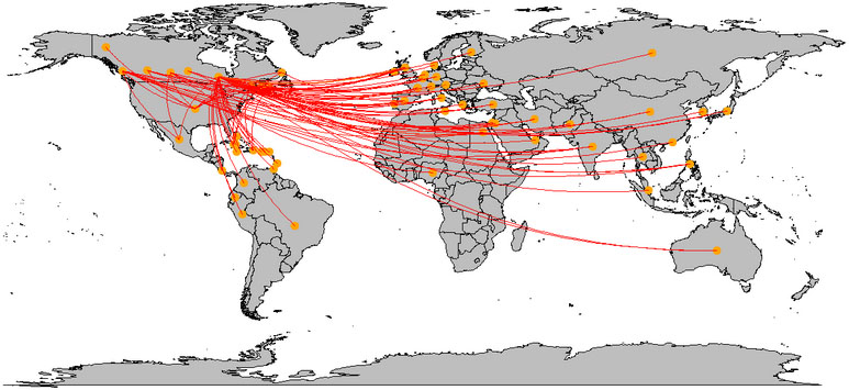
The spread of the COVID-19 across the world (within the first three months), was plotted on the world map. Figure 1 shows how this virus spread around the world, through the travel of COVID-19 patients. This plot shows that many links are connected to China and European countries. China has connections from all around the world except South America and Africa.
Figure 1.
Spread of COVID-19 across the world.
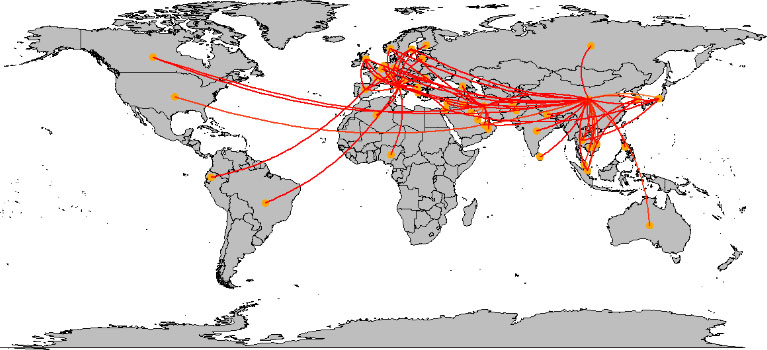
Figure 2.
In-degree network of across the world.
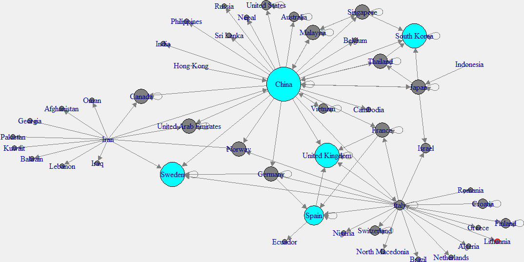
Figure 3.
Out-degree network of across the world.
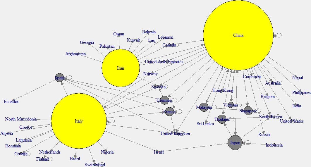
To have a better understanding, “in-degree” and “out-degree” plots were generated. Figure 2 shows the in-degree network, and the cyan color indicates the nodes with higher in-degree, while Fig. 3 shows the out-degree network and yellow color indicates the nodes with higher out-degree. Those countries which have higher out-degree consider as the main countries where many patients came from. Patients of these countries have traveled to many countries. So those countries can be considered as the main hubs of COVID-19. Higher in-degree nodes can be used to identify the main countries which found many patients who came from different other countries.
3.1.1Models creation and validation
After the visualization, ERGM models were fitted to identify the variables that influence link creation between countries. The models were fitted using network and node attributes. Even though there were many attributes, only a few were filtered as significant covariates. Among these models, the model with the smallest AIC and BIC values is considered as the best model. According to the Table 4, model 4 was considered as the best model.
Table 4
Model comaparison (across the world)
| Model1 | Model2 | Model3 | Model4 | |
|---|---|---|---|---|
| Edges | ||||
| (0.12) | (0.23) | (0.12) | (0.26) | |
| Mutual | 1.61** | |||
| (0.53) | ||||
| Indegree | 0.04** | 0.05** | ||
| (0.02) | (0.02) | |||
| Outdegree | 0.03*** | 0.06*** | ||
| (0.00) | (0.00) | |||
| Recover | ||||
| (1.01) | ||||
| Death | ||||
| (0.00) | ||||
| AIC | 652.70 | 456.95 | 645.25 | 424.84 |
| BIC | 658.47 | 480.00 | 656.78 | 447.89 |
| Log likelihood |
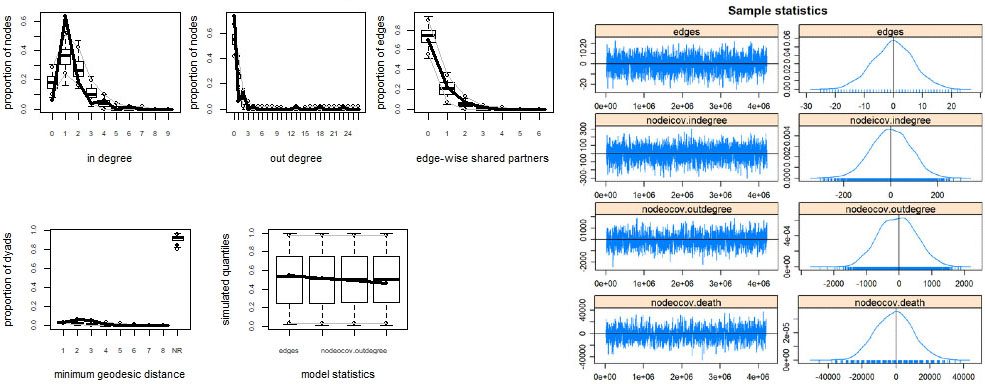
According to the goodness of fit plots, which are shown in left panel of Fig. 4, it is clear that the model 4 is achieving a good fit for key structural properties of the network with these covariates as the means of the simulated values of the plot are overlapped with the observed values. The result of MCMC diagnosis is shown in the right panel of Fig. 4. Here all the covariates have bell-curved density plots. The models appear to have converged to a desired state for each ERGM because the density is not skewed and is centered over zero.
Figure 4.
Goodness-of-fit and MCMC diagnostics for model 4.
3.2Community detection using across the world data set
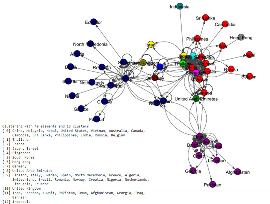
After figuring out the influencing variables on ties creation, the COVID-19 communities across the world were identified using four different algorithms. The output cluster labels of Louvain, Infomap, Label propagated, and Spinglass algorithms are shown in the following Figs 5–8.
The Fig. 5 shows eight communities based on the Louvain algorithm while the Fig. 6 shows five communities based on the Infomap algorithm. Spinglass algorithm also shows five communities, which is shown in the Fig. 7. The Fig. 8 shows thirteen communities based on label propagation algorithm. Most of the communities are around the countries which have higher out-degree.
Figure 5.
Results of Louvain algorithm for the world data set.
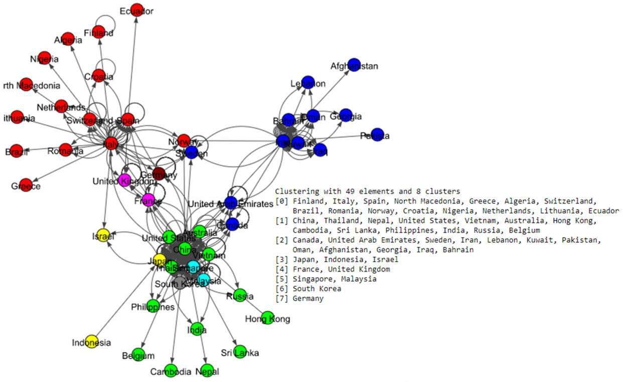
Figure 6.
Results of Infomap algorithm for the world data set.
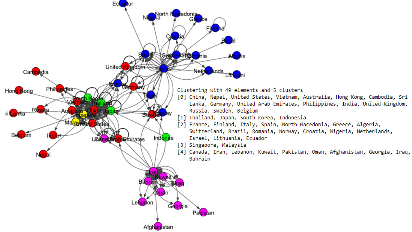
Figure 7.
Results of Spinglass algorithm for the world data set.
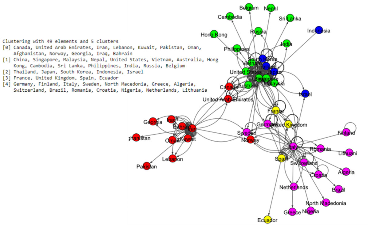
Figure 8.
Results of Label Propagation algorithm for the world data set.
We now pairwise compare the performance of the four algorithms using two different metrics, namely, Adjusted Rand Index (ARI) (William, 1971), and Normalized Mutual Information (NMI) (Zhang, 2015). ARI assesses the similarity between two algorithms by considering all pairs of countries and counting pairs that are assigned to the same or different communities in the network. Note that ARI is between
Table 5
Comparison of different algorithms with respect ARI and NMI for the world network
| Infomap | Louvain | Spinglass | Label_Propagation | ||
|---|---|---|---|---|---|
| ARI | Infomap | 1 | 0.71 | 0.55 | 0.64 |
| NMI | Infomap | 1 | 0.75 | 0.64 | 0.70 |
| ARI | Louvain | 1 | 0.67 | 0.75 | |
| NMI | Louvain | 1 | 0.74 | 0.81 | |
| ARI | Spinglass | 1 | 0.66 | ||
| NMI | Spinglass | 1 | 0.73 | ||
| ARI | Label_Prop | 1 | |||
| NMI | Label_Prop | 1 |
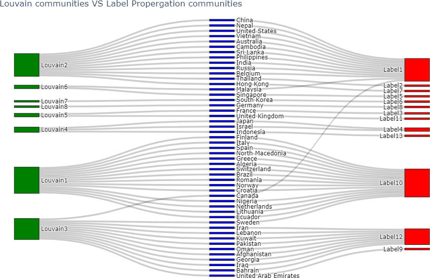
Louvain and Label Propagation algorithms are the most similar to each other amongst all pairs of comparisons in Table 5. A Sankey plot (Reda et al., 2011) which is a graphical comparative illustration of the communities of these two algorithms is given in Fig. 9. The communities of the Louvain algorithm, and the Label Propagation algorithm are indicated by green and red color nodes respectively. Blue color nodes show all the countries of the world network.
Figure 9.
Comparing communities of Louvain and Label Propagation algorithms.
3.3Analysis of Canada data set
Same as the analysis of the world, Fig. 10 illustrates how Canada has been affected by other countries. According to this plot, orange color dots, which indicate countries can be seen in every continent. It means patients from all over the world have visited Canada. But based on the provinces of Canada the impact is different. The province of Yukon which is located at the left upper corner, has only one link, while other states have multiple links.
Table 6
Model comaparison (Canada)
| Model1 | Model2 | Model3 | |
|---|---|---|---|
| Edges | |||
| (0.11) | (0.18) | (0.11) | |
| Indegree | 0.02*** | ||
| (0.00) | |||
| Outdegree | 0.02*** | ||
| (0.00) | |||
| Region | |||
| (0.72) | |||
| AIC | 860.13 | 523.47 | 855.87 |
| BIC | 866.37 | 542.19 | 868.34 |
| Log likelihood |
Figure 10.
Impact of other countries on spread of COVID-19 in Canada.
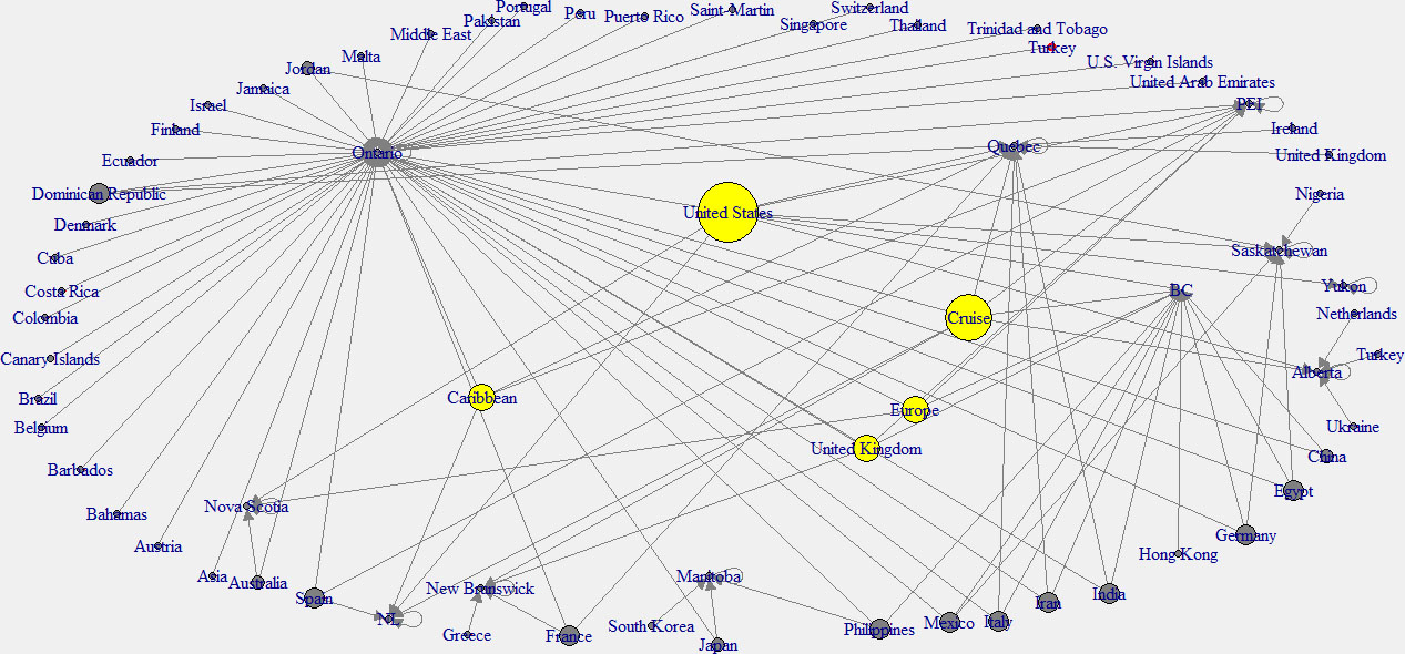
In this analysis, the in-degree network graph is showed in the left panel of the Fig. 11. Same as the above in-degree network graph, cyan color nodes indicate the higher in-degree provinces. According to this plot, the province of Ontario has the main effect from other countries. The right panel network of the Fig. 12 shows the out-degree network in Canada. Note that yellow color indicates the nodes with higher out-degree. According to this graph, Canadian provinces are mainly affected by the United States (USA), the United Kingdom, and the Carrabian islands.
Figure 11.
In-degree network of Canada.
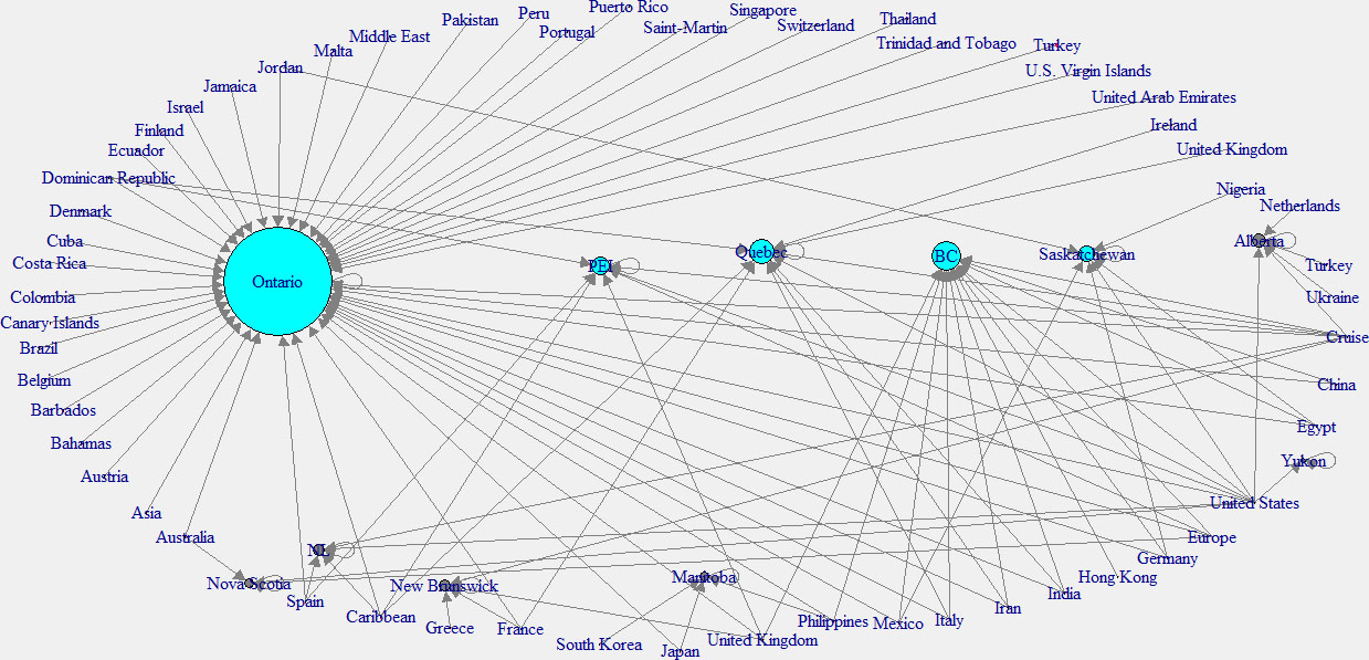
Table 7
Comparison of different algorithms with respect to ARI and NMI for the Canada network
| Infomap | Louvain | Spinglass | Label_Prop | ||
|---|---|---|---|---|---|
| ARI | Infomap | 1 | 0 | 0 | 0 |
| NMI | Infomap | 1 | 3.19e-17 | 2.14e-16 | 0 |
| ARI | Louvain | 1 | 0.72 | 0.01 | |
| NMI | Louvain | 1 | 0.74 | 0.60 | |
| ARI | Spinglass | 1 | 0 | ||
| NMI | Spinglass | 1 | 0.54 | ||
| ARI | Label_Prop | 1 | |||
| NMI | Label_Prop | 1 |
Figure 12.
Out-degree network of Canada.
3.3.1Models creation and validation
We fit ERGM models and filter out the significant covariates. The model 2 and model 4 have similar covariates. Hence the model 4 was not considered in this analysis. Finally, according to the AIC, and BIC values, model 2 was considered as the best model. Table 6 shows the model comparison. The models were validated using Goodness of fit and MCMC diagnostics as in Fig. 4, and indicated that model 2 is a good fit. That also indicated the model has converged to a desired state.
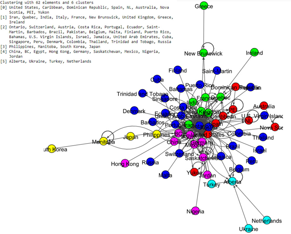
3.4Community detection using Canada data set
The community labels which are based on Louvain and Spinglass algorithms were plotted as in Fig. 13 and Fig. 14 respectively. The Louvain algorithm shows ten communities, while the Spinglass algorithm shows only six communities.
Figure 13.
Results of Louvain algorithm for the Canada data set.
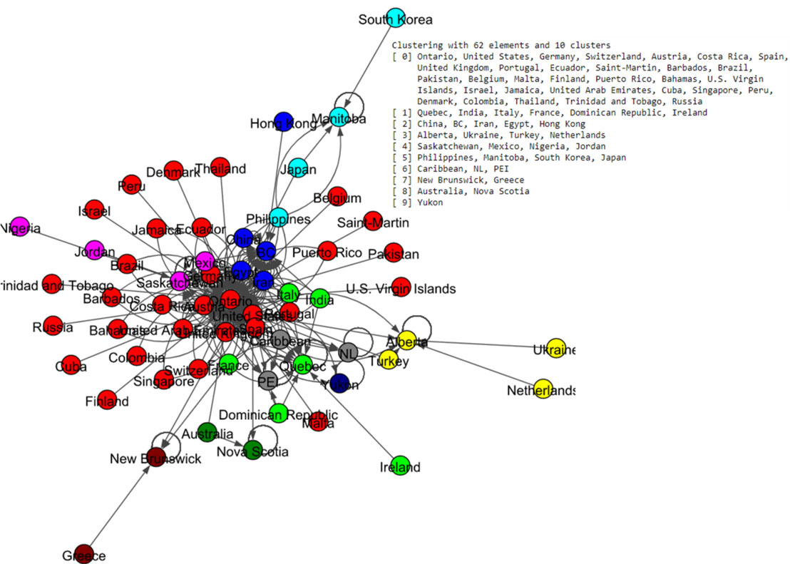
Figure 14.
Results of Spinglass algorithm for the Canada data set.
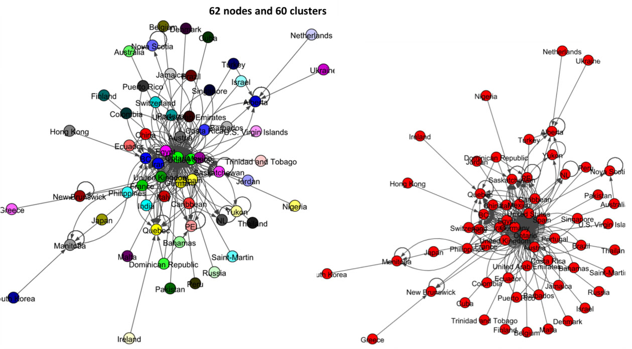
The left panel network of Fig. 15 shows the result of label propagation community detection for this data set. There are 62 nodes, and this algorithm shows that all these states and countries belong to 60 communities. All-most all the nodes have their own communities. The result of the Infomap algorithm shows in the right panel of Fig. 15 and it shows that all the countries and states of Canada belong to one community.
Figure 15.
Results of Label Propagation and Spinglass algorithms for the Canada data set.
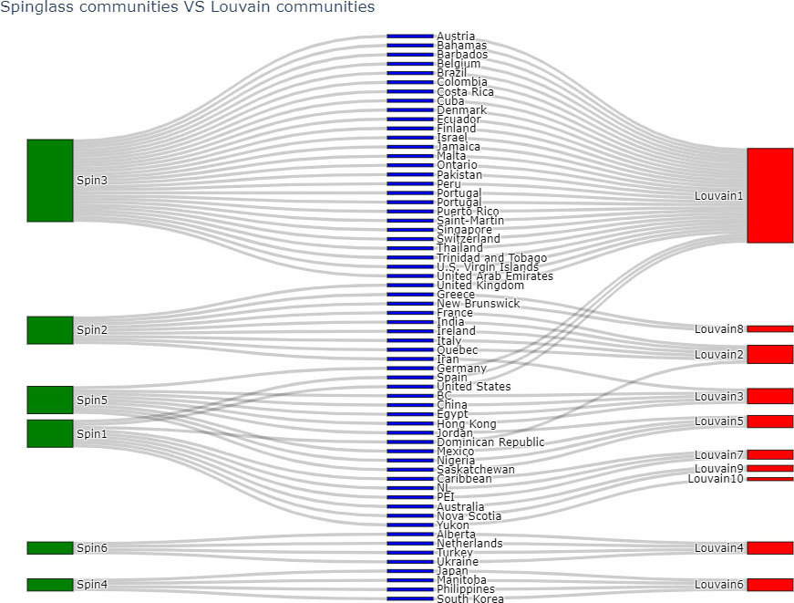
Pairwise comparison of above algorithms was done using ARI and NMI. Table 7 shows the results of comparing 4 algorithms (Infomap, Label Propagation,Louvain and Spinglass) for the Canada network.
Based on Table 7, Louvain and Spinglass are most similar to each other. The comparison of node-communities from Louvain and Spinglass methods is compared using sankey plots, where the green nodes correspond to the communities of Spinglass method and red nodes correspond to the communities of Louvain method.
Figure 16.
Comparing communities of Louvain and Label Propagation algorithms.
4.Discussion
Within the first few months of the COVID-19 outbreak, this virus has spread rapidly over the world. According to this study, China, Iran, and Italy have appeared as most out-degree countries around the world while the United Kingdom, South Korea, Sweden, and Spain have appeared as most in-degree countries. ERGM models show that mutuality, in-degree, and out-degree have a significant positive effect on the probability of a tie in the world network, while the number of recovered and the number of deaths have negative effects.
The analysis shows that, United States has the highest out-degree impact on Canada. This could happen as they are neighboring countries. The states, Ontario, British Colombia (BC), and Quebec have highly affected by other countries. According to the ERGM models, in-degree and out-degree, have significantly positive effect on the probability of a tie in the network of Canada, while the region has a negative effect.
Community detection in the spread of coronavirus across the world shows significant communities around Italy, China, and Iran which are the countries with the highest out-degree. But for the Canada data set, the resulted communities are not significant and clear. But in the results of Louvain and Spinglass, there is a significant community around Ontario, which has the highest in-degree. It is clear that all the community detection results depend on the algorithms.
We assessed the community detection algorithm performance using adjusted rand score (William, 1971) and normalized mutual information score (Zhang, 2015) which are given in Table 5 and 7. We noticed a fair agreement between algorithms performances in the world network than in the Canada network. More specifically, there is a good agreement between Louvain and Label propagation algorithms in community detection of world network, while there is a good agreement between Louvain and Spinglass algorithms in community detection of Canada network.
Our approach can also be used to assess the spread of the pandemic in local communities by applying on individual contact tracing data if available. This can be done by extending our approach to a dynamic temporal network analysis, which will help in making decisions in enforcing community specific social distancing restrictions and identifying hotspots of the pandemic.
Acknowledgments
The authors thank the Editor and referees for comments that lead to substantial improvements in the paper. Muthukumarana was partially supported by research grants from the Natural Sciences and Engineering Research Council of Canada.
References
[1] | Berry, I., & Soucy, J. R. ((2020) ). Covid19 Canada. GitHub. https://github.com/ishaberry/Covid19Canada/blob/master/codebook.csv. |
[2] | Berry, I., & Soucy, J. R. ((2020) ). Open access epidemiologic data and an interactive dashboard to monitor the COVID-19 outbreak in Canada, 192: , E420. |
[3] | Berry, I., & Soucy, J. R. ((2020) ). Technical report. Covid-19 Canada Open Data Working Group. https://opencovid.ca/work/technical-report/. |
[4] | Blondel, V. D., Guillaume, J., Lambiotte, R., & Etienne, L. ((2008) ). Fast unfolding of communities in large networks. Journal of Statistical Mechanics: Theory and Experiment, P10008: , 1-12. |
[5] | Chakraborty, D., Singh, A., & Cherifi, H. ((2016) ). Immunization strategies based on the overlapping nodes in networks with community structure. Computational Social Networks, 62-73. |
[6] | Craft, M. E. ((2015) ). Infectious disease transmission and contact networks in wildlife and livestock. Philosophical Transactions of the Royal Society of London B: Biological Sciences, 370: , 1669: , 20140107. |
[7] | Crosby, A. W. ((1990) ). America’s forgotten pandemic: The influenza of 1918. Cambridge University Press, Cambridge, UK. |
[8] | Eames, K. T. D., Tilston, N. L., Brooksâ€Pollock, E., & Edmunds, W. J. ((2012) ). Measured dynamic social contact patterns explain the spread of H1N1v influenza. PLoS Computational Biology, 8: , e1002425. |
[9] | Goeyvaerts, N. et al. ((2018) ). Household members do not contact each other at random: Implications for infectious disease modelling. Proceedings of the Royal Society B: Biological Sciences, 285: , 1893: , 20182201. |
[10] | Groendyke, C., Welch, D., & Hunter, D. ((2012) ). A network-based analysis of the 1861 hagelloch measles data. Biometrics, 68: , 755-765. |
[11] | Hu, F., & Liu, Y. ((2015) ). A novel algorithm infomap-sa of detecting communities in complex networks. Journal of Communications, 10: , 503-511. |
[12] | Hunter, D., Handcock, M., Butts, C., Goodreau, S., & Morris, M. ((2008) ). ergm: A package to fit, simulate and diagnose exponential-family models for networks. Journal of Statistical Software, 24: (3), 1-29. |
[13] | Lau, J. T. F., et al. ((2005) ). SARS-related perceptions in Hong Kong. Emerg Infect Dis, 11: , 417-424 . |
[14] | Nicolas, D., & Anthony, P. ((2015) ). Directed Louvain : Maximizing modularity in directed networks. Université d’Orléans. |
[15] | Raghavan, U. et al. ((2007) ). Near linear time algorithm to detect community structures in large-scale networks. Physical Review E, Statistical, Nonlinear, and Soft Matter Physics, 76: , 3. |
[16] | Rajkumar, S. ((2020) ). Noval corona virus 2019 dataset. Kaggle. https://www.kaggle.com/sudalairajkumar/novel-corona-virus-2019-dataset. |
[17] | Rao, J., Du, H., Yan, X., & Liu C.((2016) ). Detecting overlapping community in social networks based on fuzzy membership degree. Computational Social Networks, 99-110. |
[18] | Reda, K., Tantipathananandh, C., Johnson, A., Leigh, J., & Berger-Wolf, T. ((2011) ). Visualizing the evolution of community structures in dynamic social networks. in: Computer Graphics Forum, 30: , 1061-1070. |
[19] | Reichardt, J., & Bornholdt, S. ((2006) ). Statistical mechanics of community detection. Physical Review E, Statistical, Nonlinear, and Soft Matter Physics, 74: , 1. |
[20] | Rohani, P., Zhong, X., et al. ((2010) ). Contact network structure explains the changing epidemiology of pertussis. Science, 330: , 982-985. |
[21] | Rosvall, M., Axelsson, D., & Bergstrom, C. ((2009) ). The map equation. Eur Phys J Spec Top, 178: , 13-23. |
[22] | Scott, S., & Duncan, C. J. ((2001) ). Biology of plagues: Evidence from historical populations. Cambridge University Press, Cambridge, UK . |
[23] | Stehlé, J., Voirin, N., Barrat, A. et al. ((2011) ). Simulation of an SEIR infectious disease model on the dynamic contact network of conference attendees. BMC Medicine, 9: , 1. |
[24] | Van der Pol, J. ((2019) ). Introduction to network modeling using exponential random graph models (ERGM). Theory and an Application Using R-Project Comput Econ, 54: , 845-875. |
[25] | White, L. A., Forester, J. D., & Craft, M. E. ((2017) ). Using contact networks to explore mechanisms of parasite transmission in wildlife. Biological Reviews, 92: , 389-409. |
[26] | William, M. R. ((1971) ). Objective criteria for the evaluation of clustering methods. Journal of the American Statistical Association, 66: (336), 846-850. |
[27] | Worldometer COVID-19 Data. ((2020) ). worldometer. https://www.worldometers.info/coronavirus/about/. |
[28] | Xu, B., et al. ((2020) ). Epidemiological data from the COVID-19 outbreak, real-time case information. Scientific Data, 7: , 1. |
[29] | Zhang, P. ((2015) ). Evaluating accuracy of community detection using the relative normalized mutual information. Journal of Statistical Mechanics: Theory and Experiment, 11: . |