
Visualizing institutional activity using persistent identifier metadata
Abstract
This article investigates the opportunities and current challenges involved in using persistent identifier (PID) metadata to understand institutional research activity, based on a 2022 data visualization project led by the ORCID US Community (administered by Lyrasis) in partnership with two fellows from the Drexel University LEADING program. The fellows created an R [See: https://simple.wikipedia.org/wiki/R_(programming_language), accessed September 12, 2023] script that can be used to retrieve information about publishing collaborations between researchers at a home organization and other organizations across the globe, based on metadata from researchers’ ORCID profiles and Crossref DOIs. The dataset produced by the script can be imported into a Tableau Public dashboard template, resulting in a data visualization that can be shared with multiple stakeholders to show trends in collaboration activity and emphasize how PIDs are useful for visualizing researcher activity and impact. However, multiple gaps in the ORCID and DOI metadata, such as authors with no ORCID iD, ORCID profiles with no institution or works data, and missing collaborator information in DOI records, indicate that we still have a long way to go before PIDs can be used to demonstrate a complete picture of research activity.
1.Introduction
Persistent identifiers, such as ORCID iDs (https://orcid.org) for individuals, DOIs (https://www.doi.org/) for scholarly materials, and ROR IDs (https://ror.org) for research organizations, are increasingly important components of an open research infrastructure and are needed to make research, scholarly content, and related metadata more FAIR (Findable, Accessible, Interoperable, and Reusable) in accordance with the FAIR data principles (https://www.go-fair.org/fair-principles/). In addition to allowing individual researchers to be uniquely and persistently identified, ORCID also enables information about researchers, their affiliations, contributions, and activities to be shared between researchers’ ORCID profiles and the many organizations with which they work, such as funders, publishers, and research institutions. ORCID iDs are free for researchers, and correspond to ORCID profiles, which can contain information such as a researcher’s employment affiliation and publications or other works they have created or collaborated on. Data in ORCID profiles can be made publicly available and accessible on the web and via ORCID’s Application Programming Interface (API), which enables interoperability between ORCID profiles and other software systems and applications.
Use of ORCID by both researchers and organizations has increased steadily across the globe since ORCID was founded in 2012 [2]. In the United States, the ORCID US Community consortium (established in 2018) provides resources, guidance, and communication channels for a community of practice among non-profit organizations that are ORCID members (https://orcidus.lyrasis.org/). With over one hundred and ninety-five member organizations (and counting), the ORCID US Community is led by Lyrasis (a non-profit organization based in the United States that provides a variety of services to libraries, archives, museums, and related knowledge communities) in partnership with the Big Ten Academic Alliance, the Greater Western Library Alliance (GWLA), and the NorthEast Research Libraries (NERL).
From July through December 2022, the ORCID US Community staff at Lyrasis partnered with two fellows from the Drexel University LEADING program [3] to create a set of open resources for visualizing public data from researchers’ ORCID profiles. Inspired by other ORCID data visualizations, such as a 2017 article from Science Magazine [4] and a 2022 article from Frontiers in Research Metrics and Analytics [5], the project team decided to focus on creating tools and instructions for producing a visual map of collaborations between researchers at a home organization and other organizations across the globe within a certain time period, in order to look at patterns and trends that could help institutions better understand their researchers’ activities and impact.
2.Data visualization resources
This project makes an R script available for retrieving ORCID data and Crossref DOI metadata, revealing publication collaborations of researchers from a single university, research institution, or any other organization that employs researchers. The resulting dataset can then be loaded into a Tableau Public dashboard template and customized based on the instructions and documentation provided by the project team. These resources are openly available for anyone to use at https://github.com/lyrasis/ORCID-Data-Visualization.
Researcher collaborations are very complex and can be difficult to define. Working with the data returned by the R script over the course of the project gave the project team a better understanding of the scope and the scale of that complexity. In most cases, the data are imperfect with inconsistencies across researchers’ ORCID profiles, data gaps, as well as user and machine errors. The script and the Tableau dashboard capture all available data and produce a useful visualization, but it is not comprehensive. These resources are a starting point for exploring the possibilities of using PIDs data to identify and analyze trends and patterns.
2.1.R script
The R script that produces an organization’s collaboration data file to be visualized pulls data from ORCID about authors and from Crossref about the authors’ works. It uses the rorcid (https://cran.r-project.org/package=rorcid) and rcrossref (https://cran.r-project.org/package=rcrossref) packages developed by ropensci founder Scott Chamberlain (https://orcid.org/0000-0003-1444-9135) and builds on code [6] developed by Clark Iakovakis (https://orcid.org/0000-0002-9260-8456) for reporting ORCID adoption based on employment affiliation.
The script attempts to wrangle messy, complex data by cleaning and restructuring it into a well-formatted .csv file that can be uploaded to the Tableau Public dashboard. First, it retrieves profile data for the current ORCID iD holders from the organization of interest, based on the presence of publicly-visible and current employment affiliation in the individuals’ ORCID profiles. Then, it unpacks the works list from those individuals’ ORCID profiles and retrieves the Crossref metadata for every work with a Crossref DOI. For each DOI, it unpacks the collaborators list and retrieves the ORCID profile data for each collaborator who has an ORCID iD. Finally, it checks those collaborators’ ORCID profiles for current employment information, to fill in location data for their organizations. Finally, it repackages all the data into a final .csv output file of collaborations. Figure 1 illustrates the script workflow for a single organizational author, showing how the logic used to pull the data quickly branches out.
Fig. 1.
R script data retrieval workflow for a single organizational author.
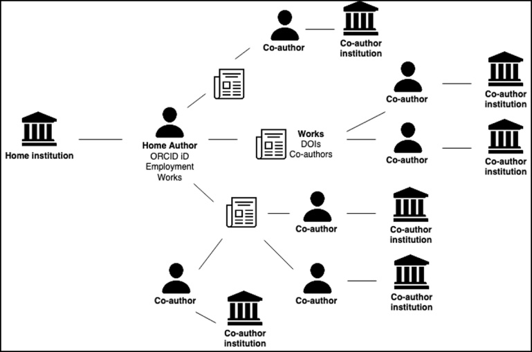
There are many works for any one author, potentially many collaborators for each individual work, and then all the collaborators have home organizations. In reality, a home organization has many authors, so this logic is repeated manyfold.
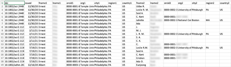
R makes it easy to iterate over this data to build the visualization file, but there are many potential blanks and gaps in the data. Authors may not have an ORCID iD, or their ORCID iD may not be included in Crossref metadata for a work they produced. Authors’ ORCID profiles sometimes lack employment and works information, or the information present could have errors. The R script attempts to fill in blank data for known authors where possible, but it can only include publicly-visible employment and works information contained within ORCID profiles. Occasionally, profile data includes errors, such as typos or inaccurate institution names. Additionally, the script currently only pulls DOIs issued by Crossref. DOIs issued by other providers are not included in the data to visualize. Though gaps in the data make the final visualization an undercount of an organization’s true collaborative reach, the script outputs a .csv data file with blank fields visible in order to expose where ORCID adoption is needed, or where existing ORCID profiles could be more complete (Fig. 2).
Fig. 2.
Example .csv file of researcher collaboration data for upload to the Tableau Public dashboard.
For organizations with many authors and a large research output, some portions of the script can take several minutes to run due to all the branching logic and the need to communicate with external services over the ORCID and Crossref APIs. Increasing the number of years of data to pull also increases the script’s runtime. As ORCID adoption increases and ORCID profile completion improves, the accuracy of the visualization will improve. Before uploading the data file to Tableau Public, cleaning the data with a tool such as OpenRefine [7], particularly to standardize organization names, can improve the visualization.
2.2.Tableau public dashboard
The dataset produced by the R script feeds into a Tableau Public dashboard that explores a “home” organization’s collaboration data for a time period of interest. The data include individual home authors and their collaborators based on those collaborators’ current institutions. The dashboard template is openly available. Tableau Public users can customize the dashboard with their own organization’s data for the time period of interest to explore collaborations at their own institutions.
The dashboard contains four sections: Background (context and considerations for the data, which impact how the data and the dashboard should be used), Summary dashboard (Fig. 3; contains aggregated totals, including the number of article collaborations, the number of collaborating cities, and the number of ORCID iD holders for the time period of interest), Collaborations map (Fig. 4; heat map of collaborations based on geographic location), and Individual search (Fig. 5; where individual users can search for their own collaborations within the data). Users navigate through the dashboard using section headers at the top.
Fig. 3.
Summary dashboard screen, showing aggregate totals.
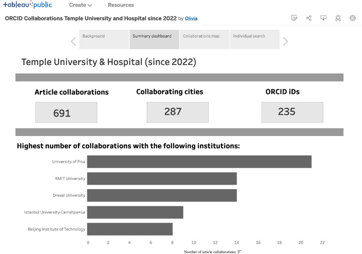
Fig. 4.
Collaborations map screen, showing an organization’s geographic collaborative reach.
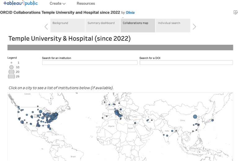
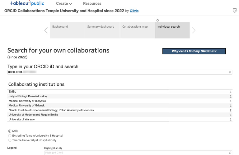
Fig. 5.
Individual search screen, allows filtering to an individual researcher’s data.
The Collaborations map is the main visual feature. It shows collaborations at the organizational and city levels and features a collaborating institutions list and search box. Users can also exclude the “home” organization from the map if they are only interested in exploring external collaborations.
The Individual Search section lets researchers explore their own collaborations by searching based on ORCID iD. The dashboard does not allow users to search by name, not only because there are cases of non-unique names (a problem ORCID solves), but also to protect those who may not want their name easily associated with their public data. If an individual cannot find their ORCID iD in the data, they can click on the “Why can’t I find my ORCID iD?” button, which takes them to a page that includes steps to acquire an ORCID iD or improve their ORCID profile so that they appear in the data in the future. This dashboard can serve as a useful outreach tool to encourage researchers to either adopt an ORCID iD or more fully fill out their ORCID profile.
To support the accessibility of the dashboard, it features captions and alternative text for images, WCAG 2-compliant color and contrast (https://webaim.org/articles/contrast/), and resizable layouts where possible. However, additional accessibility checks are encouraged as creators customize the dashboard.
3.Using the dashboard
This project is designed to motivate usage of open research infrastructure and FAIR data practices by illustrating the value of PIDs across the research landscape. Because the project data is sourced from individual researchers’ ORCID profiles, researchers must have an ORCID iD with employment and works information in a publicly-visible ORCID profile to appear in the data visualization. When they publish, researchers should supply their ORCID iD to be sure it will be associated with the DOI of their work.
This data should not be used to evaluate or compare individual researchers because the data are imperfect and do not necessarily give a full picture of collaborations and impact. This dashboard is just one way to explore this information. However, if a researcher has a complete ORCID profile and feels confident with the information listed in the dashboard, an image export from the Individual search screen might benefit them in a number of ways, such as in a promotion and tenure package, a personal website, or a CV.
At an organizational level, the data visualization creates an opportunity to showcase researcher activity across an institution and tell a compelling story on collaboration and potential research impact. As these resources are used to create collaboration maps for more organizations, patterns or trends may begin to appear that otherwise may have gone unnoticed, helping institutions to gain further insight into their reach and impact across the globe. In addition to seeing the geographic areas and institutions where collaborations are taking place, organizations can also see the regions or institutions with which collaborations are lacking. For organizations looking to expand their reach, impact, and representation, the collaboration map may help identify new priorities and collaboration areas of focus.
These resources can also help promote the use of ORCID best practices. By revealing data gaps through the collaboration map, organizations may come to understand the value of standardizing their researchers’ affiliation data in ORCID profiles by using the ORCID member API. The member API allows organizations to mitigate errors by writing consistent data directly to affiliated researchers’ ORCID profiles. This helps standardize and validate institution name, location, and affiliation scope (e.g., university versus academic department), preventing name variations and spelling errors. Researchers also benefit from having authoritative data from their organization available in their ORCID profile. The machine-written affiliation data can be used by other organizations, such as funders. It also saves researchers from having to manually keep their ORCID profile up to date.
4.Next steps
There are many potential improvements that could be made to the visualization tools. Ideas for potential new features and functionality include:
• Querying DOI metadata from other minting organizations beyond Crossref, such as DataCite, to make the data file more complete.
• Allowing users to specify precise start and end dates, rather than pulling data since January 1 of a given year, to improve the flexibility of the visualization. Currently, limiting to specific dates is accomplished by removing unwanted rows from the .csv datafile.
• Creating a web interface for the R script to help anyone who is not comfortable with R to run it without assistance from Lyrasis staff.
• Creating a version of these tools focused on an individual ORCID iD or a single department within an institution.
• Adding citation metric data for DOIs and corresponding visualizations on the dashboard.
• Creating a version of these tools that can accommodate a funder, publisher, or other entity that works with researchers from multiple institutions, as the “home” organization.
The project team created these resources in a brief timeframe of six months, as a starting point for exploring public ORCID data. Users do not need expertise in working with APIs or creating data visualization. The tools needed, RStudio [8] and Tableau Public [9], are freely available, and anyone may run the R script themselves to generate a data file for their organization. Lyrasis staff can also help with this and are available to answer questions and provide support at [email protected]. In sum, this suite of tools allows organizations and individuals to visualize researcher collaborations, promote ORCID adoption, identify new collaboration areas for focus, and tell a compelling story about their global research partnerships.
Acknowledgements
This research is supported by Lyrasis and the Institute of Museum and Library Services (IMLS) RE-246450-OLS-20.0-OLS-20.
About the corresponding author
Sheila Rabun is the Senior Strategist for Research Infrastructure Programs within the Content and Scholarly Communication Initiatives (CSCI) team at Lyrasis in Atlanta, GA, USA. She has worked in the academic library field since 2010, with a focus on digital workflows, agile project management, communicating technical information to diverse audiences, and advocating for interoperability in cultural heritage, research, and scholarly communication ecosystems. In her current role at Lyrasis, Sheila manages the ORCID US Community, the Lyrasis DataCite US Community, and the IRUS US program for institutional repository usage statistics, working with non-profit organizations across the US to support open research infrastructure by using persistent identifiers and shared open standards to make research and scholarly content more FAIR (Findable, Accessible, Interoperable, and Reusable).
(https://orcid.org/0000-0002-1196-6279); Phone: +1 470 717 0812; E-mail: .
References
[1] | See: https://simple.wikipedia.org/wiki/R_(programming_language), accessed September 12, 2023. |
[2] | ORCID. ORCID Statistics [cited June 13, 2023]. Available from: https://info.orcid.org/orcid-statistics/, accessed September 12, 2023. |
[3] | LEADING stands for LIS (Library and Information Science) Education and Data Science Integrated Network Group. More information about the LEADING program can be found online at https://mrc.cci.drexel.edu/leading/, accessed September 12, 2023. |
[4] | J. Bohannon, Vast set of public CVs reveals the world’s most migratory scientists, Science Magazine ((2017) ), [cited June 7, 2023]. Available from: https://www.science.org/content/article/vast-set-public-cvs-reveals-world-s-most-migratory-scientists, accessed September 12, 2023. |
[5] | S. Porter, Measuring research information citizenship across ORCID practice, Frontiers in Research Metrics and Analytics 7: ((2022) ), 779097. doi:10.3389/frma.2022.779097, accessed September 12, 2023. |
[6] | C. Iakovakis, Working with Scholarly Literature in R code, Force 11 Scholarly Communications Institute; 2022 [cited June 7, 2023]. Available from: https://github.com/ciakovx/fsci2022, accessed September 12, 2023. |
[7] | See: https://openrefine.org, accessed September 12, 2023. |
[8] | See: https://en.wikipedia.org/wiki/RStudio, accessed September 12, 2023. |
[9] | See: https://www.tableau.com, accessed September 12, 2023. |