
Editorial: Information Polity 2024, Vol.29, No.3 – Visualising research to reach a larger audience
As academics we are all used to conveying our ideas and research through the written and spoken word. We are used to presenting and debating ideas in lectures, seminars, conferences and workshops, as well as publishing books, chapters, reports and journal articles. Disseminating knowledge in this way has become the norm, and typically we share knowledge amongst the academy and with our students through research articles.
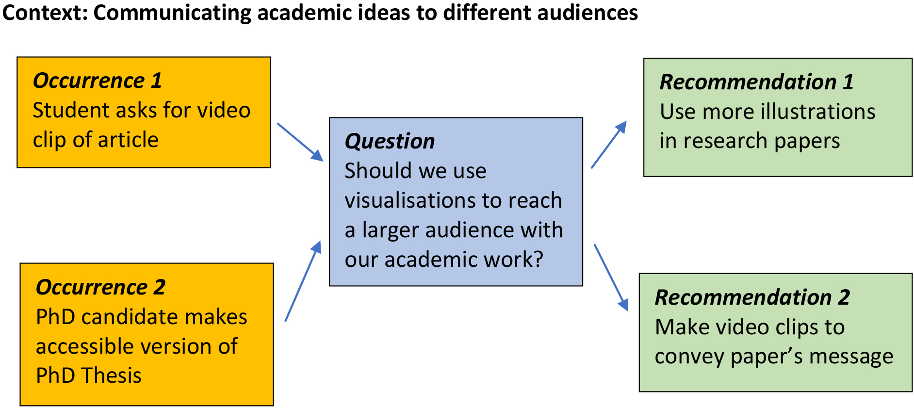
Recently, a student on a course on Public Innovation who had to read a couple of journal articles asked: ‘Can’t we get the same information in a more accessible format such as a short video clip?’ He stressed that he had difficulties reading long articles and that he, and the students of his generation, had grown accustomed to processing information in a different way. An initial reaction was, of course, that students ‘read’ for a degree and that the reading process is central to understanding, analysing and synthesising complex ideas, theories and arguments. Reading then, is a central learning process that we value. At the same time, his question makes us think about the way we present information to our audiences, and how this may have evolved over time. Not long after this event, a doctoral candidate at the University of Utrecht distributed a booklet of his thesis at his defence. The booklet was an accessible summary of the main components of the research designed to reach a lay audience. This was highly appreciated by many in attendance and certainly increased the reach of his work.
In our discipline, we still believe in the value of textual forms of communication. We write extensive research papers and we emphasize the correct use of language and concepts. We believe that well written and argumented papers are crucial to advancing state-of-art knowledge. However, we should ask whether this way of doing things is still appropriate for communicating the outcomes of scientific research. Are we not focusing too much on texts, when there are other ways of communicating these outcomes?
For anyone that has received ‘media training’, it is not a new idea to say that we have to tailor our message to the target audience and the communication tool being used. So, whilst we might communicate to our academic peers via research articles we would drastically change the content of the message if we are communicating the same research to the media or policy-makers. A case in point, is recent research in the UK which considered the implications of the proposed abolition of the office of the Biometrics and Surveillance Camera Commissioner (Fussey and Webster, 2023). The full report is dense at over seventy pages, but it has been simplified into a three-page ‘Parliamentary Briefing’ for legislators (Sampson, 2023) and a two-page press release for the media (University of Stirling, 2023).
At Information Polity we have been sensitive to the idea that we have to reach different audiences via different means, including social media. We have a blog-based website,11 that works in parallel with the publisher’s website22 and have tentatively been using X/Twitter33 to draw attention to our publications and activities. In recent years we have also encouraged authors to include ‘bullet points for practitioners’. These are intended to be a summary of the main ‘take-away’ messages from the published research with specific relevance for policy-makers and practitioners. Again, the intention here is to tailor the message for alternative audiences and to broaden the scope and relevance of the journal.
We would like to encourage two rather modest but hopefully helpful changes that could strengthen the impact of our academic work. The first is a stronger focus on visualizations to illustrate and summarize key lines of argument. As you will see, many of the papers in this issue have figures and overviews that present the line of argument or key concepts in an accessible manner. We believe that this trend can be strengthened and that we should be open to papers that contain a variety of illustrations – overviews, pictures, flow charts, mind maps (etc.) – that help the reader understand the paper’s message quickly. In other fields, such as urban geography and media studies, illustrations are frequently used and result in attractive and accessible papers. By way of an example, Fig. 1 illustrates the main line of argument in this editorial. The second change is to provide additional material that conveys the paper’s key message. Other journals occasionally provide video clips with authors briefly summarising the main line of argument of their papers Authors in Information Polity could do this as well. They could present a video clip on their university website and a URL link could be included in the published paper, in order to refer the reader to the accessible summary of the paper. In different academic disciplines, knowledge clips assume an increasingly important role in university education (e.g. Smith et al., 2012).
Figure 1.
Summary of line of argument in editorial.
Overall, we believe that building a robust line of argument is still extremely important. At the same time, we need to acknowledge that long texts are not always the best medium to convey a message to a larger audience, even if it is an audience of academics. We may need extra training to learn how to use visualisation as a powerful tool for research communication (Nayak & Iwasa, 2019) but then we will also explore all kinds of new opportunities. With this in mind, we would like to encourage authors in Information Polity to explore the power of visualizations to strengthen the impact of their work.
Editors-in-Chief
Professor Albert Meijer
Professor William Webster
Notes
1 Information Polity website, available at, URL: https://informationpolity.com.
2 IOS Press Information Polity website, available at, URL: https://content.iospress.com/journals/information-polity/24/1.
3 Information Polity on X/Twitter, at: @InformationPol2.
References
[1] | Fussey, P., & Webster, C.W.R. ((2023) ). Independent report on changes to the functions of the Biometrics and Surveillance Camera Commissioner arising from the Data Protection and Digital Information Bill. Home Office, 6 October 2023. Available at, URL: https://assets.publishing.service.gov.uk/media/653f7128e6c968000daa9cae/Changes_to_the_functions_of_the_BSCC.pdf. |
[2] | Nayak, S., & Iwasa, J.H. ((2019) ). Preparing scientists for a visual future: Visualization is a powerful tool for research and communication but requires training and support. EMBO Reports, 20: (11), e49347. |
[3] | Sampson, F. ((2023) ). Data Protection and Digital Information (no.2) Bill: Oversight of biometric data. Written evidence submitted the House of Commons Bill Committee. 15 May 2023. Available at, URL: https://bills.parliament.uk/publications/51173/documents/3425. |
[4] | Smith, W., Rafeek, R., Marchan, S., & Paryag, A. (2012). The use of video-clips as a teaching aide. European Journal of Dental Education, 16: (2), 91-96. |
[5] | University of Stirling (2023). Government plans to improve public surveillance safeguards will do the opposite, warns report. 30 October 2023. Available at, URL: https://www.stir.ac.uk/news/2023/10/government-plans-to-improve-public-surveillance-safeguards-will-do-the-opposite-warns-report/. |