
BioVenn – an R and Python package for the comparison and visualization of biological lists using area-proportional Venn diagrams
Abstract
One of the most popular methods to visualize the overlap and differences between data sets is the Venn diagram. Venn diagrams are especially useful when they are ‘area-proportional’ i.e. the sizes of the circles and the overlaps correspond to the sizes of the data sets. In 2007, the BioVenn web interface was launched, which is being used by many researchers. However, this web implementation requires users to copy and paste (or upload) lists of IDs into the web browser, which is not always convenient and makes it difficult for researchers to create Venn diagrams ‘in batch’, or to automatically update the diagram when the source data changes. This is only possible by using software such as R or Python. This paper describes the BioVenn R and Python packages, which are very easy-to-use packages that can generate accurate area-proportional Venn diagrams of two or three circles directly from lists of (biological) IDs. The only required input is two or three lists of IDs. Optional parameters include the main title, the subtitle, the printing of absolute numbers or percentages within the diagram, colors and fonts. The function can show the diagram on the screen, or it can export the diagram in one of the supported file formats. The function also returns all thirteen lists. The BioVenn R package and Python package were created for biological IDs, but they can be used for other IDs as well. Finally, BioVenn can map Affymetrix and EntrezGene to Ensembl IDs. The BioVenn R package is available in the CRAN repository, and can be installed by running ‘install.packages(“BioVenn”)’. The BioVenn Python package is available in the PyPI repository, and can be installed by running ‘pip install BioVenn’. The BioVenn web interface remains available at https://www.biovenn.nl.
1.Introduction
In many ‘big data’ projects, it can be very useful to see the overlap between different data sets, in terms of patient IDs, gene names, etc. One of the most popular methods to visualize the overlap between data sets is the Venn diagram: a diagram consisting of two or more circles in which each circle corresponds to a data set, and the overlap between the circles corresponds to the overlap between these data sets. Venn diagrams are especially useful when they are ‘area-proportional’ i.e. the sizes of the circles and the overlaps correspond to the sizes of the data sets. Some web-based tools were created that can create area-proportional Venn diagrams, such as the (deprecated) tools VennMaster [13] and DrawEuler [17]. In 2003, the website Venndiagram.tk [9] was launched, followed in 2007 by the BioVenn web interface [12], which has been used to create publication figures by many researchers [7], and is still available at this moment. The “Bio” in BioVenn showcases that it can do mapping of biological identifiers before determining sets and overlaps. Another useful functionality of BioVenn is that it displays the list of elements belonging to each of the subsets in the Venn diagram, i.e., the thirteen subsets resulting from the overlaps between the circles X, Y and Z. However, the BioVenn web application requires users to copy and paste lists of IDs (or upload files with lists of IDs) into the web browser, which is not always convenient and makes it difficult for researchers to create Venn diagrams ‘in batch’. Moreover, when the source data changes, it needs to be copy-and-pasted again into the web interface. Using programming languages, it is possible to do batch processing and to quickly rerun a script when the source data has changed. Two of the most popular programming languages used within many scientific fields are R and Python. There are some R and Python packages available that can create Venn diagrams, which are listed in the following two sections.
2.Existing R packages
2.1.colorfulVennPlot
The first package is ‘colorfulVennPlot’ [15]. This package can create 2-circle and 3-circle Venn diagrams, and use ellipses for diagrams of 4 sets. Only the 2-circle diagrams can be made area-proportional, but the user needs to calculate the circles’ sizes and overlap by using the separate ‘resizeCircles’ function.
2.2.eulerr
A second package is ‘eulerr’ [14], which can generate area-proportional Euler diagrams. A Euler diagram is a generalization of a Venn diagram, relaxing the criterion that all interactions need to be represented. In practice, both terms are used interchangeably. This package uses both ellipses and circles.
2.3.nVennR
A third package is ‘nVennR’ [16]. This package can create “quasi-proportional Venn and Euler diagrams” for an unlimited number of sets. For a large number of sets, the algorithm might be very slow, because it needs to run many simulation cycles. Because of the resulting complicated shapes, the diagrams might not be easy to read.
2.4.venn
A fourth package is ‘venn’ [6], which can generate Venn diagrams up to 7 sets, but not in an area-proportional manner. For more than three sets, it uses pre-set polygon shapes.
2.5.VennDiagram
The most popular package at this moment is ‘VennDiagram’ [3]. This package can generate Venn and Euler diagrams of up to five sets, but these are not area-proportional, unless the user calculates the radii and distances between the circles by him- or herself, and passes these numbers through to one of the draw.*.venn functions.
2.6.venneuler
A sixth package is ‘venneuler’ [19]. This package can create area-proportional Venn diagrams as well, if the sizes of the overlaps are passed to its venneuler function. The returned object also gives some mathematical information such as the residuals (percentage difference between input intersection area and fitted inter-section area) and stress values.
2.7.vennplot
The seventh and final package is ‘vennplot’ [20]. It can create area-proportional Venn diagrams in 2D or 3D, with two or three circles or balls. The 3D functionality is interesting (the diagram can be rotated), but the mathematics behind it is actually the same as for the 2D plot.
3.Existing Python packages
3.1.matplotlib-venn
The most popular package at this moment is ‘matplotlib-venn’ [18]. Its ‘venn2’ and ‘venn3’ functions can create area-proportional Venn diagrams of two and three circles, respectively. However, they don’t offer the ID mapping functionality of BioVenn, and the ‘drag-and-drop’ functionality for repositioning of titles and labels in the SVG mode of BioVenn is missing as well.
3.2.PyVenn
A second package is ‘PyVenn’ [8]. This package offers plotting of Venn diagrams of two to six circles, but these are not area-proportional like in BioVenn or Matplotlib-Venn: the shapes are always the same.
4.Methods
The PHP script that forms the basis for the BioVenn web interface, was rewritten in the R and Python languages. The only function in the package is “draw.venn” (R) or “draw_venn” (Python), and it follows these steps:
1. Remove duplicate IDs (note: BioVenn is case-sensitive)
2. Map EntrezGene and Affymetrix IDs to Ensembl IDs (using the ‘hsapiens_gene_ensembl’ dataset of the ‘biomaRt’ R package [5] or the ‘biomart’ Python package [2], only used when the optional ‘map2ens’ parameter is set to ‘True’)
3. Generate lists of IDs for the thirteen possible sets, and count the number of IDs within each set
4. Calculate the radii of the circles so that the areas of the circles correspond to the size of the datasets they represent
5. Calculate the distances between the centers of the circles, so that the areas of the two-circle overlaps correspond to the size of the datasets they represent (see Fig. 1 of [12]); in cases where an 100% accurate three-circle diagram cannot be drawn, this method gives the optimal solution
6. Calculate the angles of the XYZ triangle, formed by connecting the three centers of the circles
7. Calculate the centers of the circles
8. Calculate the intersection points of the circles
9. Calculate the points where the numbers will be printed
10. Set output type to file or screen (depending on the output parameter)
11. Print the title and subtitle
12. Print the circles with the calculated centers and radii
13. Print the absolute numbers/percentages
14. Print the texts for the three circles
15. Write to the selected output type and filename
16. If SVG is selected as output type, do some post-processing in order to create the drag-and-drop functionality for repositioning titles and labels
17. Return the contents of the thirteen lists: X, Y, Z, X only, Y only, Z only, XY, XZ, YZ, XY only, XZ only, YZ only and XYZ.
Whereas the BioVenn web interface only supports PNG and SVG as output formats, the Python package also supports JPEG, PDF and TIFF. The R package even supports all of these file formats and BMP.
5.Results
The BioVenn R/Python package can generate area-proportional Venn diagrams of two or three circles from lists of (biological) identifiers. It is a lightweight package, depending on only a small number of other packages, making it more likely that the package will still work in the future. The only function in the first version is the ‘draw.venn’ function (in R; ‘draw_venn’ in Python), for which the only required input is two or three lists of identifiers. Optional parameters include the main title, the subtitle, the printing of absolute numbers or percentages within the diagram, colors and fonts. The function can show the diagram on the screen, or it can export the diagram in one of the supported file formats. The SVG mode also supports drag-and-drop of titles and labels, which is a new functionality compared to the original publication of the web interface [12]. The function also returns the lists of IDs for the thirteen possible sets. The BioVenn R/Python package was created for biological identifiers, but it can be used for other identifiers as well. Finally, BioVenn can map Affymetrix and EntrezGene IDs to Ensembl IDs.
Fig. 1.
Example BioVenn diagram. This example was created by just entering three lists of IDs and setting two other parameters (subtitle and nrtype).
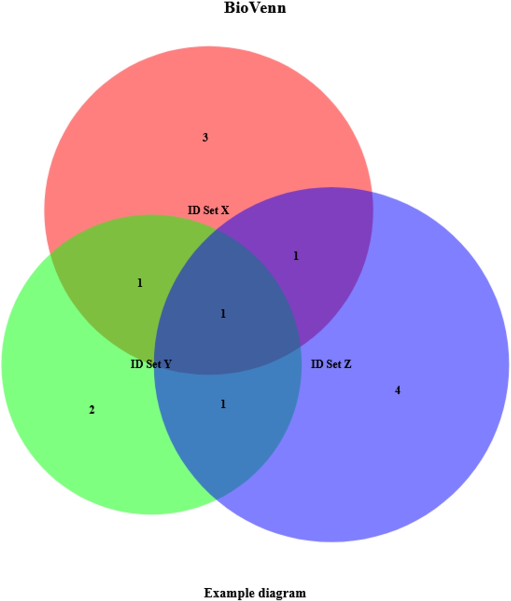
Table 1
Example output. This example was created by just entering three lists of IDs and setting two other parameters (subtitle and nrtype)
| Variable | Data type | Contents |
| $x | character [6] | 1007_s_at, 1053_at, 117_at, 121_at, 1255_g_at, 1294_at |
| $y | character [5] | 1255_g_at, 1294_at, 1316_at, 1320_at, 1405_i_at |
| $z | character [7] | 1007_s_at, 1405_i_at, 1255_g_at, 1431_at, 1438_at, 1487_at, 1494_f_at |
| $x_only | character [3] | 1053_at, 117_at, 121_at |
| $y_only | character [2] | 1316_at, 1320_at |
| $z_only | character [4] | 1431_at, 1438_at, 1487_at, 1494_f_at |
| $xy | character [2] | 1255_g_at, 1294_at |
| $xz | character [2] | 1007_s_at, 1255_g_at |
| $yz | character [2] | 1255_g_at, 1405_i_at |
| $xy_only | character [1] | 1294_at |
| $xz_only | character [1] | 1007_s_at |
| $yz_only | character [1] | 1405_i_at |
| $xyz | character [1] | 1255_g_at |
5.1.R example
The following very simple R code creates the example plot of Fig. 1, and returns the data of Table 1:
list_x <- c(”1007_s_at”, ”1053_at”, ”117_at”, ”121_at”, ”1255_g_at”, ”1294_at”)
list_y <- c(”1255_g_at”, ”1294_at”, ”1316_at”, ”1320_at”, ”1405_i_at”)
list_z <- c(”1007_s_at”, ”1405_i_at”, ”1255_g_at”, ”1431_at”, ”1438_at”, ”1487_at”, ”1494_f_at”)
biovenn <- draw.venn(list_x, list_y, list_z, subtitle=”Example diagram”, nrtype=”abs”)
5.2.Python example
The Python code works in a very similar manner:
list_x = (”1007_s_at”, ”1053_at”, ”117_at”, ”121_at”, ”1255_g_at”, ”1294_at”)
list_y = (”1255_g_at”, ”1294_at”, ”1316_at”, ”1320_at”, ”1405_i_at”)
list_z = (”1007_s_at”, ”1405_i_at”, ”1255_g_at”, ”1431_at”, ”1438_at”, ”1487_at”, ”1494_f_at”)
biovenn = draw_venn(list_x, list_y, list_z, subtitle=”Example diagram”, nrtype=”abs”)
Note that the code in both R and Python could be even compressed into one line, by adding the lists directly to the draw.venn or draw_venn command. For improved readability we use a four-line code.
5.3.Biological ID mapping
To enable the mapping of Affymetrix or Entrez identifiers to Ensembl identifiers, the parameter ‘map2ens’ should be set to ‘TRUE’, e.g. in R:
list_x <- c(”1007_s_at”, ”1053_at”, ”117_at”, ”121_at”, ”1255_g_at”, ”1294_at”)
list_y <- c(”1255_g_at”, ”1294_at”, ”1316_at”, ”1320_at”, ”1405_i_at”)
list_z <- c(”1007_s_at”, ”1405_i_at”, ”1255_g_at”, ”1431_at”, ”1438_at”, ”1487_at”, ”1494_f_at”)
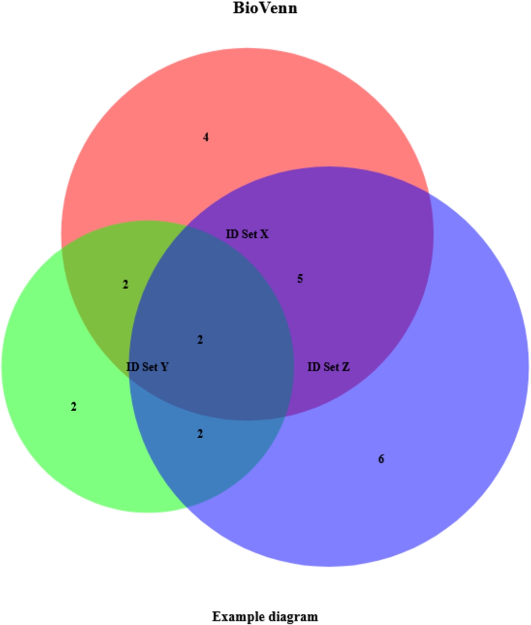
Fig. 2.
Example BioVenn diagram, created with biological ID mapping. This example was created by just entering three lists of IDs and setting three other parameters (subtitle, nrtype and map2ens).
biovenn <- draw.venn(list_x, list_y, list_z, subtitle=”Example diagram”, nrtype=”abs”, map2ens=TRUE)
This code creates the example plot of Fig. 2 and returns the data of Table 2. Note that, in comparison to Fig. 1 and Table 1, some lists contain more identifiers. This is because some Affymetrix IDs map to multiple Ensembl Gene IDs (possibly homologous genes). With the ‘map2ens’ function, BioVenn automatically converts the Affymetrix IDs to their corresponding Ensembl Gene IDs, and draws the Venn diagrams using the Ensembl Gene IDs. This is useful for researchers that want to do a gene-based comparison from expression data.
Table 2
Example output, created with biological ID mapping. This example was created by just entering three lists of IDs and setting three other parameters (subtitle, nrtype and map2ens)
| Variable | Data type | Contents |
| $x | character [13] | ENSG00000234078, ENSG00000137332, ENSG00000230456, ENSG00000215522, ENSG00000204580, ENSG00000049541, ENSG00000287363, ENSG00000048545, ENSG00000182179, ENSG00000283726, ENSG00000125618, ENSG00000173110, ENSG00000225217 |
| $y | character [8] | ENSG00000274233, ENSG00000070778, ENSG00000287363, ENSG00000048545, ENSG00000182179, ENSG00000283726, ENSG00000271503, ENSG00000126351 |
| $z | character [15] | ENSG00000234078, ENSG00000137332, ENSG00000230456, ENSG00000215522, ENSG00000274233, ENSG00000215572, ENSG00000204580, ENSG00000287363, ENSG00000048545, ENSG00000255974, ENSG00000198077, ENSG00000130649, ENSG00000173153, ENSG00000182580, ENSG00000271503 |
| $x_only | character [4] | ENSG00000049541, ENSG00000125618, ENSG00000173110, ENSG00000225217 |
| $y_only | character [2] | ENSG00000070778, ENSG00000126351 |
| $z_only | character [6] | ENSG00000215572, ENSG00000255974, ENSG00000198077, ENSG00000130649, ENSG00000173153, ENSG00000182580 |
| $xy | character [4] | ENSG00000287363, ENSG00000048545, ENSG00000182179, ENSG00000283726 |
| $xz | character [7] | ENSG00000234078, ENSG00000137332, ENSG00000230456, ENSG00000215522, ENSG00000204580, ENSG00000287363, ENSG00000048545 |
| $yz | character [4] | ENSG00000274233, ENSG00000287363, ENSG00000048545, ENSG00000271503 |
| $xy_only | character [2] | ENSG00000182179, ENSG00000283726 |
| $xz_only | character [5] | ENSG00000234078, ENSG00000137332, ENSG00000230456, ENSG00000215522, ENSG00000204580 |
| $yz_only | character [2] | ENSG00000274233, ENSG00000271503 |
| $xyz | character [2] | ENSG00000287363, ENSG00000048545 |
5.4.Overall comparison
To compare the different R and Python packages, we created Venn diagrams of a dataset showing orthologous genes that are present in human (Homo sapiens), mouse (Mus musculus) or the African clawed frog (Xenopus laevis) (available at the OMA Browser [1] through https://omabrowser.org/All/oma-groups.txt.gz). Since human and mouse are more closely related than human and Xenopus (and mouse and Xenopus), we expect that the circles of human and mouse have a larger overlap. Furthermore, Xenopus has more genes, so its circle should be larger than the circles of human and mouse.
Figure 3 shows the Venn Diagrams created in each of the R packages, in alphabetical order. For each of the plots, the colours red, green and blue were used, titles were removed, and numbers were printed in the diagram (if that option was available). The code used to generate the plots can be viewed at https://www.biovenn.nl/r_python/. We can see that the packages that create area-proportional diagrams (a, c, d, g, h) give a better impression of what the data looks like: the human and mouse circles indeed have a larger overlap than with the Xenopus circle, and the Xenopus circle is larger than the other ones. The nVennR diagram (d) might be visually less appealing, but it displays the information correctly as well. The non-area-proportional diagrams (b, e, f) need some careful reading of the numbers in the figure before they can be interpreted.
Fig. 3.
Venn diagrams created by each of the R packages: a) BioVenn, b) colorfulVennPlot, c) eulerr, d) nVennR, e) venn, f) VennDiagram, g) venneuler and h) vennplot.
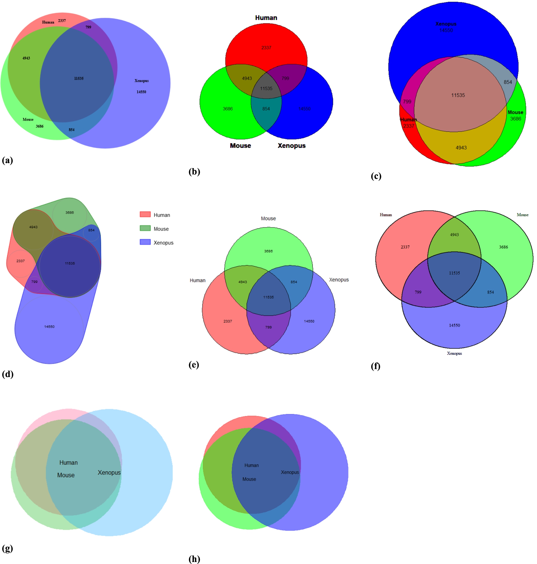
Fig. 4.
Venn diagrams created by each of the Python packages: a) BioVenn, b) matplotlib-venn and c) PyVenn.
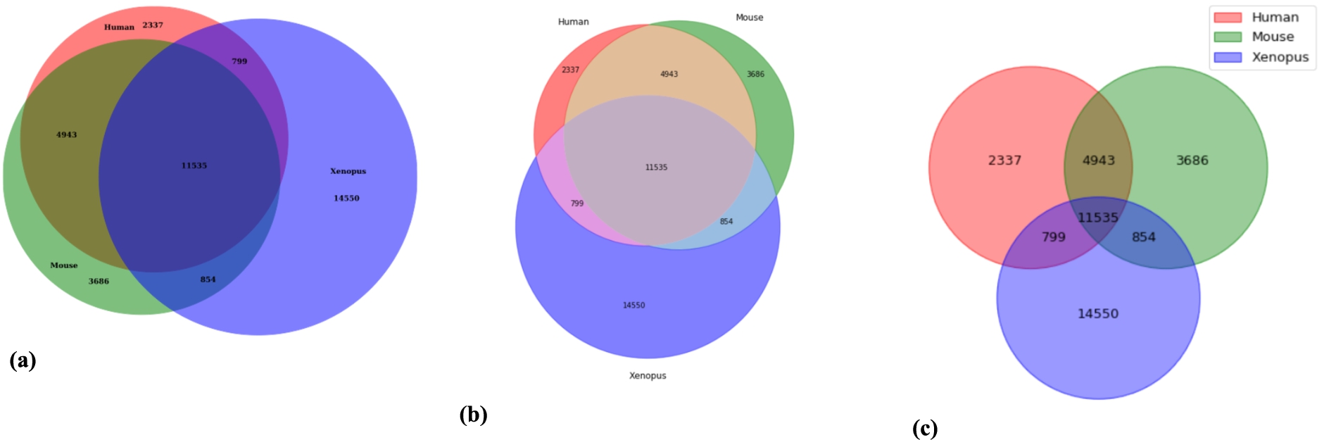
Figure 4 shows the Venn Diagrams created in each of the Python packages, in alphabetical order, with the same method as described above. Again, the area-proportional diagrams (a, b) can be understood much more easily than the non-area-proportional diagram (c).
Table 3 shows a comparison of all features of BioVenn and the seven other packages mentioned above. BioVenn is the only package that is available in both R and Python (as well as a web interface). There are packages that can generate Venn diagrams from more than three sets, but these are either not area-proportional or inaccurate. For three sets, it is sometimes impossible to create a completely accurate area-proportional Venn diagram; when more sets are added, this becomes an even larger issue. Only BioVenn has built-in biological ID mapping functionality, which earns it the prefix ‘bio’. Some programs support not only the input of IDs, but also the numbers of the sets and their overlaps. In BioVenn, these are automatically calculated from the ID lists. This also makes sure that the user cannot input mathematically impossible numbers (e.g. overlaps larger than the sets themselves). BioVenn supports a large number of output formats as well. It needs to be noted here that this table only lists built-in functionality; some functionality such as plotting to certain file formats might be possible by using other R or Python functions (e.g. the ‘matplotlib.pyplot’ functions in Python). BioVenn is the only package that supports drag-and-drop of the titles and labels (in SVG mode), which can be a very useful functionality when a set or overlap is very small compared to the rest of the figure, or when the circle title (e.g. ‘Set X’, ‘Set Y’, ‘Set Z’) overlaps with a number. BioVenn uses only circles, whereas other packages also use ellipses, polygons or even 3D balls. There are four packages (BioVenn, eulerr, PyVenn and VennDiagram) that are able to print absolute numbers or percentages in the diagram. Finally, BioVenn offers the most flexibility in formatting: title, subtitle and circle texts can be changed (as well as their fonts and colors), and the background color and the circle colors can be set.
Table 3
Venn diagram package comparison. All currently available R and Python packages that can generate Venn diagrams compared. Note that this table only lists built-in functionality; some functionality such as plotting to certain file formats might be possible by using other R or Python functions
| Package name | BioVenn | colorfulVennPlot | eulerr | matplotlib-Venn | nVennR | PyVenn | venn | vennDiagram | venneuler | vennplot |
| Programming language | R, Python (and web) | R | R (and web) | Python | R (and web) | Python | R | R (and Cytoscape and web) | R | R |
| Max. number of sets | 3 | 4 (>3 uses ellipses) | Unlimited (in theory) | 3 | Unlimited (in theory) | 6 | 7 | 5 | Unlimited (in theory) | 3 |
| Area proportionality | Automatically | Manually (only for 2-circle diagrams) | Automatically | Automatically | Automatically | No | No | Manually | Manually | Automatically |
| Built-in biological ID mapping | Yes | No | No | No | No | No | No | No | No | No |
| Input format | Sets of IDs | Sets of IDs, numbers | Sets of IDs, numbers | Sets of IDs, numbers | Sets of ID, numbers | Sets of IDs, numbers | Numbers | Sets of IDs, numbers | Sets of IDs, numbers | Sets of IDs, numbers |
| Output format | BMP (only in R), JPEG, PDF, PNG, SVG, TIFF, R/Python graphics | R graphics | R graphics | Python graphics | SVG, R graphics | Python graphics | R graphics | R graphics, TIFF | R graphics | R graphics |
| Drag-and-drop of titles, labels | Only in SVG mode | No | No | No | No | No | No | No | No | No |
| Shapes used | Circles | Circles/Ellipses | Circles/Ellipses | Circles | Polygons | Circles/Ellipses/Polygons | Circles/Ellipses/Polygons | Circles/Ellipses | Circles | Circles/Balls |
| Print absolute numbers/percentages | Both | Only absolute numbers | Both | Only absolute numbers | Only absolute numbers | Both | Only absolute numbers | Both | No | No |
| Set title(s) | Title and subtitle | Only title | Only title | No | No | No | No | Title and subtitle | No | No |
| Set circle colors | Yes | Yes | Yes | Yes | Yes | Yes | Yes | Yes | Yes | Yes |
| Set circle texts | Yes | Yes | Yes | Yes | Yes | Yes | Yes | Yes | Yes | Yes |
| Set background color | Yes | No | No | No | No | No | No | No | No | No |
| Set text colors | Yes | No | No | No | No | No | No | Yes | No | No |
| Set text fonts (family, face, size) | Yes | No | No | No | Only font size | Only font size | Only font size | Yes | No | No |
6.Conclusion
Although there are currently many tools available that can visualize sets and intersections using Venn and/or Euler diagrams or other ways (e.g. UpSetR [4], which employs a scalable matrix-based visualization), BioVenn still has added value. The BioVenn R and Python packages are a useful addition to the existing web interface, and they have some unique advantages over existing packages that can create Venn diagrams, such as the mapping of biological IDs and the drag-and-drop functionality in SVG mode. Other useful functions are the area-proportionality, printing absolute numbers or percentages, and the possibility to change all colors (including text and background) and fonts. The BioVenn R package is available in the CRAN repository [10], and can be installed by running ‘install.packages(“BioVenn”)’. The Python package is available in the PyPI repository [11], and can be installed by running ‘pip install BioVenn’. The BioVenn web interface remains available at https://www.biovenn.nl.
Acknowledgements
The author would like to thank the numerous people who have sent their suggestions for improvements over the past years, which have resulted in a more precise web tool (and now also an R package as well as a Python package).
Competing interest statement
Dr. Hulsen is employed by Philips Research.
References
[1] | A.M. Altenhoff, C.M. Train, K.J. Gilbert, I. Mediratta, T. Mendes de Farias, D. Moi, Y. Nevers, H.S. Radoykova, V. Rossier, A. Warwick Vesztrocy, N.M. Glover and C. Dessimoz, OMA orthology in 2021: Website overhaul, conserved isoforms, ancestral gene order and more, Nucleic Acids Res ((2020) ). doi:10.1093/nar/gkaa1007. |
[2] | S. Briois, Biomart – Python API that consumes the biomart webservice. Python Package Version 0.9.2, (2020) , https://pypi.org/project/biomart/. |
[3] | H. Chen and P.C. Boutros, VennDiagram: A package for the generation of highly-customizable Venn and Euler diagrams in R, BMC Bioinformatics 12: ((2011) ), 35. doi:10.1186/1471-2105-12-35. |
[4] | J.R. Conway, A. Lex and N. Gehlenborg, UpSetR: An R package for the visualization of intersecting sets and their properties, Bioinformatics 33: ((2017) ), 2938–2940. doi:10.1093/bioinformatics/btx364. |
[5] | S. Durinck, P.T. Spellman, E. Birney and W. Huber, Mapping identifiers for the integration of genomic datasets with the R/bioconductor package biomaRt, Nat Protoc 4: ((2009) ), 1184–1191. doi:10.1038/nprot.2009.97. |
[6] | A. Dusa, Venn: Draw Venn diagrams. R Package Version 1.9, (2021) , https://CRAN.R-project.org/package=venn. |
[7] | Google Scholar Citations for ‘BioVenn – a web application for the comparison and visualization of biological lists using area-proportional Venn diagrams’, https://scholar.google.com/scholar?cites=16587750604719531070. |
[8] | K. Grigorev, PyVenn: Venn diagrams for 2, 3, 4, 5, 6 sets. Python package Version 0.1.3, (2018) , https://pypi.org/project/venn/. |
[9] | T. Hulsen, VennDiagram.tk, http://www.venndiagram.tk. |
[10] | T. Hulsen, BioVenn: Create area-proportional Venn diagrams from biological lists. R Package Version 1.1.1, (2021) , https://cran.r-project.org/package=BioVenn. |
[11] | T. Hulsen, BioVenn: Create area-proportional Venn diagrams from biological lists. Python Package Version 1.1.1, (2021) , https://pypi.org/project/BioVenn/. |
[12] | T. Hulsen, J. de Vlieg and W. Alkema, BioVenn – a web application for the comparison and visualization of biological lists using area-proportional Venn diagrams, BMC Genomics 9: ((2008) ), 488. doi:10.1186/1471-2164-9-488. |
[13] | H.A. Kestler, A. Muller, J.M. Kraus, M. Buchholz, T.M. Gress, H. Liu, D.W. Kane, B.R. Zeeberg and J.N. Weinstein, VennMaster: Area-proportional Euler diagrams for functional GO analysis of microarrays, BMC Bioinformatics 9: ((2008) ), 67. doi:10.1186/1471-2105-9-67. |
[14] | J. Larsson, Eulerr: Area-proportional Euler and Venn diagrams with ellipses. R Package Version 6.1.0, (2020) , https://cran.r-project.org/package=eulerr. |
[15] | E. Noma and A. Manvae, ColorfulVennPlot: Plot and add custom coloring to Venn diagrams for 2-dimensional, 3-dimensional and 4-dimensional data. R Package Version 2.4, (2013) , https://CRAN.R-project.org/package=colorfulVennPlot. |
[16] | J.G. Perez-Silva, M. Araujo-Voces and V. Quesada, nVenn: Generalized, quasi-proportional Venn and Euler diagrams, Bioinformatics 34: ((2018) ), 2322–2324. doi:10.1093/bioinformatics/bty109. |
[17] | G. Stapleton, Z. Leishi, J. Howse and P. Rodgers, Drawing Euler diagrams with circles: The theory of piercings, IEEE Trans Vis Comput Graph 17: ((2011) ), 1020–1032. doi:10.1109/TVCG.2010.119. |
[18] | K. Tretyakov, Matplotlib-Venn – functions for plotting area-proportional two- and three-way Venn diagrams in matplotlib. Python Package Version 0.11.6, (2020) , https://pypi.org/project/matplotlib-venn/. |
[19] | L. Wilkinson and S. Urbanek, Venneuler: Venn and Euler diagrams. R Package Version 1.1-0, (2011) , https://cran.r-project.org/package=venneuler. |
[20] | Z. Xu, R.W. Oldford and M. Lysy, Vennplot: Venn diagrams in 2D and 3D. R Package Version 1.0, (2017) , https://cran.r-project.org/package=vennplot. |