
When is there enough data to create a global statistic?
Abstract
To monitor progress towards global goals such as the Sustainable Development Goals, global statistics are needed. Yet cross-country datasets are rarely truly global, creating a trade-off for producers of global statistics: the lower the data coverage threshold for disseminating global statistics, the more can be made available, but the lower accuracy they will have. We quantify this availability-accuracy trade-off by running more than 10 million simulations on the World Development Indicators. We show that if the fraction of the world’s population on which one lacks data is
1.Introduction
Open a newspaper and chances are you will find some statistic referring to how the world is fairing: “Global growth is projected to recover”, “the number of refugees worldwide is set to increase for the third straight year”, “global CO
In reality, there is rarely complete global data behind such statistics. Due to lack of resources, capacity, and political will, some countries do not produce information on the indicators of interest [1, 2]. When creating global statistics, estimates for these countries are either imputed or simply ignored. This inevitably creates a trade-off between the availability of global statistics, and the accuracy of these statistics. If global statistics are only published when data are universally or near-universally available, there will be many important topics which cannot be illuminated. If global statistics are published even when the data coverage is weak, the accuracy of the statistics may be doubtful in the sense that they are likely to deviate from the figure had all data been available.
In this paper we quantify this trade-off between data accuracy and data availability using distributional and empirical simulations. With regards to the former, we randomly draw data from various distributions and show how the type of distribution, weights, and missingness matter for assessing when there is enough data to produce global statistics. With regards to the latter, we select 165 indicators from the World Bank’s World Development Indicators spanning a wide range of topics where, for a given year, data are available for at least 99% of the world’s population. We randomly remove data from these indicators and calculate the expected difference in the global statistic as a function of the share of the world’s population without data.
We show that if the fraction of the world’s population on which one lacks data is
In further results we show how these errors change (i) if one is interested in regional statistics (ii) if data are imputed, (iii) if the probability of data missing is correlated with the indicator of interest, (iv) if one uses the share of countries rather than the share of population as a coverage threshold, and (v) if one has specific coverage requirements for populous countries, such as India.
We end with recommendations on when to produce global statistics. We hope these recommendations can be used to ensure that global statistics are only made available when the accuracy is deemed sufficiently high. This has implications for international organizations and researchers producing cross-country datasets that are aggregated to create a global statistic. By consequence, the recommendations have implications for any users of such global statistics including academia, the media, and policymakers.
To our knowledge, we are the first to study when there is enough data to create a global statistic. Yet, our paper relates to several streams of literature, such as the challenges of measuring the SDGs [3, 4], missing data on SDG reporting [5, 6] and making inference with missing data [7].
2.Method
To quantify the impact of data availability on the precision of global statistics, we rely on three methods, analytical solutions, distributional simulations, and empirical simulations. We will explain each in turn.
2.1Analytical solutions
First, we exploit the central limit theorem to derive analytical solutions to how far from the true mean one can expect to be when in possession of a subset of all data. Concretely, the central limit theorem holds that the mean value of independent random draws from some distribution tends towards a normal distribution around the true mean with a standard deviation of
In our set-up, we always standardize distributions to have a standard deviation of 1, while
We are interested in how far one can expect to be from the mean (measured in standard deviations) when one only has data on
Note that these results hold even if the original distribution is not normally distributed, and hence holds whether the distribution of the variable of interest is skewed, has high kurtosis, is bounded, categorical etc.
2.2Distributional simulations
Table 1
Examples of one standard deviation for selected indicators
| Indicator | Global mean | 1 standard deviation |
| Life expectancy at birth, total (years) | 71.1 | 6.9 |
| GDP growth (annual %) | 5.0 | 3.0 |
| People using at least basic sanitation services (% of population) | 71.5 | 24.2 |
| Agricultural land (% of land area) | 47.9 | 17.5 |
| CO | 4.4 | 4.2 |
Note: The table shows what one standard deviation (using the distribution of country estimates) implies for five different indicators for a particular year.
Unfortunately the analytical results above do not apply when each observation has a separate weight, and hence when one is interested in population-weighted means. They also do not apply if the data are not missing at random. To study how these elements impact the results in a stylized set-up, we randomly draw distributions of data under various assumptions.
Concretely, we draw 1000 random draws from a normal distribution 217 times, which reflects the number of economies in our set-up. Next we assign each draw a weight from a Weibull distribution with shape parameter 0.5 and scale parameter 1. This generates weights that somewhat resemble the spread of the distribution of population sizes across countries (albeit a bit less dispersed). We then randomly set some of this data as missing and study how accurate the weighted mean is from the true mean as a function of the share of weights missing.
To study the impact of data not missing at random, we return to uniform weights and randomly drop data, but let large values have a greater probability of being dropped. Concretely, for a distribution of normally distributed values,
2.3Empirical simulations
Finally, we will use the World Bank’s World Development Indicators (WDI) to investigate how all of this plays out in practice. The WDI is arguably the world’s largest database of relevant country-year indicators spanning a wide range of topics. The WDI contains information on around 1400 indicators covering topics such as poverty, health, agriculture, education, climate change, infrastructure and more. The data behind the indicators are solicited from numerous different sources spanning dozens of international organizations, research institutions, and more.
We select 165 different indicators that for a given year have near universal coverage (
For these 165 indicators we abstract from the small degree of missingness and consider the statistic they produce as the ground truth. Next, we randomly delete a subset of the data for each indicator calculate the new global mean and compare it to the ground truth. This gives us an estimate of the error when only a fraction of the global population has data. By repeating this exercise more than 10 million times using different indicators and different probabilities of missingness, we can calculate the expected error as a function of population coverage.
2.4Interpreting the results
To compare the results across the different methods, and in the empirical case, to compare indicators in different units, we always standardize all variables to have mean 0 and variance 1. This allows us to express the error as standard deviations from the mean and average these errors across simulations and indicators.
Most data producers may not be used to thinking of their indicator in terms of standard deviations from the mean. To foster some intuition, Table 1 shows what one standard deviation implies for five selected indicators. If one is a standard deviation away from the true mean when creating a global statistic, one could get life expectancy off by 7 years, global growth off by 3 percentage points, and the share using at least basic sanitation services off by 24 percentage points. Even if these errors are cut by four, and one is 0.25 of a standard deviation off the truth, they still represent large errors.
Another way of interpreting standard deviations from the mean is by looking at how much global statistics change from one year to the next. For 144 of the 165 indicators we have chosen we have at least 99% coverage two years after each other. This means that we can calculate how much the global mean changed expressed in standard deviations from the mean in the first year. Half of all indicators change by 0.03 standard deviations or less from one year to the next, and no indicator changes by more than 0.33 standard deviations.
On the one hand, this means that if one is 0.03 standard deviations from the true mean in a single year because of missing data, then for half of all indicators, one would not be able to tell apart true changes in the statistic from changes driven by inaccuracy. On the other hand, to the extent that countries with missing data remain the same from one year to the next, missingness is less likely to impact year-to-year changes and more likely to cause a systematic and consistent bias. Across WDI, 93% of instances with missing data in one year also have missing data in the next year, suggesting the latter channel may dominate in many cases.
3.Analytical results and distributional simulations
Figure 1.
Comparing errors with simple and weighted averages.
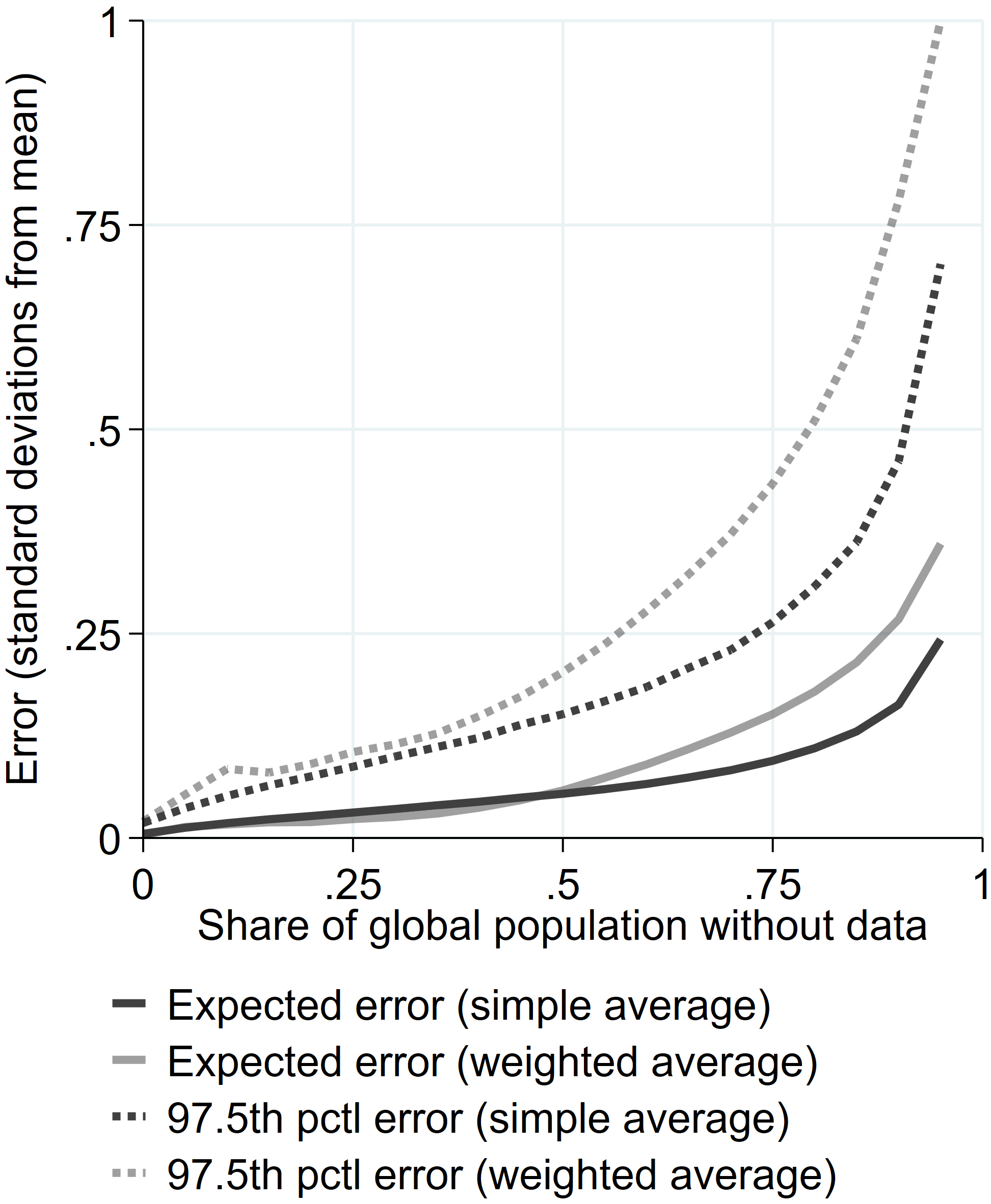
Figure 1 shows the results when one is interested in simple averages and data are missing at random. The expected error is quite low and only gets above 0.25 standard deviations when more than 95% of the global population is without data. Even some of the most extreme cases (the 97.5
Though these findings are encouraging, we believe most practical applications will use population-weighted averages where the errors are much larger. Figure 1 shows that the expected error and the most extreme error when using weighed averages increase notably. The reason is that the effective number of observations fall when weights are unequal. The exact amount the errors increase is a function of how unequal we drew the weights.
Figure 2.
Comparing errors when data are missing at random and not.
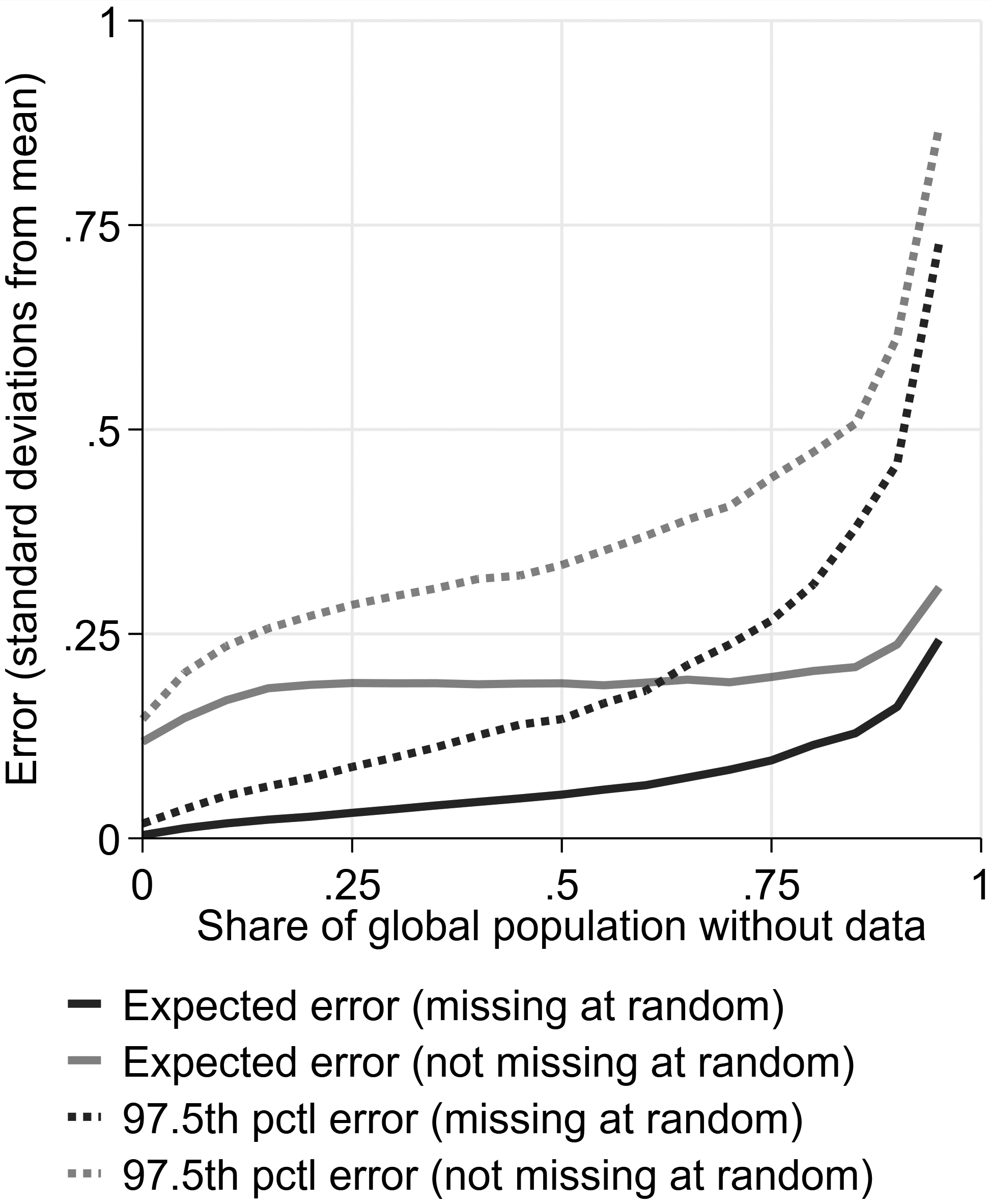
We also look at what happens if data are not missing at random, but that larger (or smaller) values are more likely to be missing. This could be the case, for example if one is interested in calculating the average income globally and data are more frequently missing for poorer countries. As shown in Fig. 2, this increases both the expected error and outlier errors. Even when nearly all countries have data, one could be quite off because one might be missing the most extreme values. Again, the exact amount the errors increase is a function of how we drew the data.
4.Empirical simulations
4.1Main results
In Fig. 3 we plot the results from our empirical simulations. We plot the expected error in the global statistic as a function of the share of the global population without data. These results account for unequal weights but do not yet account for potential non-random missingness. The expected error increases linearly with the share of population without data. The linear fit suggests that if the share of the world’s population on which one lacks data is
Figure 3.
Relationship between global data coverage and accuracy.
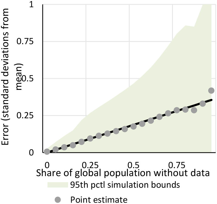
As an example, if one has data for half of the world’s population, the global statistic will on expectation be 0.185 (0.37
If one is interested in producing regional statistics (or any other sub-global statistic), the errors could be smaller or larger. On the one hand, to the extent that countries within regions are relatively alike, just having data on a few countries in the region might be sufficient to get the mean relatively right. This pushes the errors down relative to the global statistics. On the other hand, aggregating to a smaller number of countries means that for a fixed population share, there are less estimates to average over, which pushes the uncertainty and expected error up. The distribution of population sizes also plays a role here: in regions where one country dominates the total population, the effective number of observations is smaller. We can see this by comparing Figs 1 and 3 – the errors are three times larger for a given population share when using weighted averages.
Figure 4.
Relationship between data coverage and accuracy by subgroups. Note: Each grey line represents a World Bank region or a World Bank income group.
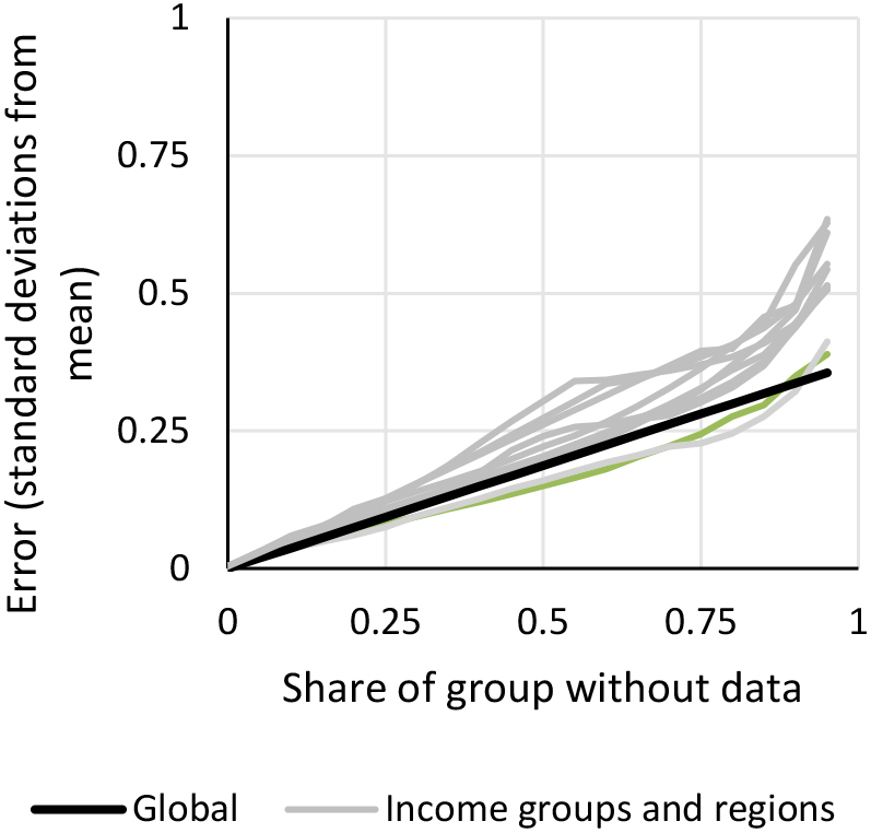
Figure 4 shows the estimated errors across the World Bank’s geographical regions and four income groups. Evidently, the errors tend to be higher for regions and income groups than for the world as a whole. The only subgroups with lower errors are Europe & Central Asia and High-Income Countries. These are, non-coincidentally, groupings with relatively many countries that in many indicators are not too different.
4.2Alternative missingness assumptions
The empirical simulations so far provide too optimistic errors if the data are systematically missing in the sense that the correlation between the probability of missingness and the value of the indicator is not zero. This is the case with SDG 1.1.1 – the share living below the international poverty line – where less data is associated with higher poverty. Countries with at most five poverty estimates since 1980 have an average poverty rate of 32%, countries with 6–10 poverty estimates have an average poverty rate of 22%, and countries with more than 10 estimates have an average poverty rate of 4%. On the other hand, the errors we have presented so far might be too pessimistic if imputations are used to get proxy values for the countries with missing data.
In this section, we try to address these two issues empirically. First, we assume that all missing values are imputed using regional averages. This is a common way of dealing with missing values in applied work. Second, we order countries by their share of missingness in an indicator in the years without full coverage and delete observations using this order rather than at random. The purpose is to only retain the data for the countries most likely to have data in any other year. The results from these two exercises are shown in Fig. 5.
Figure 5.
Relationship between data coverage and accuracy with alternative assumptions.
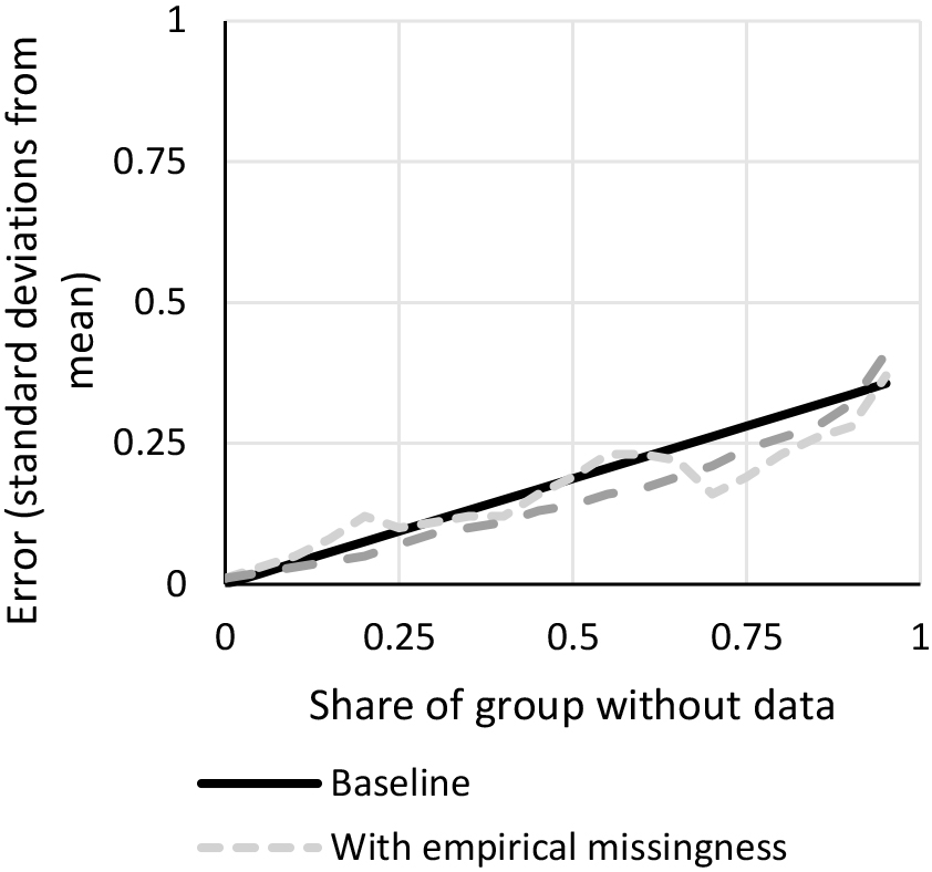
Using the empirical missingness from WDI does not systematically make the errors greater. This suggests that the probability of missingness in WDI is not systematically correlated with the indicator values and that our main results are not too optimistic. The reason for this is that across WDI, it is not the case that there is a clear monotonic relationship between missingness and economic development. In fact, among the indicators we use, low- and high-income countries have the greatest probability of missingness, while upper middle- and lower-middle income countries have the lowest. Yet, if for specific indicators the probability that data is missing is correlated to the values of the indicator, as with SDG 1.1.1, then we would be underestimating the error.
Imputing with regional averages reduces the error by about 20%. Note, however, that if the share of the population with data is very low (below 20%), then using regional averages as an imputation does not help – it may even make matters worse. Such imputations would be based on so few data points that they actually increase the error. The fact that this breakdown point is very low means that this likely is of little concern in most applications. Note also that if true imputations are better than using regional averages, then the expected reduction in the error before the breakdown point will be higher and the breakdown point will occur for even lower coverage rates.
4.3Alternative coverage weights
Data producers sometimes use coverage rules based on the share of countries covered rather than the share of the global population covered. Suppose one is in doubt between which rule to use. A way to determine this would be for a given coverage requirement, say 50%, to compare the average error of the statistics that satisfy the country criterion but not the population criterion, and vice versa. Conditional on the same number of statistics passing the two coverage thresholds, ideally the coverage rule should minimize the error of those that pass.
Figure 6.
Comparing error with population coverage and country coverage.
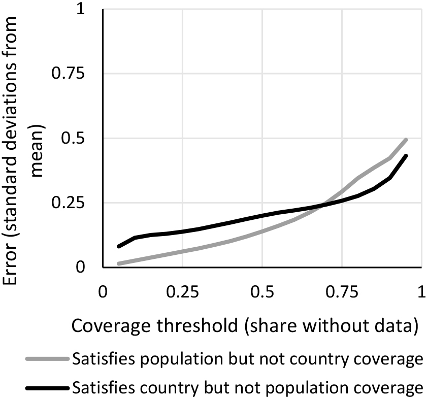
Figure 6 tests this as a function of the threshold. We find that for any missing data tolerance less than 0.7, population weights work better than country weights. The intuition for this is as follows. If one has data on a large fraction of the world’s countries, one might still get the statistic far off if one is lacking data on some of the most populous countries of the world. To the contrary, if one is willing to tolerate a large share of missingness, one might pass the bar by only having data on, say, India. If India is very different from the rest of the world, one can risk being quite off, and it might be better to average over more countries even if they account for a smaller population share. To see the latter argument more clearly, suppose one can choose between having data for one country of 40 million people or 4 countries of 10 million people. The latter would probably be better given that it would average out idiosyncrasies, outliers, and possible measurement error.
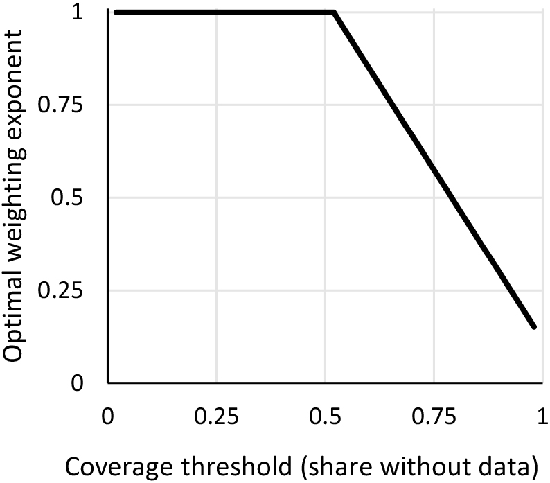
Does this mean that one ought to use country weights when tolerating high degrees of missingness? Actually not – intermediate options might be preferable. Notice that population weighting is equivalent to giving each country a weight of their population^1 while country weighting is equivalent to giving each country a weight of their population^0. By altering the exponent, we can get intermediate options. For example, using the square-root of the population size as weights would give the same weight to having data from two countries of 10 million and one country of 40 million (rather than half the weight, as population-weighting would do, or twice the weight, as country-weighting would do).
By making pairwise comparisons between such intermediate weighting schemes, we can see which weighting scheme for a given coverage threshold minimizes the expected error. The results are presented in Fig. 7. The ideal weighting scheme is to use population weights for any missingness tolerance less than around 50%. After that, the optimal exponent declines. Using square root weights is optimal if one is willing to tolerate around 80% missingness. Using country weights (exponent
Figure 7.
Optimal population weight as a function of coverage threshold. Note: The figure shows the optimal country weight for a given coverage threshold. A y-axis value of
An alternative intermediate approach to taking an exponent of the population size is to condition coverage rules on data for the most populous countries being available. Comparing the performance of such coverage rules is a bit more challenging, given that for a certain population or country coverage threshold, the coverage rule is stricter. For example, the global statistics that cover at least half of the world’s population and India on average cover a larger population share and are thus bound to be more precise than the global statistics that cover at least half of the world’s population regardless of whether India is covered. Instead, we can compare a rule that conditions on data in India being present to a rule that does not condition on India being present, but has a slightly higher coverage threshold, such that they are equally stringent, meaning that equally many global statistics pass the rule.
Figure 8 makes such a comparison by replacing the
Figure 8.
Coverage rules that condition on data for the largest country being present.
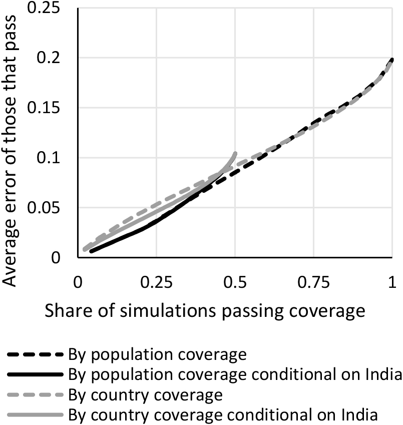
For about the 20% of simulations that first pass the bar, the error is the same whether conditioning on India or not: if a simulation has at least 80% of the world’s population covered, by necessity it must have India covered. After that, they are nearly identical until around 40% of the simulations pass the threshold. At that point, conditioning on India being present gives higher errors. This means that for a given stringency level, there is little evidence in favor of conditioning on data for the most populous country being present. If one is worried about having too imprecise global statistics, it would be better instead to increase the coverage threshold.
Though conditioning on India being present does not help when using population coverage, it more obviously might help when using country coverage. It only increases the country coverage strictness by one country but can substantially reduce the error. The grey lines in Fig. 8 show that if using country coverage, conditioning on data being present for the most populous country helps. Yet since the solid grey line is above the black lines, it is still preferable not to use country coverage rules at all – even when conditioning on data being present for the most populous country.
4.4Alternative aggregation schemes
At times, data producers will want to summarize or aggregate an indicator of interest using other methods than by taking the population-weighted average. We have already seen that if taking a simple unweighted average, the errors tend to be much lower.
If one is interested in the sum of an indicator, such as the sum of refugees worldwide, the population-weighted results presented so far all apply if countries with missing data are giving the population-weighted average per capita value multiplied by its population size.
If one is interested in calculating weighted averages using the size of the economy, the size of the country or other weights that are not population sizes, the results will depend on the dispersion of the weights. All else equal, the more unequal the weights, the larger the expected error.
5.Conclusion
In conclusion we offer some advice for how to decide when there is sufficient data to create global statistics. The most important to note is that there is no single threshold which can guide when to publish global statistics or not. The decision will depend on the context. In particular, we think the data producer should ask her- or himself the following questions:
• How large errors am I willing to tolerate?
• How pervasive is missing data in my indicators of interest?
• Is the probability of a country not having data likely correlated with the indicator of interest?
• [If producing time series] How much do the global statistics change from year to year and do the same countries consistently have missing values?
• [If missing data is imputed] How confident am I in the precision of the imputations?
• [If producing sub-global statistics] How large are the groups and how much of the variation happens between subgroups rather than within subgroups?
• [If not using population-weights] How unequal are the weights?
Jointly answering these questions should afford an approximate slope of the error as a function of the population coverage, as well as a ceiling on how large an error one is willing to tolerate. Judging from the table comparing standard deviations with original units, our (admittedly, subjective) take is that errors should never on expectation exceed 0.25 standard deviations. Even in the less optimistic cases we presented, this roughly corresponds to not publishing statistics when data for less than half of the relevant population is available. For certain purposes, such as comparing statistics over time, it is likely that much lower errors are needed. A corollary of these recommendations is that it is always optimal to use the share of the global population covered rather than the share of countries covered as the coverage threshold. A corollary of this is that rather than conditioning on data being present for populous countries, it would be better to increase the coverage threshold.
Acknowledgments
We are grateful for comments received from Aart Kraay, R. Andrés Castañeda Aguilar, Bob Rijkers, Christoph Lakner, and Dean Jolliffe. We are also grateful for discussions on the topic from participants of the Interagency Task Team on Aggregation coordinated by the United Nations. The code for the paper is available at https://github.com/danielmahler/Aggregation.
References
[1] | Serajuddin U, Uematsu H, Wieser C, Yoshida N, Dabalen A. Data Deprivation: Another Deprivation to End. World Bank Policy Research Working Paper. Washington, D.C.: (2015) . no. 7252. |
[2] | Dang H, Pullinger J, Serajuddin U, Stacy B. Statistical Performance Indicators and Index. World Bank Policy Research Working Pape. Washington, D.C.: (2021) . no. 9570. |
[3] | MacFeely S. The 2030 Agenda: An Unprecedented Statistical Challenge. Friedrich-Ebert-Stiftung, Global Policy and Development; (2018) . |
[4] | Sachs J. From millennium development goals to sustainable development goals. The Lancet. (2012) ; 379: (9832): 2206-2211. doi: 10.1016/S0140-6736(12)60685-0. |
[5] | Dang H, Serajuddin U. Tracking the Sustainable Development Goals: Emerging measurement challenges and further reflections. World Development. (2020) ; 127: : 104570. doi: 10.1016/j.worlddev.2019.05.024. |
[6] | World Bank. World Development Report 2021: Data for Better Lives. Washington, D.C.: (2021) . |
[7] | Dang H, Jolliffe D, Carletto C. Data gaps, data incomparability, and data imputation: A review of poverty measurement methods for data-scarce environments. Journal of Economic Surveys. (2019) ; 33: (3): 757-797. doi: 10.1111/joes.12307. |
Appendices
Appendix
Table A.1
Indicators used for the analysis
| WDI code | Description | Year |
|---|---|---|
| AG.LND.AGRI.ZS | Agricultural land (% of land area) | 2016 |
| AG.LND.ARBL.HA.P | Arable land (hectares per person) | 2011 |
| AG.LND.ARBL.ZS | Arable land (% of land area) | 2011 |
| AG.LND.CROP.ZS | Permanent cropland (% of land area) | 2011 |
| AG.LND.FRST.ZS | Forest area (% of land area) | 2016 |
| AG.PRD.CROP.XD | Crop production index (2014–2016 | 2016 |
| AG.PRD.FOOD.XD | Food production index (2014–2016 | 2016 |
| AG.PRD.LVSK.XD | Livestock production index (2014–2016 | 2016 |
| AG.YLD.CREL.KG | Cereal yield (kg per hectare) | 2015 |
| BX.KLT.DINV.WD.GD.ZS | Foreign direct investment, net inflows (% of GDP) | 2014 |
| BX.TRF.PWKR.DT.GD.ZS | Personal remittances, received (% of GDP) | 2014 |
| EG.EGY.PRIM.PP.K | Energy intensity level of primary energy (MJ/$2011 PPP GDP) | 2013 |
| EG.ELC.ACCS.RU.Z | Access to electricity, rural (% of rural population) | 2015 |
| EG.ELC.ACCS.UR.Z | Access to electricity, urban (% of urban population) | 2019 |
| EG.ELC.ACCS.ZS | Access to electricity (% of population) | 2019 |
| EG.ELC.RNEW.ZS | Renewable electricity output (% of total electricity output) | 2015 |
| EG.FEC.RNEW.ZS | Renewable energy consumption (% of total final energy consumption) | 2015 |
| EN.ATM.CO2E.GF.Z | CO | 2014 |
| EN.ATM.CO2E.LF.Z | CO | 2014 |
| EN.ATM.CO2E.PC | CO | 2018 |
| EN.ATM.CO2E.SF.Z | CO | 2014 |
| EN.ATM.GHGT.ZG | Total greenhouse gas emissions (% change from 1990) | 2004 |
| EN.ATM.METH.AG.Z | Agricultural methane emissions (% of total) | 2008 |
| EN.ATM.METH.EG.Z | Energy related methane emissions (% of total) | 2008 |
| EN.ATM.NOXE.AG.Z | Agricultural nitrous oxide emissions (% of total) | 2008 |
| EN.ATM.NOXE.EG.Z | Nitrous oxide emissions in energy sector (% of total) | 2008 |
| EN.ATM.PM25.MC.Z | PM2.5 air pollution, population exposed to levels exceeding WHO guideline value (% of total) | 2017 |
| EN.POP.DNS | Population density (people per sq. km of land area) | 2017 |
| EN.URB.LCTY.UR.Z | Population in the largest city (% of urban population) | 2017 |
| EP.PMP.DESL.CD | Pump price for diesel fuel (US$ per liter) | 2008 |
| EP.PMP.SGAS.CD | Pump price for gasoline (US$ per liter) | 2014 |
| ER.H2O.FWAG.ZS | Annual freshwater withdrawals, agriculture (% of total freshwater withdrawal) | 2017 |
| ER.H2O.FWDM.ZS | Annual freshwater withdrawals, domestic (% of total freshwater withdrawal) | 2017 |
| ER.H2O.FWIN.ZS | Annual freshwater withdrawals, industry (% of total freshwater withdrawal) | 2017 |
| ER.H2O.FWTL.ZS | Annual freshwater withdrawals, total (% of internal resources) | 2012 |
| ER.LND.PTLD.ZS | Terrestrial protected areas (% of total land area) | 2016 |
| ER.PTD.TOTL.ZS | Terrestrial and marine protected areas (% of total territorial area) | 2016 |
| FB.CBK.BRCH.P5 | Commercial bank branches (per 100,000 adults) | 2012 |
| IC.BUS.DFRN.XQ | Ease of doing business score (0 | 2019 |
| IC.BUS.DISC.XQ | Business extent of disclosure index (0 | 2019 |
| IC.CRD.INFO.XQ | Depth of credit information index (0 | 2019 |
| IC.CRD.PRVT.ZS | Private credit bureau coverage (% of adults) | 2019 |
| IC.CRD.PUBL.ZS | Public credit registry coverage (% of adults) | 2019 |
| IC.ELC.TIM | Time required to get electricity (days) | 2014 |
| IC.EXP.CSBC.CD | Cost to export, border compliance (US$) | 2015 |
| IC.EXP.CSDC.CD | Cost to export, documentary compliance (US$) | 2015 |
| IC.EXP.TMB | Time to export, border compliance (hours) | 2015 |
| IC.EXP.TMD | Time to export, documentary compliance (hours) | 2015 |
| IC.IMP.CSBC.CD | Cost to import, border compliance (US$) | 2015 |
| IC.IMP.CSDC.CD | Cost to import, documentary compliance (US$) | 2015 |
| IC.IMP.TMB | Time to import, border compliance (hours) | 2015 |
| IC.IMP.TMD | Time to import, documentary compliance (hours) | 2015 |
| IC.LGL.CRED.XQ | Strength of legal rights index (0 | 2019 |
| IC.LGL.DUR | Time required to enforce a contract (days) | 2019 |
| IC.PRP.DUR | Time required to register property (days) | 2019 |
| IC.PRP.PRO | Procedures to register property (number) | 2019 |
| Table A.1, continued | ||
|---|---|---|
| WDI code | Description | Year |
| IC.REG.COST.PC.FE.ZS | Cost of business start-up procedures, female (% of GNI per capita) | 2019 |
| IC.REG.COST.PC.MA.ZS | Cost of business start-up procedures, male (% of GNI per capita) | 2019 |
| IC.REG.COST.PC.Z | Cost of business start-up procedures (% of GNI per capita) | 2019 |
| IC.REG.DUR | Time required to start a business (days) | 2019 |
| IC.REG.DURS.FE | Time required to start a business, female (days) | 2019 |
| IC.REG.DURS.MA | Time required to start a business, male (days) | 2019 |
| IC.REG.PRO | Start-up procedures to register a business (number) | 2019 |
| IC.REG.PROC.FE | Start-up procedures to register a business, female (number) | 2019 |
| IC.REG.PROC.MA | Start-up procedures to register a business, male (number) | 2019 |
| IC.TAX.DUR | Time to prepare and pay taxes (hours) | 2018 |
| IC.TAX.LABR.CP.Z | Labor tax and contributions (% of commercial profits) | 2018 |
| IC.TAX.OTHR.CP.Z | Other taxes payable by businesses (% of commercial profits) | 2018 |
| IC.TAX.PAY | Tax payments (number) | 2018 |
| IC.TAX.PRFT.CP.Z | Profit tax (% of commercial profits) | 2018 |
| IC.TAX.TOTL.CP.Z | Total tax and contribution rate (% of profit) | 2018 |
| IT.CEL.SETS.P2 | Mobile cellular subscriptions (per 100 people) | 2010 |
| IT.MLT.MAIN.P2 | Fixed telephone subscriptions (per 100 people) | 2010 |
| IT.NET.SECR.P6 | Secure Internet servers (per 1 million people) | 2017 |
| IT.NET.USER.ZS | Individuals using the Internet (% of population) | 2013 |
| MS.MIL.TOTL.TF.Z | Armed forces personnel (% of total labor force) | 2014 |
| NV.AGR.TOTL.ZS | Agriculture, forestry, and fishing, value added (% of GDP) | 2006 |
| NV.IND.TOTL.ZS | Industry (including construction), value added (% of GDP) | 2006 |
| NV.SRV.TOTL.ZS | Services, value added (% of GDP) | 2014 |
| NY.ADJ.AEDU.GN.Z | Adjusted savings: education expenditure (% of GNI) | 2001 |
| NY.ADJ.DCO2.GN.Z | Adjusted savings: carbon dioxide damage (% of GNI) | 2014 |
| NY.ADJ.DKAP.GN.Z | Adjusted savings: consumption of fixed capital (% of GNI) | 2014 |
| NY.ADJ.DMIN.GN.Z | Adjusted savings: mineral depletion (% of GNI) | 2014 |
| NY.ADJ.DNGY.GN.Z | Adjusted savings: energy depletion (% of GNI) | 2014 |
| NY.ADJ.DPEM.GN.Z | Adjusted savings: particulate emission damage (% of GNI) | 2014 |
| NY.GDP.COAL.RT.Z | Coal rents (% of GDP) | 2006 |
| NY.GDP.DEFL.KD.Z | Inflation, GDP deflator (annual %) | 2014 |
| NY.GDP.FRST.RT.Z | Forest rents (% of GDP) | 2004 |
| NY.GDP.MINR.RT.Z | Mineral rents (% of GDP) | 2004 |
| NY.GDP.MKTP.KD.Z | GDP growth (annual %) | 2014 |
| NY.GDP.NGAS.RT.Z | Natural gas rents (% of GDP) | 2006 |
| NY.GDP.PCAP.CD | GDP per capita (current US$) | 2014 |
| NY.GDP.PCAP.KD | GDP per capita (constant 2010 US$) | 2014 |
| NY.GDP.PCAP.KD.Z | GDP per capita growth (annual %) | 2014 |
| NY.GDP.PETR.RT.Z | Oil rents (% of GDP) | 2006 |
| NY.GDP.TOTL.RT.Z | Total natural resources rents (% of GDP) | 2006 |
| NY.GNP.PCAP.CD | GNI per capita, Atlas method (current US$) | 2014 |
| SE.PRM.DUR | Primary education, duration (years) | 2019 |
| SE.SEC.DUR | Secondary education, duration (years) | 2019 |
| SG.GEN.PARL.ZS | Proportion of seats held by women in national parliaments (%) | 2016 |
| SH.ALC.PCAP.LI | Total alcohol consumption per capita (liters of pure alcohol, projected estimates, 15 | 2018 |
| SH.DTH.COMM.ZS | Cause of death, by communicable diseases and maternal, prenatal and nutrition conditions (% of total) | 2019 |
| SH.DTH.INJR.ZS | Cause of death, by injury (% of total) | 2019 |
| SH.DTH.NCOM.ZS | Cause of death, by non-communicable diseases (% of total) | 2019 |
| SH.DYN.050 | Probability of dying among children ages 5–9 years (per 1,000) | 2019 |
| SH.DYN.101 | Probability of dying among adolescents ages 10–14 years (per 1,000) | 2019 |
| SH.DYN.151 | Probability of dying among adolescents ages 15–19 years (per 1,000) | 2019 |
| SH.DYN.202 | Probability of dying among youth ages 20–24 years (per 1,000) | 2019 |
| SH.DYN.MOR | Mortality rate, under-5 (per 1,000 live births) | 2019 |
| SH.DYN.NCOM.ZS | Mortality from CVD, cancer, diabetes or CRD between exact ages 30 and 70 (%) | 2019 |
| SH.DYN.NMR | Mortality rate, neonatal (per 1,000 live births) | 2019 |
| SH.H2O.BASW.ZS | People using at least basic drinking water services (% of population) | 2015 |
| SH.IMM.HEP | Immunization, HepB3 (% of one-year-old children) | 2019 |
| SH.IMM.IDP | Immunization, DPT (% of children ages 12–23 months) | 2019 |
| SH.IMM.MEA | Immunization, measles (% of children ages 12–23 months) | 2019 |
| SH.MMR.RIS | Lifetime risk of maternal death (1 in: rate varies by country) | 2017 |
| Table A.1, continued | ||
|---|---|---|
| WDI code | Description | Year |
| SH.MMR.RISK.ZS | Lifetime risk of maternal death (%) | 2017 |
| SH.STA.AIRP.P5 | Mortality rate attributed to household and ambient air pollution, age-standardized (per 100,000 population) | 2016 |
| SH.STA.BASS.ZS | People using at least basic sanitation services (% of population) | 2015 |
| SH.STA.DIAB.ZS | Diabetes prevalence (% of population ages 20 to 79) | 2019 |
| SH.STA.MMR | Maternal mortality ratio (modeled estimate, per 100,000 live births) | 2017 |
| SH.STA.ODFC.ZS | People practicing open defecation (% of population) | 2014 |
| SH.STA.POIS.P5 | Mortality rate attributed to unintentional poisoning (per 100,000 population) | 2019 |
| SH.STA.SUIC.P5 | Suicide mortality rate (per 100,000 population) | 2019 |
| SH.STA.TRAF.P5 | Mortality caused by road traffic injury (per 100,000 population) | 2016 |
| SH.STA.WASH.P5 | Mortality rate attributed to unsafe water, unsafe sanitation and lack of hygiene (per 100,000 population) | 2016 |
| SH.TBS.DTEC.ZS | Tuberculosis case detection rate (%, all forms) | 2016 |
| SH.TBS.INC | Incidence of tuberculosis (per 100,000 people) | 2019 |
| SH.UHC.SRVS.CV.X | UHC service coverage index | 2017 |
| SH.XPD.CHEX.GD.Z | Current health expenditure (% of GDP) | 2010 |
| SH.XPD.CHEX.PP.C | Current health expenditure per capita, PPP (current international $) | 2010 |
| SH.XPD.EHEX.CH.Z | External health expenditure (% of current health expenditure) | 2010 |
| SH.XPD.EHEX.PP.C | External health expenditure per capita, PPP (current international $) | 2010 |
| SH.XPD.GHED.CH.Z | Domestic general government health expenditure (% of current health expenditure) | 2010 |
| SH.XPD.GHED.GD.Z | Domestic general government health expenditure (% of GDP | 2010) |
| SH.XPD.GHED.PP.C | Domestic general government health expenditure per capita, PPP (current international $) | 2010 |
| SH.XPD.PVTD.CH.Z | Domestic private health expenditure (% of current health expenditure) | 2010 |
| SH.XPD.PVTD.PP.C | Domestic private health expenditure per capita, PPP (current international $) | 2010 |
| SL.AGR.EMPL.ZS | Employment in agriculture (% of total employment) (modeled ILO estimate) | 2019 |
| SL.EMP.1524.SP.Z | Employment to population ratio, ages 15–24, total (%) (modeled ILO estimate) | 2019 |
| SL.EMP.MPYR.ZS | Employers, total (% of total employment) (modeled ILO estimate) | 2019 |
| SL.EMP.SELF.ZS | Self-employed, total (% of total employment) (modeled ILO estimate) | 2019 |
| SL.EMP.TOTL.SP.Z | Employment to population ratio, 15 | 2020 |
| SL.EMP.VULN.ZS | Vulnerable employment, total (% of total employment) (modeled ILO estimate) | 2019 |
| SL.EMP.WORK.ZS | Wage and salaried workers, total (% of total employment) (modeled ILO estimate) | 2019 |
| SL.FAM.WORK.ZS | Contributing family workers, total (% of total employment) (modeled ILO estimate) | 2019 |
| SL.IND.EMPL.ZS | Employment in industry (% of total employment) (modeled ILO estimate) | 2019 |
| SL.SRV.EMPL.ZS | Employment in services (% of total employment) (modeled ILO estimate) | 2019 |
| SL.TLF.ACTI.1524.Z | Labor force participation rate for ages 15–24, total (%) (modeled ILO estimate) | 2019 |
| SL.TLF.ACTI.ZS | Labor force participation rate, total (% of total population ages 15–64) (modeled ILO estimate) | 2019 |
| SL.TLF.CACT.FM.Z | Ratio of female to male labor force participation rate (%) (modeled ILO estimate) | 2019 |
| SL.TLF.CACT.ZS | Labor force participation rate, total (% of total population ages 15 | 2020 |
| SL.UEM.1524.ZS | Unemployment, youth total (% of total labor force ages 15–24) (modeled ILO estimate) | 2019 |
| SL.UEM.TOTL.ZS | Unemployment, total (% of total labor force) (modeled ILO estimate) | 2020 |
| SM.POP.TOTL.ZS | International migrant stock (% of population) | 2015 |
| SP.ADO.TFR | Adolescent fertility rate (births per 1,000 women ages 15–19) | 2019 |
| SP.DYN.CBRT.IN | Birth rate, crude (per 1,000 people) | 2006 |
| SP.DYN.CDRT.IN | Death rate, crude (per 1,000 people) | 2014 |
| SP.DYN.IMRT.IN | Mortality rate, infant (per 1,000 live births) | 2019 |
| SP.DYN.LE00.IN | Life expectancy at birth, total (years) | 2012 |
| SP.DYN.TFRT.IN | Fertility rate, total (births per woman) | 2007 |
| SP.RUR.TOTL.ZS | Rural population (% of total population) | 2020 |
| SP.URB.GRO | Urban population growth (annual %) | 2020 |
| SP.URB.TOTL.IN.Z | Urban population (% of total population) | 2020 |
| TG.VAL.TOTL.GD.Z | Merchandise trade (% of GDP) | 2006 |