LiteRate: A Shiny R app for improving data literacy in Indonesia1
Abstract
The longer a decision-maker has to wait for the statistics, the less useful they are likely to be. This statement is not only related to how fast the data is available, but also how fast the data can be understood. As the leading portal in presenting trusted data in Indonesia, the Badan Pusat Statistik (BPS) website provides complete data that covers various areas, subjects, and domains. However, the visualization of these data seems to be lagging. These data are presented in the form of tables and static graphs that are monotonous and the lack of interactivity discourages users from exploring the data more.
To tackle this gap, we developed liteRate which is an interactive web-based visualization/exploration tool that is based on the Shiny R. LiteRate aims to improve the public’s ability to understand the online data of the BPS’ by utilizing web scraping and headless browsers to produce ready-to-visualize data frames. Effective visualization techniques will empower users to quickly gain insight, see patterns, correlation, outliers, and view statistics across topics and areas. LiteRate hopes to increase statistical literacy in Indonesia as BPS continues to generate statistics that leave no one behind.
1.Introduction
Nowadays, statistical literacy has become a concern of every National Statistics Office (NSO) around the globe. The ability for the public to understand statistics is a prerequisite for successful communication. Amidst the present-day hoax and fake news, the need to reinforce the ability for the public users to understand figures and evaluate information are deemed increasingly urgent.
Statistical literacy is generally defined as the ability of an individual or a group to understand and comprehend statistics [1]. It includes the ability to read and communicate the meaning of data. The lack of statistical understanding can lead to numerous misinterpretations of official data which can be observed in media reports, daily newspaper articles, and in direct contact with our users.
As the leading portal for trusted data in Indonesia, the BPS-Statistics Indonesia (BPS) website has been providing extensive data that cover various subjects and areas. However, these data are presented in the form of tables and static graphs that are monotonous and lack interactivity. The static nature of information from the BPS website discourages users from exploring the data more. As the volume of quantitative information increases, tables need to be carefully designed so that they can still be understood. The more knowledge people have on evaluating figures and the reliability of official statistics; the easier they can assess the meaning and quality of the data. Hans Rosling’s Gapminder tool [2], for example, has changed the way data can be presented, in which international statistics is converted into motion and interactive graphics.
There are already numerous products from different sources that provide innovative tools for data communication. However, few are from official trusted sources. Questions emerge around how the official statistics community should best invest in this endeavor [3]. One way to achieve this is by creating a digital tool that can explain statistics in a clearer and easier way [4]. Organizations such as Eurostat [5] and International Association for Statistical Education (IASE) have developed a range of initiatives to promote statistical literacy. The IASE is leading the work on the International Statistical Literacy Project (ISLP) [6]. Inspired by these breakthroughs, we developed liteRate, an interactive web-based tool for rapid visualization of data published on the BPS website.
LiteRate is an excellent way of showcasing data, which unveils the beauty of data by converting uninteresting figures into attractive and interactive visualizations. LiteRate targets users of various knowledge levels including students, academics, journalists, and policymakers. The users can intuitively engage themselves in customizing the visual using the provided advanced widgets, such as slider, dropdown, and checkbox. There are numerous visualization options available, from scatter plot to boxplot, and from heatmap to word cloud. The user can also do further exploration by changing colors, adding/removing legend, faceting, zooming, panning, and annotating/highlighting important features. Moreover, users can perform simple descriptive computations and download the resulting outputs into various formats. These combinations give users the ability to gain a simple overview of complicated subjects as well as spot quick facts and any interesting features in a graph. These features and functionality of LiteRate are seen to increase data literacy among users of BPS online data.
2.Literature and open source software options review
R is a free and open-source language and environment that provides a wide variety of statistical and graphical techniques [7]. It compiles and runs on a variety of platforms (Windows, UNIX, and MacOS). We choose R for this project because it is a well-developed and effective programming language that provides services such as effective data handling, integrated collection of intermediate tools for data analysis, graphical facilities, and is highly extensible [8]. Some of the R library products used to build liteRate are ggplot [9] and rplotly [10], rpivotTable [11], and esquisse [12].
Shiny is an R package that allows the development of interactive web apps entirely in R, providing a powerful framework for disseminating official statistics [13]. Shiny is a combination of a dashboard, apps, and interactive documents, which are commonly used for data exploration and analysis. The main important features of Shiny are the user interactivity and widget control. Furthermore, a Shiny app can also be extended with themes [14], widgets [15], and JavaScript actions [16]. R Shiny [17] can be used to build a service that enables users to create on-the-fly data visualization which can be presented in a dashboard format.
RSelenium [18], on the other hand, is an R wrapper or a function which wraps another function for the Selenium 2.0 Remote WebDriver [19]. It provides a range of tools and libraries that enable and support the automation of web browsers locally or remotely. It allows developers to simulate common activities performed by end-users such as entering text into fields, selecting drop-down values, checking boxes, and clicking links in documents. It also provides many other controls such as mouse movement and arbitrary JavaScript (JS) execution [20]. JS execution is conducted inside the web browser. This step involves a series of additional processes including interaction with Document Object Model (DOM) [21] and making a Hypertext Transfer Protocol (HTTP) request [22] by utilizing JQuery. JQuery is a fast, small, and feature-rich JavaScript library that simplifies HTML document traversal, manipulation, and event handling [23]. Crawling data with RSelenium requires the server to run execution in parallel. To handle this challenge, we utilize containers provided by Docker. Docker is a full development platform to build, run, and share containerized applications [24]. It provides a way to run applications securely isolated in a container, packaged with all its dependencies and libraries.
RSQLite is an R package that embeds the SQLite [25] database engine in R [26]. We use SQLite in this project because it is a simple, single-user, embedded (serverless), and very light-weight database engine that implements table creation, updating, insertion, and selection operations, plus transaction management.
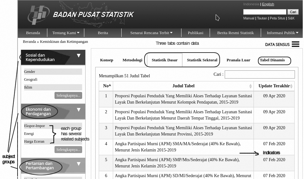
Figure 1.
The data section on BPS website.
3.Methodology
3.1Data crawling and extract, transform, load (ETL)
LiteRate works by parsing the data available on the BPS website and making them ready-to-use for further visualization and analysis. It takes the data published on BPS website as input by scanning all pages containing relevant data and scraping (extracting) the data (including the metadata) from the webpage. Pages containing data can be accessed from the menu located on the page’s left-hand sidebar (Fig. 1). This data is classified into three groups, which are “Social and Population”, “Economy and Trade”, and “Agriculture and Mining”. Each group has several related subjects that are presented on different pages and tables.
Each subject page has six tabs, which are concept, methodology, basic statistics, sectoral statistics, external link, and dynamic table. The tabs concept, methodology, and external link are not considered for ETL because these tabs are only intended to display explanations regarding definitions and methodologies. On the other hand, the tabs’ basic statistics and sectoral statistics, have two types of table format available: static and dynamic. The static table has an irregular format with non-standardized row and column names. Hence, we also excluded it from this research. Meanwhile, the dynamic table has consistent structures (rows and columns) and standardized metadata that enabled us to automate content and variable extraction. Furthermore, we defined that tables presented in the tabs basic statistics and sectoral statistics are just subsets of the tab dynamic table. Therefore, for purposes of this study, we crawled data from the tab dynamic table only.
As shown on Fig. 2, the tab dynamic table comprises several sections: subject, indicator, characteristic, time, and area. Each section is dynamically loaded using an Asynchronous JavaScript and XML (AJAX) request. However, the BPS website is protected from Cross-Site Request Forgery (CSRF) [27] that prevents outside access via an Application Programming Interface (API). We solved this challenge using Selenium in Fig. 3. Selenium opens the dynamic table page, gets the CSRF code, and makes an AJAX request by including the CSRF code in the payload request. Since each subject in dynamic tables has a different collection of variables (indicators, characteristics, time, and area), it was necessary to create a request for each variable combination using the AJAX request. The result is stored in the RSQLite database. Figure 4 shows the data crawling flow chart.
Figure 2.
The dynamic table page.
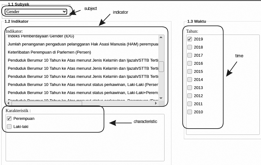
Figure 3.
AJAX request dengan CSRF.
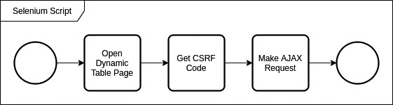
Figure 4.
Flowchart data crawling.
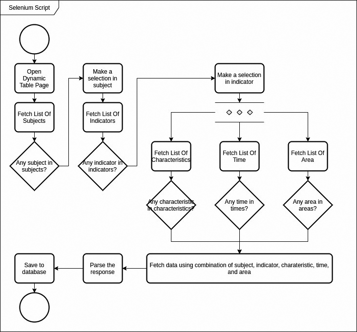
Figure 5.
Example of metadata variable provided on SIRUSA.
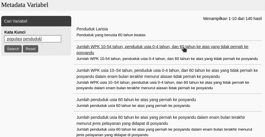
Figure 6.
Automation testing using selenium IDE.
3.2Building the LiteRate Shiny app
The data resulting from the ETL process is visualized in a dashboard format that is built by utilizing the libraries Shiny, shinyWidgets, rpivotTable, and rplotly. The widgets pivot tables and plotters enable users to easily explore data, select variables, and automatically detect and give a suggestion about the right chart type to use according to the data type and axis chosen. Users can also choose different types of plot charts according to their needs.
Data obtained through ETL are still in unpivoted or long table format. Thus, we have to create a service in which users can conduct on the fly pivoting process using the tidyr library [28]. A selector is provided on the left-hand sidebar as well as the drag and drop features for variable selection and visualization components (title, legend, and the likes). This feature is created using the esquisse [29] and pivottables.js [30] libraries.
3.3Standardized metadata
Metadata is the key element of statistical production. It allows the data to be identified and provides provenance information about how they were produced. In developing metadata, BPS refers to international standards that are Generic Statistical Business Process Model (GSBPM) [31], the Generic Statistical Information Model (GSIM) [32], Statistical Data and Metadata Exchange (SDMX) [33], and Data Document Initiative (DDI) [34]. These standards help BPS in constructing information models and standardized metadata. GSBPM provides the overarching framework to describe the statistical production process, while GSIM is a reference framework of information objects, which enables generic descriptions of the definition, management, and use of data and metadata throughout the statistical production process. Figure 5 shows the example of metadata provided in Sistem Informasi Rujukan Statistik (SIRUSA).
3.4Testing and systems evaluation
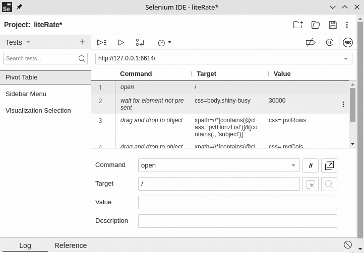
Software testing aims to detect errors or faults in software as early as possible. Software testing consumes 30 to 60 percent of all life cycle cost, depending on product criticality and complexity [35]. For the liteRate prototype, we conducted automation testing to measure its functionalities. Automation testing means to minimize human intervention, simplify test execution, and increase test coverage. It automates the testing process or activities including design and execution of test scripts and uses effective software automation tools. There are various tools available for performing automation testing, such as Watir, JMeter, Selenium IDE, and QTP [36]. In this paper, we use Selenium IDE as a testing tool. Selenium IDE is a Chrome and Firefox extension that makes it easy to record and playback tests in the browser. We choose Selenium IDE because it is open source, ready to use (requires no additional setup), and supports cross-browser execution [37].
Selenium IDE works by employing and recording various types of locators for each web page element it interacts with. The elements are identified by id, class, xpath, or cascading style sheet (CSS) name. It records multiple locators for each element it interacts with. It follows an iterative process such that if one locator fails during playback, the others will be tried until one is successful. Figure 6 depicts how the cases are written in Selenium IDE by defining the command, target, and value for the test. We also plan to do user testing in the future to measure user satisfaction and how users interact with liteRate.
The automation testing are executed in three different scenarios:
1. Variable selection testing: In this scenario, we run a test to select variables available on the liteRate’s sidebar menu sequentially, using a set of selenium commands, such as explicit wait and click.
2. Pivot testing: This scenario is executed by choosing variables from the variable bucket in liteRate and put them on the horizontal (x) and vertical (y) axis, respectively, using drag-and-drop feature.
3. Visualization selection: This scenario is similar to that of variable selection, except that we select the type of visualization instead of variables.
All the scenarios above are executed as sequential commands.
4.Result
The result of this research is a comprehensive Shiny app named liteRate. In general, there are three major features offered by liteRate:
1. Fancy and sophisticated widgets: Utilization of shinywidgets to implement tabs, dropdown, slider, textbox, and radio button.
2. Interactivity, customization, and aesthetic aspect: LiteRate enables users to follow their intuition in exploring the data and hopefully contribute to statistical literacy. The availability of interaction and customization including defining plot axis, modifying tables (sort, filter), changing color, and customizing graphs; further enhance user engagement in the features and services of liteRate and various BPS statistics.
3. Various visualization options: LiteRate provides a pie chart, bar graph, boxplot, scatter plot, line graph, histogram, and area chart options.
Figure 7.
Pivot table in liteRate.
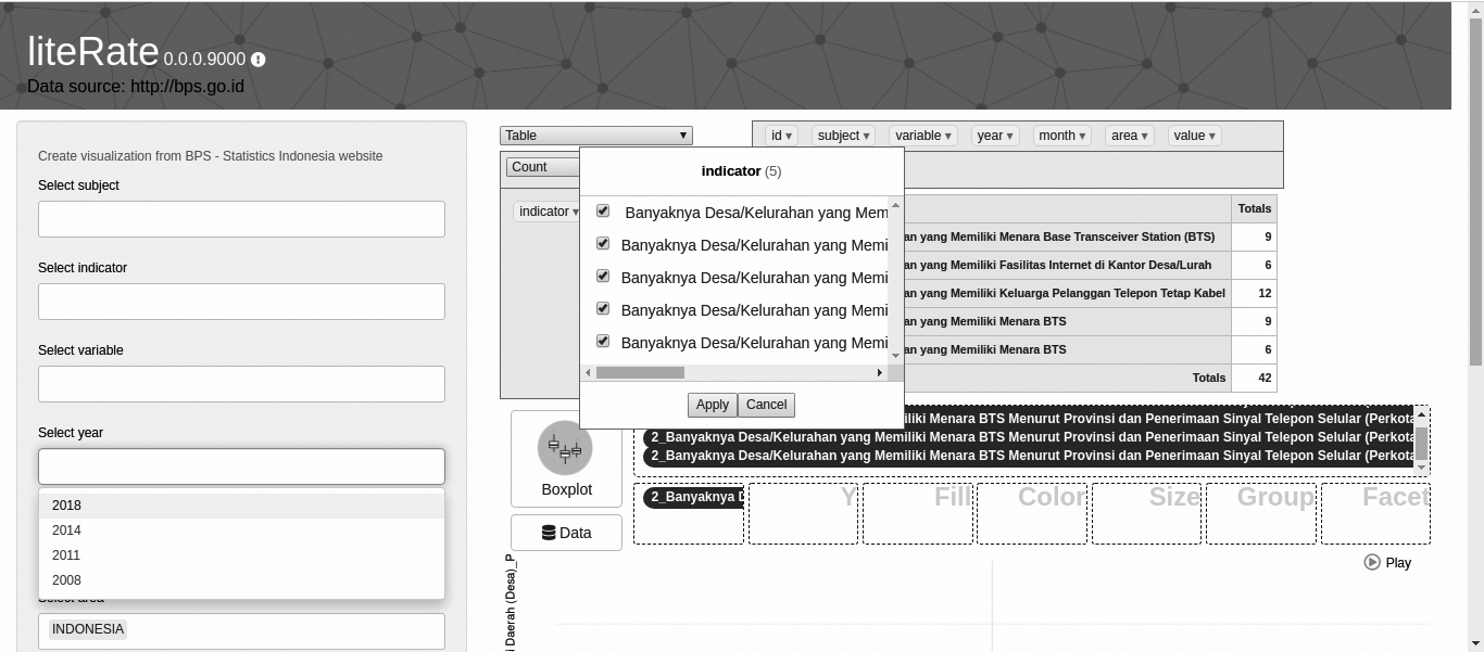
Figure 8.
An example of visualization options in liteRate.
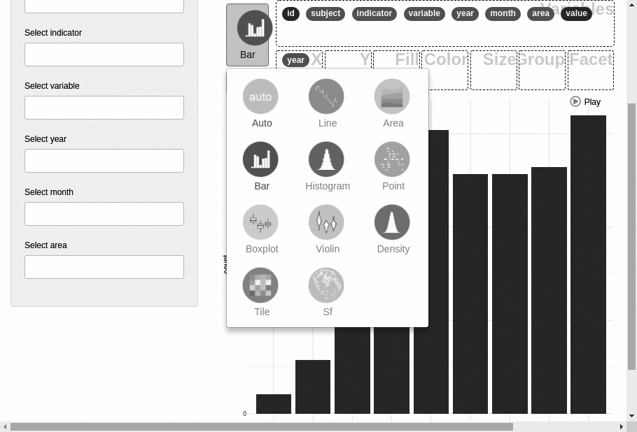
Table 1
Automation test results
| No. | Scenario | Number of commands | Pass | Fail | Execution time (s) |
|---|---|---|---|---|---|
| 1 | Variable selection | 20 | 20 | 0 | 10 |
| 2 | Pivot table | 4 | 4 | 0 | 7 |
| 3 | Visualization | 8 | 8 | 0 | 7 |
Figures 7 and 8 provide examples of a pivot table and the visualization options that can be created using liteRate. The testing result (Table 1) shows that all the three scenarios successfully passed the 32 testing commands with a total time of 24 seconds.
5.Conclusion
We provide a new way to investigate data by providing a non-conventional tool to visualize BPS-Statistics Indonesia data that enables users to understand the information clearly and directly through some previously underexplored points of view. Although currently still in the prototype phase, we believe that liteRate could be a breakthrough for BPS in creating a user appetite for their data and helping to develop citizens’ understanding on how to use data.
The prototype requires further development in order to provide better customer support and improved functionality. To keep improving liteRate, we are encouraging users to provide feedback to us. Future work following this study would focus on (1) handling static-format tables, (2) providing a feature for conducting analyses such as descriptive tables and regressions, (3) collecting logs to analyze user behavior, (4) publishing liteRate on The Comprehensive R Archive Network (CRAN) to reach a broader audience, and (5) incorporating metadata to assist users in data interpretation.
We realize that the use of metadata in liteRate is still limited and only includes a few variables and indicators. It is because there is no integration between the BPS website (bps.go.id) with the BPS metadata website (sirusa.bps.go.id) or API that allows liteRate to get direct access to related metadata at SIRUSA. To empower users to make more informed use of the data, we plan to incorporate metadata into liteRate in a more comprehensive way by adding a flag (‘i’) that indicates there is metadata available for the data. By clicking on the flag, a user can obtain information which includes the statistical methods used for the data collection, data items and definitions, and the classifications used for these data items. We will also provide video tutorials about using liteRate to support users in learning how to use liteRate.
References
[1] | UNECE. Making Data Meaningful Part 4 – A Guide to Improving Statistical Literacy (2012) . |
[2] | Gapminder Tools n.d. https://www.gapminder.org/tools/#$chart-type=bubbles (accessed September 30, 2020). |
[3] | Ferligoj A. How to improve statistical literacy? (2015) ; 12: : 1–10. |
[4] | Corselli-Nordblad L, Gauckler B. New tools to improve statistical literacy – developments and projects – an ESS priority and reality. 16th Conf IAOS (2018) : 8. |
[5] | Eurostat. Visualisations, Mobile Apps & Extraction Tools (2020) . https://ec.europa.eu/eurostat/help/first-visit/tools (accessed February 25, 2020). |
[6] | ISLP – Home n.d. https://iase-web.org/islp/ (accessed September 30, 2020). |
[7] | The R Foundation. R: What is R? (2020) . https://www.r-project.org/about.html (accessed April 27, 2020). |
[8] | de Vries A, Meys J. R For Dummies. 2nd ed. New Jersey: John Wiley & Sons, Inc; (2015) . |
[9] | Wickham H, Chang W, Henry L. Create Elegant Data Visualisations Using the Grammar of Graphics (2020) . https://ggplot2.tidyverse.org/ (accessed April 28, 2020). |
[10] | Plotly R Graphing Library n.d. https://plotly.com/r/ (accessed September 30, 2020). |
[11] | Martoglio E. rpivotTable (2018) . https://cran.r-project.org/web/packages/rpivotTable/vignettes/rpivotTableIntroduction.html (accessed May 3, 2020). |
[12] | Meyer F. Explore and Visualize Your Data Interactively esquisse (2020) . https://dreamrs.github.io/esquisse/index.html (accessed May 3, 2020). |
[13] | RStudio. Shiny (2020) . https://shiny.rstudio.com/ (accessed April 27, 2020). |
[14] | Shiny Themes n.d. http://rstudio.github.io/shinythemes/?_ga=2.232983133.238969485.1587877221-399063134.1586489685 (accessed September 30, 2020). |
[15] | htmlwidgets for R n.d. http://www.htmlwidgets.org/ (accessed September 30, 2020). |
[16] | daattali/shinyjs. GitHub n.d. https://github.com/daattali/shinyjs (accessed September 30, 2020). |
[17] | Shiny n.d. https://shiny.rstudio.com/ (accessed September 30, 2020). |
[18] | Kim JY. RSelenium package |
[19] | Remote WebDriver :: Documentation for Selenium n.d. https://www.selenium.dev/documentation/en/remote_webdriver/ (accessed September 30, 2020). |
[20] | Selenium. The Selenium project and tools :: Documentation for Selenium (2020) . https://www.selenium.dev/documentation/en/introduction/the_selenium_project_and_tools/ (accessed April 28, 2020). |
[21] | What is the Document Object Model? n.d. https://www.w3.org/TR/WD-DOM/introduction.html (accessed September 30, 2020). |
[22] | HTTP request methods. MDN Web Docs n.d. https://developer.mozilla.org/en-US/docs/Web/HTTP/Methods (accessed September 30, 2020). |
[23] | JQuery Foundation. jQuery (2020) . https://jquery.com/ (accessed April 29, 2020). |
[24] | Docker Inc. Get started with Docker for Windows. Docker Doc (2020) . https://docs.docker.com/docker-for-windows/ (accessed April 29, 2020). |
[25] | SQLite Consortium. SQLite Home Page (2020) . https://sqlite.org/index.html (accessed April 29, 2020). |
[26] | Müller K. RSQLite package |
[27] | Wasson M. Preventing Cross-Site Request Forgery (CSRF) Attacks in ASP.NET MVC (2012) . https://docs.microsoft.com/en-us/aspnet/web-api/overview/security/preventing-cross-site-request-forgery-csrf-attacks (accessed May 1, 2020). |
[28] | Tidy Messy Data n.d. https://tidyr.tidyverse.org/ (accessed September 30, 2020). |
[29] | esquisse package |
[30] | PivotTable.js n.d. https://pivottable.js.org/examples/ (accessed September 30, 2020). |
[31] | GSBPM v5.0 – GSBPM v5.0 – UNECE Statswiki n.d. https://statswiki.unece.org/display/GSBPM/GSBPM+v5.0 (accessed September 30, 2020). |
[32] | UNECE. Generic Statistical Information Model (GSIM): Communication paper for a general statistical audience (2014) . http://www.unece.org/fileadmin/DAM/stats/documents/ece/ces/2014/ECE_CES_2014_2-Generic_Statistical_Information_Model.pdf (accessed September 23, 2020). |
[33] | SDMX – Statistical Data and Metadata eXchange |
[34] | Welcome to the Data Documentation Initiative |
[35] | Polo M, Reales P, Piattini M, Ebert C. Test automation. IEEE Softw (2013) ; 30: : 84–9. doi: 10.1109/MS.2013.15. |
[36] | Singla S, Kaur H. Selenium keyword driven automation testing framework. IJARCSSE ISSN (2014) ; 2277. |
[37] | Selenium IDE. Open source record and playback test automation for the web n.d. https://selenium.dev/selenium-ide/index.html (accessed September 23, 2020). |