
Evaluating the usability of a semantic environmental health data framework: Approach and study
Abstract
Environmental exposures transported across air, land and water can affect our health making us more susceptible to developing a disease. Therefore, researchers need to face the complex task of integrating environmental exposures and linking them to health events with the relevant spatiotemporal and health context for individuals or populations. We present a usability evaluation approach and study of a semantic framework (i.e. Knowledge Graph, Methodology and User Interface) to enable Health Data Researchers (HDR) to link particular health events with environmental data for rare disease research. The usability study includes 17 HDRs with expertise in health data related to Anti-Neutrophil Cytoplasmic Antibody (ANCA)-associated vasculitis (AAV) in Ireland and Kawasaki Disease in Japan, and with no previous practical experience in using Semantic Web (SW) technologies. The evaluation results are promising in that they indicate that the framework is useful in allowing researchers themselves to link health and environmental data whilst hiding the complexities of SW technologies. As a result of this work, we also discuss the limitations of the approach together with the applicability to other domains. Beyond the direct impact on environmental health studies, the description of the evaluation approach can guide researchers in making SW technologies more accessible to domain experts through usability studies.
1.Introduction
Environmental risk factors are associated with almost one in every four deaths worldwide. These deaths may have been prevented with healthier environments.11 Particularly, environmental exposures can make us more susceptible to diseases when inhaled, ingested or in contact with our skin. The exposures can affect some people more than others, depending on the health context of the individual. For example, people with an existing health condition who are genetically predisposed could be more likely to have a relapse or a health event triggered by contact with an external environmental agent [7]. Therefore, researchers need to link the available environmental and health information to propose disease prevention measures for individuals and populations. However, integrating multiple heterogeneous data sources to answer complex research questions can be daunting and time consuming for a researcher.
Usability testing presents an opportunity to promote collaboration between domain experts and computer scientists when developing tools and processes to address data integration challenges [22]. Potential data challenges include having diverse data formats and sources, outdated data, lack of understanding of the data integration process, a vast volume of data and complex processes to access data. In this case, a data engineer with an expertise in Knowledge Graphs (KG) could collaborate with the domain expert to enable the linkage between diverse health and environmental data sources [37]. In doing so, the researcher would not only resolve the data challenges mentioned above but also contribute to disease-specific research outputs as KGs provide meaning to the data (context), querying and reasoning capabilities to generate new insights (efficiency) and transparency of the linkage process (explainability) [15].
A common approach to facilitate the uptake and use of KGs and Semantic Web technologies is to use visualisations [2,32]. Domain experts could link health and environmental data through a User Interface (UI) that allows the experts themselves to run queries in an intelligible manner.
In this paper, usability testing is used as a method to promote collaboration between Health Data Researchers (HDR) and data engineers to accomplish shared goals. The usability testing approach was applied to identify, refine, validate and consolidate the user requirements of HDRs; when trying to link particular health events with environmental data to explore the environmental risk factors of rare diseases.
Previous work from the authors identified the researchers requirements and the limitations in the state of the art [27,28].
1.1.Researcher requirements
In this case, data linking for HDRs involves querying the data linked through location and time, understanding the linked data and metadata generated during the linkage process, and exporting the data to be used as input for data analysis and for open data publication. This definition of data linking led to the formulation of three requirements, which were extracted from expert consensus:
– Requirement 1: Enable HDRs to query environmental data associated with individual health events through location and time, within the region of the event and a period of data before the event.
– Requirement 2: Support the understanding of event-environmental linked data and metadata, with its use, limitations and data protection risk for individuals.
– Requirement 3: Export event-environmental linked (meta)data to be used as input in statistical models for data analysis (CSV) and for publication (RDF).
1.2.State of the art limitation
As part of our research, we reviewed tools that facilitate the linkage between health and environmental data using KGs. In summary, most of the tools focused on the biomedical domain, required expertise in KGs for the tools to be practical, and/or the developers of the tools did not conduct any usability testing using standard metrics with the domain experts.
The state of the art limitations and the domain expert driven requirements motivated the design of a framework called SERDIF (Semantic Environmental and Rare Disease data Integration Framework), which is a combination of a Methodology, a KG and a UI, that supports HDRs [28]. Furthermore, it motivated us to design a usability evaluation using standard metrics, which will allow for comparison of progress on usability issues between versions and also as a means to deeply include researchers’ perspective during the development process.
1.3.Extended evaluation and framework updates
The evaluation approach presented in this paper is a progression from the first usability study, undertaken by us [28]. In this case, the usability evaluation is presented in a general manner to encourage other researchers to apply in different contexts. Providing an example of how the approach was applied for our particular scenario, that is with HDR participants, use cases and sample sizes elements (Section 2).
The evaluation was conducted on the updated version of SERDIF after the first usability evaluation. The SERDIF updates are described to provide the context for the evaluation (Section 3). The updates include the improvements to the KG, methodology and UI SERDIF components (Section 3). This includes the reuse of existing ontologies to cover the framework requirements. That is because the focus of this work was not to create a new ontology to model the medical terminology but to enable data linkage. The evaluation execution section starts by describing the experimental setup, execution and metrics recorded, and follows with the demonstration of the findings and recommendations (Section 4 and 5). Furthermore, the implementation exemplifies how to conduct the analysis of the metrics, providing the data and processing steps to guide researchers when applying the methods, in a transparent manner.
1.4.Health context
The health context of the framework includes studies that require meaningful data linkage to test hypotheses exploring environmental risk factors, potentially providing new insights into disease causation. Examples include our use case of systemic vasculitis, including ANCA-associated vasculitis (AAV) and Kawasaki Disease (KD) (Fig. 1), where the current theory for its aetiology involves a complex interaction between environmental and epigenetic factors in a genetically susceptible individual [17,35,36,38]. The framework can provide the necessary data to researchers when answering questions such as: Are reduced levels of air pollution associated with a reduced propensity for relapse? [39]. Relapses are a type of health event that can occur during an individual’s chronic disease course and are characterised by a worsening of disease activity.
In this work, potential health events, obtained from disease registries, routine or self-reported health surveys, include dates of development of a disease or symptoms, a population peak in disease cases or hospital admissions in a certain geographical area. Critically, health related data are considered sensitive under data protection legislation so the embedding of this consideration in all aspects of SERDIF is central to the solution.
1.5.FAIR framework
When using SERDIF, the resulting linked data can be exported for data analysis or publication with the necessary provenance and lineage metadata facilitating reuse and linkage in other contexts or domains. At this point, researchers will have generated, in a semi-automated manner, graph data represented using the Resource Description Framework (RDF) [9], which makes their data linkable by machines.
Not only that, but if the data is licensed, provided with a data use and deposited in a data repository; the data will already be Findable, Accessible, Interoperable and Reusable (FAIR) [41]. Therefore, exporting the linked data as FAIR data can provide the grounds to address the data integration challenges while enabling data sharing within a research group, project or consortium with an agreed processing purpose. This will encourage collaboration between researchers towards new insights in disease prevention, reducing the time and cost investments.
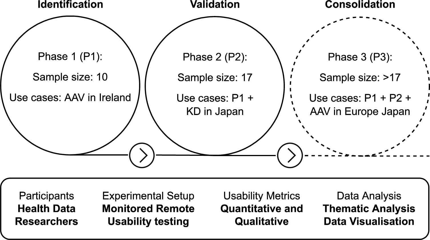
Fig. 1.
Overview of the usability testing approach. AAV: anti-neutrophil cytoplasmic autoantibody (ANCA)-associated vasculitis (AAV). KD: Kawasaki disease.
1.6.Contributions
The main contribution of this article is the results of the evaluation approach taken to validate the usefulness of a framework aimed at facilitating the use by HDR of Semantic Web technologies in support of data linkage. This provides a follow up, progressive and extended evaluation of the framework, which is not common in the domain (see Section 6). Two minor contributions, which are a consequence of the main contribution, are the potential implementation of the evaluation approach to other health data linkage studies and the open source artefacts (i.e. data and processing) to promote reuse, reproducibility and credibility of the approach taken.
The relevance of the contributions is highlighted by comparing our evaluation approach with other evaluation approaches applied in the development of other tools which aim to promote the use of Semantic Web technologies for HDR (Section 6). The comparison includes the limitations and advantages of the reviewed studies, compared with the approach presented in this article. Also discussed is the applicability of such usability evaluation to other domains, the limitations of our approach and the lessons learned after conducting the evaluation (Section 7). Finally, the article concludes with future work and the potential impact of collaborations between health experts and computer scientists when trying to address data challenges (Section 8).
2.Evaluation approach
The methods to evaluate the usefulness of SERDIF through usability testing include static elements: the strategy, participants, experimental setup, metrics and data analysis; and dynamic elements for environmental health studies of rare diseases including the use cases and sample size. We define static elements as the elements that remain the same throughout the usability study while dynamic elements are progressively incorporated in each phase of the usability study. The evaluation approach was submitted to and gained approval from the relevant Ethics Committee in Trinity College Dublin.
2.1.Static evaluation elements
Strategy. The usability testing approach consists of three phases (Fig. 1): (P1) identifying and refining the initial user requirements, (P2) validation of the usefulness of the framework for HDRs and (P3) consolidation of the requirements. Each phase represents an iteration that comprises the development or refinement of the framework based on the user requirements and the evaluation that provides the basis for the refinement of the framework and requirements.
Participants. The participants are HDRs, meaning researchers with a health background and statistical or data analysis experience (e.g. clinicians, health informatics technicians/managers and epidemiologists), or statisticians and data analysts that are studying health related outcomes. In addition, only HDRs without practical expertise in using KGs are eligible for the study. A minimum of 10 participants is recommended for the first phase of the study [21], progressively increasing in the following phases. The eligible researchers are recruited by sending two personal emails asking if they would like to participate in the usability study. The first email contains a brief introduction and the rationale of the experiment, and expert participants are asked to complete an online poll to select a time slot that works for them. The second email provides the participants with the details of the experiment: virtual meeting details, participant information sheet and consent form to be read and signed, the UI link and login credentials.
Experimental setup. Expert participants are asked to complete a series of tasks using the UI while thinking aloud [4]. The tasks were derived from consensus among HDRs with real workflows in mind. Then, the participants are asked to fill out a post usability test survey. The experiment is conducted remotely using a video conferencing platform where participants are asked to share their screen and audio while observed and assisted, if necessary, by a usability moderator.
Metrics. The metrics gathered to assess the usefulness of the framework combine quantitative and qualitative metrics to support the findings.
Quantitative. Time taken to complete each task during the usability testing session (time per task); the task being completed or abandoned with/out assistance from the usability session moderator (task completion or failure); the Post-Study System Usability Questionnaire (PSSUQ) [20], which is a standard questionnaire used to assess the usability during the development of a system (usability test survey scores and scales).
Qualitative. The session transcripts with the think aloud comments of the participants (usability session transcripts); the open answers to PSSUQ, which allowed users to record text statements for further clarification of the scores (usability test survey open comments); the usability moderator recorded participant thoughts in a summarised manner for an initial impression on the usability, which were not used in the analysis (moderator notes).
Data analysis. A thematic analysis [29] was conducted by three researchers on the usability testing session transcripts, supported by the quantitative metrics and thematic analysis of the PSSUQ open comments, to identify the findings and recommendations for each phase. Therefore, triangulating participant comments, questionnaire responses and observations to demonstrate the findings from multiple perspectives. The PSSUQ scores and scales are compared with previous phases or similar tools comparing the distributions with box plots.
2.2.Dynamic evaluation elements
Use cases. The use case refers to ongoing rare disease research involved in environmental health studies that would benefit from applying KG to integrate the heterogeneous sources of data (see Section 1.4). Researchers in projects such as HELICAL,22 PARADISE,33 WINDBIOME44 and FAIRVASC55 provide ideal participants for this particular study as they are international professors, researchers and PhD students with fluent English and no previous practical experience in using KGs.
Sample size. The sample sizes presented in Fig. 1 cover the requirement of a specialised tool for linking environmental and health data [21]. Specific numbers are given for Phase 1 and 2 as they have been conducted already. Phase 3 will be conducted in the coming months after the publication of this article, but it is expected to be larger given the numbers involved in the FAIRVASC project, who will be the target participants. The study advances in a progressive manner through each phase, including researchers and the use case from the previous phase. This iterative approach improves the chances to find errors, ambiguous information and confusing features while generalising the health data input capabilities of the framework. The coverage of the environmental data will also increase to more countries throughout the phases.
3.Framework updates after Phase 1
The SERDIF components have been updated after the results from Phase 1 of the usability study and the refined requirements, which have been published as previous work from the authors [28]. The updates are presented here for each of the components of the framework (KG, Methodology and UI) and for the usability testing execution. Providing enough context to interpret the evaluation results of this work.
3.1.Framework components
KG component. The KG component is where environmental data and health data is linked together through location and time using RDF and SPARQL queries. Environmental data is described using the RDF Data Cube vocabulary (QB) [8] instead of the Semantic Sensor Network Ontology (SOSA/SSN) [6] that was used in the KG at the start of P1. QB focuses on describing statistical and multi-dimensional datasets, which presents an advantage as it provides a general data structure and flexibility to represent other types of environmental data besides sensors such as occupational exposures or environments. The datasets can be represented as a time series of observations with a fixed location (GeoSPARQL geometry) using qb:Slice. The slice structure facilitates the access to subsets of data and allows for metadata to be included at the slice level. The updated KG now includes metadata information beyond the weather and air pollution variables descriptions with the dataset descriptors [3], and the origin and processing of the datasets [19]. While keeping the spatial dimension of the data (i.e. locations and regions) represented as GeoSPARQL [31] geometries, and the time dimension as xsd:dateTime. Enabling spatial and temporal reasoning features, which are key to answer HDR research questions.
Regarding the data sources uplifted to RDF, the air pollution data source was replaced with the European Environmental Agency (EEA)66 while the weather data remains the same from MetEireann.77 The uplifted data includes 25 weather and 2000 air quality individual datasets with hourly data from the 2000-2021 period and for the Republic of Ireland. The total amount of triples from environmental data has increased from 30M to 80M triples. The KG data has been published as open data in Zenodo [26] and a SPARQL endpoint is available at the following URL for public use:
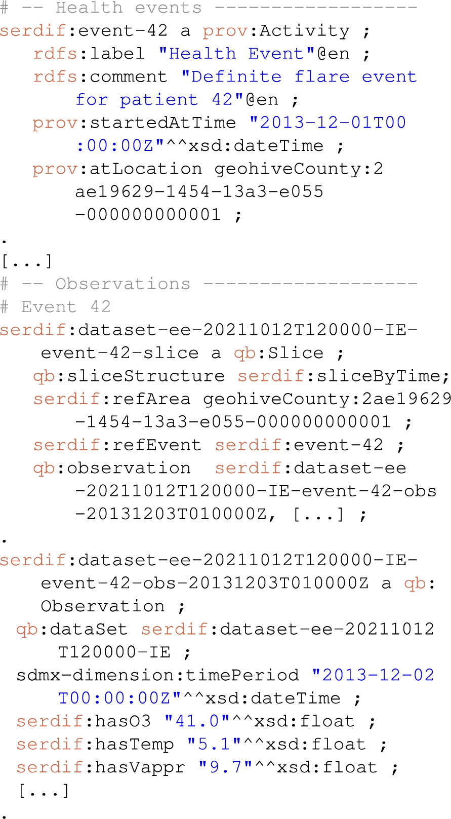
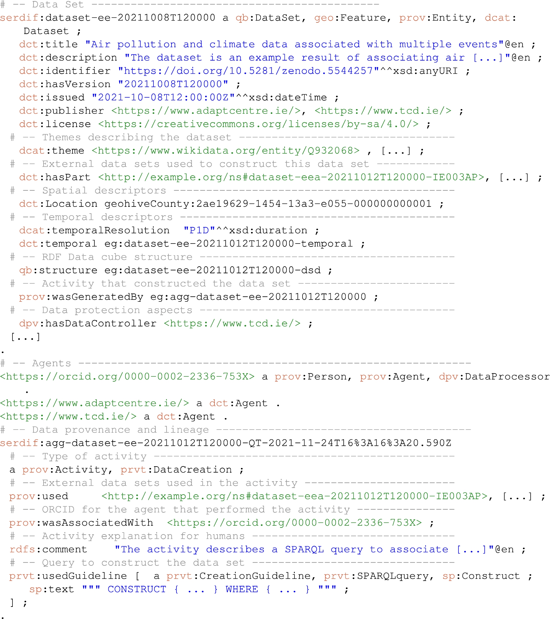
Only the minimum health event data to enable the linkage was uplifted to RDF, hence the name, description, time and location of the health event (Fig. 2) using the provenance ontology (PROV-O) [19].
Fig. 2.
Snippet of a Turtle RDF file with health related events linked with environmental data.
Methodology component. The methodology is a series of steps that guides the researcher in linking particular events with environmental data using SW technologies. Two new steps were added to the methodology regarding data protection and privacy and open data publication. The data protection and privacy step provides the user with relevant information to make sure the processing of the personal data (i.e. health data) meets the requirements of the contract signed to use the data under a specific purpose (e.g. a data sharing agreement or consent form) and complies with the General Data Protection Regulation (GDPR)88 in data processing. The data protection information is represented in RDF using the Data Protection Vocabulary (DPV)99 [30]. The open data publication step includes the semi-automatic means to make the data FAIR; for the later publication in an open data repository. The publication of the data will only be possible after explicit permission from the data controller, and when it does not provide means for re-identification of the data subject.
Fig. 3.
Screenshot of the SERDIF UI displaying (a) the login panel, (b) the query input panel with selected options, (C) the tabs generated after submitting a query, which includes metadata section with the FAIR export button, (d) a data table and three different visualisations, (e) heat map, (f) box plot.
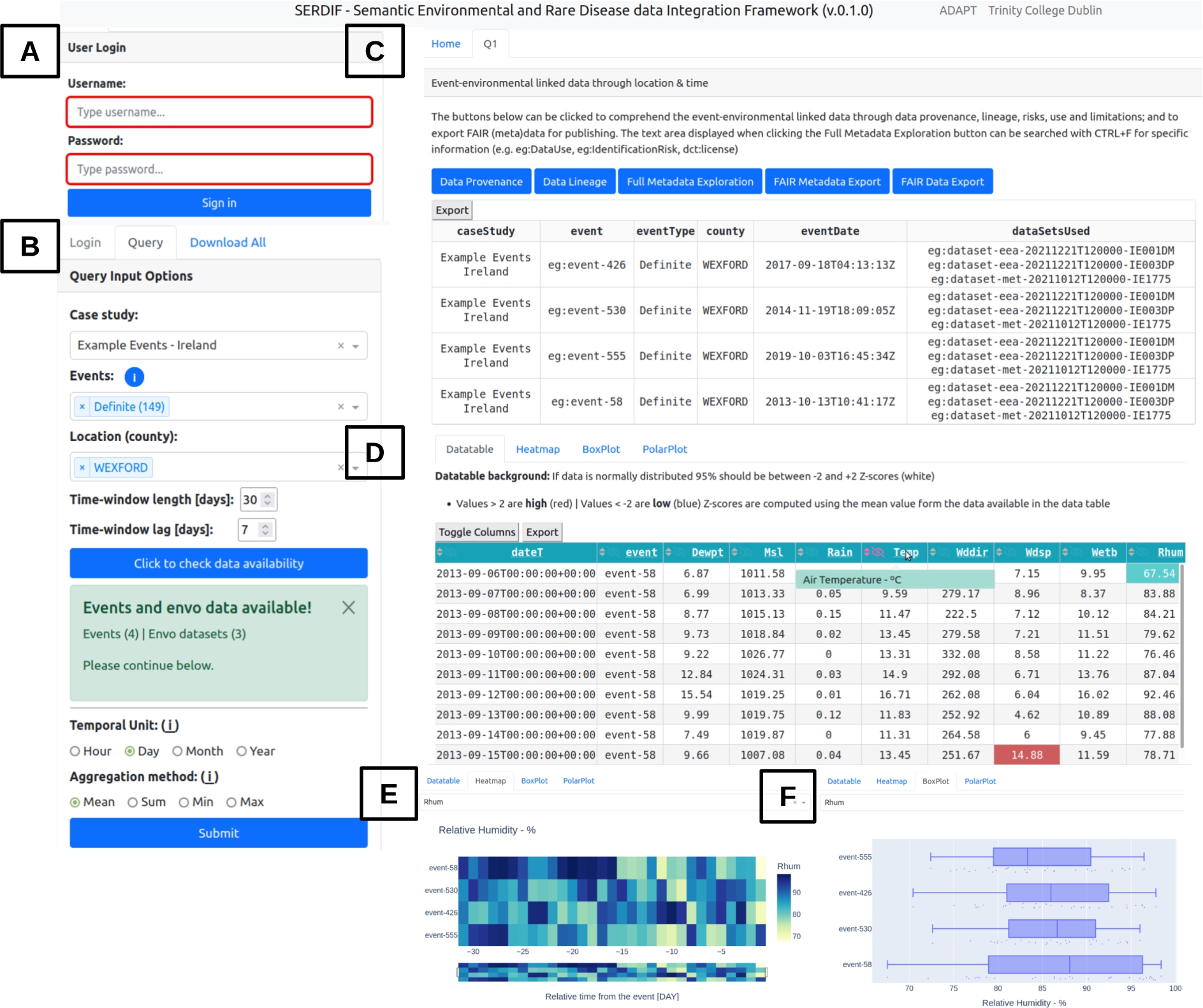
UI component. The UI component is designed from a user-centric perspective to support HDRs access, explore and export the linked health-environmental data with appropriate visualisations, and by facilitating the query formulation for non-SW experts. The data is linked using a SPARQL query [33] reasoning over location and time. The GEOSPARQL function geof:sfWithin is used to select the environmental datasets within the region of the event (e.g. a county or country). The xsd:dateTime datatype allows for the selection of a certain period before the health events. Therefore, environmental data is associated with health data for a particular region and period before the health event, as the researchers are trying to understand the risk factors that led to the event (Fig. 2). The UI was updated to present environmental data linked to individual health events instead of aggregated data for an event type. The updates affected existing features of the UI like the data table (Fig. 3D) and the time series plot, which became a temporal heat map (Fig. 3E). The comparative tab was removed as it was confusing to the users and the relevance was not clear at the end of Phase 1. In addition, a check button was added for the user to check if environmental data is available for options selected from the previous dropdowns (Fig. 3B); and a login step was added to avoid multiple participants running queries at the same time, which could affect the experimental metrics (Fig. 3A).
Then, information about the origin of the data and processing steps was made available through the data provenance and lineage buttons as RDF graphs (Fig. 3C). The user can also explore the full metadata generated for the linkage process that includes dataset descriptors (e.g. licence, distribution, temporal and spatial information and structure of the dataset), data provenance and lineage information (e.g. datasets used and SPARQL query to link the data), data protection and privacy aspects of the linked data (e.g. data controller, processing risks and purpose of the linkage) and the data use (e.g. for studying a specific disease by researchers with a signed data sharing agreement to process the health data). Furthermore, the results from a query can be exported as FAIR data with the potential for researchers to further link the data with other studies and for open data publication (Appendix A).
3.2.Improving the experimental setup
The participants experienced some delays and control malfunctions during the P1 of the usability study. That was because the moderator had to open the UI in a local computer, share the screen during the video conference call and then give remote control to the participant. In P2, an example UI was made available for the participants under the following URL:
The example UI used simulated health data integrated with environmental data. The health data is available in a different repository within the triplestore (i.e. internal repository) to work as a proof of concept for a federated scenario, where health data does not leave the storage location but it is only consulted. The improvement also granted the possibility to include researchers that had not signed a data sharing agreement to use and process the health data (Section 4).
In addition, the tasks were rephrased using simpler language and were divided into subtasks to improve the readability and to avoid having to go back and forth between the PDF document with the tasks and the browser window with the UI (Table 1).
Table 1
Tasks that the participants are asked to complete during the usability testing associated with the requirements from Section 1
| Task | Requirement | Description |
| T1 | Querying | Read the ‘Home’ tab information. (a) Was the information presented enough for you to get an overall understanding of the SERDIF framework? (b) If not, what information would you add? |
| T2 | Querying | Login with the credentials provided in the invitation email. |
| T3 | Querying | Submit a query using the input options available in the ‘Query’ tab on the left panel. (a) Please explain and justify aloud the specific choices that you make. (b) Are the query input options clear to you? (c) Would you add any extra information to get a better understanding? (d) After completing all the inputs, please click the ‘Submit’ button once. |
| T4 | Understanding | Explore the ‘Q1’ tab generated after submitting a query. (a) Read the information provided in the introductory paragraph. (b) Explore and discuss aloud the usefulness of the information displayed for each of the three buttons below, in order to understand the event-environmental linked data. (c) Click the following buttons: Data Provenance, Data Lineage and Full Metadata Exploration. (d) Can you say aloud how many data sets were used for each event in the Data Provenance table? (e) Can you identify aloud the data use comment (eg:DataUse), identification risk comment (eg:IdentificationRisk) and license (dct:license) in the Full Metadata Exploration text? |
| T5 | Understanding | Explore the data table displayed underneath the metadata buttons. (a) Can you understand all the column headings when hovering over the abbreviations? (b) Do you understand the meaning of the cell background colours? (c) Can you hide columns by using the eye icon next to the column heading or by using the ‘Toggle Columns’ button? (d) After coming to conclusion on the previous questions, discuss aloud whether you found the data table useful to comprehend the event-environmental linked data? (e) Say aloud if you would add any feature to the current display |
| T6 | Understanding | Explore the Heat map, Box Plot and Polar Plot tabs. (a) Select an environmental variable from the inputs provided. (b) Please explain aloud the usefulness and clarity of each plot. (c) Say aloud if you would add any more visualisations to the current ones. |
| T7 | Understanding | Submit one more query with different input options from the ones used before. (a) Which individual event uses the most data sets between Q1 and Q2? (b) Do both data sets (Q1 and Q2) have the same license? (c) Which of the data tables (Q1 and Q2) seem to have more extreme values (i.e., more colored cell backgrounds)? (d) Choose one of the following plots from Heat map, Box Plot and Polar Plot tabs and compare aloud Q1 and Q2 plots. (e) Say aloud if you would add any other feature to help you comprehend better the data at this point. |
| T8 | Exporting | Export/download the metadata and data from the first query (Q1) (a) FAIR data and metadata. (b) Data provenance and Data table as CSV files. (c) Export all data tables at once in the ‘Download All’ tab in the left panel. (d) Say aloud whether such event-environmental linked data and metadata would be useful and re-usable as input for environmental research. |
| T9 | All | Could you summarise verbally your overall experience in completing these tasks using the SERDIF dashboard? |
4.Evaluation execution: Phase 2
The purpose of the Phase 2 (P2) of the evaluation was to evaluate the usefulness of the SERDIF framework, after the refinements from P1, for HDRs in their hypothesis validation of environmental factors for rare disease research. The evaluation was conducted with 17 HDRs with expertise in health data related to AAV in Ireland and KD in Japan during the fourth quarter of 2021. In particular, the researchers were international (associate) professors, clinicians, research assistants, technicians and PhD students with fluent English, and without practical experience in using KGs. The participants were recruited by email, which was facilitated by the involvement of the authors in the HELICAL, PARADISE and WINDBIOME projects. The participants were asked to complete the tasks in Table 1 while thinking aloud and using the SERDIF UI component.
The metrics recorded throughout P2 of the usability evaluation (Section 2) and the subsequent data analysis, leading to the findings and recommendations, are presented in this section. The analysis is described following the six steps towards a trustworthy thematic analysis by Nowell et al. 2017 [29].
4.1.Step 1: Familiarising yourself with your data
While in a typical thematic analysis only qualitative data (in many formats) is considered, quantitative metrics were also included as they provided further insight in the analysis to support the findings. The recorded metrics (data) include the previous quantitative and qualitative metrics mentioned in Section 2.1, which are available in the data folder of the paper’s GitHub repository:
https://github.com/navarral/swj2022-usability-paper
Data was collected by different interactive means by the usability moderator: stopwatch (time per task), manual typing during the session (moderator notes), automatic process using an online version of the questionnaire (usability test survey scores, scales and open comments), manual transcription of the audio recordings of the sessions (usability session transcripts), and manual input after the usability session transcription (task completion or failure).
It was found that the accuracy of the automatic transcription feature of the video conferencing platform used was not enough for the later coding. Many sentences and words could not be understood without the context and previous involvement in moderating the experiment. As a consequence, the transcription process was performed manually from the audio recordings of the sessions and the text was organised by each task heading, improving the readability of the documents. The manual transcription was a time consuming process as the sessions lasted between 30 and 60min but led to rich documents facilitating the following steps. The audios and transcripts were stored locally and then, the audios were deleted and the transcripts without any personal information uploaded into a Taguette [34] local database for the subsequent coding. The 17 documents are named ParticipantID_GMTdate (e.g. P1_GMT20211118) for easier management and interpretation of the audit trail.
4.2.Step 2: Generating initial codes
The interactive data collection influenced the generation of the codes as the moderator and data analyst were the same person, but two other researchers, authors of this paper, were involved in the coding process. Besides the initial influence mentioned above, the researcher did not use an initial codebook at the start of the process, addressing the data with an open mind. The initial generation of the codes was performed line by line and assigning specific codes. Then, redundant codes were merged resulting into 120 different initial codes for the 17 documents (see ‘codebook_20220223_0.csv’ in the paper’s Github). The number of highlights per code started to show some tendency for some of the codes. In addition, the code ‘open tag’ stored sentences which seemed to not fit into any of the other codes but that could be useful in the later iterations of the coding process.
The Taguette software proved to be a great asset for the tagging and categorisation of the sentences in the transcripts, facilitating the researcher complex task to highlight the sentence, assign a code and write a memo as a description of the code for the debriefing with the other two researchers in Step 3. The memo was useful as some of the codes’ names would have been hard to be understood by themselves for the other two researchers involved in the analysis and future researchers trying to reproduce this work that are not experts in the content (Appendix B).
The researchers met three times within 8 days for a debriefing of the coding process. In each meeting, the researchers tried to reduce the number of codes by merging codes discussing similar concepts. The descriptions associated to the merging codes were rephrased to include all the relevant information from the predeceasing codes. After 8 iterations, the final codebook was agreed by consensus between the three researchers. The final codebook included 22 codes with at least 30 references of each, which were generated from the 120 initial ones (Appendix B). The codebook generated at each iteration and a document summarising the 1930 highlights are available in the paper’s GitHub.
4.3.Step 3: Searching for themes
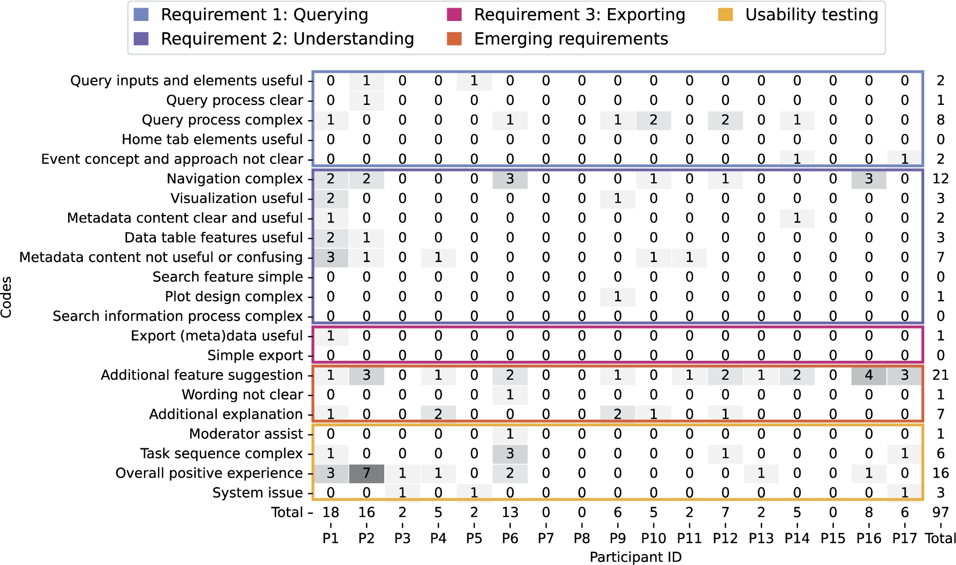
The searching for themes process was conducted by displaying the number of references per participant for each code as an annotated heat map (Fig. 5E). The heat map was generated using one of the exports supported in Taguette’s software. The export included the transcription highlights per document (i.e. per participant ID) with the associated code as a CSV file (all_tags_date.csv documents in the paper’s GitHub).
The heat map rows were reordered by number of references but also by their importance in assessing the objective of the usability test: ‘Validate the usefulness of the framework for the users’. The reordering naturally led to codes that informed the achievement of the requirements. However, some of the codes did not fit into the requirements, which were left as ‘open theme’ and not discarded at this step.
4.4.Step 4: Reviewing themes
The document highlights were read again two times to validate the assignment of each code to a particular theme. During the reviewing, the naming and descriptions of the codes had to be adjusted. In addition, the ‘open theme’ codes started to shape into two different themes regarding new features or functionalities not present in the framework and references to the overall usability experience when conducting the experiment. The participants’ experience was then included in the five themes.
4.5.Step 5: Defining and naming themes
The five themes identified are described in detail as the findings of the usability study, supported by the quantitative metrics and thematic analysis of the PSSUQ open comments (Section 5). Therefore, triangulating participant comments, questionnaire responses and observations to demonstrate the findings from multiple perspectives. The combination of the metrics is visualised in Fig. 5 to serve as reference when providing the evidence for each finding. Showcasing the strength of the proposed approach of combining quantitative and qualitative data within the definition of the themes. In addition, the comparison between the PSSUQ scales between the first and second phase of the usability study is represented in Fig. 4.
Fig. 4.
Comparative PSSUQ scales box plots for System Usefulness (SysUse), Information Quality (InfoQual), Interface Quality (IntQual) and Overall for the P1 (white) and P2 (grey) phases of the usability testing. The sample sizes for each of the metrics are 80,70,30 and 190 (P1) and 136, 119, 51 and 323 (P2) respectively. The scores are in a Likert 7 points scale where the lower the value the higher the satisfaction.
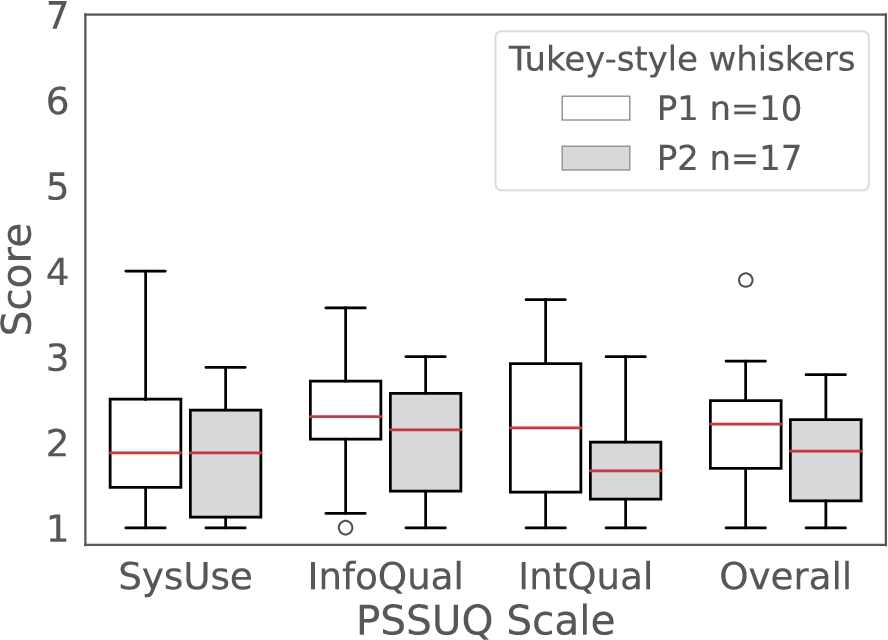
Fig. 5.
Combination of the quantitative and qualitative metrics collected in the Phase 2 of the evaluation. A – task completion bar plot including the if assistance was needed from the participants (n=17): no assistance required (no assist, dark grey), with at least one intervention to assist (with assist, light grey) and task or subtasks not completed (not completed, white). B – number of assists from the usability testing moderator to the participants (n=17) including the type of assistance needed: the system is crashed or is not responsive (system issue, dark grey), the task is confusing or not completed in a sequential manner (task complex, light grey) and the design and/or content of the user interface complicates the completion of the tasks (white). C – time spent magnitude and variability to complete each task during the usability session represented as a box plot. D – PSSUQ scores box plots with the four averaged metrics (SysUse, InfoQual, IntQual and overall) on the right end with sample sizes of 136, 119, 51 and 323. The scores are in a Likert 7 points scale where the lower the value the higher the satisfaction. E – codes and themes that emerged from the thematic analysis of the usability sessions transcripts as a heat map for traceability.
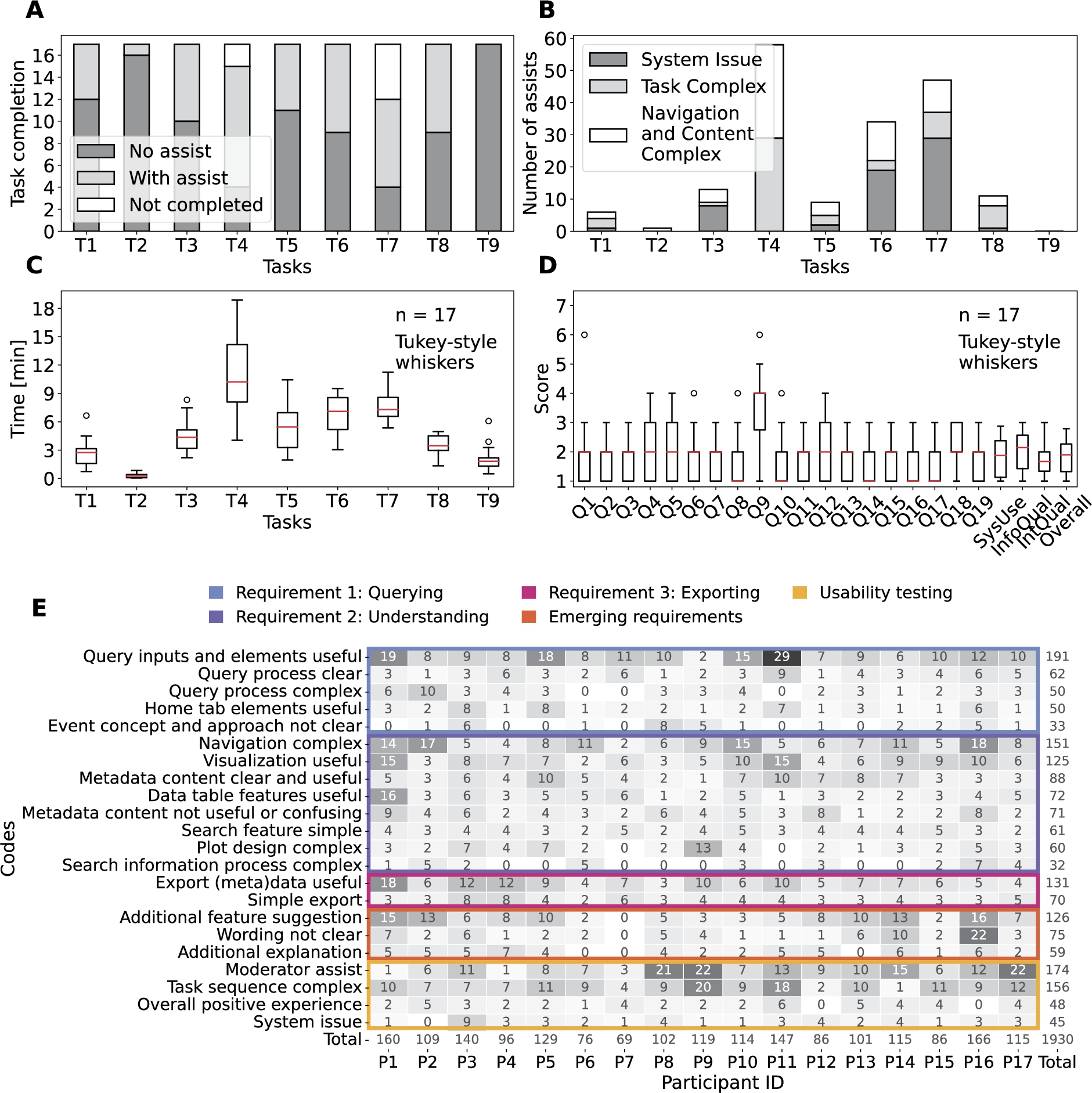
Table 2
Thematic analysis summary of the usability sessions transcripts colour coded as in Fig. 5E heat map
4.6.Step 6: Producing the report
The thematic analysis report was written as a usability report since the aim of the analysis was to study the metrics recorded during the usability evaluation. Therefore, the structure of the document was as follows: executive summary, methods, metrics, results, analysis, findings and recommendations, and next steps. The content of the report is included in this paper together with the recorded metrics in the paper GitHub to ensure the transparency of the methods and findings. The study did not finalise by checking the findings with all the participants as it was not viable to organise a meeting where the 17 expert participants were present and could participate in a discussion. The participants were sent the usability report by email and they had the chance to come back to the authors with further comments or feedback.
5.Evaluation results: Phase 2
The results, findings and recommendations sections of the usability report are presented in this section.
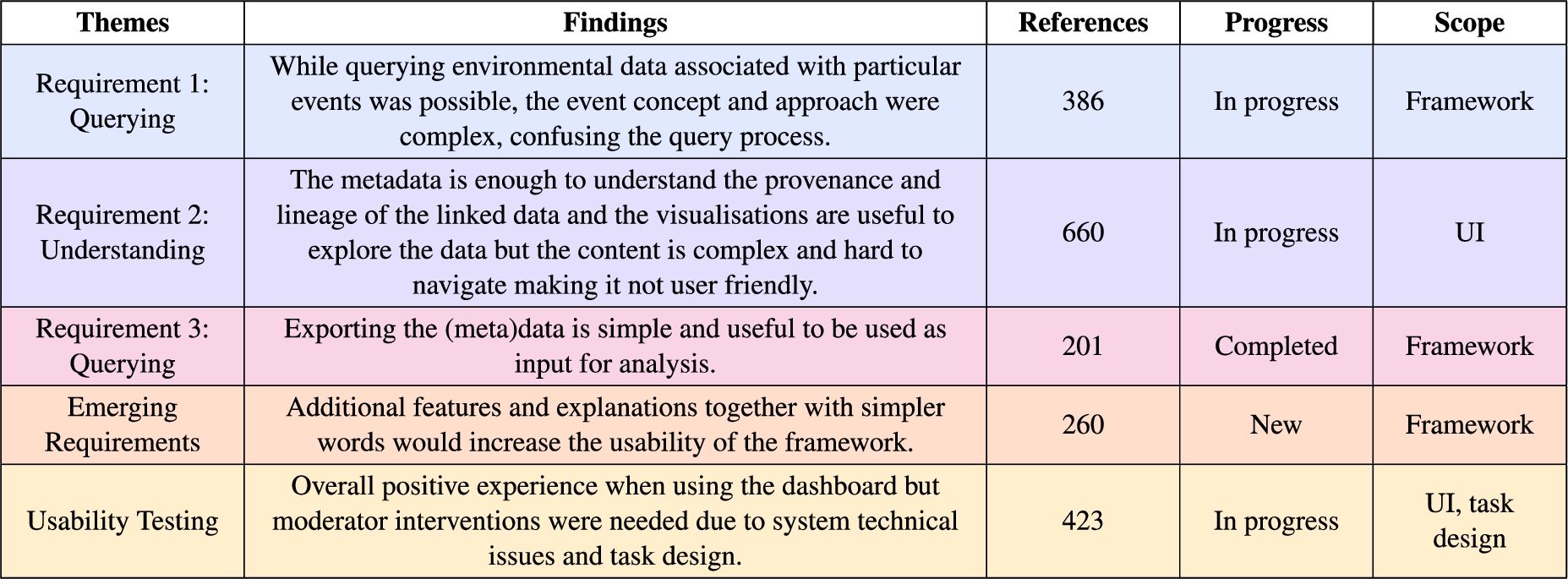
The themes name, description, number of references, progress towards achieving the requirements and scope of the finding in terms of the framework artefacts (KG, Methodology and UI) from the participants are summarised in Table 2. The themes clearly capture the progress towards achieving the user requirements important for the overall research question, while also including emerging requirements and the experience when completing the tasks using the user interface.
The findings supported by the other metrics together with the recommendations are described in the section below.
5.1.Requirement 1: Querying
Finding. “While querying environmental data associated with particular events was possible, the event concept and approach were complex, confusing the query process.”
Evidence. The 17 expert participants were able to complete the first three tasks (T1, T2 and T3), which were formulated based on the querying requirement (Fig. 5A). The time per task variability is below 2 minutes for the first three tasks (Fig. 5C), supporting that querying was possible for all participants in a similar manner. The majority of the code references for the first theme indicate clarity and usefulness of the query inputs, elements and processes (253 out of 386), and the codes are referenced across all participants (Fig. 5E).
However, the tasks that involved actual querying (T3 and T7) required the most assistance due to system issues related to a memory exceeding issue due to the hosting service used during the usability session. The memory limit was noticed three times more in T7 since the free memory was even less than at the start (T3). The system issue is also reflected in the high PSSUQ score in Q9 (Fig. 5D).
Furthermore, 14 out of 17 participants found the query process and query inputs complex at least once (Fig. 5E). That was mostly due to the time window length and lag and the event query inputs, which together made the query process less straightforward. The PSSUQ open comments reinforce the complexity of the query process and the understanding of the event approach (10 out of the 13 comments, Appendix C). An event is something that occurs in a certain place during a particular time. While it was understood that environmental data was being gathered for events that happen within a spatial region, the temporal part of the event was less clear. Our hypothesis is that the events exemplified a particular use case but the researchers were thinking of answering their own research question. Therefore, limiting the events to a particular use case may be the source of the confusion in the query process together with the terminology of the time window parameters.
Recommendations:
1. P2.R.Qu.1: Host the dashboard in a site, service or virtual machine where memory capacity should not be a problem for a regular query.
2. P2.R.Qu.2: Provide an example to visualise the time window parameters and the outcome of the query.
3. P2.R.Qu.3: Allow users to input their own events to answer their research questions instead of limiting to the available example event data in the triplestore.
5.2.Requirement 2: Understanding
Finding. “The metadata is enough to understand the provenance and lineage of the linked data and the visualisations are useful to explore the data but the content is complex and hard to navigate making it not user friendly.”
Evidence. Most of the expert participants needed assistance when completing T4, T5, T6 and T7, which are tasks formulated towards the understanding of the event-environmental linked data (Fig. 5A). The task completion pattern together with the time per task magnitude and variability of tasks T4, T5, T6 and T7 indicate that these were complicated tasks compared to the rest (Fig. 5A,C). The results are also coherent with the number of subtasks within each task.
Furthermore, the most complicated task, T4, was associated with understanding where data came from (i.e. data provenance) and the processing steps from the initial data sources to the aggregated version (i.e. data lineage). Therefore, learning about the data from understanding the content of the metadata. While the metadata was useful to learn about the data, the content was complex and searching for the information was not straightforward. This statement is supported by the codes emerged regarding the metadata from the usability transcripts (Fig. 5E) and PSSUQ open comments (Appendix C) together with the Q12 PSSUQ score (Fig. 5D).
The visualisation of the data as a data table and with plots were useful for the participants. The features in the data table were appreciated when trying to have a first insight of the queried data. While the plots were also useful to explore the data from different perspectives, they need an additional explanation to clarify some of the elements and guide the participants in what they should be looking for (Fig. 5E).
Nevertheless, the most negative finding of the usability study is that the navigation was complex as supported by the type of assists for tasks T4, T5, T6 and T7 (Fig. 5B), and the code with the most references from the Requirement 2: Understanding theme in the usability transcripts (151 out of 660, Fig. 5E) and the PSSUQ open comments (12 out of 28, Appendix C). Therefore, the layout of the dashboard needs to be improved to be more inline with the workflows and story lines from the researchers.
Recommendations:
1. P2.R.Un.1: Metadata content needs to be simplified and summarised in a user friendly way.
2. P2.R.Un.2: Visualisations need explanations to guide researchers in the interpretation of the results.
3. P2.R.Un.3: The dashboard approach with multiple tabs will be switched to a simplified user interface with 3 main sequential steps: (i) upload the event data, (ii) select query options and (iii) exportable and explorable output.
5.3.Requirement 3: Exporting
Finding. “Exporting the (meta)data is simple and useful to be used as input for analysis.”
Evidence. All of the expert participants completed T8 (Fig. 5A), which was related to exporting the data and metadata. However, 8 participants needed a one time intervention due to the complexity of the task (5) or because the navigation was complex (3) (Fig. 5B). Only one participant needed 3 interventions, 2 related to the task complexity and 1 to the complex navigation (Appendix C). The short time spent in T8 and the low variability below 2 min support the simplicity of the (meta)data export (Fig. 5C).
The number of references for the codes related to the usefulness (131) and simplicity (70) to export the (meta)data (Fig. 5E). Exporting the data for a subsequent analysis is imperative for researchers. The metadata is useful to understand and contextualise the data for the researcher. This allows other researchers to reuse the data after publication. However, some of the comments included in the navigation complex code referred to the confusion around the graph formats (i.e. rdf and ttl) of the exports (Fig. 5E).
Recommendations:
1. P2.R.Ex.1: Allow users to choose the data export format between data table and graph.
5.4.Emerging requirements
Finding. “Additional features and explanations together with simpler words would increase the usability of the framework.”
Evidence. The overall framework is useful for the participants, which is represented by the Q19 and SysUse scores, but the framework needs additional features denoted by the higher score in Q18 (Fig. 5D). Most of the references for the forth theme, emerging requirements, are related towards extending the current features of the framework in the usability transcripts (126 out of 260, Fig. 5E) and PSSUQ open comments (21 out of 29, Appendix C) thematic analysis. All participants but one suggested additional features, which would increase the usability of the framework. The additional features include: (i) adding an advanced aggregation method and selecting all query features, (ii) summarising the metadata in a user-friendly way, (iii) facilitating the understanding of the data table and increasing the amount of data, (iv) defining, selecting and grouping events feature for exploration, (v) adding a time series, scatter and histogram plots, and (vi) distinguishing outliers based on historical data.
Even though the framework is specialised for environmental health research, some of the technical terms and paragraph wording were hard to understand. All but one participant referred to the confusing wording at least twice with an overall reference number of 75 out of 260 (Fig. 5E). In particular, the terms in the metadata content, which require additional explanation. Another element that required further explanation was the plots to explore the data. The number of references in the usability sessions transcript (59 out of 260, Fig. 5E) and the PSSUQ open comments (7 out of 29, Appendix C) support the need for additional explanations to facilitate the use of the framework.
Recommendations:
1. P2.ER.1: Include the additional features suggested by the users.
2. P2.ER.2: Simplify the wording when possible and include a tooltip providing a definition for complicated terms.
3. P2.ER.3: Include an explanation for all the visualisations in the dashboard.
5.5.Usability testing
Finding. “Overall positive experience when using the dashboard but moderator interventions were needed due to system technical issues and task design.”
Evidence. The expert participants had an overall positive experience when using the dashboard to complete the tasks as supported by the number of references in the usability sessions transcript (48 out of 423, Fig. 5E) and the PSSUQ open comments (16 out of 26, Appendix C). The Overall scale of the PSSUQ displays a distribution of values between 1 and 2 (Fig. 4), which reinforces the positive results from the thematic analysis. In addition, the Interface Quality and Overall PSSUQ scales have improved in respect to the P1 usability evaluation (Fig. 4).
However, the participants required assistance to complete most of the tasks related to system issues and the task being complex to understand (Fig. 5B). The system issues lead to the non completion of T7 for 5 out of 17 participants (Fig. 5A) due to the memory limit explained in 5.1. Following, some of the plots did not work for certain environmental variables, mostly for pollutants, leading to confusion.
The participants also needed assistance in understanding the tasks or found the tasks complex (Fig. 5E), which could mean that the sequence of tasks does not represent a real workflow or that the wording of the tasks is not intelligible. In addition, the PSSUQ score distribution for Q4 and Q5, which are related to the quickness and efficiency when completing the tasks, are higher than the rest of the questions (Fig. 5D). Most of the assists due to a task being complex (29 out of 54) are for T4 (Fig. 5B), which represent a particular step in the workflow that the participants had trouble reinforcing the discussion about metadata not being clear in the second finding.
Recommendations:
1. P2.UT.1: Check why some of the environmental variables do not display a plot.
2. P2.UT.2: The wording and story line of the tasks will be improved and simplified.
6.Related work
Table 3
Summary of key features in empirical usability evaluations of Semantic Web tools in the health domain. The efficacy and quality of the system algorithm are not included in this summary. Acronyms: Follow-up evaluation (≫), Different metrics in each phase (ab), Semantic Web (SW), Cognitive Walkthrough (CW), Think Aloud comments (Aloud), Thematic Analysis (Themes), Task Completion (TC), Pre-interaction Questionnaire (Pre-Q), Post-test Interview (Post-I), System Usability Scale (SUS), Post-Study System Usability Questionnaire (PSSUQ), User Experience Questionnaire (UEQ)
| Publication | Phases (type) | Participants (sample size) | Experimental setup | Metrics | Data analysis (evaluators) | Reproducible |
| Hanlon, R. et al. 2021 [11] | 1 | Experts (4) | Pre-Q, tasks, Post-I | Aloud, Time, TC, PSSUQ | Themes (−) | No |
| Stöhr, M.R. et al. 2021 [40] | 1 | Experts (12) | Training, tasks | Aloud, TC, SUS | Themes (2) | No |
| Hu, A. et al. 2017 [16] | 1 | Experts (20), SW students (10) | Tutorial, training, tasks | Custom SUS, Time, TC | Statistics (−) | No |
| Minutolo, A. et al. 2022 [25] | 2 (ab) | Patients (30, 30) | Pre-Q, free exploration, Tasks | SUS, UEQ [18], Chatbottest [24] | Data visualisation (−) | No |
| Marcilly, R. et al. 2020 [23] | 2 (ab) | Experts (2, 6) | Training, CW, Tasks, debriefing | Aloud, SUS | Subjective (2) | No |
| Dafli, E. et al. 2015 [10] | 2 (≫) | Experts (12, 20), students (0,13) | Training, tasks | SUS | Expert review (>2) | No |
| He, X. et al. 2019 [13] | 3 (≫) | Students (9,8,8) | Tutorial, free exploration, questions, discussion | Aloud, SUS | Themes, heuristics (5) | No |
| He, X. et al. 2020 [12] | 4 (≫) | Students (8, 8, 0, 0), workers (0, 0, 14, 17) | Tutorial, tasks, questions, discussion | Aloud, SUS | Themes, heuristics (2) | No |
| SERDIF evaluation | 3 (≫) | Experts (10, 17, >17) | Tasks | Aloud, Time, TC, PSSUQ | Themes, data visualisation (3) | Yes |
This section overviews the state-of-the-art in empirical usability evaluations of User Interfaces (UI) to facilitate the use of Semantic Web technologies (i.e. RDF, OWL or SPARQL) for health researchers without practical experience in using the technologies. It focuses on studies where users interact with the UI in the health domain, and not use cases that present how the tool can answer competency or domain specific questions (e.g. ontology evaluations or rank search systems). The review is centred on the number and type of phases and participants, experimental setup, metrics used, data analysis and the availability of the raw and processed data and the sufficient description to reproduce the results of the study (Table 3).
A common approach when evaluating the usability of a UI is the combination of quantitative and qualitative metrics [11–13,23,40], identifying the issues and the underlying reason why they are an issue for the users respectively. The qualitative metrics concur with the ones described in Section 2.1, the think aloud thoughts recorded on the transcriptions of the usability sessions, notes taken and open comments from the usability surveys. Thematic analysis was the preferred method to analyse the qualitative data. In addition, two studies from the same authors conducted a heuristic evaluation to map identified usability issues to usability heuristics [12,13]. Nevertheless, the number of evaluators for the data analysis step was not always explicit in the analysis nor in the author’s contribution section of the work (denoted by – in Table 3). Mentioning the evaluators number and their role in the analysis is recommended to minimise the subjectivity of the qualitative analysis [29].
Quantitative metrics included standard usability questionnaires allowing researchers to compare the results with further versions or similar tools. Most of the studies reviewed (7 out of 8) used the System Usability Scale (SUS) questionnaire [5] to gather quantitative data about the usability and efficacy of a tool for a specific purpose [10,12,13,16,23,25,40]. The remaining study used PSSUQ as the usability questionnaire [11]. The choice between the use of SUS or PSSUQ depends on each case. For example, the evaluation approach presented in this article decided to adopt the PSSUQ since the questionnaire was designed specifically for scenario-based usability studies. The PSSUQ also provides scores for the System Usefulness, Information Quality, and Interface Quality scales for a more detailed view of how the HDRs perceived the usability of the SERDIF framework. In addition, the standard questionnaires have been validated to be sensible to small sample sizes (<10), which tends to be a common size for the reviewed studies, as well as, including an objective and quantitative view to the study.
Regarding the evaluation strategy, most of the reviewed studies included health experts from professional and researcher profiles. Therefore, the purpose of the studies was to facilitate the use of SW technologies to domain experts. Student participants were also included for convenience in three of the studies. While most of the studies planned for multiple phased approaches to refine the tools [10,12,13,23,25], some mentioned the intention to do further evaluations in the strategy or plan as future work since the studies were not at that stage [11,16,40]. Therefore, a multi phased approach can be considered as best practices in this domain.
Only three studies [10,12,13] provided follow-up evaluations comparing the SUS results of experts, college students, consumers or workers when using a UI. While the usability improved in [10], the authors from [12,13] argue that the SUS results did not follow an increasing trend from phase to phase (i.e. improving the usability) since new functionalities or features requested by the users were added, making the UI more complex. Coinciding with the evaluation results of SERDIF, they concluded that dividing complex tasks in subtasks and choosing simplicity over including all functionalities will improve the usability of the UI. Nonetheless, only [11] provided information about the assistance required by the usability moderator for the participants when completing the tasks. The assistance combined with the completion or failure assessment and the time per task can be a key combination of metrics when trying to understand the adequacy of a task in the experiment and the complexity for the user. Furthermore, the reviewed studies included a tutorial or training step at the start of the experiment, reducing first barrier of complexity when using the tool.
The reviewed studies did not provide either the raw and processed data or sufficient description to reproduce the results of the study as supplementary information or deposited in an open data repository generating a persistent Digital Object Identifier (DOI). The additional information provided was limited to tables and figures linking the themes, usability findings and recommendations. Therefore, complicating the reproducibility of the work by other researchers and making it hard for novice researchers in usability studies but knowledgeable in SW technologies to learn how to analyse the results.
7.Discussion
In contrast to the related work outlined above, this article presents the result of the evaluation approach to validate the usefulness of a SW-based approach detailing each of the steps of thematic analysis and provides the necessary data to fully reproduce the study. The manual transcription process allows for the removal of any personal information (e.g. references to people, experiences or locations) carefully, making the data safe to be published together with the methods on GitHub. The results and the description of the methods can guide and promote future usability studies of tools to make the SW technologies more accessible to domain experts, and researchers seeking to learn about SW technologies. Therefore, answering the call for more research related to reducing the expertise required to benefit from the technologies and engaging new researchers from other domains [14].
Our evaluation approach includes quantitative usability metrics within the thematic analysis process (Section 5) supporting the identification and description of the themes as the findings of the usability test. The results are collated together in a multi-panel picture reducing the cognitive load compared to presenting the information as tables and text as in the literature reviewed (Fig. 5). The display also offers the multi angle perspective needed to face the complex process of evaluating the usability of a UI.
The PSSUQ scales improved or remained the same from P1 to P2 (lower values in Fig. 4), even though new functionalities and features have been added to the framework required by the users. The increase in usability between the two phases indicates that the framework is useful but also the adequacy of the usability evaluation approach. In addition, the involvement of the authors in the research projects mentioned above, facilitated the recruitment of expert participants. The increase in the sample size between P1 and P2 together with the positive results support the generalisation of the framework beyond a single case study. Addressing one of the main issues for the lack of user studies in the SW domain [32].
7.1.Applicability to other domains
While the research framework (SERDIF) and the evaluation approach have been implemented for rare disease studies, both have the potential to be used in other contexts to address the data integration challenges of environmental studies.
The framework. The only requirement from the health event data is to have a date and location to be linked with environmental data. Therefore, dates can also represent populations such as a peak in flu cases in a specific city, county or country. Expanding the application possibilities of the framework to study environmental factors linked to any disease or health event. Furthermore, (i) ecological, (ii) sociological, (iii) political and (iv) sustainable business environmental studies could benefit from our research. For example, (i) when studying the environmental conditions a population of animals or plants have been exposed to; (ii) comparing survey results on the perceived quality of the environment with actual environmental data; (iii) advocating with evidence that certain communities are exposed to poor environmental conditions; or (iv) providing a record of the air quality in the business surroundings to demonstrate their impact on the environment.
The evaluation approach. The evaluation approach presented could be also implemented in other projects where SW technologies need to be made accessible for expert participants. For example, research and industry projects might want to benefit from representing their data as a KG, to facilitate the integration and contextualisation of their data, but the data will be explored and analysed by experts which have no background in SW technologies. Therefore, making the data usable for experts could be time and cost effective for the projects.
7.2.Limitations
The design of the framework and tasks are focused on simplifying the formulation of SPARQL queries, exploration of the retrieved data (CSV) and the generation of FAIR data (RDF). Therefore, the design does not provide additional tools beyond the GraphDB triplestore1010 functionalities to explore the KG, which limits the property and class exploration of the KG. Following, the data in the KG needs to be relevant to each use case, which did not happen for researchers studying KD in Japan. That was because only Irish health events and environmental data were available in the KG. Therefore, HDRs need to be familiar with the health events.
Several factors endorsed the use of the QB vocabulary to describe the heath-environmental linked data (see Section 3.1). Nevertheless, researchers trying to build on the work presented in this paper are encouraged to describe the health data compliant with Health Level Seven (HL7) and Fast Health Interoperability Resources (FHIR) standards for health care data exchange [1]. The use of the HL7 FHIR standard would have provided the framework with connections to medical terminologies defined in existing ontologies. Therefore, the resulting linked data would have been ready to be shared with the healthcare sector besides HDR.
Regarding the subjectivity of our evaluation approach, the study followed best practices to minimise the subjectivity of the thematic analysis [29]. The three authors participated in coding the data (see Section 4.2) and reviewing the findings (see Section 4.4), reducing the coding bias. The evidence for the findings combines multiple sources of qualitative and quantitative usability metrics (see Section 5), lowering the findings bias. The participants were given the chance to review the results providing feedback to the authors, sustaining the representation of participants’ views.
7.3.Lessons learned from the evaluation
The following pieces of advice are shared to facilitate the implementation of the evaluation approach for data engineers without experience in usability testing.
Mutualism. If expert participants can relate their research and benefit from your SW tool or framework, they will be more keen to invest their time providing more relevant feedback during the evaluation.
Less is better. Even if the domain or nature of the problem is complex, simple instructions and design are more appealing to users.
Transparent data analysis. Making the analysis steps reproducible by publishing the data and methods will strengthen your findings as other researchers will be able to trace the results.
Combine metrics. Supporting the findings of a qualitative analysis with quantitative metrics makes the story of your evaluation more credible.
Being patient and receptive. New tools and technologies can be confusing at first, even for expert participants. Trying to understand the source of the confusion could help you in the following iterations of the evaluation.
8.Future work and conclusions
From the results obtained from the evaluations performed to date (P1 and P2), the usability testing approach was able to improve the usefulness of the framework for HDRs. However, while researchers can link particular health events with environmental data to explore environmental risk factors of rare diseases, the framework needs to be refined to enhance the linkage process.
A third usability study (P3) will be conducted on the updated version of the framework towards consolidating the requirements. The sample size will be increased further by including researchers studying ANCA associated vasculitis across Europe. The KG will be expanded accordingly with environmental data from the necessary countries and with geometry data representing those countries. The UI will include an option to incorporate varying data sources, with the option to allow the domain expert to select/add the data source of interest. Therefore, generalising once more the results to support the usefulness of the framework for environmental health studies.
While the framework focuses on making data linkage usable to HDRs, future studies will consider testing the scalability and technical validity. Link discovery towards health outcomes will also be explored by making the linking steps automatic for researchers.
Besides the direct impact on environmental health studies, the framework has the potential to become the foundation of an early warning system for public health researchers investigating outbreaks, including potential future global pandemics, such as COVID-19.
Notes
Acknowledgements
This research was conducted with the financial support of HELICAL as part of the European Union’s Horizon 2020 research and innovation programme under the Marie Skłodowska-Curie Grant Agreement No. 813545 and No. 713567 at the ADAPT Centre for Digital Content Technology (grant number 13/RC/2106_P2) at Trinity College Dublin.
Authors’ contributions
A.NG. performed the research, analysed the data and led the manuscript with input from all authors. F.O. and D.O supervised the research and data analysis. A.NG., F.O. and D.O. designed the research framework and provided critical ideas for the research implementation. J.S. and M.L. reviewed the health context aspect of the research. D.O. and M.L. proposed the research problems. All authors provided critical feedback contributing and revising the final version of the article.
Appendices
Appendix A.
Appendix A.Snippet of a turtle RDF file describinf the metadata of the linkage process between health related events and environmental data
Fig. 6.
Metadata snippet as an example.
Appendix B.
Appendix B.Code descriptions for the thematic analysis (P2)
Table 4
Description of the codes and references from the participants in the thematic analysis of the usability sessions transcripts (P2)
| Code | Description | References |
| Additional explanation | The participant requests additional explanation for a feature, visualisation, text description or tool tip. | 59 |
| Additional feature suggestion | Distinguish outliers based on historical data. Add time series, scatter and histogram plots. Add an advanced aggregation method and select all features. Define, select and group events feature for exploration. Summarise the metadata in a user friendly way. Facilitate the understanding of the data table and increase the amount of data. | 126 |
| Data table features useful | Hiding, restoring, ordering and colouring the columns and values in the data table improves the usability of the table. | 72 |
| Event concept and approach not clear | The purpose to gather data for particular events complicates the understanding of the event concept and terminology. | 33 |
| Export (meta)data useful | Exporting the data, once it is understood, is useful for a subsequent analysis and the metadata for the provenance and reusability. | 131 |
| Home tab elements useful | The text, diagram and links in the home tab facilitate the overall understanding of processes underpinned by the UI. | 50 |
| Metadata content clear and useful | The content from the data provenance, data lineage and/or full metadata windows is clear and/or useful. | 88 |
| Metadata content not useful or confusing | The information provided in the data provenance table, data lineage and/or full metadata exploration windows is not useful or confusing. | 71 |
| Moderator assist | The moderator intervenes because the participant struggles to complete a task, wanders off task or goes too deep into a task or the system crashes. | 174 |
| Navigation complex | The design of the export and metadata buttons together with the multiple tab approach, the functionality of the pop ups and some of the data table features complicate the navigation. | 151 |
| Overall positive experience | Generic comment on the positive experience when using the tool. | 48 |
| Plot design complex | The content, axis ticks and labels of the plots are not clear. | 60 |
| Query inputs and elements useful | The query input options are clear in general and the tool tips, text and drop downs (multi)inputs help the user in understanding the query process. | 191 |
| Query process clear | The query process and execution is clear. | 62 |
| Query process complex | The query process and the sequence and meaning of the query inputs are not understood. | 50 |
| Search feature simple | Control+F function to look for specific elements in the metadata is simple and easy for the user. | 61 |
| Search information process complex | Finding relevant information in the metadata windows can be complex. | 32 |
| Simple export | Data and metadata generated are simple and easy to export. | 70 |
| System issue | The user identifies a system issue as taking long to load, crash or not responsive. | 45 |
| Task sequence complex | The task was confusing, not completed in the required order or had to be read again. | 156 |
| Visualisation useful | Visualising the data as a heat map, box plot and/or polar plot is useful, simple, interactivity adds value and the plots can be compared. | 125 |
| Wording not clear | A word or expression that appears in a paragraph is not clear or used appropriately. | 75 |
Appendix C.
Appendix C.PSSUQ open comments thematic analysis
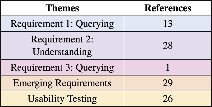
Fig. 7.
Categorization of the PSSUQ open comments using the same codes as in the usability sessions transcripts displaying coherence between both sources.
References
[1] | HL7 FHIR Release v4.3.0, Fast Healthcare Interoperability Resources, HL7, 2022, http://hl7.org/fhir/. |
[2] | M. Al-Tawil, V. Dimitrova and D. Thakker, Using knowledge anchors to facilitate user exploration of data graphs, Semantic Web 11: (2) ((2020) ), 205–234. doi:10.3233/SW-190347. |
[3] | R. Albertoni, D. Browning, S. Cox et al., Data Catalog Vocabulary (DCAT) – Version 2, W3C Recommendation, W3C, 2020, https://www.w3.org/TR/vocab-dcat-2/. |
[4] | T. Boren and J. Ramey, Thinking aloud: Reconciling theory and practice, IEEE Transactions on Professional Communication 43: (3) ((2000) ), 261–278. doi:10.1109/47.867942. |
[5] | J. Brooke, SUS: A quick and dirty usability scale, Usability Evaluation in Industry 189: ((1996) ), 189–194. |
[6] | R. Catherine, B. Stephan, A. Géraldine and B. Daniel, Weather data publication on the LOD using SOSA/SSN ontology, Semantic Web 11: (4) ((2020) ), 581–591. doi:10.3233/SW-200375. |
[7] | E.Y.Y. Chan, Essentials for Health Protection: Four Key Components, Oxford University Press, (2019) . doi:10.1093/oso/9780198835479.001.0001. |
[8] | R. Cyganiak and D. Reynolds, The RDF Data Cube Vocabulary, W3C Recommendation, W3C, (2014) , https://www.w3.org/TR/vocab-data-cube/. |
[9] | R. Cyganiak, D. Wood and M. Lanthaler, RDF 1.1 Concepts and Abstract Syntax, W3C Recommendation, W3C, (2014) , https://www.w3.org/TR/rdf11-concepts/. |
[10] | E. Dafli, P. Antoniou, L. Ioannidis et al., Virtual patients on the semantic web: A proof-of-application study, Journal of Medical Internet Research 17: (1) ((2015) ), e16, https://www.jmir.org/2015/1/e16/. doi:10.2196/jmir.3933. |
[11] | R. Hanlon, M. Barry, F. Marrinan and D. O’Sullivan, Towards an effective user interface for data exploration, data quality assessment and data integration, in: 2021 IEEE 15th International Conference on Semantic Computing (ICSC), (2021) , pp. 431–436. doi:10.1109/ICSC50631.2021.00077. |
[12] | X. He, H. Zhang and J. Bian, User-centered design of a web-based crowdsourcing-integrated semantic text annotation tool for building a mental health knowledge base, Journal of Biomedical Informatics 110: ((2020) ), 103571. doi:10.1016/j.jbi.2020.103571. |
[13] | X. He, R. Zhang, R. Rizvi et al., ALOHA: Developing an interactive graph-based visualization for dietary supplement knowledge graph through user-centered design, BMC Medical Informatics and Decision Making 19: (4) ((2019) ), 150. doi:10.1186/s12911-019-0857-1. |
[14] | A. Hogan, The semantic web: Two decades on, Semantic Web 11: (1) ((2020) ), 169–185. doi:10.3233/SW-190387. |
[15] | A. Hogan, E. Blomqvist, M. Cochez et al., Knowledge Graphs, ACM Computing Surveys 54: (4) ((2021) ), 1–37. doi:10.1145/3447772. |
[16] | W. Hu, H. Qiu, J. Huang and M. Dumontier, BioSearch: A semantic search engine for Bio2RDF, Database 2017: ((2017) ), bax059. doi:10.1093/database/bax059. |
[17] | A.R. Kitching, H.-J. Anders, N. Basu et al., ANCA-associated vasculitis, Nature Reviews Disease Primers 6(1) (2020). doi:10.1038/s41572-020-0204-y. |
[18] | B. Laugwitz, T. Held and M. Schrepp, Construction and evaluation of a user experience questionnaire, in: HCI and Usability for Education and Work, A. Holzinger, ed., Springer, Berlin, Heidelberg, (2008) , pp. 63–76. doi:10.1007/978-3-540-89350-9_6. |
[19] | T. Lebo, S.S. Sahoo and D.L. McGuinness, PROV-O: The PROV Ontology, W3C Recommendation, W3C, 2013, https://www.w3.org/TR/prov-o/. |
[20] | J. Lewis, Psychometric evaluation of the PSSUQ using data from five years of usability studies, International Journal of Human–Computer Interaction 14: (3–4) ((2002) ), 463–488. doi:10.1080/10447318.2002.9669130. |
[21] | R. Macefield, How to specify the participant group size for usability studies: A practitioner’s guide, Journal of Usability Studies 5: ((2009) ), 34–45, https://dl.acm.org/doi/10.5555/2835425.2835429. |
[22] | Y. Mao, D. Wang, M. Muller et al., How data ScientistsWork together with domain experts in scientific collaborations: To find the right answer or to ask the right question?, in: Proceedings of the ACM on Human-Computer Interaction, Vol. 3: , Association for Computing Machinery, New York, NY, USA, (2019) , pp. 1–23. doi:10.1145/3361118. |
[23] | R. Marcilly, L. Douze, S. Ferré et al., How to interact with medical terminologies? Formative usability evaluations comparing three approaches for supporting the use of MedDRA by pharmacovigilance specialists, BMC Medical Informatics and Decision Making 20: (1) ((2020) ), 261. doi:10.1186/s12911-020-01280-1. |
[24] | J. Martín, C. Muñoz-Romero and N. Ábalos, Chatbottest – improve your chatbot’s design, 2017, http://chatbottest.com/. |
[25] | A. Minutolo, E. Damiano, G. De Pietro et al., A conversational agent for querying Italian patient information leaflets and improving health literacy, Computers in Biology and Medicine 141: ((2022) ), 105004. doi:10.1016/j.compbiomed.2021.105004. |
[26] | A. Navarro-Gallinad, Weather and Air Quality data for Ireland as RDF data cube, Zenodo, 2021, Type: dataset, https://zenodo.org/record/5668287. |
[27] | A. Navarro-Gallinad, A. Meehan and D. O’Sullivan, The semantic combining for exploration of environmental and disease data dashboard for clinician researchers, in: Proceedings of the Fifth International Workshop on Visualization and Interaction for Ontologies and Linked Data, V. Ivanova, P. Lambrix, C. Pesquita and V. Wiens, eds, CEUR Workshop Proceedings, VOILA’20, Vol. 2778: , Virtual Workshop, (2020) , pp. 73–85, http://ceur-ws.org/Vol-2778/paper7.pdf. |
[28] | A. Navarro-Gallinad, F. Orlandi and D. O’Sullivan, Enhancing rare disease research with semantic integration of environmental and health data, in: The 10th International Joint Conference on Knowledge Graphs, IJCKG’21, Association for Computing Machinery, New York, NY, USA, (2021) , pp. 19–27. doi:10.1145/3502223.3502226. |
[29] | L.S. Nowell, J.M. Norris, D.E. White and N.J. Moules, Thematic Analysis: Striving to Meet the Trustworthiness Criteria, International Journal of Qualitative Methods 16(1) (2017). doi:10.1177/1609406917733847. |
[30] | H.J. Pandit, A. Polleres, B. Bos et al., Creating a vocabulary for data privacy, in: On the Move to Meaningful Internet Systems: OTM 2019 Conferences, H. Panetto, C. Debruyne, M. Hepp, D. Lewis, C.A. Ardagna and R. Meersman, eds, Lecture Notes in Computer Science, Springer International Publishing, (2019) , pp. 714–730. doi:10.1007/978-3-030-33246-4_44. |
[31] | M. Perry, J. Herring, N. Car et al., GeoSPARQL – a Geographic Query Language for RDF Data | OGC, OGC Standard, Open Geospatial Consortium, (2012) , https://www.ogc.org/standards/geosparql. |
[32] | C. Pesquita, V. Ivanova, S. Lohmann and P. Lambrix, A framework to conduct and report on empirical user studies in semantic web contexts, in: Knowledge Engineering and Knowledge Management, C. Faron Zucker, C. Ghidini, A. Napoli and Y. Toussaint, eds, EKAW 2018, Vol. 11313: , Springer International Publishing, Cham, (2018) , pp. 567–583, Lecture Notes in Computer Science. doi:10.1007/978-3-030-03667-6_36. |
[33] | E. Prud’hommeaux and A. Seaborne, SPARQL Query Language for RDF. W3C recommendation, W3C Recommendation, W3C, 2008, https://www.w3.org/TR/rdf-sparql-query/. |
[34] | R. Rampin and V. Rampin, Taguette: Open-source qualitative data analysis, Journal of Open Source Software 6: (68) ((2021) ), 3522. doi:10.21105/joss.03522. |
[35] | X. Rodó, J. Ballester, R. Curcoll et al., Revisiting the role of environmental and climate factors on the epidemiology of Kawasaki disease, Annals of the New York Academy of Sciences 1382: (1) ((2016) ), 84–98. doi:10.1111/nyas.13201. |
[36] | X. Rodó, R. Curcoll, M. Robinson et al., Tropospheric winds from northeastern China carry the etiologic agent of Kawasaki disease from its source to Japan, Proceedings of the National Academy of Sciences 111: (22) ((2014) ), 7952–7957. doi:10.1073/pnas.1400380111. |
[37] | M. Roos, E. López Martin and M.D. Wilkinson, Preparing data at the source to Foster interoperability across rare disease resources, in: Rare Diseases Epidemiology: Update and Overview, M. Posada de la Paz, D. Taruscio and S.C. Groft, eds, Advances in Experimental Medicine and Biology, Vol. 1031: , Springer International Publishing, Cham, (2017) , pp. 165–179. doi:10.1007/978-3-319-67144-4_9. |
[38] | J. Scott, J. Hartnett, D. Mockler and M.A. Little, Environmental risk factors associated with ANCA associated vasculitis: A systematic mapping review, Autoimmunity Reviews 19(11) (2020). doi:10.1016/j.autrev.2020.102660. |
[39] | A.J. Sommer, E. Leray, Y. Lee and M.C. Bind, Assessing environmental epidemiology questions in practice with a causal inference pipeline: An investigation of the air pollution-multiple sclerosis relapses, relationship 40: (6) ((2020) ), 1321–1335. doi:10.1002/sim.8843. |
[40] | M.R. Stöhr, A. Günther and R.W. Majeed, The collaborative metadata repository (CoMetaR) web app: Quantitative and qualitative usability evaluation, Journal of Medical Internet Research Medical Informatics 9: (11) ((2021) ), e30308. doi:10.2196/30308. |
[41] | M. Wilkinson, M. Dumontier, I. Aalbersberg et al., The FAIR guiding principles for scientific data management and stewardship, Scientific Data 3: (1) ((2016) ), 160018. doi:10.1038/sdata.2016.18. |