
How to present your data II: Tables
1Introduction
In a previous paper [1] the use of graphs in research papers was discussed. Tufte, [2] listed the data presentation choices as, the sentence, the table and the graphic, in this paper guidance on the preparation and presentation of table will be described. The purpose of a table is to display numerical information for the reader’s evaluation. However, if you have ever struggled with the layout of a table in a research paper, blame the author [3]. Anyone who produces a table should consider who is going to read it and to make their task as easy as possible.
2Presenting data in tables
Tables in journal articles have critics [4] and supporters [5, 6], but have been described as the most eye-catching part of a journal article [7]. A successful table communicates its purpose with ease, [8] and should be understandable with a quick glance [9]. Successful tables centralise large amounts of data, save space and prevent long passages of text [10]. They are useful for giving information about several variables at once, and allowing direct scrutiny of the data by the reader [11]. The data can be displayed precisely, [12] and complex relationships can be examined [12].
However, good, clear tables do not come about by chance, and unfortunately the instructions for authors in journals have been criticised for devoting too little space and information on the subject [13]. Nevertheless, authors have offered direction on achieving good table displays [5, 7, 10, 14], but two suggestions stand out: a table should be stand alone and understandable at a quick glance [9, 10]; a table should not replicate information in the text and readers should understand the contents of a table without referring to the text [10]. The information can be presented in either text or a table, but it is not a good idea to do both. Authors should ask themselves if they have enough data for a table. Riordan [12] gave the example shown in Table 1 as having too little information. The recommendation was that it was perhaps better suited to a sentence.
3Table anatomy
Figure 1 shows the structure of a table, each of the components are important. Tables need comprehensive titles and succinct headings [8]. The title is essential, it should be brief, descriptive and informative [11, 14]. It is acceptable to use a phrase rather than a complete sentence, but it must cover the background [14]. Column headings should contain the main categories, and the units of measurement if applicable. When displaying independent and dependent variables, convention dictates that the independent variables are displayed in the left-hand column as row headings and the dependent variables in the columns to the right [12, 14]. The column heading should identify and apply to all of the items listed in the column [14]. Row headings or table stubs should be placed in the left hand of the table. As they label the row, they should apply to all items in that row. If there is no unit of measurement in the column heading, it should be included in the row heading. Row headings should be left justified [12]. With both row and column headings avoiding abbreviations will give less chance of confusing the reader [12]. If they are used, they should be explained in a footnote [11].
![The major components of a scientific table [5, 14].](https://content.iospress.com:443/media/ppr/2017/38-2/ppr-38-2-ppr097/ppr-38-ppr097-g001.jpg)
The data field cells represent the body of the data in the table. Each data entry point is contained within a cell at the intersection of a column and a row. The cells can contain numerals, text, symbols, or a combination of these. Missing data and blank space should be avoided, so use ‘0’ to indicate that the value in the cell is zero [12, 14]. When showing data in the table the numerical precision should be consistent throughout, and adding extra decimal places is unnecessary [11]. The number of observations in the data should always be included [11]. If small ‘P’ values are being displayed, they could be displayed in scientific form [15]. Footnotes are used to convey extra information, they can apply to the whole table, a column, or a row. The American Psychological Association [16] refers to footnotes as general, specific or probability, and serve they the same purpose. Footnotes should be listed in the order in which they are referred to in the table [12].
4Ordering the data
The order in which the data is considered is important. If it is done properly, it can enhance the presentation. If done poorly, it will hinder the reader’s understanding. Unfortunately, there is no one rule, the choice varies with the circumstances, [3, 11] but ordered data is always better as it aids comparisons [3]. Some authors suggest that data should go from the largest category to the smallest, beginning in the top left data field [3]. Freeman [11] urges using a natural order if one exists, but if there is not natural order begin with the largest and work down to the smallest. Tables 2 and 3 display the same information, but Table 3 is ordered. Table 3 is easier on the eye of the reader and makes comparisons between categories easier.
Table 2
Marital status of 226 patients with leg ulcer (unordered) [11]
| Frequency | Percent | |
| Divorced/Separated | 11 | 4.9 |
| Married | 104 | 46.0 |
| Single | 25 | 11.1 |
| Widowed | 86 | 38.1 |
| Total | 226 | 100 |
Table 3
Marital status of 226 patients with leg ulcer (ordered) [11]
| Frequency | Percent | |
| Married | 104 | 46.0 |
| Widowed | 86 | 38.1 |
| Single | 25 | 11.1 |
| Divorced/Separated | 11 | 4.9 |
| Total | 226 | 100 |
5Formatting
Authors have warned about putting too much information on a table, [2, 8] the purpose is to let the data be seen by the reader. One way to help with this task is to minimise the number of lines on the table, and use white space effectively. Tables 4 and 5 show the same information on sample size calculations. The difference in the two tables is that Table 4 has five horizontal lines and four vertical lines. In contrast, Table 5 has two horizontal lines. Table 4 could be described as a “Dreaded Grid”, [2, 8] and it should be avoided because vertical lines stop the eye scanning across rows, and horizontal lines disturb comparisons [8, 11]. Solid lines should be used to separate labels and summary measures from the data [11]. Both Freeman [11] and Knight [10] suggest no vertical lines and a maximum of three horizontal lines. The latter [10] suggested that they should be located with one between the title and header descriptions, one between the column headers and the first line of data, and one following the last line of data.
Table 4
Sample size calculations
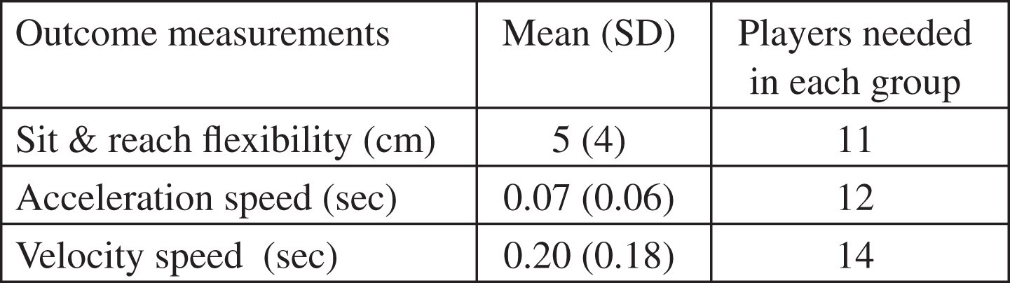 |
Table 5
Sample size calculations
| Outcome measurements | Mean (SD) | Players needed in |
| each group | ||
| Sit &reach flexibility (cm) | 5 (4) | 11 |
| Acceleration speed (sec) | 0.07 (0.06) | 12 |
| Velocity speed (sec) | 0.20 (0.18) | 14 |
Tabulated data can be an effective way of displaying study data if it is best presented in a way that makes interpretation easy for the reader. Such a presentation will take time and effort on the part of the authors, but the time and effort will pay dividends.
Conflict of interest
None to report.
References
[1] | Gissane C , Runswick OR . How to present your data I: Graphs. Physiotherapy, Practice and Research. (2017) (In press). |
[2] | Tufte ER , Graves-Morris P . The visual display of quantitative information: Graphics Press Cheshire, CT; (1983) . |
[3] | Ehrenberg ASC . A primer in data reduction: An introductory statistics textbook: Wiley; (2000) . |
[4] | Farquhar A , Farquhar H . Economic and industrial delusions: A discourse of the case for protection. New York: Putnam. (1891) . |
[5] | Annesley TM . Bring your best to the table. Clinical Chemistry (2010) ;56: (10):1528–34. |
[6] | Whitley E , Ball J . Statistics review Presenting and summarising data. Critical Care (2002) ;6: (1):66–71. |
[7] | Hamilton CW . On the table: Form and function. Chest (2009) ;135: :1087–9. |
[8] | Bigwood S , Spore M . Presenting numbers, tables, and charts: Oxford Unversity Press; (2003) . |
[9] | Hoogenboom BJ , Manske RC . How to write a scientific article. International Journal of Sports Physical Therapy (2012) ;7: (5):512. |
[10] | Knight KL , Ingersoll CD . Structure of a scholarly manuscript: 66 tips for what goes where. Journal of Athletic Training (1996) ;31: (3):201–6. |
[11] | Freeman JV , Walters SJ , Campbell MJ . How to display data. Oxford: Blackwell Publishing; (2008) . |
[12] | Riordan L . Enhancing your manuscript with graphic elements, part Tables. J Am Osteopath Assoc (2013) ;113: (1):54–7. |
[13] | Schriger DL , Cooper RJ . Achieving graphical excellence: Suggestions and methods for creating high-quality visual displays of experimental data. Annals of Emergency Medicine (2001) ;37: (1):75–87. |
[14] | AMA. American Medical Association manual of style: A guide for authors and editors. Oxford University Press: New York; (2010) . |
[15] | Gissane C . P values in standard form. Physiotherapy Practice and Research (2014) ;35: :65–6. |
[16] | Yao R . Publication manual of the American psychological association. Wiley Online Library; (2011) . |